By Michelle Marceny, Certified Color Expert and founder of The Color Concierge
Last updated August 2026
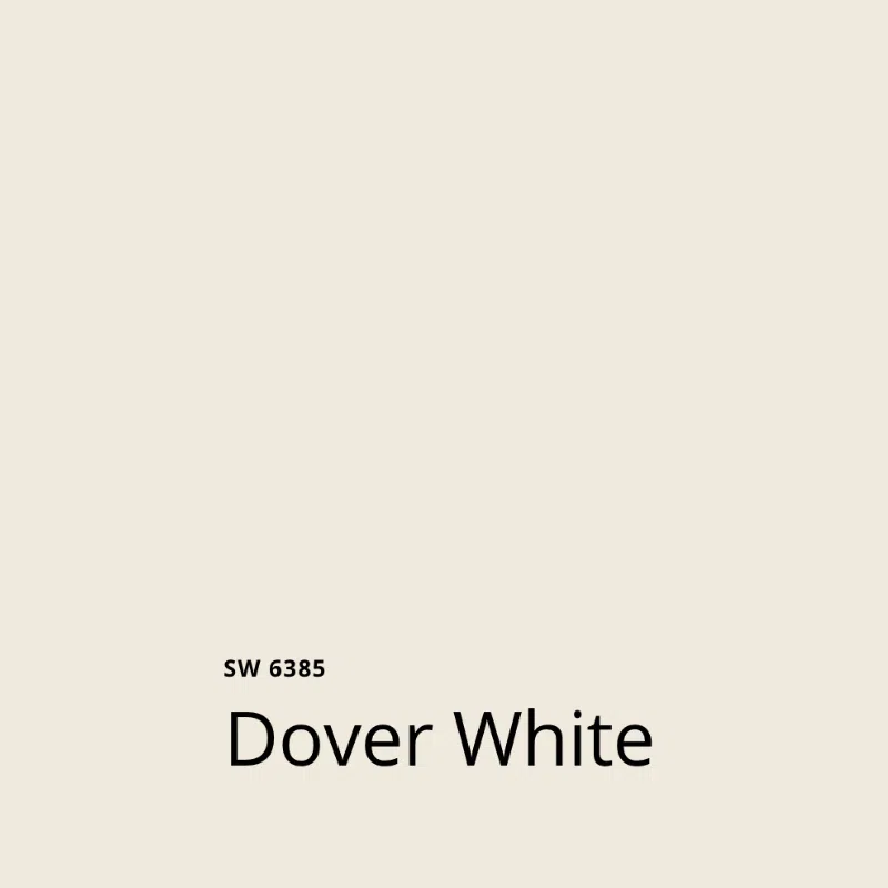
Sherwin-Williams Dover White (SW 6385) is a warm, creamy off-white with strong yellow undertones and an LRV of 83. It has been a builder favorite for interior walls for years. Dover White works best in rooms with low or shadowy light, where its yellow warmth brightens dim corners. Pair it with Pure White trim rather than Extra White.
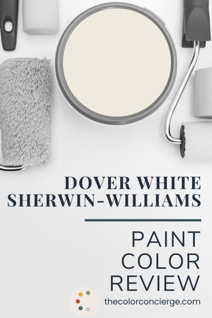
| Color | Sherwin-Williams Dover White |
|---|---|
| Color number | SW 6385 |
| LRV | 83 (Light Reflectance Value, on a scale of 0 to 100) |
| Undertones | Yellow (strong) |
| Color family | Warm, creamy off-white |
| Best for | Rooms with low, uneven, or shadowy light |
| Best trim & ceiling | Sherwin-Williams Pure White (SW 7005) |
| Avoid pairing with | Sherwin-Williams Extra White (SW 7006) trim |
| Closest Benjamin Moore match | Benjamin Moore Swiss Coffee |
*This post contains affiliate links for products I use and love. If you click on some links and make a purchase, I will get a small commission at no cost to you. This helps pay for the costs of the blog, so I can continue to offer great content to our readers.
About The Color Concierge
Our Colorado-based paint color consultants make finding the right paint colors for your home easy. Whether you’re painting the exterior or interior of your home, our simple yet effective process lets us get your paint color right the first time. We’ve helped thousands of homeowners transform their homes into a space they love. Learn more about ONLINE COLOR CONSULTATIONS today.
Dover White Tips and Tricks
- Use with: Colorful art and decor, loaded bookshelves, warm wood floors, and rooms that get low or uneven natural light.
- Don’t use with: SW Extra White trim or ceilings. Dover White has enough yellow in it that Extra White will read cold and disconnected beside it. I’d only use Extra White trim if it’s already in place and you’re not repainting. Read our SW Extra White review.
- Best trim color: SW Pure White. Read our SW Pure White review.
- Best ceiling color: SW Pure White, or Dover White itself if you want to wrap the room.
- Best paint matches: BM Swiss Coffee — the LRVs are close and both are creamy rather than stark. Read our SW Swiss Coffee review.
- Watch out for: Yellow flashing. Dover White can go noticeably yellow in an interior room, especially one picking up green reflection from foliage outside. This can come from trees or even a golf course outside your window.
Is Dover White a builder color?
Yes, and it has been for years. Builders across the country have used Dover White as a standard interior wall color for a long time, and I run into it constantly in my consulting practice.
Don’t let that put you off, though. Builder-grade doesn’t mean bad. It’s actually quite lovely, and it’s one of Sherwin-Williams’ Top 50 paint colors for a reason. A color becomes a builder standard because it’s forgiving, it covers well, and it flatters a wide range of finishes. Those are good qualities.
What is the LRV of Sherwin-Williams Dover White?
The LRV of Dover White is 83. LRV stands for Light Reflectance Value, a scale from 0 (pure black) to 100 (pure white) that tells you how much light a color bounces back into the room.
At 83, Dover White sits firmly in off-white territory — light and reflective, but not stark. Explore our list of the best off-white paint colors.
What are the undertones of Dover White?
Sherwin-Williams Dover White gets its warmth from yellow undertones, and the yellow is strong. This is a creamy white, not a clean one.
That yellow is what makes Dover White so good at what I call cutting through the dinge — brightening a room that’s shadowy without lighting it up artificially. If a room is genuinely dark, no paint color will fix that. But if a room is dim, a warm white with real yellow in it will make it feel considerably lighter than a cool white would. Explore our full list of the best white paint colors for dark rooms.
The flip side: those same undertones can flash too yellow in an interior room, or a room pulling in a lot of green from outside.
Why does Dover White look different in every room?
Sherwin-Williams Dover White has a high LRV and very little pigment of its own to assert, so it behaves less like a paint color and more like a reflector. This is something I tell clients constantly: white is a mirror. Dover White can pick up and reflect your floors, your furniture, your countertops, and — most dramatically — whatever is on the other side of your windows.
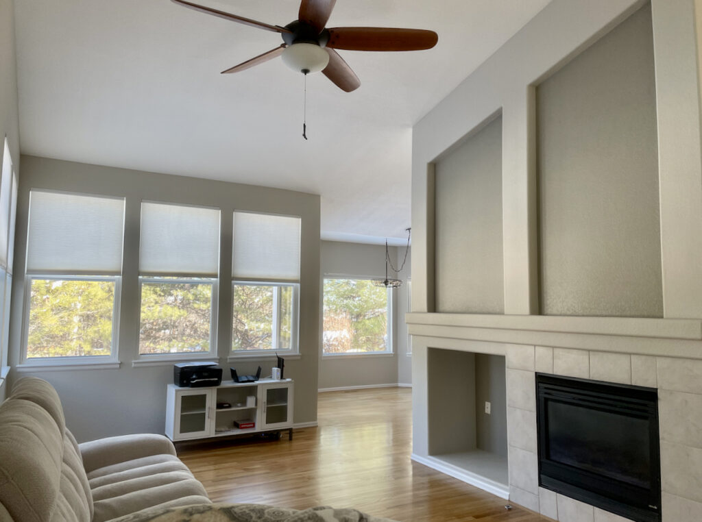
Take a look at the photo below from my clients’ home (you’ll see even more of their home in the project spotlight below). There’s a green stripe running across the center of this wall, and it’s coming from the golf course directly outside the window on the opposite wall. All that lawn is bouncing off the grass, through the glass, and onto the Dover White.
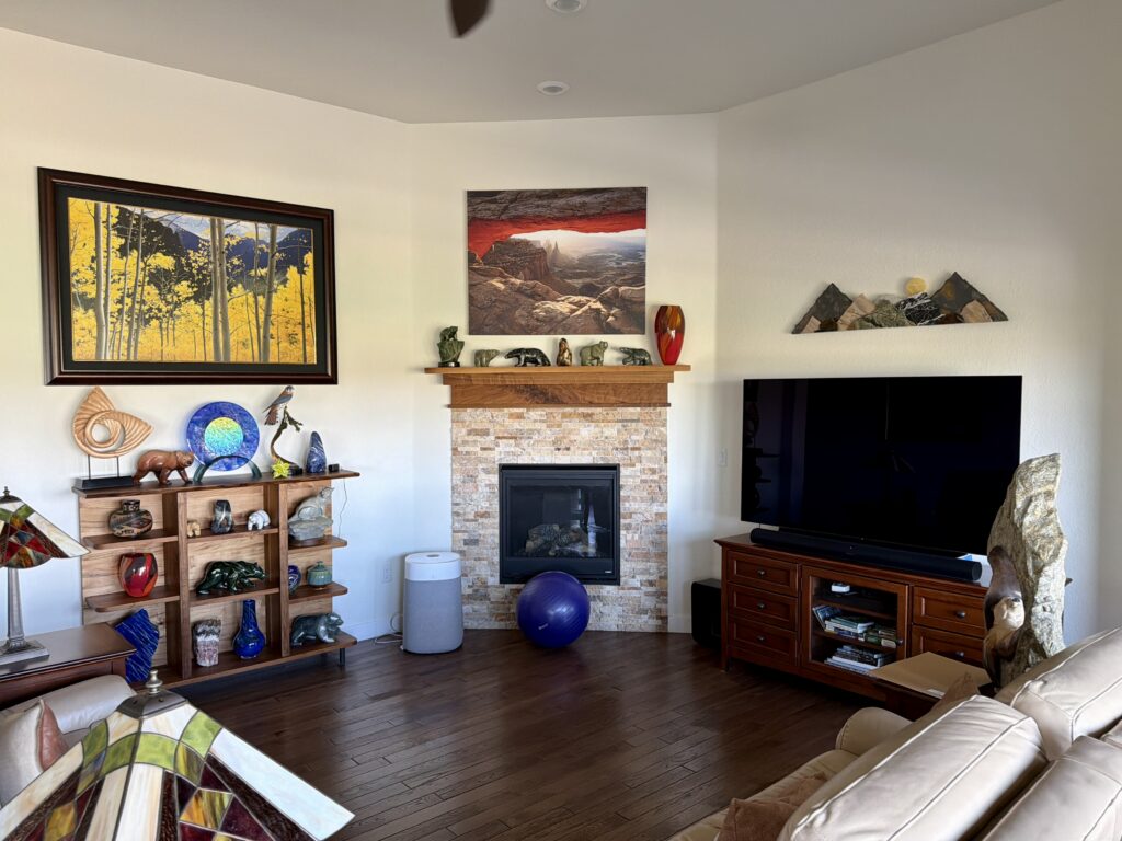
My client had lived in this house since it was built and had never noticed it. I saw it the moment I walked in.
This is the single most useful thing to know before you commit to Dover White. It will not look like the swatch when it’s on the wall. The best thing you can do is to test carefully and make sure to test in different rooms, different lighting, and alongside any decor and hard finishes you have.
What can you do when Dover White picks up a color cast?
There are three main ways to deal with this:
1. Live with it. This is genuinely a real choice. The cast shifts through the day and the room moves with it. Once people know what they’re looking at, many of them find they can live with it, and actually love it.
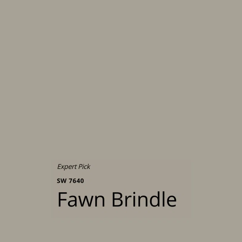
2. Break up the reflection with a darker accent wall. This is what we chose for our client’s home. A more saturated color has enough pigment of its own that it stops acting as a mirror, and it gives the Dover White around it something to sit against. For this room I recommended Sherwin-Williams Fawn Brindle, a green-gray.
There’s a reason that direction works. Walk into the Musée d’Orsay in Paris and the Impressionist galleries — some of the most colorful paintings ever made — hang against a green-gray backdrop. It makes the color sing. My client has a house full of gorgeous, colorful art, and Fawn Brindle gives all of it a background to work against instead of a mirror to compete with.
3. Move to a different white. Sometimes the honest answer is that Dover White is the wrong tool for a room with a strong reflected cast. Look for a warm white with less yellow, such as Sherwin-Williams White Duck, or a more muted white paint color, such as Benjamin Moore White Dove. Read our full reviews of SW White Duck and White Dove.

Project Spotlight: A 2019 Ranch Where the Builder Chose Dover White
Every photo in this section was taken in a client’s home during an in-person color consultation. This is a ranch with a finished basement, built in 2019. The builder painted the entire main floor Sherwin-Williams Dover White, and my clients hadn’t repainted a thing since. So what you’re seeing is six years of living with a builder white, and it’s a fabulous example of how Dover White can be a beautiful whole-house paint color!
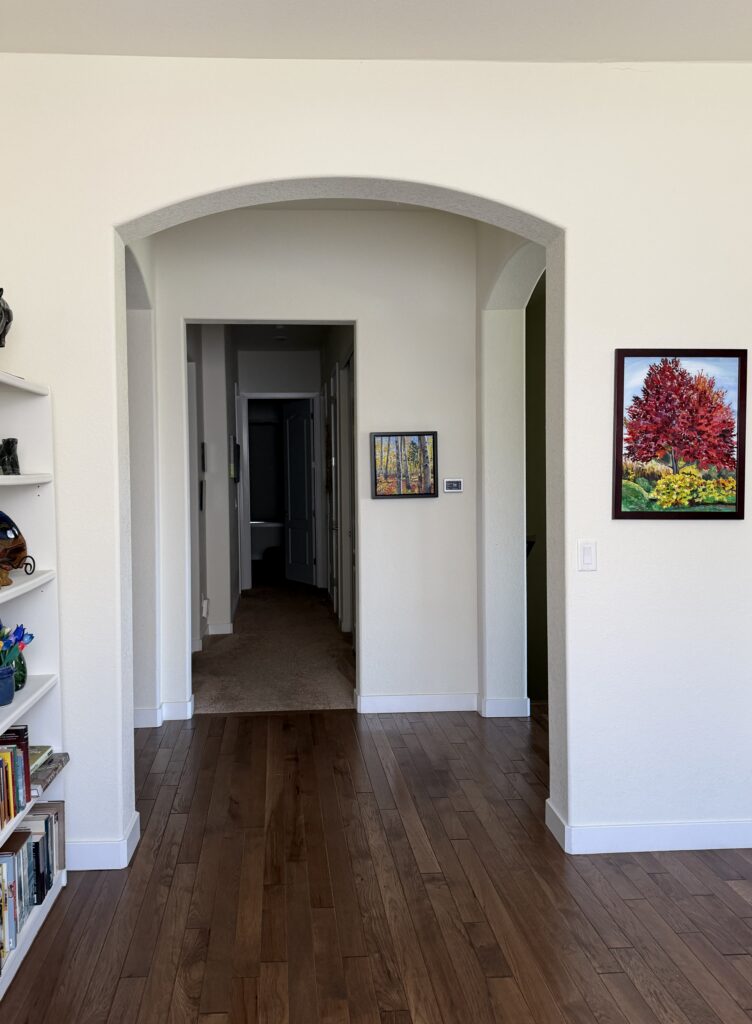
This house is full of art, books, and decor, and Dover White turned out to be the perfect backdrop for all of this color.
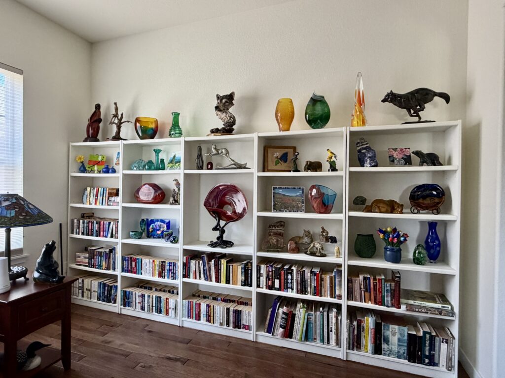
People underestimate how colorful a bookshelf is. It isn’t just the spines — a bookshelf is where most of us put our objects. A creamy white like this one, rather than a stark white, gives all of that somewhere to land. It’s warm enough to feel like an intentional color choice and quiet enough to let the decor and finishes shine
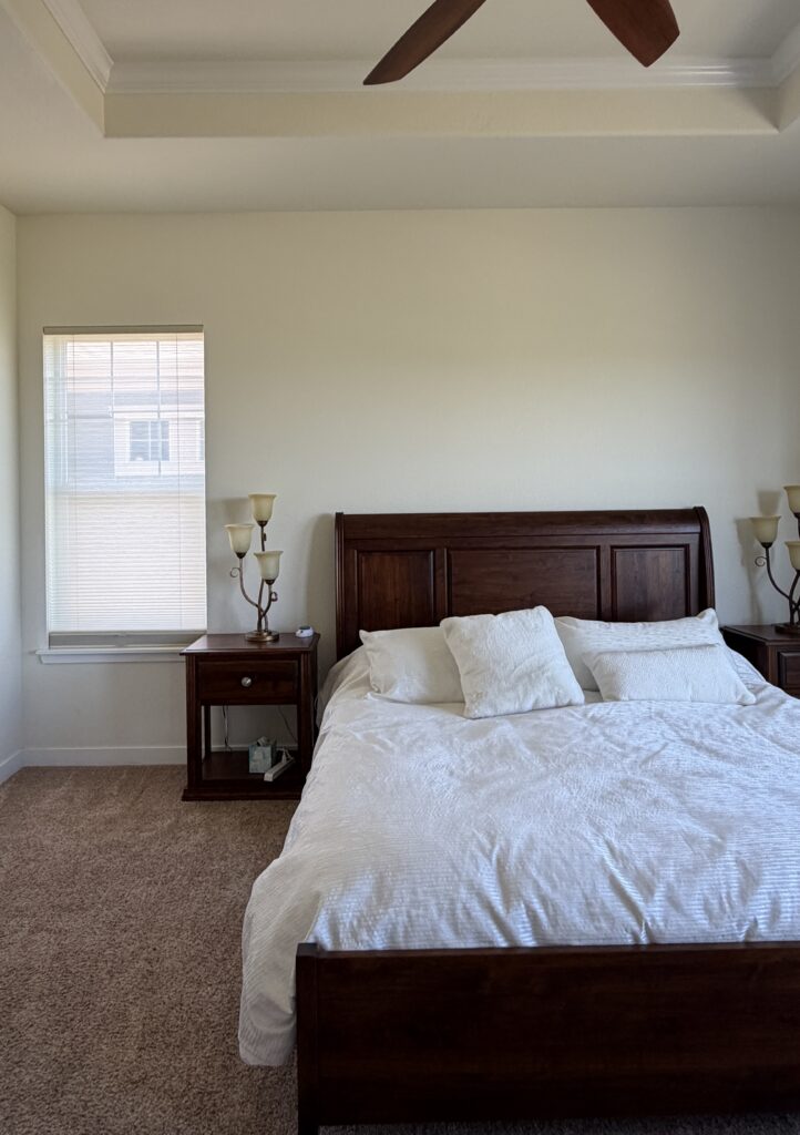
The trim and doors throughout are Sherwin-Williams Pure White, and in the bedroom the ceiling is Pure White as well. This is the pairing I recommend most often with Dover White — Pure White is cool enough to read as a clean trim line, but not so cool that it fights the yellow in the walls.
You can also use Dover White as the trim color (satin sheen) and Pure White as the ceiling color (flat sheen). In the long run, though, I prefer Pure White because, in this situation, it gives more long-term flexibility in case you want to paint your walls another color.
The primary bathroom is also painted with Dover White walls, but the color doesn’t work as well in this space. The dark wood vanity, warm peachy beige tile, and granite countertop are all warm, but not yellow, and they look a little discordant with the Dover White walls.
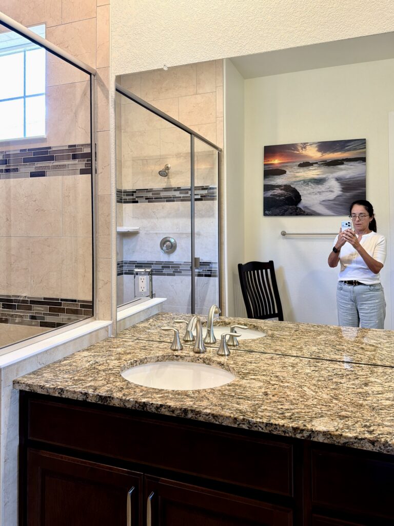
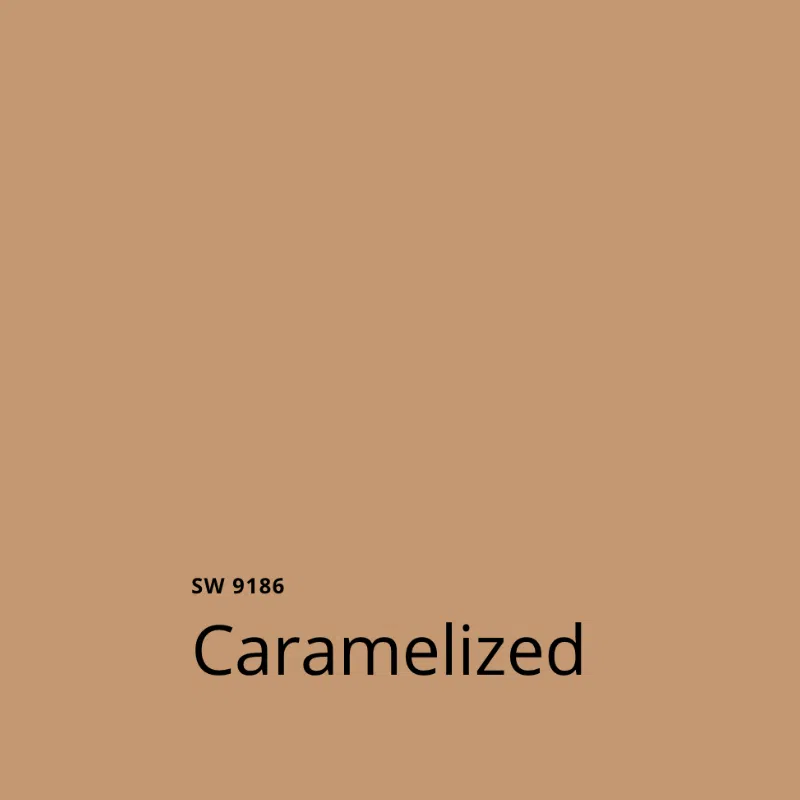
In this space, I recommended going in a different direction entirely and painting the walls Sherwin-Williams Caramelized, which will be gorgeous.
As I mentioned before, the other space that’s getting a new paint color is the living room. While we’ll keep most of the Dover White walls as they are, we’re going to add a Sherwin-Williams Fawn Brindle accent on the wall that reflects all the green from outside.
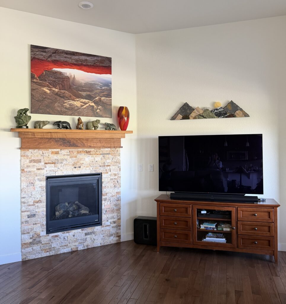
Here’s an example of a Fawn Brindle accent wall from another client’s home. Explore the rest of this home in our full Sherwin-Williams Gossamer Veil review.
The Sherwin-Williams Dover White Palette
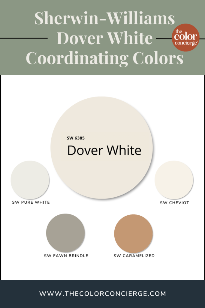
- Walls (main floor): SW Dover White — the builder’s original 2019 color, still going strong
- Trim and doors: SW Pure White — cool enough to separate, warm enough not to clash
- Bedroom ceiling: SW Pure White
- Living room accent wall (planned): SW Fawn Brindle — a green-gray, chosen to stop the reflection and give the art a backdrop
- Primary bathroom (planned): SW Caramelized — a warm step away from white without leaving the palette
What colors go with Dover White?
Dover White is a warm, creamy backdrop, which makes it an unusually easy color to build around. It pairs beautifully with saturated color, warm woods, and other warm tones. The colors that give it trouble are cool, blue-based whites.
Best trim and ceiling colors for Dover White
SW Pure White in almost every case. It’s cooler and cleaner than Dover White without going cold, and it gives you real separation at the trim line. In the project above, the trim, doors, and bedroom ceiling are all Pure White, and it’s the combination I’d recommend to almost anyone using Dover White.
SW Cheviot is the other option worth testing. It’s a warm white from the Emerald Designer Edition, and it works as trim and ceiling above Dover White walls if you want a softer, warmer transition than Pure White gives you. Read our full SW Cheviot review.
You can also paint the ceiling Dover White itself and wrap the whole room. Shift the sheen between walls and ceiling to keep it from going flat.
Don’t Pair Dover White with SW Extra White. Dover White has enough yellow in it that Extra White trim reads disconnected and cold beside it. The exception is the common one — if Extra White is already on your trim and you aren’t repainting, test before you assume you have to change it. It can work.
Best accent colors for Dover White
SW Fawn Brindle, a green-gray, is my pick for an accent wall in a Dover White room. It’s dark enough to stop mirroring the way a white does, and green-gray is one of the great backdrops for colorful art and decor.
SW Caramelized works beautifully in an adjoining room when you want to step away from white altogether without breaking the warmth of the palette.
The broader principle: because Dover White is so warm and so reflective, it wants accents with real pigment in them. Anything too pale sitting next to it will just read as another version of the same wall.
When should you avoid Dover White?
Dover White is at its best when it’s solving a problem. And the problem it’s best at solving is a house with a lot of shadows that you want to brighten.
Skip it if:
- Your room already gets abundant, warm light. Dover White may tip over into looking yellow.
- Your room has a strong green cast from outside and you aren’t prepared to manage it (or live with it).
- Your trim is Extra White and you can’t repaint it. Test first.
- You want a crisp, clean white. This isn’t that. Dover White is unapologetically creamy.
Dover White alternatives: colors to consider instead
If Dover White is close but not quite right, these are the colors I’d look at next. Note that these are alternatives to Dover White, from both Sherwin-Williams and Benjamin Moore.
SW Dover White vs SW Greek Villa
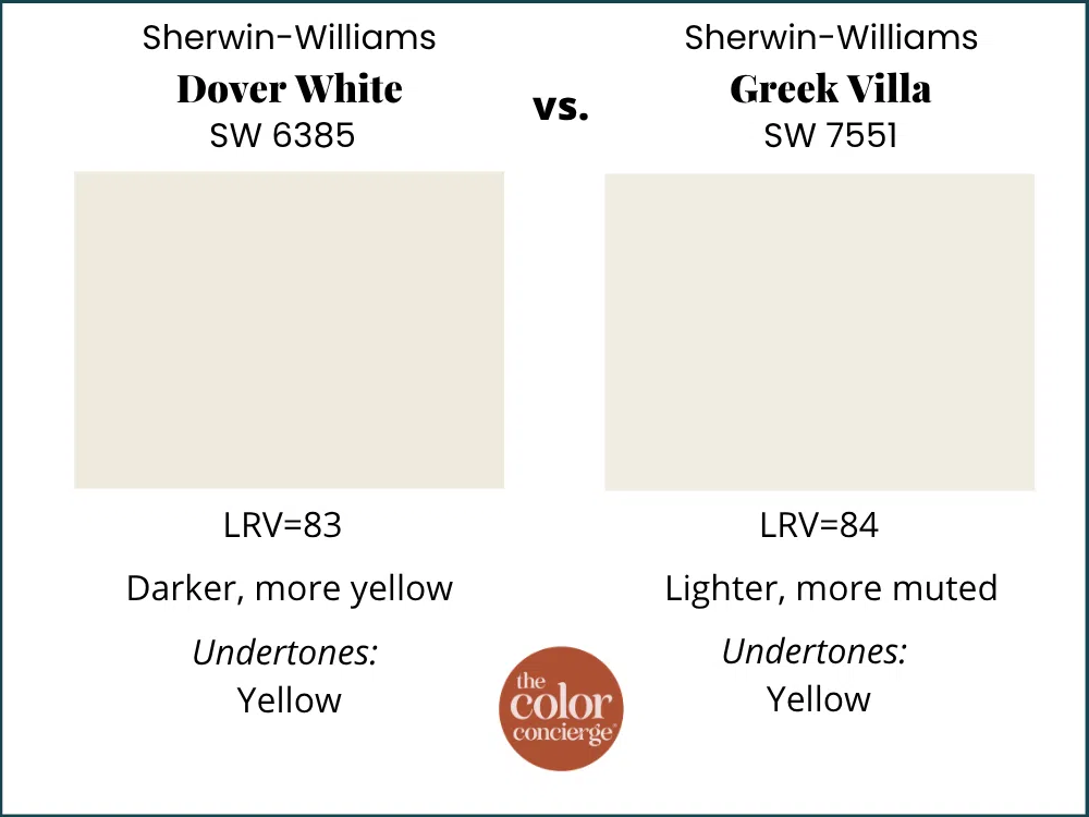
SW Greek Villa is warm, but less yellow-forward than Dover White.
SW Dover White vs SW Alabaster
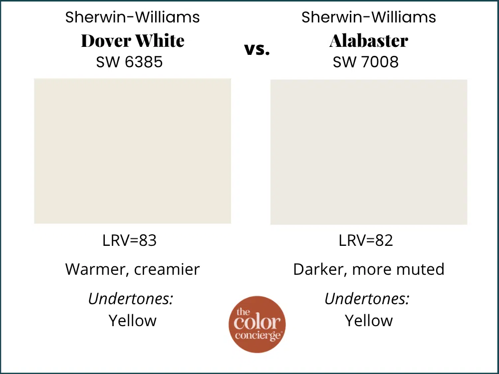
SW Aabaster is warm with yellow undertones, and is one of Sherwin-Williams’ most popular whites. However, it’s more muted than Dover White.
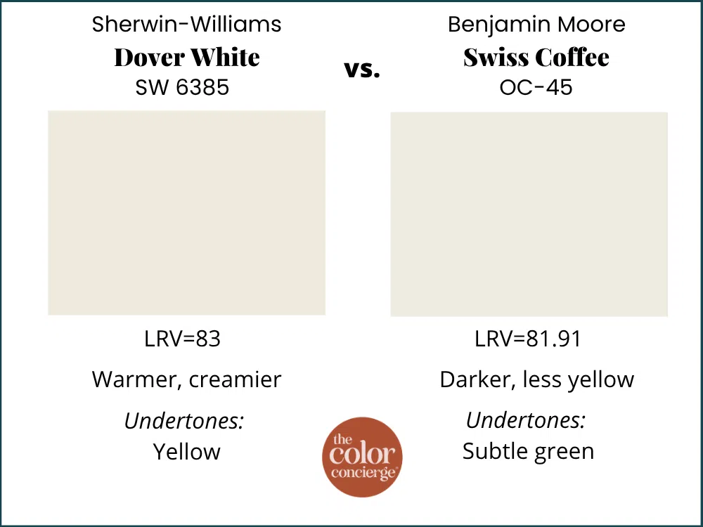
SW Dover White vs BM Swiss Coffee
BM Swiss Coffee is the closest Benjamin Moore match to Dover White in feel. It has a similar LRV and is similarly creamy.
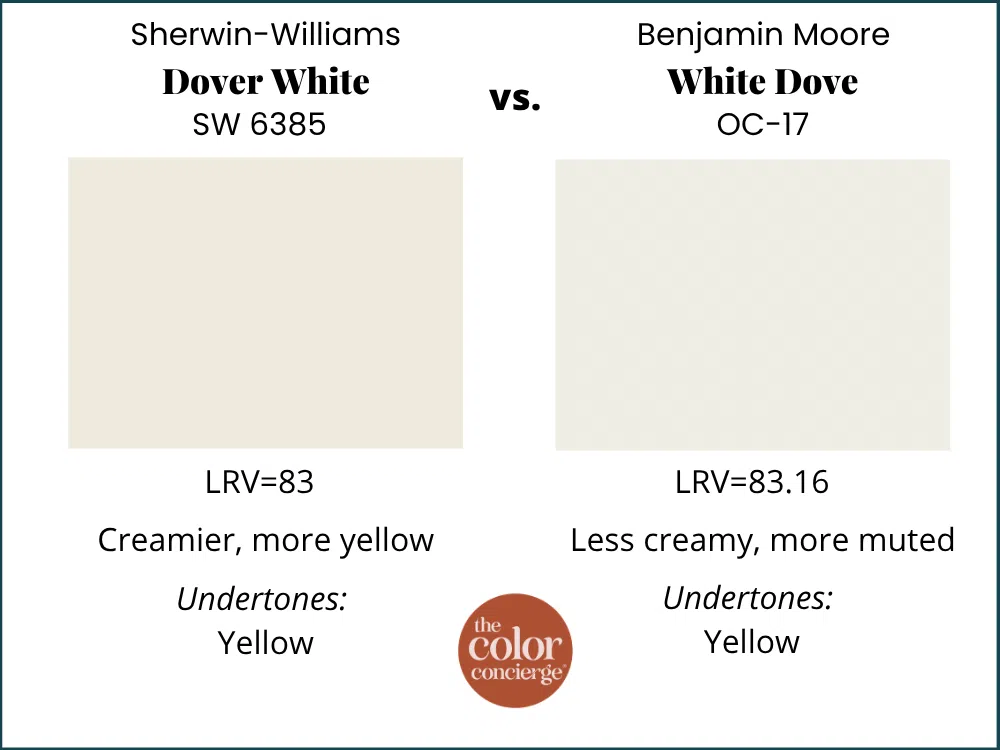
SW Dover White vs BM White Dove
BM White Dove has an LRV 85, subtle yellow undertones and is more muted and slightly cooler on the wall.
Dover White FAQ
Dover White has strong yellow undertones, which give it a creamy warmth on the wall. It usually reads as a warm white rather than a yellow one, but it can flash yellow in interior rooms or in spaces picking up green reflection from outside.
Dover White has strong yellow undertones and a high LRV of 83, which makes it very reflective. When it picks up a color cast — most often green bouncing in from lawn or trees outside — the yellow in Dover White pushes forward rather than muting, so the wall reads warmer or more yellow-green than the swatch suggests.
Yes, for a dim room. Dover White’s yellow undertones brighten shadowy corners in a way that cool whites can’t. It won’t fix a genuinely dark room — no paint can — but it will make a dim one feel lighter.
Benjamin Moore Swiss Coffee is the closest match. The two have similar LRVs and the same creamy, not-stark quality.
Sample These Paint Colors
Dover White is a mirror, and its yellow is strong. That means what it does on your wall depends almost entirely on what’s outside your windows and what’s already in the room — which is exactly what a fan deck in a store can’t show you. Tape a sample up on the actual wall, look at it in the morning and again at four in the afternoon, and you’ll know within a day if it’s the right color for your project.
Below, grab the links to sample any of the colors we featured in today’s post:
| Paint color | Peel-and-stick sample |
|---|---|
| Sherwin-Williams Dover White (SW 6385) | Sample Dover White |
| Sherwin-Williams Pure White (SW 7005) | Sample Pure White |
| Sherwin-Williams Alabaster (SW 7008) | Sample Alabaster |
| Benjamin Moore White Dove (OC-17) | Sample White Dove |
| Sherwin-Williams Greek Villa | Sample Greek Villa |
| Benjamin Moore Swiss Coffee | Sample Swiss Coffee |
| Sherwin-Williams Fawn Brindle | Sample Fawn Brindle |
| Sherwin-Williams Caramelized | Sample Caramelized |
New to peel-and-stick samples? Samplize sends real manufacturer paint, two coats, in a 9” x 14” sheet, delivered overnight — no sample pots, no poster board, no mess. I use them on every consultation. More on our method here: how to test paint colors.
Key Learning Points
Dover White is a builder standard that deserves a second look. It’s a creamy, yellow-warm off-white that does its best work in rooms where most whites struggle.
- Dover White is a mirror, and a reactive one. At LRV 83 with strong yellow undertones, Dover White doesn’t just reflect what surrounds it — its yellow amplifies a reflected cast instead of neutralizing it. Before you choose it, look at what’s outside your windows.
- The yellow is a feature, not a flaw. Dover White’s strong yellow undertones cut through the dinge in shadowy rooms where a cool white would look gray and lifeless. In a bright, warm room, that same yellow can become too much.
- Pair it with Pure White, not Extra White. Pure White trim and ceilings give Dover White clean separation without going cold. Extra White reads disconnected and blue-gray against all that yellow.
Remember: NEVER, EVER use paint matches from a different brand than the one specified. Results are poor and there are no standards for the sheens. Even though your painter may truly believe it can be done, don’t do it. See results in our paint matching guide.
No matter what, always test your paint colors. It’s a standard best practice. Whenever I test my paint colors, they are perfect, and when I don’t test they turn out wrong. Learn how to test your paint colors like a pro.
Online Color Consulting
Still need help picking the best paint colors? Discover our Online Color Consulting Packages.

About the Author

Hi, I’m Michelle Marceny, founder, owner, and Principal Color Designer at The Color Concierge. I believe a fresh coat of paint can completely transform a space. The Color Concierge was born out of my drive to help clients fall back in love with their homes. My clients trust me to help them find the perfect paint color — whether that’s a whole-house color scheme or ideas for a single room.
Since founding The Color Concierge in 2017, my team and I have completed 1,000s of color consultations, online and in person. I’m a Certified Color Expert with nine years of experience creating interior and exterior color palettes throughout North America.
Every color review on this site comes from colors we’ve specified in real homes and photographed on location during our own consultations — not from a fan deck or a manufacturer’s website.
Related Posts:
- Benjamin Moore Swiss Coffee Review
- Sherwin-Williams Greek Villa Review
- Benjamin Moore White Dove Review
- Best Off-White Paint Colors
We love your comments! Please note that the blog is meant as general advice, and it is not possible to give out specific answers to your paint questions. If you want more specific advice, our Online Color Consultations will help you pick your paint colours. Thank you for your understanding.