Looking for the best Victorian farmhouse exterior paint colors? Read our guide to choosing the right colors for your home and explore three color palettes to inspire your project.
As paint color consultants, we love it when we get to take on a Victorian exterior project. Designing a Victorian house color scheme (Article) is always an adventure, thanks to the homes’ many unique architectural details, but the project we’re sharing today was extra special.
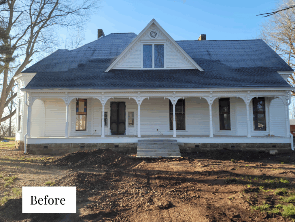
This is one of the most interesting projects that we have ever worked on. This historic 1890s Queen Anne farmhouse in Kentucky sits on 11 acres. The home was painted white when the owner first came to us and even with this monochromatic color palette, the home is stunning.
But we knew this home could be even more beautiful with a color scheme that accents its architectural details. We worked with our client to find the perfect Victorian farmhouse exterior paint colors that would bring this home to life but also still feel classic and timeless.
Keep reading to learn more about choosing Victorian exterior paint colors (Article) and see the three color palettes we put together for this gorgeous historic farmhouse.
*This post contains affiliate links for products I use and love. If you click on some links and make a purchase, I will get a small commission at no cost to you. This helps pay for the costs of the blog, so I can continue to offer great content to our readers.
About The Color Concierge
Our Colorado-based paint color consultants make finding the right paint colors for your home easy. Whether you’re painting the exterior or interior of your home, our simple yet effective process lets us get your paint color right the first time. We’ve helped thousands of homeowners transform their homes into a space they love. Learn more about ONLINE COLOR CONSULTATIONS today.
Understanding Victorian Farmhouse Architecture
Any time you’re painting a Victorian house, it’s important to get a clear picture of the various architectural details that make up the home’s exterior.
Every Victorian home is unique, but if you’re working on a Queen Anne Victorian farmhouse, then there’s a good chance it has some of the same details as the client’s home featured in today’s post.
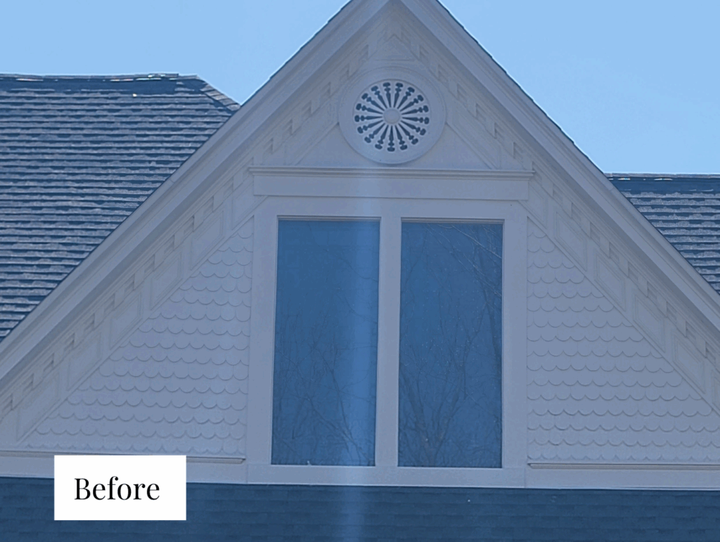
At the top of the house, the gable is packed with eye-catching details, including dentils, layered crown moulding, and a mix of shapes like triangles, rhombuses, and even a decorative circle with a sunburst design.
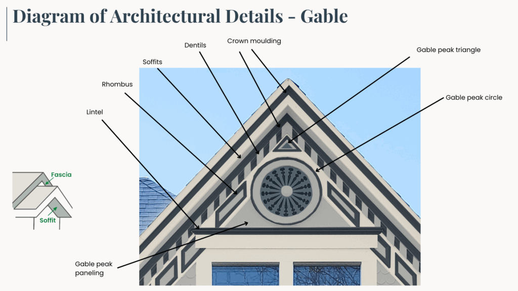
The soffits (the underside of the roof overhang) and fascia (the trim along the edge of the roof) help frame everything out. There’s also paneling and a strong lintel (the horizontal trim over the windows) that add structure and contrast to the gable peak.
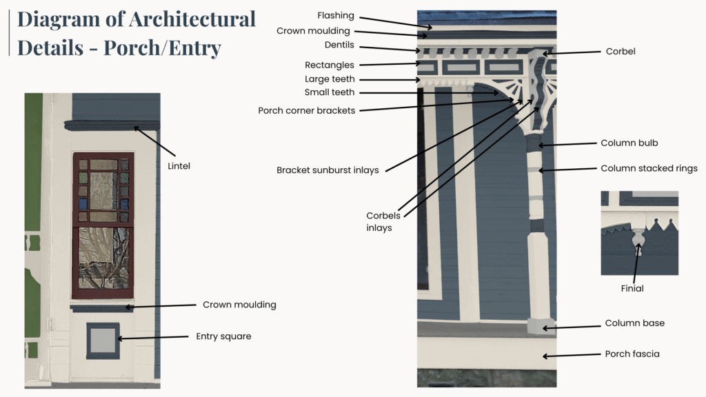
Above the porch columns, you’ll see a mix of trim styles, including more crown moulding, dentils, rectangles and what look like rows of small teeth. The porch corner brackets have a sunburst design that ties in beautifully with the gable above. Corbels, inlays, and even a tiny finial (a little decorative point) also add an extra touch to the design.
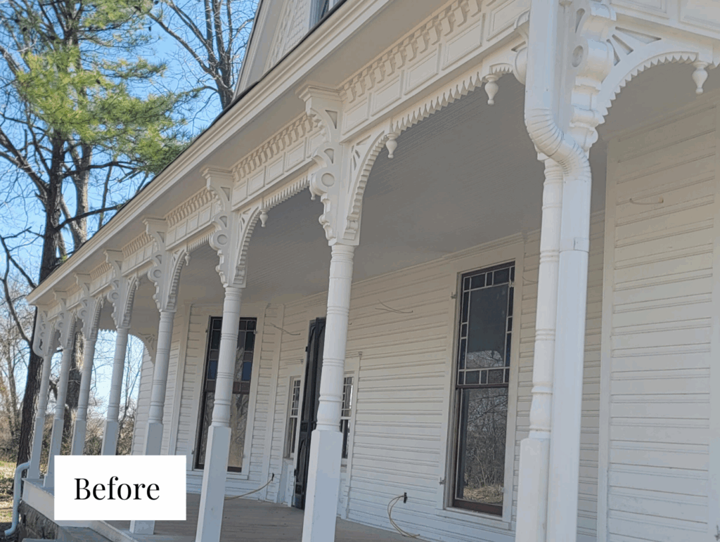
The porch columns themselves are also very detailed, with stacked rings, rounded bulbs, and solid bases. Around the door, you’ll find a stained-glass window, crown moulding, and a square panel that adds symmetry. The window frames/mullions were always red.
Together, all of these pieces make this home a standout example of Victorian farmhouse architecture. These little details may be easy to overlook, but they’re what give this style its timeless magic. And they’re important to consider when choosing paint colors for a Victorian exterior color palette.
How to Choose Victorian Exterior Paint Colors
Painting a Victorian home is an art, and it can be overwhelming! These are the go-to tips we always keep in mind when creating a Victorian exterior color palette that feels balanced and beautiful:
- Aim for 6–10 colors on more detailed homes. That might sound like a lot, but with all the trim, panels, and accents, you’ll need them.
- Assign one color per architectural feature, especially when surfaces change. This helps each element stand out in the right way.
- Want to simplify things a bit? Group similar features under the same color. For example, scallops and diamonds can share a shade. It keeps things cohesive and cuts down your total number of paints.
- Resist the urge to give every tiny detail its own color. Too many bold accents can feel scattered. Use a lighter shade instead to highlight texture without visual chaos.
- Build your palette with light and dark tones from the same color family to keep it from feeling too busy.
- Use your darkest tones toward the bottom of the house to anchor everything visually.
- Don’t forget about the porch floor and stairs! Pick a dedicated color for these areas so they feel like part of the design too.
Sample Victorian Farmhouse Paint Colors
We always recommend that you test paint colors (Article) in your home because lighting can completely change a color, both on interiors and exteriors.
In the old days, this meant we painted a large poster board with sample pots and a huge mess.
Now we have a better way to test paint, with Samplize Peel-and-Stick samples!
- Samples pre-painted with 2 coats of real paint from the manufacturer.
- Large 9” x 14” samples to see the color better in the lighting.
- Delivered overnight
- Colors are accurate
- Less expensive than painting a large poster board with sample pots
- No mess, and no toxic paint to dispose of
I use these in my color consulting practice for exact results. Discover Samplize peel-and-stick paint samples via the link below.
Project Spotlight: Queen Anne Victorian Farmhouse Exterior Color Scheme
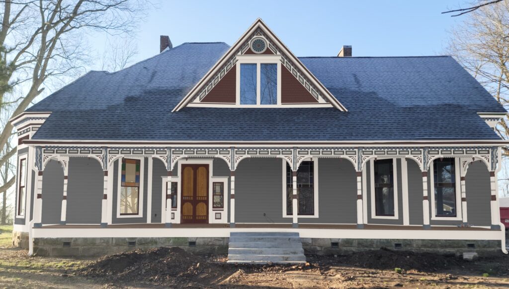
The gorgeous Queen Anne Victorian farmhouse featured in this post was owned by a single family up until 1990. Our client purchased the home at an auction then, but ended up selling it soon after. The new homeowners did not live in the house for long and left the house fall into disrepair over the next 20+ years. Our client was able to purchase the home again in 2024 and has been working to bring it back to life ever since.
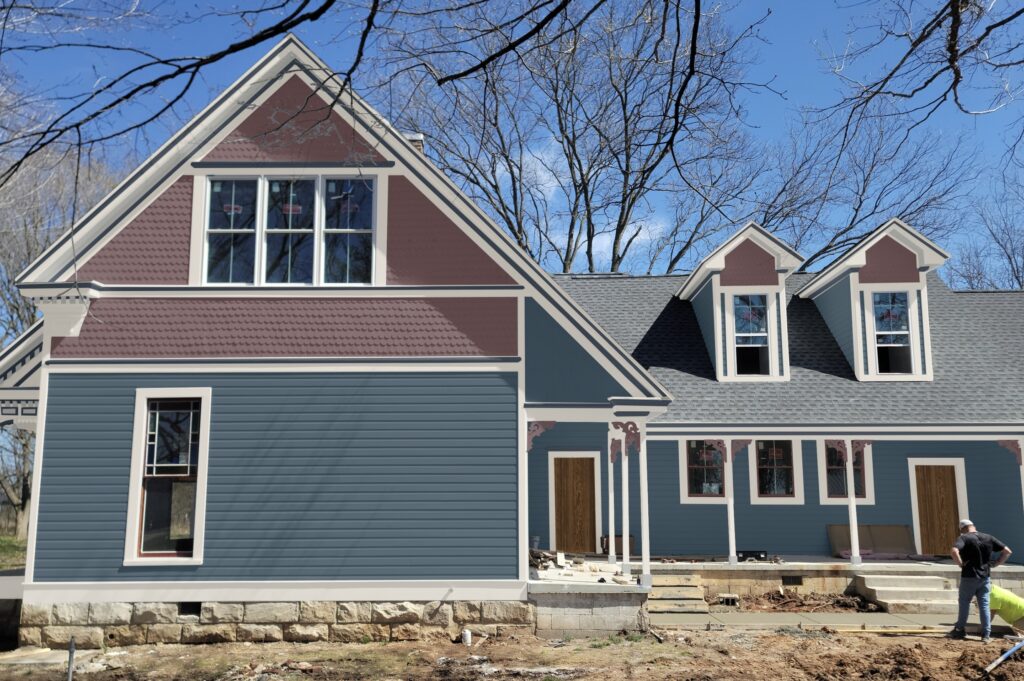
Between termites and water damage, he’s had to replace 40% of the exterior of the home and gut the interior. As he works to restore the home to its former glory, our client wants to upgrade the exterior, bringing it into the modern age while keeping the Victorian farmhouse look.
Designing a Classic Victorian Color Palette
This home has been painted white for its entire history. Our client actually looked at different layers of paint while working on the home and they were all white, so we know the home has always been this way.
While we wanted to maintain the home’s classic look, we also knew a more colorful palette would better highlight the home’s many architectural details. We pulled inspiration from the beautiful stained glass window in the front of the house and the window frames/mullions on the main floor, which are all red.
We knew every palette we designed would include these elements:
White Exterior Trim
Although the whole house was no longer going to be white, we’d still need a great white exterior paint color to use for trim and other elements. Whites look much lighter outside than on the page, so we pick a darker shade that won’t look stark outside. If we picked a white to match the white vinyl windows, it would be too stark.
The correct shade of white depends greatly on the climate. For example, a white that is stark and blinding in Kentucky could be just right in Michigan. We opted for soft, muted dark whites like SW City Loft, SW Oyster White (Article) and SW Pearly White (Article).
Red Stained Glass Windows
We also picked some red paint colors that matched the original red windows. I chose Sherwin-Williams Rookwood Red in the palettes featured below, but Sherwin-Williams Sundried Tomato and Sherwin-Williams Rustic Red could also work well.
Dark Exterior Paint Colors
We wanted these palettes to be very different from the all-white color scheme the home had had for so long, so we built the palettes below with warm, deep blue-greens, gray and earthy paint colors that help highlight all the little details on this home.
Our Queen Anne Victorian Farmhouse Color Schemes
Ready to find the right Victorian farmhouse exterior paint colors for your home? Explore the three palettes designed for our clients’ home and find the one that’s right for your project!
Please note: All of the palettes pictured in this post are Photoshop renderings because at the time of publishing, our client hadn’t yet chosen the final color scheme to use on his home! These are the renderings we provide our clients to help them choose their perfect paint colors.
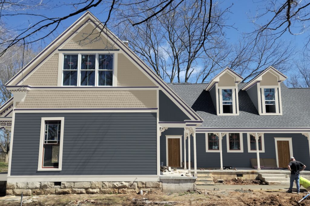
Palette 1: Sherwin-Williams Needlepoint Navy Victorian Farmhouse
This palette features shades of blue and blue-gray for a clean, crisp, eye-catching look. We added a gorgeous dark mauve on the shingles to add more of a “pop” to this accent and tie in with the home’s red windows.
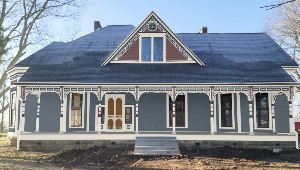
Sherwin-Williams Needlepoint Navy is used on the home’s siding in this palette. This color is a warm, muted navy blue exterior paint color with strong green undertones that really come to life in the bright sunlight. Sherwin-Williams Pearly White is the perfect soft white for this palette and won’t look too stark outdoors. Sherwin-Williams Naval – a deep navy blue – helps the many small architectural details around the porch roofline truly pop.
I especially love the combination of SW Needlepoint Navy and the mauve paint color – Sherwin-Williams River Rouge – on the side of the home, as seen above.
Sample This Color Palette
- SW Pearly White: Fascia, gutters, flashing, trim, frieze board, porch surrounding beam, porch corner brackets, large teeth, columns, porch fascia, storm doors
- SW Naval: Crown moulding, crown moulding behind dentils, lintels, rhombus outlines, rectangle outlines, gable peak triangle outline, gable circle outline, entry square outlines, bracket sunburst inlays, small teeth, column bulbs
- SW Gray Clouds: Soffits, inner rectangles, inner rhombuses, gable triangle inner border, gable circle inner border and center circle, inner entry squares, dentils, column bases, corbel inlays
- SW River Rouge: Scalloped shingles gable peak paneling, gable peak innermost triangle, corbels, finials, column stacked rings, side of house brackets
- SW Needlepoint Navy: Gable peak decorative inner circle, siding
- SW Westchester Gray: Porch floor
- SW Rookwood Red: Paintable windows (to match original red windows)
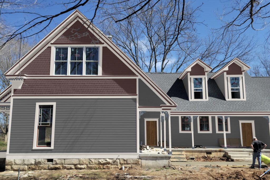
Palette 2: Sherwin-Williams Sea Serpent Victorian Farmhouse
In this palette, we used a deeper navy blue for the siding, painted with Sherwin-Williams Sea Serpent (Article). The warm blue paint color looks beautiful paired with lots of earthy hues that keep the color scheme feeling fresh and inviting.
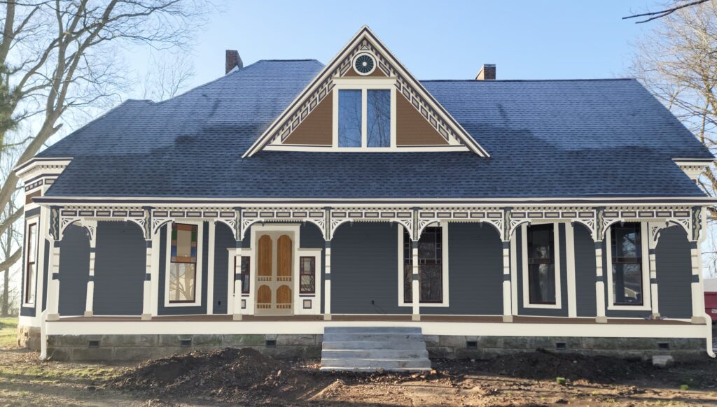
Sherwin-Williams Oyster White is this palette’s exterior white trim. The home’s gable roof, porch floor and some of the small architectural details are painted with varying shades of warm beige and brown.
A deep plum color, Sherwin-Williams Quixotic Plum, adds a pop of color to the home’s crown moulding, gable peak outline and other design elements.
Sample This Color Palette
- SW Oyster White: Fascia, gutters, flashing, trim, frieze board, gable triangle inner border, gable circle inner border and center circle, porch surrounding beam, porch corner brackets, large teeth, columns, porch fascia
- SW Quixotic Plum: Crown moulding, crown moulding behind dentils, rhombus outlines, rectangle outlines, gable peak triangle outline, gable circle outline, entry square outlines, bracket sunburst inlays, small teeth, finials
- SW Universal Khaki: Soffits, lintels on siding, inner rectangles, inner rhombuses, gable peak innermost triangle, inner entry squares, dentils, corbel inlays, column stacked rings, column bases, side of house brackets, scalloped shingles on sides, storm doors
- SW Sea Serpent: Corbels, column bulbs, gable peak decorative inner circle, lintels on shingles, siding
- SW Grounded: Scalloped shingles on gable, gable peak paneling
- SW Dark Brown: Porch floor
- SW Rookwood Red: Paintable windows (to match original red windows)
Palette 3: Sherwin-Williams Peppercorn Victorian Farmhouse
In this palette, we replaced most of the deep blues and warm brown hues with shades of gray. The siding features Sherwin-Williams Peppercorn paint, a deep gray color that can look like a soft black indoors but looks much lighter in the sun.
SW Granite Peak (Article) and SW Dorian Gray offer a softer take on gray for some of the home’s unique design elements. We used Sherwin-Williams City Loft, a warm muted white paint, as the white exterior trim in this palette.
Finally, we added a pop of bold color to the gable shingles with Sherwin-Williams Sommelier, a deep, rich red, for a stunning contrast. This contrast is especially clear in the side view of the home.
Sample This Color Palette
- SW City Loft: Fascia, gutters, flashing, trim, frieze board, porch surrounding beam, porch corner brackets, columns, porch fascia
- SW Sommelier: Crown moulding, crown moulding behind dentils, gable triangle inner border, gable circle center circle, entry square outlines, bracket sunburst inlays, finials, column bulbs, storm doors, scalloped shingles, gable peak paneling
- SW Granite Peak: Gable peak decorative inner circle, dentils, corbels, column bases, side of house brackets
- SW Dorian Gray: Soffits, lintels, inner rectangles, inner rhombuses, gable peak innermost triangle, gable circle inner border, small teeth, large teeth, corbel inlays, inner entry squares, column stacked rings
- SW Peppercorn: Rhombus outlines, rectangle outlines, gable peak triangle outline, gable circle outline, siding
- SW Dark Brown: Porch floor
- SW Rookwood Red: Paintable windows (to match original red windows)
Key Learning Points
Choosing Victorian farmhouse paint colors requires a strong understanding of the many architectural details in the home. By choosing the right Victorian farmhouse exterior paint colors, you can help all of these little details come to life.
- Use darker paint colors toward the bottom of the home to help anchor the palette and keep the home looking balanced.
- Choose enough paint colors to highlight the unique details, but not so many that the color scheme looks busy.
- Don’t be afraid to add a bold pop of color to a Victorian color palette!
Remember: NEVER, EVER use paint matches from a different brand than the one specified. Results are poor and there are no standards for the sheens. Even though your painter may truly believe it can be done, don’t do it. See results from paint matching here.
No matter what, always test your paint colors. It’s a standard best practice. Whenever I test my paint colors, they are perfect, and when I don’t test they turn out wrong. Learn how to test your paint colors here.
Online Color Consulting
Still need help picking the best paint colors? Discover our Online Color Consulting Packages, including our custom Victorian home paint color palette service.

Related Posts
- BM Waterbury Cream Yellow Victorian Exterior Palette
- How to Choose a Victorian Exterior Color Scheme
- Coastal Victorian Exterior Color Palette
- Our Favorite Exterior Paint Colors for Victorian Homes
- A Painted Lady Victorian Exterior Color Scheme
- A Painted Gentleman Victorian Exterior Color Scheme
About the Author

Hi, I’m Michelle Marceny, founder, owner, and Principal Color Designer at The Color Concierge. I believe a fresh coat of paint can completely transform a space. The Color Concierge was born out of my drive to help clients fall back in love with their homes. My clients trust me to help them find the perfect paint color for their home – whether it’s a whole-house paint color scheme or ideas for a single room.
Since The Color Concierge was founded in 2017, we have completed over 3000 color consultations, both online and in-person. I am a Certified Color Expert with 7 years of experience creating interior and exterior color palettes throughout North America.
We love your comments! Please note that the blog is meant as general advice, and it is not possible to give out specific answers to your paint questions. If you want more specific advice, please consider purchasing a color consultation. Thank you for your understanding.
