Explore 6 of our favorite Sherwin-Williams exterior color schemes and learn more about the color consultation process.
Whether you’re building a new home or want to give your existing home new life, choosing the perfect exterior paint colors can offer the ultimate curb appeal. There are endless color combinations for any house. The key is to find the ones that work best for your home, taking your location, neighborhood style, and lighting into account.
Want to make this process easier? Working with a color consultant (like the Color Concierge!) can help you save time, money, anguish, and hassle.
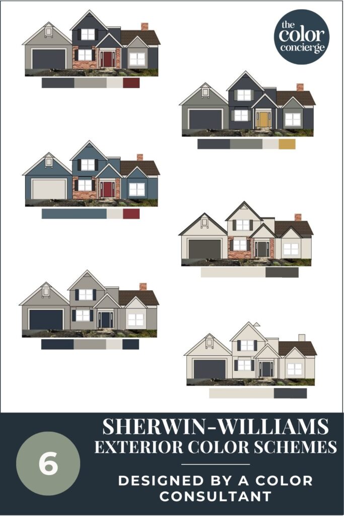
In today’s blog, we’re going to explore the process of working with a consultant through the lens of one of our recent projects. Along the way, we’ll share the six gorgeous Sherwin-Williams exterior color schemes we designed for their home.
By the end, you’ll see there are many ways you can paint one house. Our job is to give you choices that all work together so you can pick the one that makes your heart sing!
*This post contains affiliate links for products I use and love. If you click on some links and make a purchase, I will get a small commission at no cost to you. This helps pay for the costs of the blog, so I can continue to offer great content to our readers.
About The Color Concierge
Our Colorado-based paint color consultants make finding the right paint colors for your home easy. Whether you’re painting the exterior or interior of your home, our simple yet effective process lets us get your paint color right the first time. We’ve helped thousands of homeowners transform their homes into a space they love. Learn more about ONLINE COLOR CONSULTATIONS today.
Working with a Color Consultant to Choose an Exterior Color Palette
The right exterior paint color scheme can do wonders for your home. It can help you create a cohesive, beautiful look. It can also help make sure your home fits in with your neighborhood, without looking exactly the same as the surrounding homes.
When you work with a paint color consultant to choose your home’s exterior color palette, the process becomes even easier.
At the Color Concierge, our All-In Exterior consultation package includes three palettes with up to 5 paint colors in each one. Mood board mock-ups and detailed instructions on color placement for your trim, soffits, doors and more ensure you can easily update your home with new paint colors.
An optional add-on Photoshop rendering is a beautiful way to visualize the changes. Our Photoshop expert is an accomplished artist that brings your new palette to life on the screen.
Elements to Consider When Building an Exterior Color Palette
Whether you’re working with a color consultant or DIYing a Sherwin-Williams exterior color scheme (or any color scheme for that matter), it’s not as simple as choosing the paint colors you like. Here are some of the things we consider when building exterior palettes for our clients.
Your Geographic Location
Your home’s location can have a big impact on the exterior colors that look best. If you live in a high-altitude area (like Colorado) or in a very bright, sunny place (like Florida), very light paint colors may look too washed out, but dark colors may heat up your house and increase your air conditioning bills. If you’re surrounded by lots of foliage, some white exterior paint colors may reflect the trees and leave your home looking green. Whites with warm tones can counter the “green” effect.
Your Neighbors’ Paint Colors
When we create an exterior color scheme, we always ask for photos of your next-door neighbors. We want to make sure that your exterior paint won’t look completely out of place in your neighborhood, but also don’t want to repeat color schemes.
It’s also important to make sure your paint won’t reflect the colors of your neighbors’ homes and end up looking wrong. Think of your home as being part of a larger palette. It makes a difference to curb appeal.
HOA Rules & Guidelines
If you live in a neighborhood with an HOA, then it’s very important to ensure your exterior color palette aligns with their guidelines. In most HOA neighborhoods, you’ll have to submit any proposed changes for approval before taking action. With a color consultant, we make this easy with full-color mock-ups, color codes, and color placement details for all surfaces of your home.
White Exterior Paint Colors
Nearly every home will have some kind of exterior white paint color (Article), whether as a body color or a trim color. And choosing the perfect white is not as easy as it seems. Whites look MUCH lighter outside than on the page, so we make sure to pick a darker shade that won’t look too stark outdoors.
A darker white looks great with natural brick and stone and won’t look harsh next to darker body colors. The correct shade of white can also depend on where you live. A white that is stark and blinding in Florida could be just right in Michigan.
Exterior Stone & Brick
If your home has exterior brick or stone, these have to be considered when choosing exterior paint colors. If you want to keep your natural brick, then it’s important to find paint colors that go with brick (Article). If you want to paint your brick, it’s important to test that out and see what it really looks like before taking the leap.
In today’s featured project, the client wasn’t sure what she wanted to do about her brick, so we gave her options to envision it both painted and unpainted.
Color Placement
We often tell our clients that color placement is almost as important as the paint colors themselves. Every paint color consultation we work on includes detailed notes about how to use the paint colors in the palette. You’ll walk away knowing exactly which colors to paint your trim, soffits, fascia, downspouts, doors, porch roof, garage doors, and any unique design elements of your home.
Paint Color Tests
Don’t forget to test your paint colors! (Article) Even when you’re working with a color consultant, you can never settle on a color scheme without seeing it in person, in your exterior lighting. We send large color card samples by FedEx after the consultation so they can easily test their selected color scheme before painting their whole house.
Even with a Photoshop rendering of each color scheme, you still need to test your paint colors to see the effect of sunshine and natural light on your house.
Sample Colors
We always recommend that you test paint colors (article) in your home because lighting can completely change a color, both on interiors and exteriors.
In the old days, this meant we painted a large poster board with sample pots and a huge mess.
Now we have a better way to test paint, with Samplize Peel-and-Stick samples!
- Samples pre-painted with 2 coats of real paint from the manufacturer.
- Large 9” x 14” samples to see the color better in the lighting.
- Delivered overnight
- Colors are accurate
- Less expensive than painting a large poster board with sample pots
- No mess, and no toxic paint to dispose of
I use these in my color consulting practice for exact results. Discover Samplize peel-and-stick paint samples via the link below.
Project Spotlight: 6 Sherwin-Williams Exterior Color Schemes on One House
Ready to build your own exterior paint palette? We’re sharing six gorgeous Sherwin-Williams color schemes we created for our recent client project. This client’s home was located in the Northeast US and needed an update that would give it a more modern look and more personality.
While our packages include 3 color schemes, in this case, the client wasn’t sure if she wanted to paint her brick so we showed additional variations of the looks.
The Final Color Scheme
We set out to create some timeless Sherwin-Williams exterior color schemes that would make this home shine.
The homeowners chose a palette that left their gorgeous red brick unpainted and included a beautiful, deep blue Sherwin-Williams Cyberspace (review) body color as shown below.
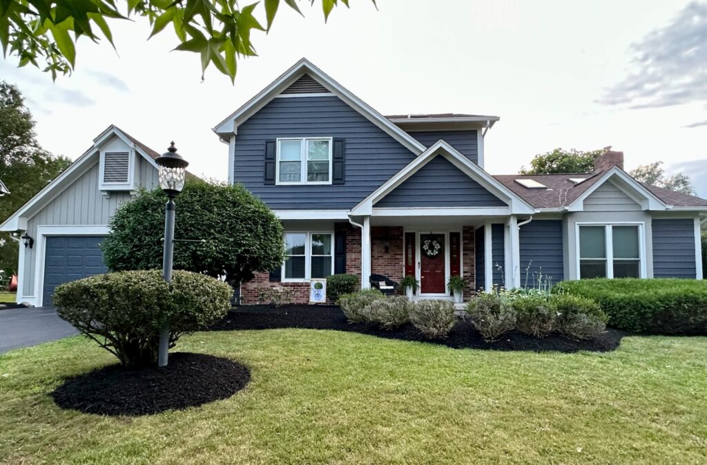
Our client was thrilled with the results. She said: “I am so excited to share the finished project with you! We LOVE it!! A million thanks!”.
Explore their winning color palette and all the Sherwin-Williams exterior color schemes (Article) we designed for them below.
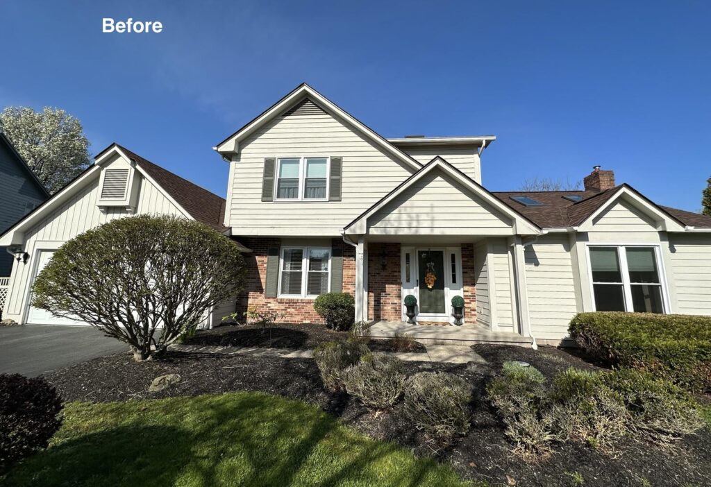
The Original House – Before
The home featured a red brick accent and really gorgeous board-and-batten trim on the body of the garage. But its original light body color skewed yellow and looked muddy, and wasn’t doing anything to highlight these unique architectural features.
Sherwin-Williams Cyberspace Exterior Color Scheme – Version 1a (unpainted brick)
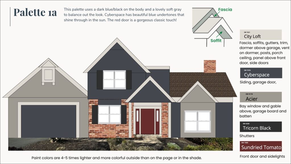
This first palette we created for this home is the one the homeowners actually chose! This palette uses dark blue-black on the body (Sherwin-Williams Cyberspace) (sample) and a lovely soft elephant gray to balance the look (Sherwin-Williams Acier-sample).
SW Cyberspace has beautiful blue undertones that really shine through in the sun and add a pop of color to this darker palette. The cool blue undertones of this paint color nicely balance the warm, red brick on this home for a modern, yet timeless look.

We went with Sherwin-Williams Sundried Tomato (sample) for our front door paint color (article). A red door with this color scheme is a really gorgeous, classic touch!
By painting the bay window and garage with a soft gray, we help these design features stand out and keep the palette from looking too dark overall. Sherwin-Williams City Loft (sample) is used as the trim color throughout the palette for a soft, light look that isn’t stark.
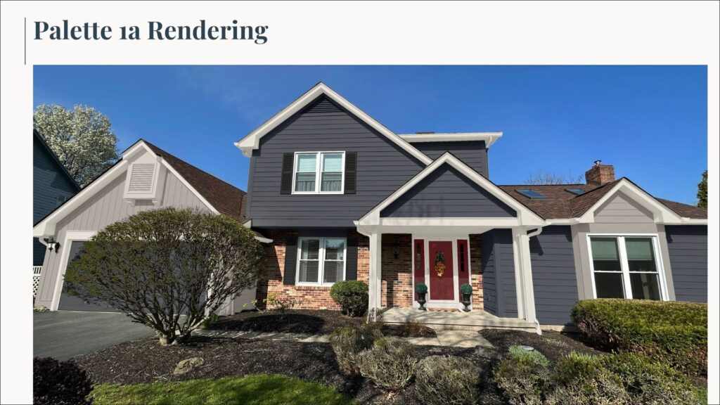
Sherwin-Williams Exterior Color Scheme Placement
- SW Cyberspace: Siding, garage doors. Sample here.
- SW City Loft: Fascia, soffits, gutters, trim, dormer above garage, vent on dormer, posts, porch ceiling, panel above front door, side doors. Sample here.
- SW Acier: Bay window and gable above, garage board and batten. Sample here.
- SW Tricorn Black: Shutters. Sample here.
- SW Sundried Tomato: Front door and sidelights. Sample here.
Sherwin-Williams Cyberspace Exterior Color Scheme – Version 1b (painted brick)
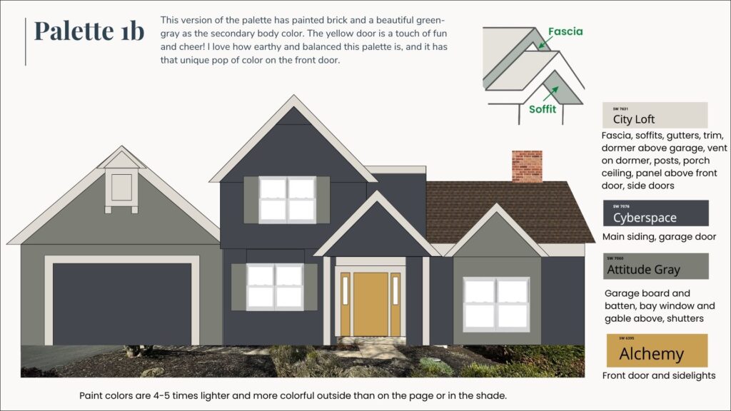
This version of a Sherwin-Williams Cyberspace exterior color scheme includes painted brick and Sherwin-Williams Attitude Gray (sample), a beautiful green-gray, as the secondary body color. While this palette is darker overall, it gets a burst of color and cheer from the yellow front door, painted with Sherwin-Williams Alchemy (sample).
I love how earthy and balanced this palette is! Painting the brick with Cyberspace really modernizes this palette. Using Attitude Gray for the garage and bay window accents simplifies the palette and lets the yellow door really pop.
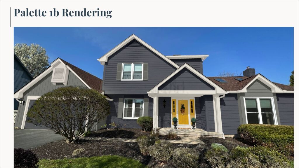
Sherwin-Williams Exterior Color Scheme Placement
- SW Cyberspace: Main siding, garage door. Sample here.
- SW City Loft: Fascia, soffits, gutters, trim, dormer above garage, vent on dormer, posts, porch ceiling, panel above front door, side doors. Sample here.
- SW Attitude Gray: Garage board and batten, bay window and gable above, shutters. Sample here.
- SW Alchemy: Front door and sidelights. Sample here.
Sherwin-Williams Waterloo Exterior Color Scheme
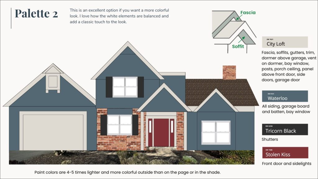
This exterior color palette is an excellent option if you want a more colorful look. I love how the white elements are balanced and add a classic touch to the look.
The foundation for this palette is Sherwin-Williams Waterloo (sample), a mid-toned blue with green undertones that pairs really well with the warm red brick on this home. Because this is a much brighter blue than SW Cyberspace (especially when used outdoors), we kept the palette simple and used the same color on the garage board and batten siding.
Sherwin-Williams Tricorn Black (sample) shutters and a deep red front door painted with Sherwin-Williams Stolen Kiss (sample) complete this classic Americana look and tie together the red brick and blue body.
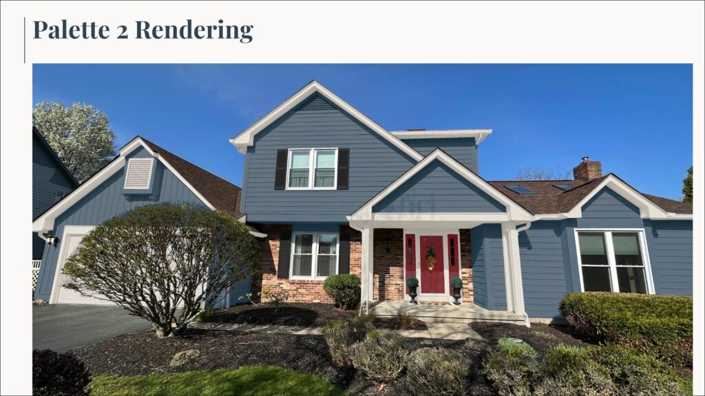
Sherwin-Williams Exterior Color Palette Placement
- SW Waterloo: All siding, garage board and batten, bay window. Sample here.
- SW City Loft: Fascia, soffits, gutters, trim, dormer above garage, vent on dormer, bay window, posts, porch ceiling, panel above front door, side doors, garage door. Sample here.
- SW Tricorn Black: Shutters. Sample here.
- SW Stolen Kiss: Front door and sidelights. Sample here.
Sherwin-Williams Acier Exterior Color Scheme
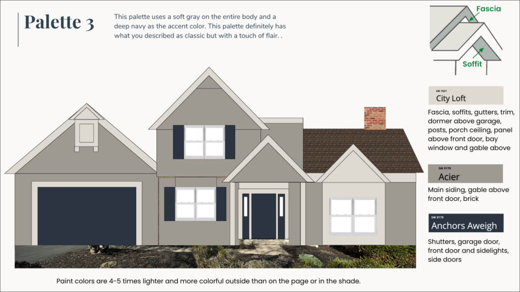
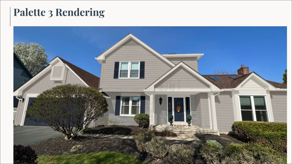
This Sherwin-Williams exterior color scheme features a lighter body color with darker accents. It’s a classic look and a really simple palette that still feels unique and modern.
In this palette, Sherwin-Williams Acier (sample) is used on the entire body – including the brick and garage. The soft gray paint color keeps the house looking light without being too washed out or stark.
The navy blue accents – painted with Sherwin-Williams Anchors Aweigh (sample) – help this palette really pop. SW City Loft trim and accents provide just enough contrast with SW Acier without looking too bright white.
Sherwin-Williams Exterior Color Scheme Placement
- SW Acier: Main siding, gable above front door, brick. Sample here.
- SW City Loft: Fascia, soffits, gutters, trim, dormer above garage, posts, porch ceiling, bay window and gable above, panel above front door. Sample here.
- SW Anchors Aweigh: Shutters, garage door, front door and sidelights, side doors. Sample here.
Sherwin-Williams Oyster White Exterior Color Scheme – Version 1
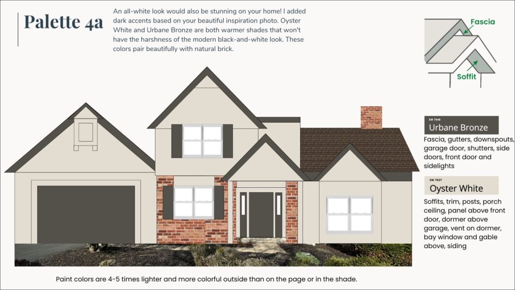
For this client’s home, we wanted to try a couple of white color palettes for a modern farmhouse look. This first version features Sherwin-Williams Oyster White (sample) (Color Review) as the body color for the house and garage and leaves the red brick unpainted.
SW Oyster White is a very light greige with green undertones that looks like a soft white outside. It’s one of our favorite white paint colors to pair with red brick or warm stone colors.
We used Sherwin-Williams Urbane Bronze (Sample) (their 2021 Color of the Year(Article)) as a dark, but warm accent on the fascia, gutters, downspouts, shutters, and doors. The dark trim along the roof line looks really beautiful with the white body paint.
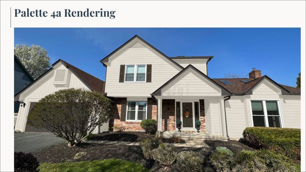
Sherwin-Williams Exterior Color Scheme Placement
- SW Oyster White: Soffits, trim, posts, porch ceiling, the panel above the front door, dormer above garage, vent on the dormer, bay window and gable above, siding. Sample here.
- SW Urbane Bronze: Fascia, gutters, downspouts, garage door, shutters, side doors, front door, and sidelights. Sample here.
Sherwin-Williams Oyster White Exterior Color Scheme – Version 2
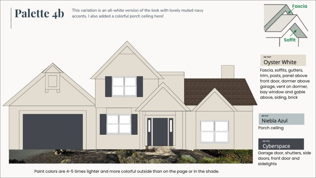
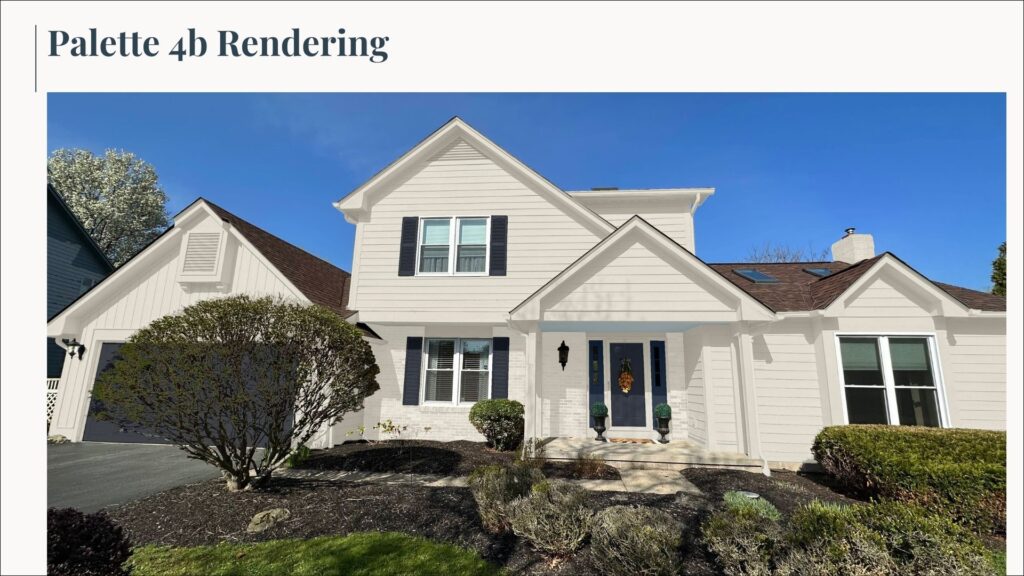
This all-white color scheme is a softer twist on a classic black-and-white palette, using SW Oyster White (a light greige) and SW Cyberspace (a very deep blue-black). We painted the brick in this version of the palette and also kept the fascia white for a monochromatic look that feels really modern.
SW Cyberspace is used as an accent on the garage door, front door, and shutters and really pops against the white background. A colorful, soft blue porch ceiling, painted in Sherwin-Williams Niebla Azul (sample), adds another fun pop of color to this otherwise simple palette.
Sherwin-Williams Exterior Color Scheme Placement
- SW Oyster White: Fascia, soffits, gutters, trim, posts, the panel above the front door, dormer above garage, vent on the dormer, bay window and gable above, siding, brick. Sample here.
- SW Cyberspace: Garage door, shutters, side doors, front door, and sidelights. Sample here.
- SW Niebla Azul: Porch ceiling. Sample here.
Key Learning Points
Choosing an exterior color palette is no easy task! The exterior paint colors of your home have a big impact on its curb appeal and are the first impression visitors have of your home. If you’re ready to start building your own paint color palette, don’t forget these important guidelines:
- Don’t pick a white paint that is too light. Bright whites look much lighter outdoors in the sunlight and can end up looking too stark. Opt for a warmer, softer white or even a light greige – it will look white outside.
- Pay attention to the other colors in your neighborhood. You want your home to look unique without looking like it doesn’t belong. Make sure to not repeat your neighbor’s palettes and stay within any HOA rules you may need to follow.
- Don’t be afraid to try a pop of color. Using a darker accent for front doors, garage doors, shutters, and even some trim can be a really lovely look. If you’re using a more simple color palette, add a fun burst of color with a bright front door.
We always recommend that you test paint colors on your home because lighting can change a color completely, both with interiors as well as exteriors.
In the old days, this meant we painted a large poster board with sample pots and a huge mess.
Now we have a better way to test paint, with Samplize Peel-and-Stick samples!
- Samples pre-painted with 2 coats of real paint from the manufacturer.
- Large 9” x 14” samples to see the color better in the lighting.
- Delivered overnight
- Colors are accurate
- Less expensive than painting a large poster board with sample pots
- No mess, and no toxic paint to dispose of
I use these in my own color consulting practice for exact results. Discover Samplize peel-and-stick paint samples:
Buy 8 samples and get 2 free – no coupon code required. Order today and get samples tomorrow!
Remember: NEVER, EVER use paint matches from a different brand than the one specified. Results are poor and there are no standards for the sheens. Even though your painter may truly believe it can be done, don’t do it. See results from paint matching here.
Get an Expert-Made Exterior Paint Color Scheme
Don’t want to create a color palette by yourself? Contact The Color Concierge for more about our in-person and online paint color consultations.
Our All-In Exterior consults include three tailor-made color palettes, support with testing paint colors, one round of design edits, and detailed color placement instructions you can give your painter.
Click here to explore our exterior paint color consultation package.

Related Posts
- 6 Exterior Paint Color Combos to Try (Article)
- Top Exterior House Palettes for 2021 (Article)
- Best Exterior White Paint Schemes (Article)
- Best Exterior Blue Color Palettes (Article)
- Best Exterior White Trim Colors (Article)
- Best Exterior Paint Colors for Victorian Homes (Article)
About the Author

Hi, I’m Michelle Marceny, founder, owner, and Principal Color Designer at The Color Concierge. I believe a fresh coat of paint can completely transform a space. The Color Concierge was born out of my drive to help clients fall back in love with their homes. My clients trust me to help them find the perfect paint color for their home – whether it’s a whole-house paint color scheme or ideas for a single room.
Since The Color Concierge was founded in 2017, we have completed over 3000 color consultations, both online and in-person. I am a Certified Color Expert with 7 years of experience creating interior and exterior color palettes throughout North America.
We love your comments! Please note that the blog is meant as general advice, and it is not possible to give out specific answers to your paint questions. If you want more specific advice, our Online Color Consultations will help you pick your paint colours. Thank you for your understanding.


2 Responses
I wanted to match a 2012 exterior color scheme # 1010 stucco E-3354 New Taupe. This color is on the Lennar home we bought new in 2012 and I needed some touch up paint.
Hi, I would like a exterior paint consultation for my house.