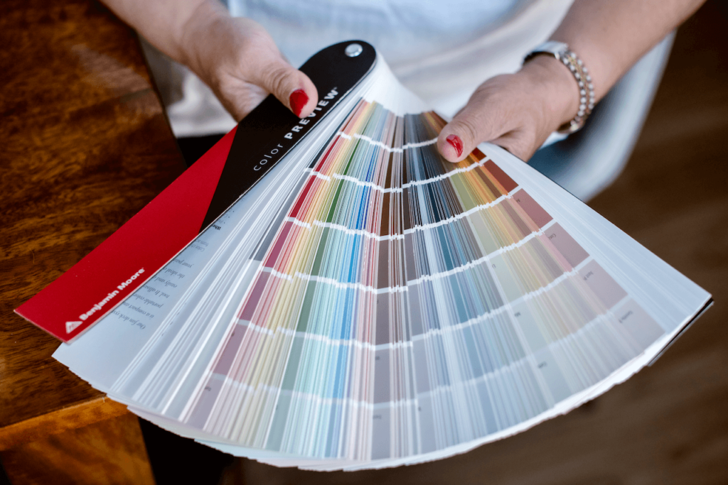
By Michelle Marceny, Certified Color Expert and founder of The Color Concierge
Webster Green HC-130 painted and photographed in Michelle’s own home
Benjamin Moore Webster Green (HC-130) is Benjamin Moore’s 2027 Color of the Year, announced
October 14, 2026. Webster Green is a fairly neutral mid-tone green with hints of blue
(LRV 20.2). Webster Green suits interior walls, cabinets, and color drenching. I painted a guest room Webster Green on announcement day.
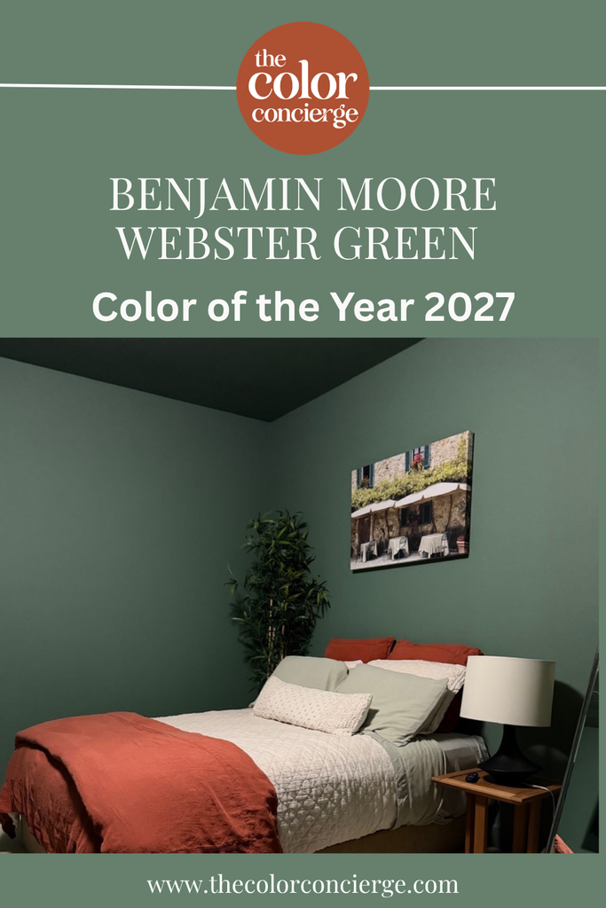
Benjamin Moore announced its 2027 Color of the Year, Webster Green, and within a couple of hours I color-drenched my guest room in this rich green hue. Now, I’m sharing our annual Color of the Year review with the added bonus of having this color in my own home, so you can see what it looks like in action. I was so excited about this color that I immediately called my painter with New Morning, Inc.
*This post contains affiliate links for products I use and love. If you click on some links and make a purchase, I will get a small commission at no cost to you. This helps pay for the costs of the blog, so I can continue to offer great content to our readers.
About The Color Concierge
Our Colorado-based paint color consultants make finding the right paint colors for your home easy. Whether you’re painting the exterior or interior of your home, our simple yet effective process lets us get your paint color right the first time. We’ve helped thousands of homeowners transform their homes into a space they love. Learn more about ONLINE COLOR CONSULTATIONS today.
What Color is Benjamin Moore Webster Green?
| Color | Benjamin Moore Webster Green, the 2027 Color of the Year |
|---|---|
| Color number | HC-130 |
| Collection | Benjamin Moore Historical Colors |
| LRV | 20.2 (Light Reflectance Value, on a scale of 0 to 100) |
| Undertones | Fairly neutral, leans slightly blue |
| Color family | Mid-tone green |
| Best for | Interiors, color drenching, cabinets, and whole-house color with white trim and ceilings |
| Exteriors | Use with caution: reads brighter in direct sun. For a green exterior, go darker and more muted with Sherwin-Williams Rosemary (SW 6187) or Sherwin-Williams Retreat (SW 6207). |
| Best trim & ceiling | Benjamin Moore White Down OC-131, Benjamin Moore White Dove OC-17 or Benjamin Moore Swiss Coffee OC-45 |
| Avoid pairing with | Very bright, cold whites like BM Chantilly Lace or BM Simply White, which will look too stark |
| Similar Benjamin Moore colors | Benjamin Moore Cambridge Green 468 (LRV 20.99, more muted) and Benjamin Moore Pinelands 446 (LRV 21.25, leans more yellow) |
| Closest Sherwin-Williams match | Sherwin-Williams Jadite (SW 6459) |
Webster Green is the first green Benjamin Moore Color of the Year since October Mist in 2022, and it’s a very different hue. Webster Green is pretty neutral but leans a bit more toward cool (blue) undertones than warm (yellow). The result is a color with enough energy to give a room personality while still reading calm and refined. It is cozy and still sophisticated!
The green color family’s ability to adapt and transform makes it incredibly timeless. Sitting at the center point is Webster Green HC-130, a mid-tone that serves as a reminder of the past but feels right and relevant today. — Andrea Magno, Vice President of Brand, Color, and Integrated Marketing, Benjamin Moore
The full Color of the Year palette released alongside Webster Green is also beautiful. I can see myself recommending all of these colors to clients.
My First Reaction As a Paint Color Consultant
I am obsessed with Webster Green! Benjamin Moore knocked it out of the park with this one. Although green is a trend right now, I have always considered it timeless, and I am confident we’ll be recommending this color for years and years!
My first thought when I saw the Color of the Year announcement was about how perfect it would be for color-drenching. So naturally, I had to try it out right away.

I’ve always used my own home as a testing ground for paint colors, but I have to say this was the fastest I’ve ever gone from hearing a COTY announcement to having it in my home.
Within two hours of the announcement, my regular painter’s son was in my guest room painting all the walls, ceiling and trim with this gorgeous Webster Green paint.
Using the Benjamin Moore Color of the Year Webster Green
At the time of writing this, I’ve had Webster Green in my home for about 1 day and I love it more every day.
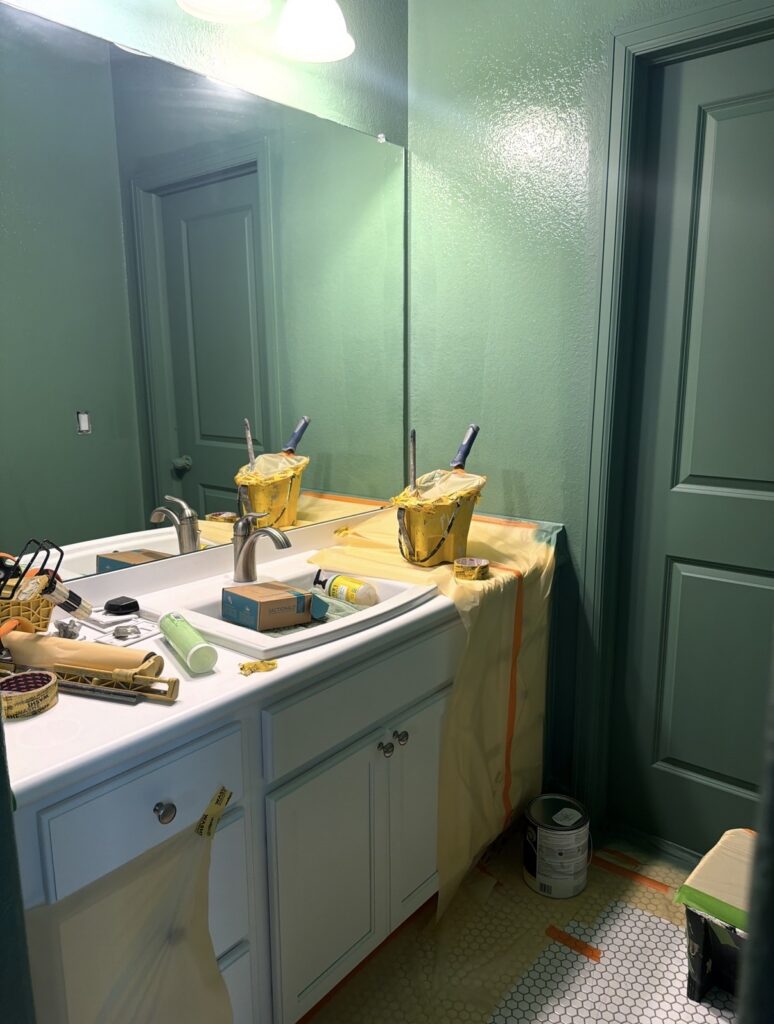
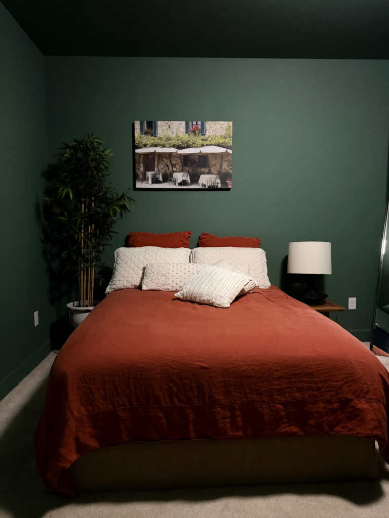
I painted all of the walls, ceilings and trim in my guest room with Webster Green in a flat sheen. There are many ways to do color drenching and people will often choose to use the same color but different sheens on the walls, trim and ceiling. But because my walls have a rough texture and my doors and trim are smooth, it makes the all-over flat paint actually look like different sheens.
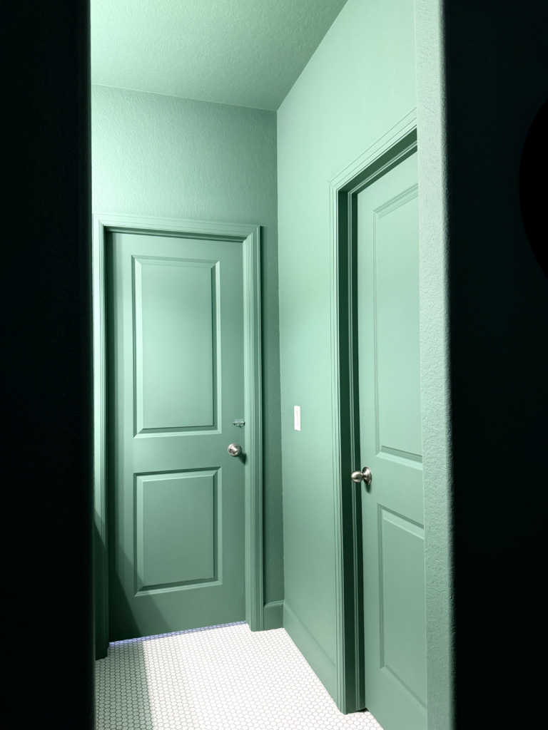
You can really see this in action in the attached bathroom, pictured below, which we also painted with Webster Green. This room has no windows and no natural light. This picture was taken with the lights over the sink turned on. It is really what it looked like with those very bright lights.
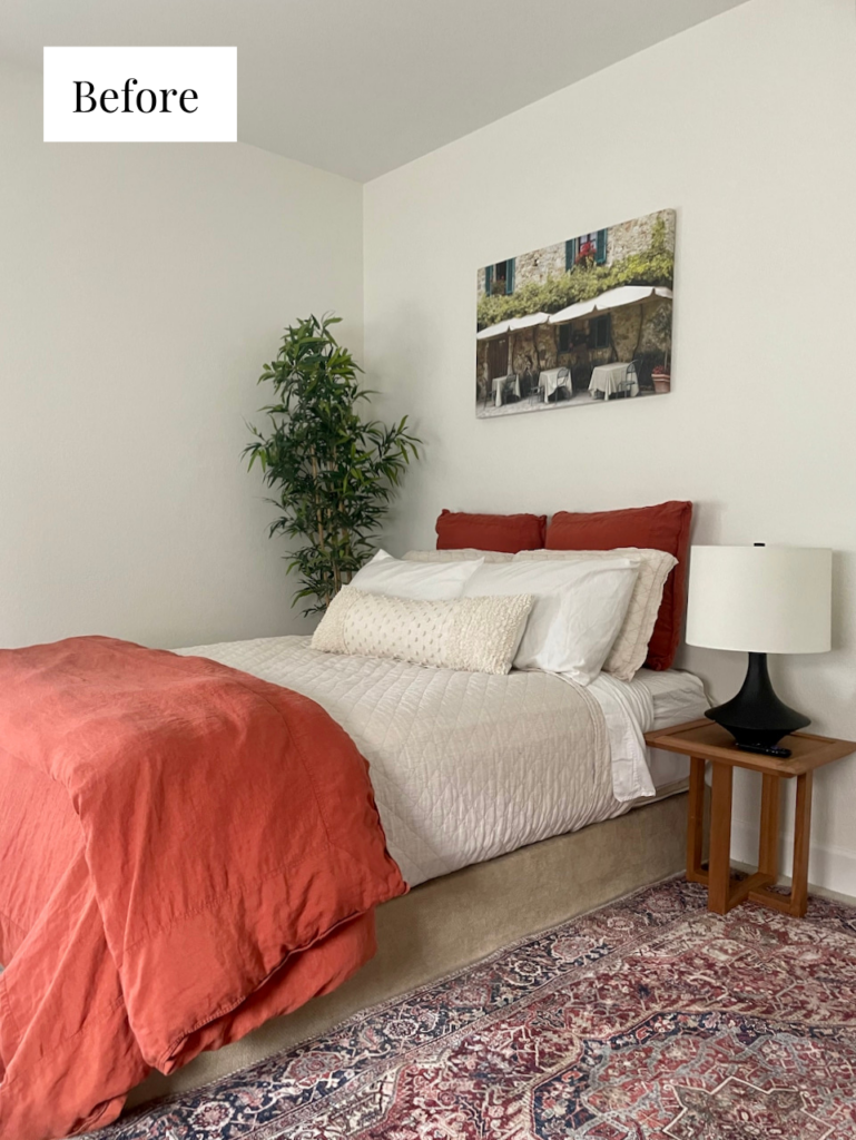
In the guest room, we kept all of the linens, rugs and other decor items the same and only changed the wall color. Previously, this room was painted with Sherwin-Williams Alabaster. That version of the guest room was neutral, classic and really beautiful, but the new Webster Green walls are stunning.
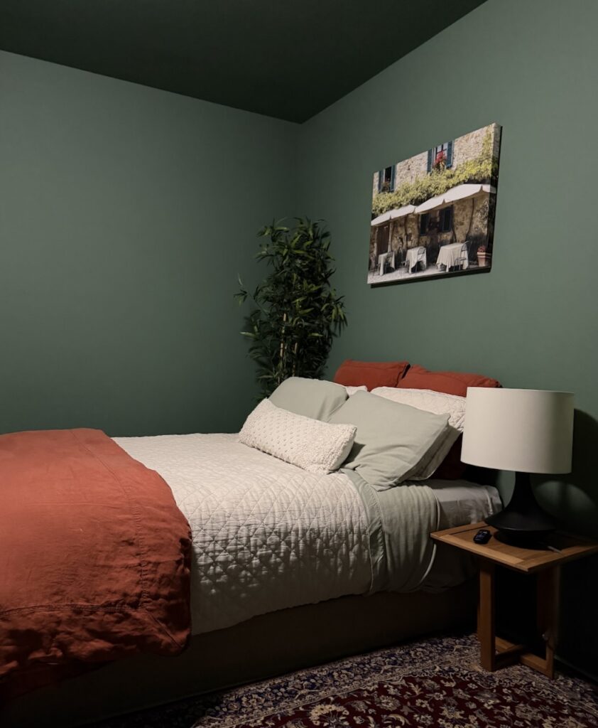
I absolutely love the way the green walls contrast with the orange bedding, tan carpet and burgundy area rug. These accents remind me of a lot of the colors in the full Color of the Year palette, which we’ll share below. These photos were taken with overhead light. I took the photos myself with my iPhone, and they are real-life, not AI photos.
Note that the ceiling really does look darker even though its the same color as the walls. This is because ceilings always look darker because of the way the light hits them.
How Does Webster Green Look in Different Light?
One of my favorite observations about Webster Green is how it looks in different kinds of lighting. By color drenching my guest room I was able to see it painted on a variety of surfaces and see how it shifted throughout the changing light of day.
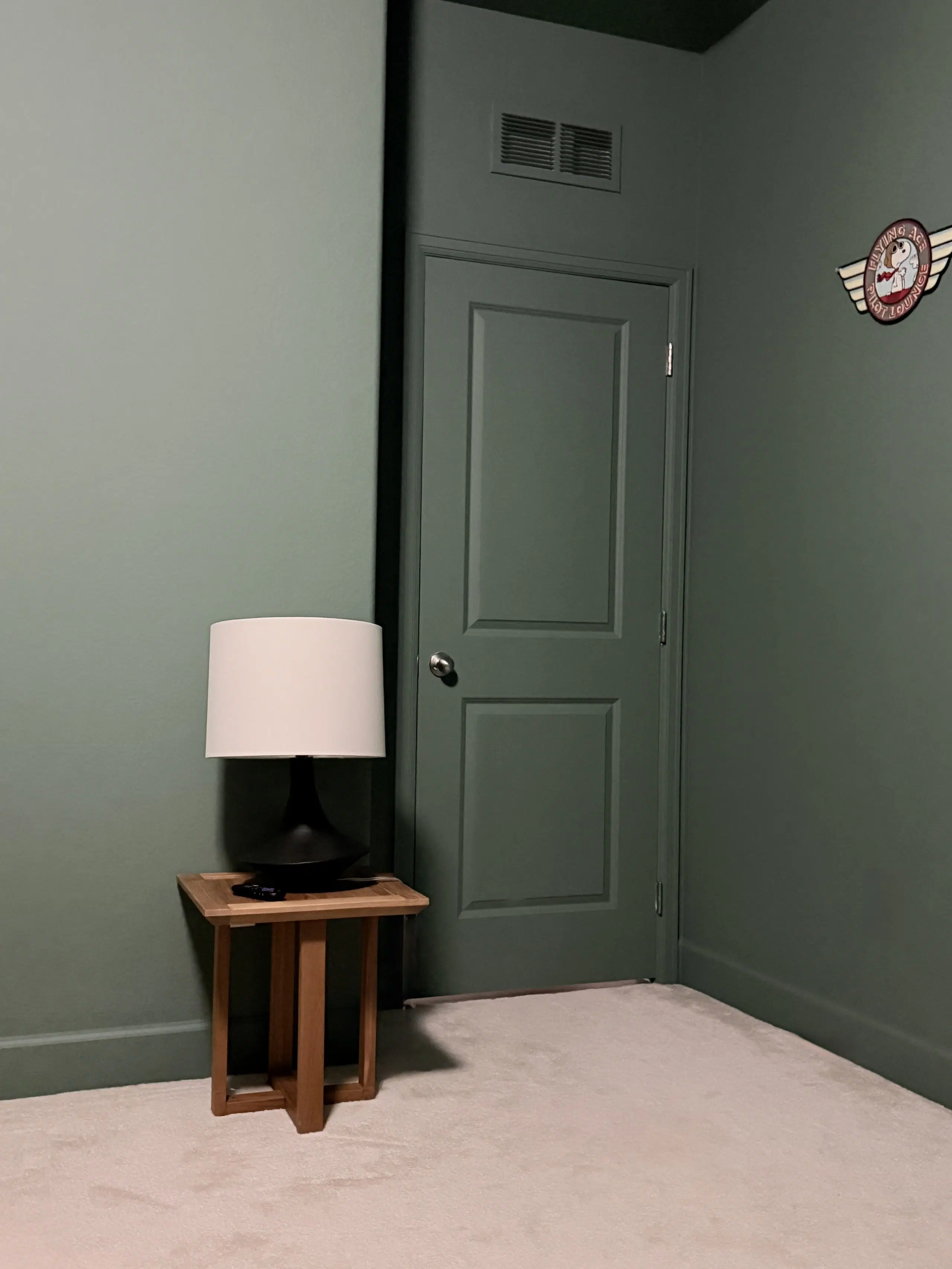
In the shadows, it looks like a gorgeous darker green. In areas with brighter sunlight, it looks much more colorful but still classic.
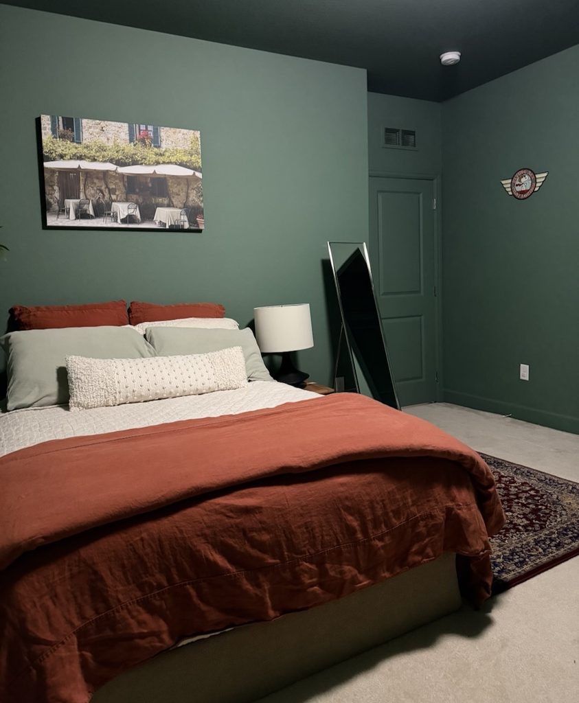
In most interior applications, the color will look darker. But in my guest room, a North-facing window is on the right, and you can see the natural light shining on the wall in the photo below. It’s a lighter, brighter color, similar to what we would see if the photo were taken outside for an exterior project.
The image below shows Webster Green in shadow and in sunlight in the same shot – a great example of how this color can shift depending on the light.

Where Else Can You Use Webster Green Paint?
I see Webster Green as more of an interior than exterior color. This paint would be beautiful for cabinets, walls, and even a whole house color with white ceilings and trim.
Small, Cozy Spaces
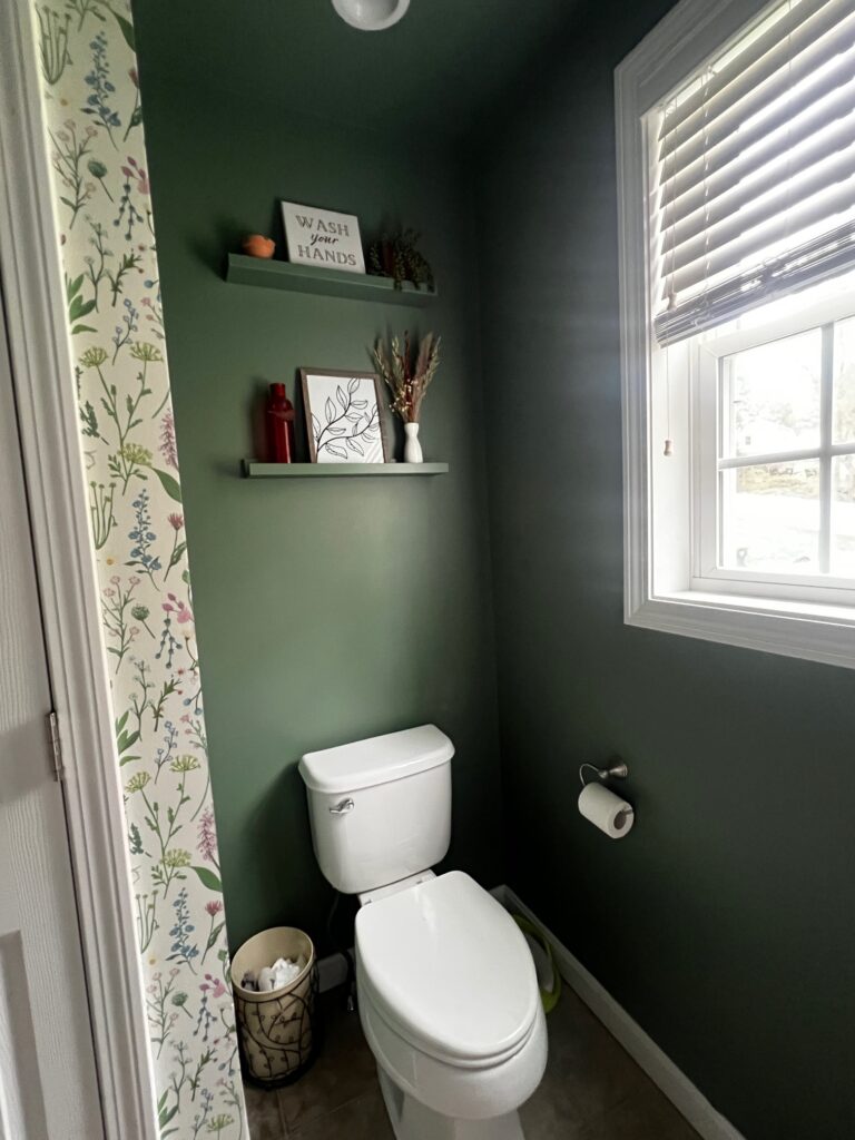
I love to use dark paint colors in small spaces like powder rooms, offices and even home libraries. Webster Green would look beautiful in this kind of project, especially with color drenching.
My SEO consultant Danielle painted her powder room with a very similar green color, Benjamin Moore Pinelands (LRV: 21.25; a bit warmer than Webster Green). She painted the walls and ceiling and added some coordinating wallpaper. Webster Green could absolutely be used in a similar way!
Kitchen Cabinets
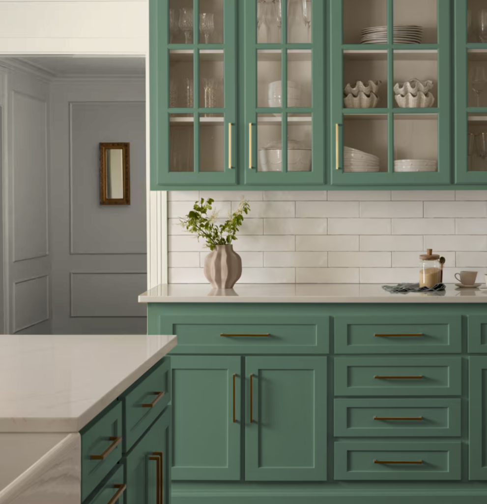
I love the idea of Webster Green cabinets! This would look beautiful for a bathroom vanity or in a kitchen. It could also work for tuxedo kitchen cabinets with warm white uppers. You can see in the photo from Benjamin Moore below just how inviting a Webster Green kitchen looks.
Whole-House Color With White Trim and Ceilings
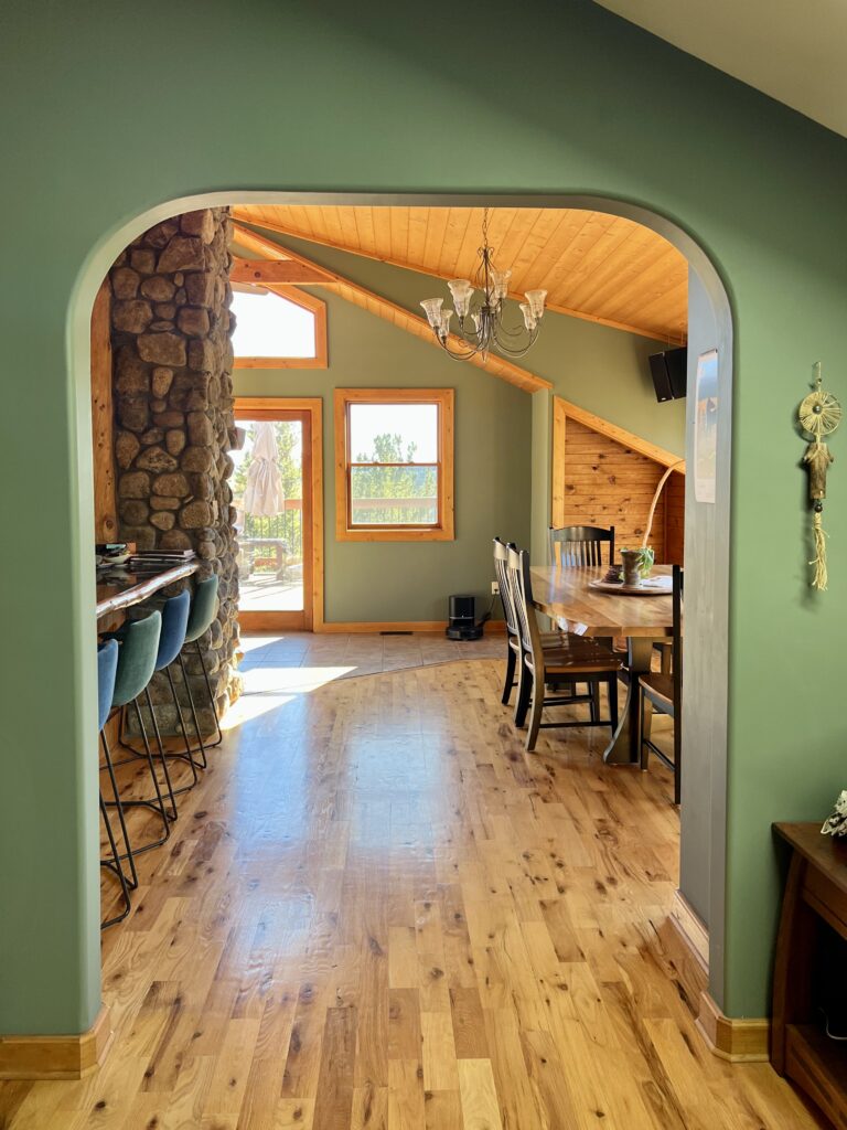
It may not be most people’s first instinct to use a mid-tone green as a whole-house paint color, but I think it can actually be really beautiful! My fellow paint color consultant at The Color Concierge, Maddie, painted her home with a similar color – Benjamin Moore Cambridge Green (LRV: 20.99; slightly warmer and more muted).
Her home has lots of natural wood that helps balance the dark green walls, but you could achieve a similar effect with warm white trim in BM White Dove or BM Swiss Coffee.
Is Benjamin Moore Webster Green a Good Exterior Color?
I typically wouldn’t recommend Benjamin Moore Webster Green as an exterior color, even though it’s gorgeous inside. In full sun, Webster Green could look a little too bright. If you love this color and want this look for your siding, I’d actually recommend a slightly darker and more muted green color, like Sherwin-Williams Rosemary (SW 6187) or Sherwin-Williams Retreat (SW 6207).
In the sunshine, Sherwin-Williams Rosemary and SW Retreat look so similar to the BM Webster Green swatch.
Our two clients’ homes below, for example, feature Sherwin-Williams Rosemary siding. In the Colorado high-altitude sunshine, it looks much brighter than you’d expect and quite similar to the Webster Green swatch.
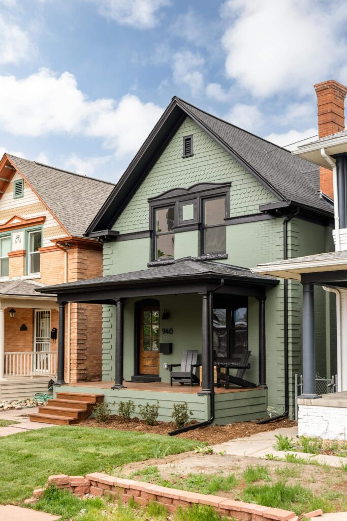
Sherwin-Williams Retreat (SW 6207) has the same depth as Webster Green HC-130, but it’s more muted. On our client’s home below, you can see it’s muted enough to still show some gray tones even in the sunshine.

Is Webster Green Good for a Front Door?
I think you could absolutely use a BM Webster Green front door! Green is one of our favorite front door paint colors – especially if your home has red brick or warm stone. Front doors also typically get a less sun than siding, so you don’t have to worry about it looking too light.
The photo from Benjamin Moore below shows what a Webster Green front door might look like with brick (most likely in the shade). When I tested it in the sunshine, it looked much lighter.
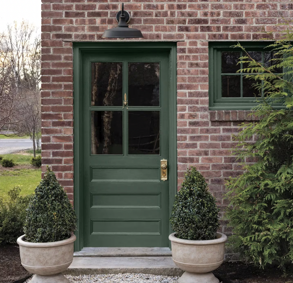
We used Sherwin-Williams Pewter Green for the front door and window trim on a client’s red brick home. Webster Green would create a very similar look.

Exploring the Benjamin Moore Color of the Year Palette
In addition to announcing Webster Green as the Color of the Year, Benjamin Moore also released a curated, coordinating color palette. The palette is truly gorgeous, and I can absolutely see myself using these paints in my own home and my clients’ spaces.
Here’s the full list:
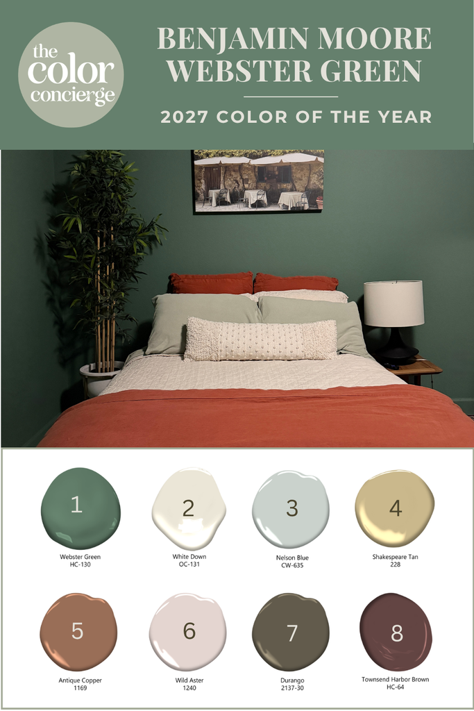
- Webster Green HC-130 (Color of the Year)
- White Down OC-131: soft, warm off-white
- Nelson Blue CW-635: pale, watery blue
- Shakespeare Tan 228: golden neutral
- Antique Copper 1169: warm, spiced terracotta brown
- Wild Aster 1240: muted soft pink with gray notes
- Durango 2137-30: deep neutral with olive undertones
- Townsend Harbor Brown HC-64: grounded burgundy
Here are some ways I plan to use these colors in my own home:
I’m planning to paint the accent wall in my studio (currently Sherwin-Williams Iron Ore) with Townsend Harbor Brown. I love that this color is still dark and calming but also brings so much warmth and a bit more color to my space.
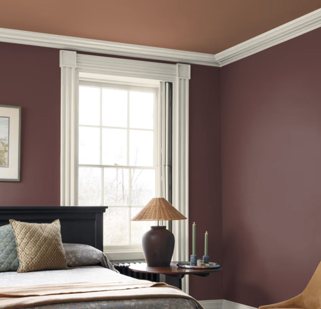
I will probably paint the walls of my primary bedroom with Nelson Blue and use a deep blue for the bathroom. The separate toilet room will be painted with Antique Copper.
I’m considering Shakespeare Tan for my new Ikea closet. While I don’t think I look very good in that color for my clothing, I think it would be a really lovely backdrop for all the colors of my closet.
Antique Copper bedding and decor. I already have burnt orange linens in my guest bedroom that remind me of a slightly darker version of Antique Copper. I absolutely love the way they look with my freshly painted Webster Green walls!
BM Webster Green FAQ
Is green still on trend for 2027?
It absolutely is! We’re seeing lots of interest among our clients in green interior paint and green exterior paint. But although green is a trend right now, I have always considered it timeless.
Can you use Webster Green in a small or dark room?
Yes, you can! Webster Green will look darker in a room with dim light, but that’s not a bad thing. Color drenching smaller spaces in a dark color can make them feel unbelievably cozy.
What is the Sherwin-Williams equivalent of Webster Green?
The closest match is Sherwin-Williams Jadite (SW-6459), which has an LRV of 20. It has similarly neutral undertones, but leans a tiny bit warmer and is also less muted than Webster Green.
| Paint color | Peel-and-stick sample |
|---|---|
| Benjamin Moore Webster Green HC-130 (2027 Color of the Year) | Sample Webster Green |
| Benjamin Moore White Down OC-131 | Sample White Down |
| Benjamin Moore Nelson Blue CW-635 | Sample Nelson Blue |
| Benjamin Moore Shakespeare Tan 228 | Sample Shakespeare Tan |
| Benjamin Moore Antique Copper 1169 | Sample Antique Copper |
| Benjamin Moore Wild Aster 1240 | Sample Wild Aster |
| Benjamin Moore Durango 2137-30 | Sample Durango |
| Benjamin Moore Townsend Harbor Brown HC-64 | Sample Townsend Harbor Brown |
Benjamin Moore Webster Green HC-130 shifts more than most mid-tone greens. It reads as a deep, moody green in shadow and noticeably brighter in direct sun, so test your sample on more than one wall and check it at different times of day before you commit. If you’re pairing it with other palette colors, hang the samples side by side in the room where you’ll use them.
New to peel-and-stick samples? Samplize sends real manufacturer paint, two coats, in a 9” x 14” sheet, delivered overnight. I use them on every consultation. More on our method here: how to test paint colors.
Key Learning Points
Benjamin Moore Webster Green (HC-130) is a versatile mid-tone green, but where and how you use it makes all the difference.
- Webster Green shines indoors, especially as a color drench. In our guest room, we painted the walls, ceiling and trim all in a flat sheen. Because our walls have a rough texture and the doors and molding are smooth, they look like different sheens even though everything is flat.
- Use a darker and more muted green paint color for a green house exterior. In direct sun, Webster Green HC-130 may look a little too bright. For an exterior that looks like the Webster Green swatch, choose a deeper green like Sherwin-Williams Rosemary (SW 6187) or Sherwin-Williams Retreat (SW 6207).
- Using the 2027 Benjamin Moore Color of the Year Palette is a great way to create a cohesive look in your home or even in one room. Use the colors for paint, furniture, finishes, and decor.
Remember: NEVER, EVER use paint matches from a different brand than the one specified. Results are poor and there are no standards for the sheens. Even though your painter may truly believe it can be done, don’t do it. See results in our paint matching guide.
No matter what, always test your paint colors. It’s a standard best practice. Whenever I test my paint colors, they are perfect, and when I don’t test they turn out wrong. Learn how to test your paint colors like a pro.
Online Color Consulting
Still need help picking the best paint colors? Discover our Online Color Consulting Packages.

Related Posts:
About the Author

Hi, I’m Michelle Marceny, founder, owner, and Principal Color Designer at The Color Concierge. I believe a fresh coat of paint can completely transform a space. The Color Concierge was born out of my drive to help clients fall back in love with their homes. My clients trust me to help them find the perfect paint color — whether that’s a whole-house color scheme or ideas for a single room.
Since founding The Color Concierge in 2017, my team and I have completed 1,000s of color consultations, online and in person. I’m a Certified Color Expert with nine years of experience creating interior and exterior color palettes throughout North America.
Every color review on this site comes from colors we’ve specified in real homes and photographed on location during our own consultations — not from a fan deck or a manufacturer’s website.
We love your comments! Please note that the blog is meant as general advice, and it is not possible to give out specific answers to your paint questions. If you want more specific advice, our Online Color Consultations will help you pick your paint colors. Thank you for your understanding.