Learn all about Benjamin Moore Gray Cashmere (2138-60) in this paint color review.
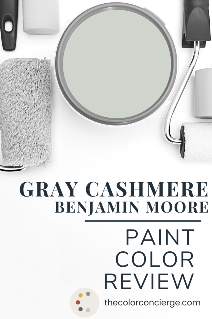
Gray Cashmere is a beautiful color that designers and homeowners use for bedrooms, bathrooms, and offices. It is the Benjamin Moore version of Sherwin-Williams Sea Salt, which is one of their Top 50 Colors.
This paint color looks warm and soft and colorful in rooms flooded with light, especially South facing rooms. It starts to skew blue in a color with lower light or cool North facing light. It can change colors from green to blue throughout the day and then gets grayer at night.
Learn more about Gray Cashmere paint and discover if this classic color is right for your home in the rest of our color guide. All photos in this post are from a real online color consulting client project.

*This post contains affiliate links for products I use and love. If you click on some links and make a purchase, I will get a small commission at no cost to you. This helps pay for the costs of the blog, so I can continue to offer great content to our readers. Benjamin Moore doesn’t compensate me in any way for these color reviews.
About The Color Concierge
Our Colorado-based paint color consultants make finding the right paint colors for your home easy. Whether you’re painting the exterior or interior of your home, our simple yet effective process lets us get your paint color right the first time. We’ve helped thousands of homeowners transform their homes into a space they love. Learn more about ONLINE COLOR CONSULTATIONS today.
What is the LRV of Benjamin Moore Gray Cashmere?
The LRV of BM Gray Cashmere (Sample) is 65, which makes it light, and bright, but still saturated with color. Since it’s over 50, it’s still considered reflective. It’s light enough to use in any room of the house but also has plenty of pigment. LRV is Light Reflectance Value, a measurement that shows how light or dark a color is. The range is from 1(black) to 100 (white). Colors over 50 LRV are light reflective, and under 50 absorb light.
What undertones does Gray Cashmere have?
Gray Cashmere is a muted blue-green color, and its muted quality is what classifies it as gray. Its undertones are more green than gray, although in cool light it looks bluer.
Color is all about comparison, so when you compare it with other blue and green colors it looks gray.
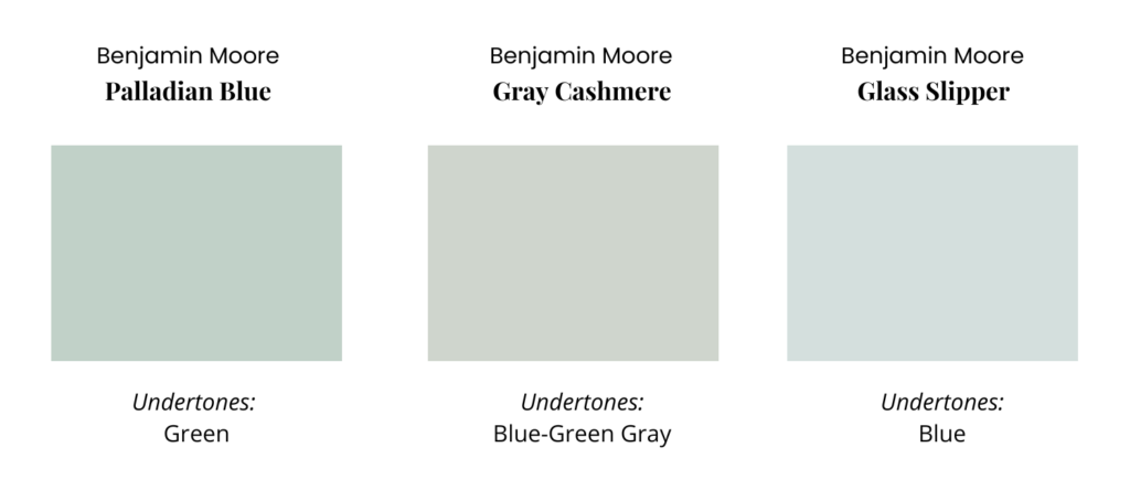
When you compare it to more gray colors it looks colorful.
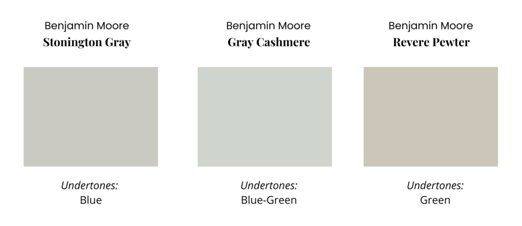
Is Gray Cashmere warm or cool?
Gray Cashmere is classified as a cool color because of its blue component. I see it as a warm color because it’s so much warmer than blue-gray or violet-gray.
When you look into this room with Gray Cashmere paint, it looks grayer than you would expect, because it’s contrasted with Simply White walls and Oxford White trim from a brighter room.
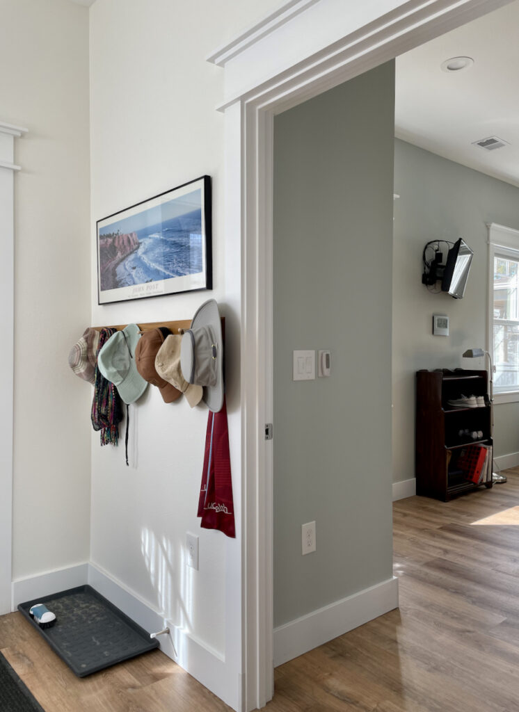
Sample BM Gray Cashmere
We always recommend that you test paint colors (article) in your home because lighting can completely change a color, both on interiors and exteriors.
In the old days, this meant we painted a large poster board with sample pots and a huge mess.
Now we have a better way to test paint, with Samplize Peel-and-Stick samples!
- Samples pre-painted with 2 coats of real paint from the manufacturer.
- Large 9” x 14” samples to see the color better in the lighting.
- Delivered overnight
- Colors are accurate
- Less expensive than painting a large poster board with sample pots
- No mess, and no toxic paint to dispose of
I use these in my color consulting practice for exact results. Discover Samplize peel-and-stick paint samples and sample Benjamin Moore Gray Cashmere (Sample) via the link below.
When should I use Benjamin Moore Gray Cashmere?
I like to use Gray Cashmere as a color for rooms such as bedrooms, bathrooms, offices, and even workout rooms. It’s not my favorite for whole-house color or for an open-concept room. It’s just too much for me, but if you like it a lot, then go for it!
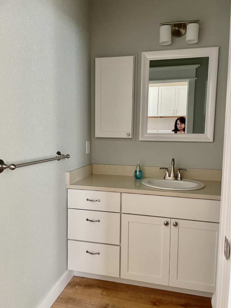
The powder room below is painted with Gray Cashmere. it is windowless, but with the door open you can see how lovely the color is. With the warm natural light from the hall area, it looks more green than blue.
Can I use Gray Cashmere as a trim color?
A Gray Cashmere trim color would be colorful and fun, especially for a kid’s room. I wouldn’t use it throughout a house. It would be lovely paired with white. If you pair it with another pastel for a kid’s room, make sure the contrast color is as muted as Gray Cashmere, or it might look discordant. Getting this type of color scheme is tricky. it’s easiest if you pair it with white.
Can I try Gray Cashmere kitchen cabinets?
Gray Cashmere cabinets are so pretty! Maddie painted her cabinets Gray Cashmere, and they look light, soft, and lovely. This photo was taken late in the afternoon with a West-facing exposure. The wall color is BM Chantilly Lace (review here).
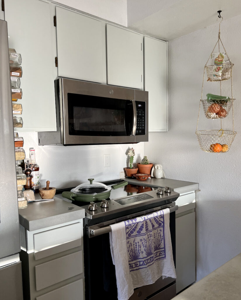
Cabinets always look brighter because they are painted with a shinier sheen than walls. In this case, Maddie used Advance Satin for the cabinets.
I wouldn’t pick Gray Cashmere as an island color because it would likely be too light, even if the perimeter cabinets were a crisp white. Don’t pair Gray Cashmere with earthy granite colors because it’s too fresh a color.

Is a Benjamin Moore Gray Cashmere living room a good idea?
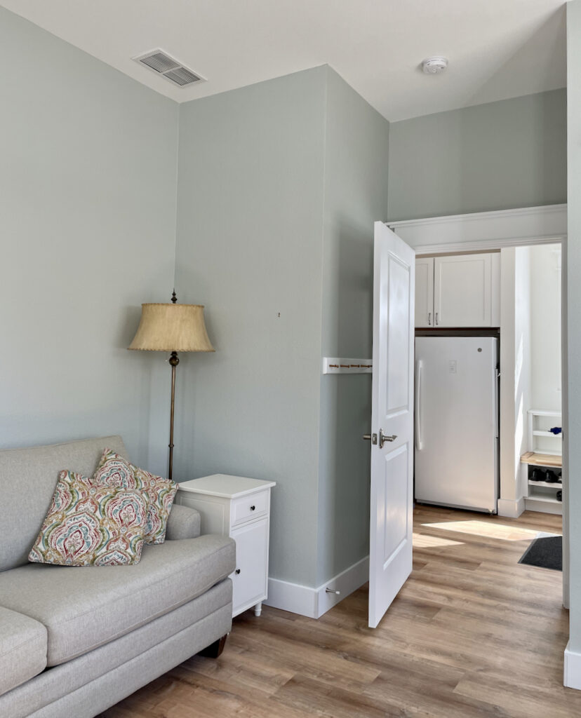
A Gray Cashmere living room is a great idea, as long as it’s not part of a larger area. The photo below shows part of an all-purpose room with a sofa. The room is only connected to other spaces with a door, so the color stands on its own.
This photo was taken in the afternoon with West Facing light. The light was cooler and lower than expected because a building blocked the light. That’s why the Gray Cashmere walls look blue in this photo.
Is BM Gray Cashmere a good whole house color?
I really don’t recommend Gray Cashmere as a whole-house color because it’s so colorful. The color can be limiting, and as pretty as it is, may be hard to live with for a long time.
Can I use Gray Cashmere for Exteriors?
I’ve never recommended Gray Cashmere for an exterior. The LRV of 65 is so high that it would look like a minty white outside. If you really want to use it, I’d pair it with a bright crisp white, and only use it if you have tons of shade.
When should I avoid Gray Cashmere?
Avoid Gray Cashmere as an exterior color, unless you test THOROUGHLY. It might look ok with some granites, but generally, it’s too colorful and fresh (vs. muted) to pair with earthy colors that you see in granites unless they are solid black.
What are the Best Gray Cashmere Coordinating Colors?
Gray Cashmere looks amazing with cool blue whites, clean whites, and off-white colors. I also love it with rich mid-toned or dark blues.
You can pair it with other muted pastel colors but tread carefully so that you don’t end up with an easter egg look. I also like it with light neutral beige colors such as Manchester Tan (review here).
Does Gray Cashmere go with blue?
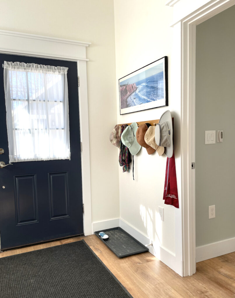
Gray Cashmere looks fantastic with blues! Check out this photo from the hallway where you can see the combination of a Hale Navy (review here) back door, Oxford White trim, and Simply White walls.
From this sun-lit perspective, the walls look grayer when compared to the other bright colors.
Does Gray Cashmere go with white?
Yes, Gray Cashmere can pair well with many white paint colors (Sample). It works best with cool whites like BM Decorator’s White (Sample) and clean whites such as Chantilly Lace (Sample) and Oxford White (Sample) and even off-whites like Simply White. White Dove (review here) looks ok, but warmer off-whites and creams can start to flash yellow next to Gray Cashmere (Sample).
Does Gray Cashmere go with earthy finishes?
It can go with earthy finishes, as long as they aren’t too brown, or heavy. Test the colors very carefully next to the earthy finish. I’ve seen this color look good with granite, but only when the stone is lighter.
What are the Best Trim and Ceiling Colors For BM Gray Cashmere?
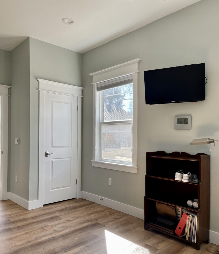
Use Gray Cashmere with cool white (Decorator’s White, White Diamond), clean whites (Chantilly Lace, Oxford White), and bright off-white trim and ceiling colors such as Simply White, Cloud White, and White Dove (Sample). You can go as warm as Swiss Coffee (Sample) trim paint, but it wouldn’t be my first choice.
The trim and ceiling color below are Oxford White.
What is the easiest way to sample Gray Cashmere?
The easiest way to sample BM Gray Cashmere (and any paint color for that matter) is via SAMPLIZE. Their peel-and-stick paint samples are easy to use and true to color. With Samplize you can easily see how different shades look on your unique wall.
Gray Cashmere Color Comparisons
Not sure if the Gray Cashmere paint color is right for your next project? See how it compares to other similar colors.
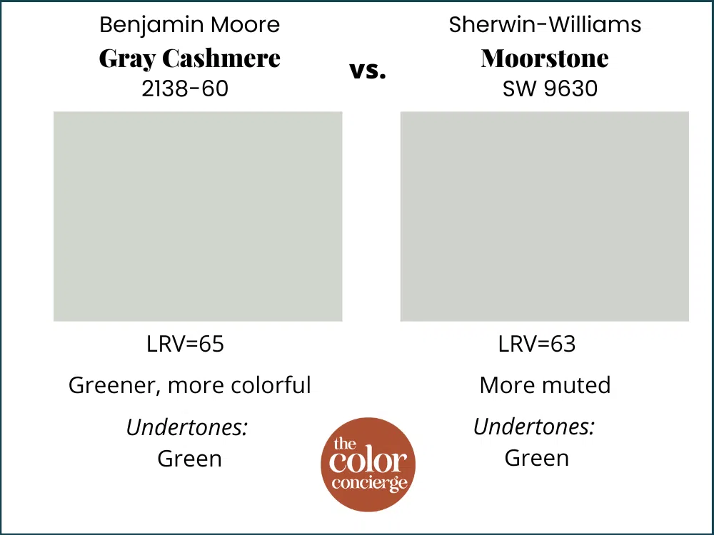
Gray Cashmere vs Moorstone
BM Gray Cashmere (Sample) is lighter and brighter than Moorstone (Sample). They are both blue-green grays, but Moorstone is much more muted. Gray Cashmere will probably be more forgiving in North-facing rooms, and Moorstone will shine in a room flooded with light. Both colors have green undertones.
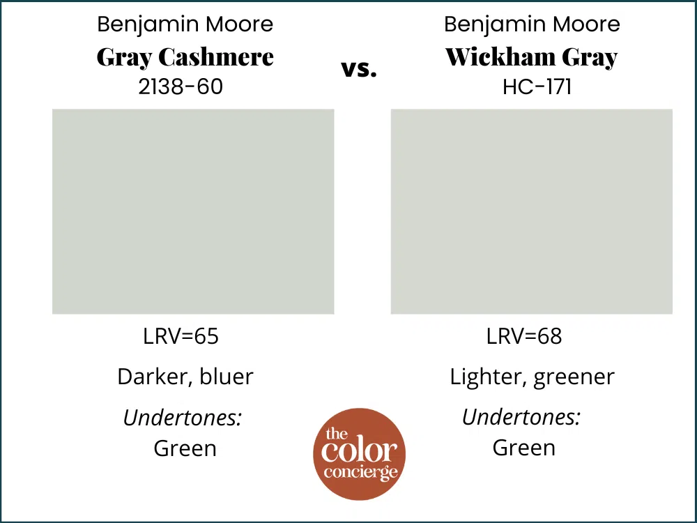
Gray Cashmere vs. Wickham Gray
Benjamin Moore Wickham Gray (Sample) is lighter and greener, but more muted than Gray Cashmere. They are pretty similar, but Wickham might get washed out in rooms with warmer and brighter light.
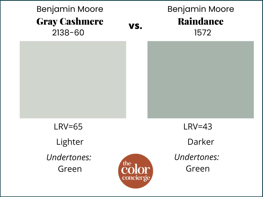
Gray Cashmere vs Raindance
Raindance (Sample) is a darker version of Gray Cashmere, used in different applications. Gray Cashmere is more for walls and I would (and have) used Raindance as a kitchen island color, and front door color.
Gray Cashmere vs. Sherwin-Williams Sea Salt
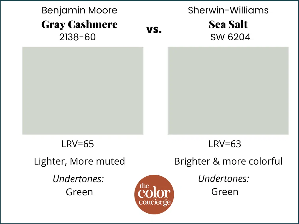
Gray Cashmere and Sherwin-Williams Sea Salt (Sample) are almost exactly the same color. I would use these in the same applications, and test both. Gray Cashmere is lighter and less colorful than Sea Salt. Which one is best will depend on the lighting of the room vs. the colors of the decor.
Benjamin Moore Gray Cashmere Pros and Cons
Pros:
- Looks warm and soft in rooms flooded with light, especially South-facing rooms
- Gorgeous as a contrasting trim with white walls for a kids room
- Great option if you want some color without being overwhelming
Cons:
- Can skew blue in rooms with lower light or cool, North-facing light
- Not the best choice for a whole-house color or open-concept space
- Avoid Gray Cashmere exterior paint unless you test thoroughly
What is the best way to test Gray Cashmere?
As always, don’t forget to test your paint colors! The easiest way to sample any paint color is via SAMPLIZE. Their peel-and-stick paint samples are easy to use and true to color. With Samplize you can easily see how different shades look on your unique wall.
If you’d like to test the colors that we mentioned in this post, link below for the Samplize samples:
BM Gray Cashmere (Sample)
SW Sea Salt (Sample)
Key Learning Points
Benjamin Moore Gray Cashmere is a beautiful color that designers and homeowners use for bedrooms, bathrooms, and offices.
- Gray Cashmere is the Benjamin Moore version of Sherwin-Williams Sea Salt
- It looks warm and soft and colorful in rooms flooded with light, especially South facing rooms. It starts to skew blue in a color with lower light or cool North facing light. It can change colors from green to blue throughout the day and then gets grayer at night.
- Gray Cashmere looks great with rich dark and mid-toned blue colors, and crisp or cool white trim and ceiling colors.
- Don’t forget to test your paint colors, and whatever you do, don’t paint match to another brand. If you like Gray Cashmere and need to use a Sherwin-Williams color, just pick Sea Salt.
Online Color Consulting
If you still need help with paint colors, check out our Online Color Consulting packages.

Related Posts
Sherwin-Williams Sea Salt Color Review
Benjamin Moore Stonington Gray Color Review
Sherwin-Williams Agreeable Gray Color Review
Benjamin Moore Classic Gray Color Review
About the Author

Hi, I’m Michelle Marceny, founder, owner, and Principal Color Designer at The Color Concierge. I believe a fresh coat of paint can completely transform a space. The Color Concierge was born out of my drive to help clients fall back in love with their homes. My clients trust me to help them find the perfect paint color for their home – whether it’s a whole-house paint color scheme or ideas for a single room.
Since The Color Concierge was founded in 2017, we have completed over 3000 color consultations, both online and in-person. I am a Certified Color Expert with 7 years of experience creating interior and exterior color palettes throughout North America.
We love your comments! Please note that the blog is meant as general advice, and it is not possible to give specific answers to your paint questions. If you want more specific advice, our Online Color Consultations will help you pick your paint colors. Thank you for your understanding.


2 Responses
Hello! My master bedroom is BM gray cashmere, and I love the color on my walls! We are updating carpet and not sure what color to choose! Any helpful ideas ? Thanks Jean
We used this as a whole house color for our first floor and up our staircase. It’s fun to watch how the color changes throughout the day and night. We had natural white oak colored floors and used BM Cotton Balls for the trim! Our furniture is grays and blues. Just love this color!