Learn all about Benjamin Moore Hepplewhite Ivory (HC-36) in this paint color review.
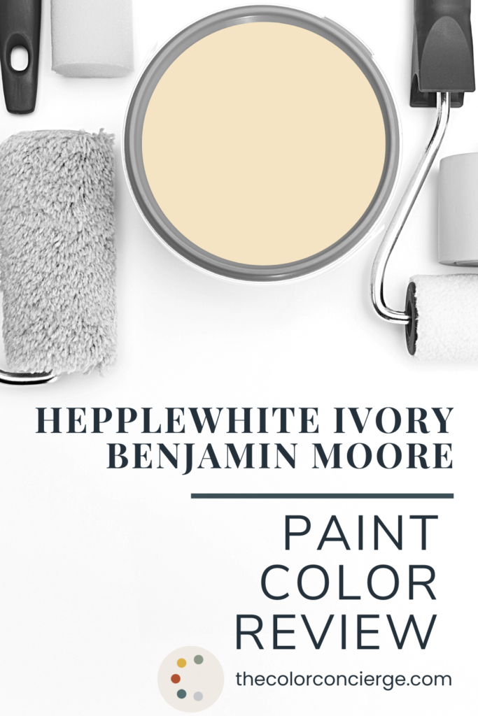
Hepplewhite Ivory is a beautiful, bright and sunny yellow hue perfect for exterior color palettes. Part of the Benjamin Moore historic collection, Hepplewhite Ivory is a favorite for Victorian and other historic homes.
My grandmother always said that yellow is really good luck when you paint it on your walls, and her beautiful house was yellow on the outside, and yellow on the inside. Hepplewhite Ivory is a very personal color for me because it reminds me of the yellow she used for her house, and for me it spells love.
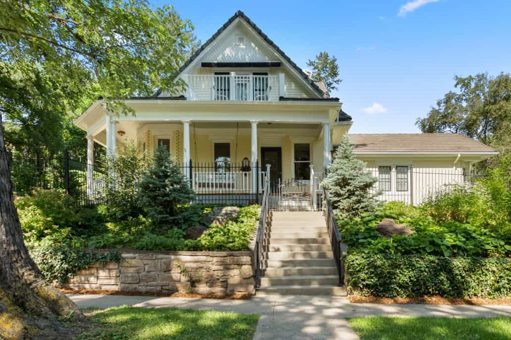
In fact, it is the foundation of a yellow exterior paint color scheme we created for a client a few years ago for their historic home in the foothills of Colorado. We believe that this gorgeous house with incredible bones was a Sears Roebuck catalog house. This meant that the original owners ordered the home from a catalog and all the building materials were shipped to Colorado from the east coast by rail car in the early 1900s.
The current homeowners are a hardworking Colorado family. The parents own their own business, and their priority is to focus on their four really nice kids. Our objective was to update the home for sale with high-end finishes that wouldn’t break the bank.
Hepplewhite Ivory (Sample) was a gorgeous foundation for this color palette. You’ll see a lot more of this home further down in this paint color review.

*This post contains affiliate links for products I use and love. If you click on some links and make a purchase, I will get a small commission at no cost to you. This helps pay for the costs of the blog, so I can continue to offer great content to our readers.
About The Color Concierge
Our Colorado-based paint color consultants make finding the right paint colors for your home easy. Whether you’re painting the exterior or interior of your home, our simple yet effective process lets us get your paint color right the first time. We’ve helped thousands of homeowners transform their homes into a space they love. Learn more about ONLINE COLOR CONSULTATIONS today.
What Color is Hepplewhite Ivory?
Benjamin Moore Hepplewhite Ivory (HC-36) (Sample) can be a confusing color if you’re not familiar with it. The name makes it sound like an off-white paint. It looks like a yellow paint color. But in reality, Hepplewhite Ivory is a beige paint with soft yellow undertones.
Yellow is one of the trickiest colors when it comes to finding the right shade. Hepplewhite Ivory is a great option if you want yellow paint for a project but want to avoid the color looking too harsh or glowing on the walls.
For the project we feature in today’s post, for example, the homeowners wanted a light and happy exterior that would show off the architectural features of the house without feeling too heavy. Hepplewhite Ivory was the perfect foundation for their historic home color palette.
What is the LRV of Hepplewhite Ivory?
The LRV of Hepplewhite Ivory is 75. LRV stands for light reflective value and measures how much light a color reflects when it’s on the wall. For reference, pure white has an LRV of 100. With an LRV of 75, Hepplewhite Ivory is a light color.
Is Hepplewhite Ivory warm or cool?
Hepplewhite Ivory is a warm color. Its warmth makes it ideal for rooms with bright sunlight or for exterior purposes. The natural light brings out its warmth, keeping it from looking too stark or washed out.
What are the undertones of Hepplewhite Ivory?
Hepplewhite Ivory (Sample) has strong yellow undertones that lean slightly orange. This color is most often used as a yellow paint color, although it is actually a beige.
Sample BM Hepplewhite Ivory
We always recommend that you test paint colors (article) in your home because lighting can completely change a color, both on interiors and exteriors.
In the old days, this meant we painted a large poster board with sample pots and a huge mess.
Now we have a better way to test paint, with Samplize Peel-and-Stick samples!
- Samples pre-painted with 2 coats of real paint from the manufacturer.
- Large 9” x 14” samples to see the color better in the lighting.
- Delivered overnight
- Colors are accurate
- Less expensive than painting a large poster board with sample pots
- No mess, and no toxic paint to dispose of
I use these in my color consulting practice for exact results. Discover Samplize peel-and-stick paint samples and sample Benjamin Moore Hepplewhite Ivory (Sample) via the link below.
When should I use Hepplewhite Ivory interior paint?
Benjamin Moore Hepplewhite Ivory has a lot of possible uses both inside and outside the home. It looks best in a space with lots of natural light and adds plenty of bright warmth to the wall.
Is Hepplewhite Ivory a good kitchen color?
We love the idea of a Hepplewhite Ivory kitchen! Especially if you have white kitchen cabinets, adding yellow kitchen walls is a simple way to add color without making the space feel too dark.
Hepplewhite Ivory walls would pair really nicely with both warmer white kitchen cabinets, such as Benjamin Moore Simply White (Article), or clean white cabinets, like Benjamin Moore Chantilly Lace (Article).
Just make sure you don’t go too cool with your white cabinets. A white with a blue undertone could end up looking mismatched and off when paired with Hepplewhite Ivory walls.
Is Hepplewhite Ivory good for an east-facing room?
Hepplewhite Ivory can work well in a lot of different rooms within a home, including east-facing rooms. East-facing rooms get soft, warm light in the morning as the sun rises and get brighter as the day goes on until about noon. After noon, when the sun is directly overhead, east-facing rooms start to get darker, cooler and more shaded.
Hepplewhite Ivory is a great color for this kind of space because even when the light is cooler its warm, yellow undertones can keep a room looking bright and cheery.
No matter where you use Hepplewhite Ivory (Sample), it works best in a space with lots of natural light (this is one of the reasons we love using this paint for exterior applications).
Is Hepplewhite Ivory a good whole house color?
While it’s technically a beige, Hepplewhite Ivory is really too bright and colorful to make a good whole-house paint color. It can, however, play a role in a whole house color palette (Article) as an accent color for individual rooms, accent walls or decor.
It’s also a great option for an exterior paint color and can be used for the whole house in that scenario.

Project Spotlight: A Historic House with Hepplewhite Ivory Exterior Paint
Hepplewhite Ivory is one of our favorite colors to use when a client wants a yellow exterior for their home.
Yellow can be hard to work with because it can be very in your face. The difference between a yellow that reads like caution tape and a yellow that is soft and friendly is really small, and it can be challenging to find the right shade.
It’s also important to pick a yellow shade that is approved for exterior use. Otherwise, your paint will fade too quickly.
Because Hepplewhite Ivory (Sample) is actually beige with yellow undertones, it offers a really nice balance of a bright yellow hue while still being soft and neutral enough to not feel overpowering – even in direct sunlight.
When we started working with our clients in Colorado with the Sears Catalog House, they had actually already started painting the siding Hepplewhite Ivory. We were so excited to be able to finish this project for them and use this paint color to build out a full historic home exterior color palette (Article).
The previous paint palette was once really nice, but it was worn and needed a refresh.
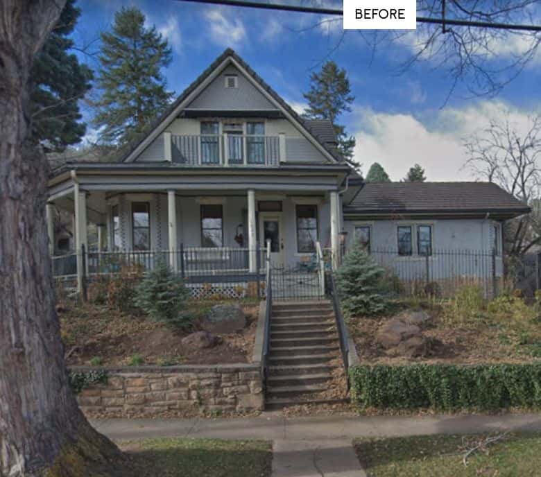
Our new color palette was soft, light and bright. With light colors, we were able to update the house without sacrificing its historic identity.

Hepplewhite Ivory Siding & Architectural Accents
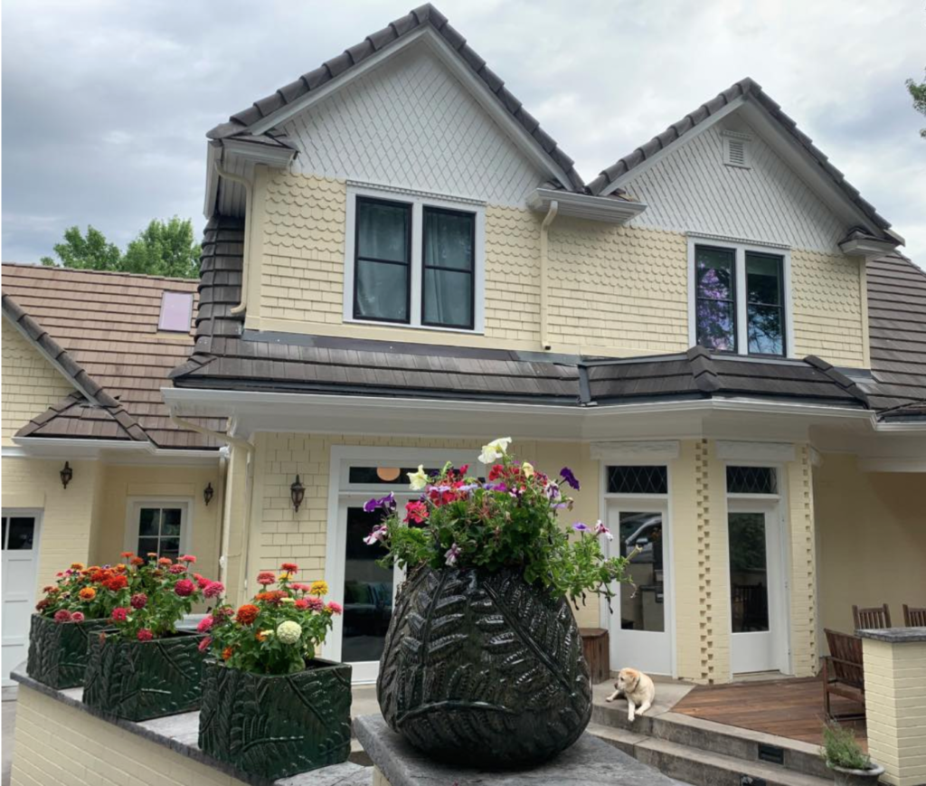
We used Hepplewhite Ivory (Sample) exterior paint across most of the outside of this home, including the shake siding and scalloped siding accents on the home.
In many historic house color palettes, it’s common to see architectural accents like scalloped siding painted in a different color than the body of the home. But in this case we went with a simple color palette and you can see that the scalloped siding still really stands out.
It may seem counterintuitive, but sometimes light colors highlight architectural details better than if you paint each feature a different color.
Hepplewhite Ivory Painted Brick
This home also uses Hepplewhite Ivory paint on the brick walls on the property. It’s not uncommon to hear that you really can’t paint brick without dealing with peeling paint a few years down the line. But thankfully, that is really just an urban myth.
The key to painting brick is making sure the surface is well-cleaned and primed really well. Once you prime them you can treat brick like pretty much any other siding surface. This house proves it. The brick has been painted for decades, and it was not peeling before it was painted.
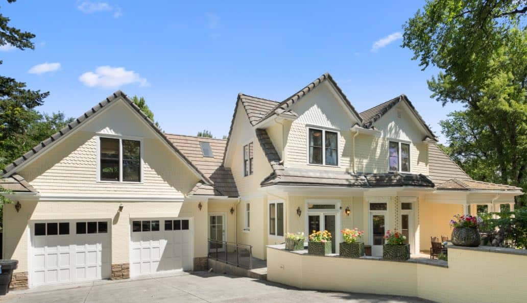
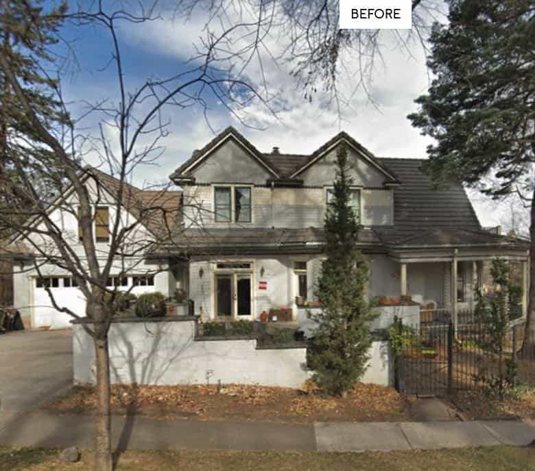
The brick walls surrounding the back patio were truly gorgeous by the time we were done – it really improved the curb appeal of this house (see the before photo below!).
Which Colors Look Best with Hepplewhite Ivory?
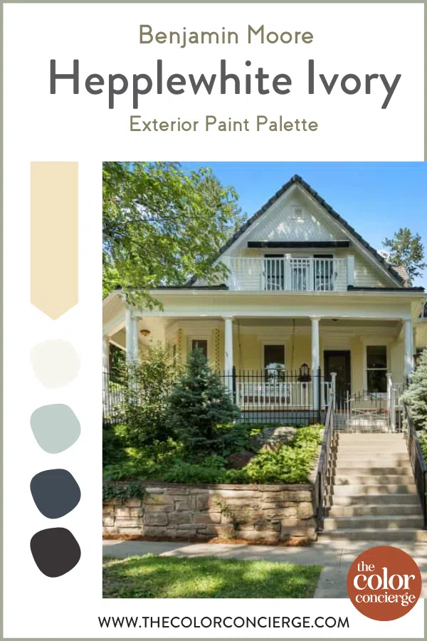
Any time you’re building a color palette around a specific paint, it’s important to explore the best coordinating colors. In the case of this historic Sears Catalog House, we wanted to keep the overall palette simple, to really let the Hepplewhite Ivory (Sample) body color and the architectural details shine.
The homeowner had already settled on a yellow, black and white color palette when we took over this project. When we got to the property however, there was way too much black and the home was starting to have a bit of a “bumblebee effect.”
While we wanted to stick with the overall color scheme, we knew we needed to make some adjustments. We chose a different, softer black, selected a brighter white and used fewer black accents (opting for more white trim instead). When we were done, this home was completely transformed!
What white paint color goes with Hepplewhite Ivory?
We incorporated a lot of white paint on all of the trim and some architectural elements to keep this home light and bright.
We chose Benjamin Moore Simply White (OC-117) (Sample) because it is a warmer white that has just enough color to not look too stark in bright sunlight. Simply White might look too bright on some home exteriors, but it works with the soft and sunny Hepplewhite Ivory siding. Since it is a very bright white for an exterior, you may need to prime the surfaces first.
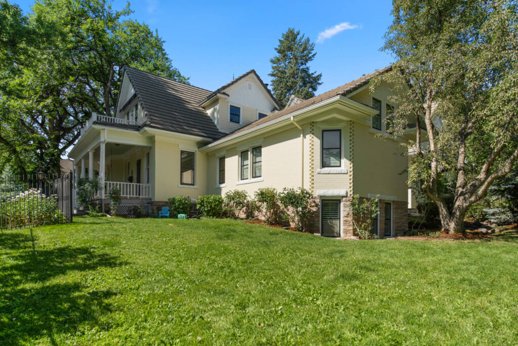
This side view shows a peek into the gorgeous patio. We painted the gable peaks Simply White and kept the trim the same color. We tested painting the gutters black, in the current farmhouse style, but they looked too heavy.
Instead, we painted the gutters, fascia, trim, soffits, garage doors and downspouts with Simply White, too. Besides, we wanted everyone to see the beautiful house, not the gutters!
What black paint goes with Hepplewhite Ivory?
When we first arrived at this property, we knew we needed to choose a different black than they had tried. We chose Benjamin Moore Carbon Copy (2117-10) (Sample) because it is a soft black with warm, violet undertones that provided contrast without looking too harsh in this otherwise bright color palette.
The homeowners had originally tried painting some of the downspouts black, but it looked too heavy (and too much like a bumblebee!). So we painted the downspouts white and used Carbon Copy on the window frames only.
In this type of a project, a little bit of black is a lovely accent, too much throws the palette out of balance.
What other colors go with Hepplewhite Ivory?
While this color palette was focused on yellow, white and black, we also wanted to incorporate a couple of other Hepplewhite Ivory coordinating colors. We picked two different blue paints to offer a touch of cooler freshness to the palette.
The inviting front porch is a family gathering spot. We painted the front door Hale Navy (HC-154), and added a splash of blue with Woodlawn Blue (HC-147) (Sample) to the front porch ceiling in the Southern tradition of Haint Blue. You can see another Haint Blue front porch here.
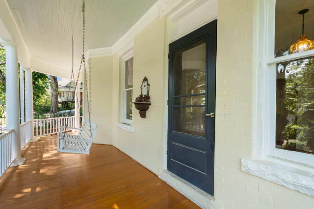
Benjamin Moore Hale Navy (Article) is an iconic navy-blue paint color that is slightly grayed out and muted. Many designers consider it a dark neutral color because it looks great with almost any other color. It comes to life in natural sunlight, so it’s a popular choice for exterior paint color palettes.
Woodlawn Blue is another color from Benjamin Moore’s historic collection. A warm blue-green, this color offers a touch of soft color to the home’s porch roof. It has enough pigment to be clearly blue without being too bright or overwhelming.
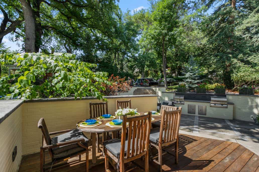
We continued the blue accents in the patio garden, which opens from the kitchen door. We painted the walls with Hepplewhite Ivory, and used Hale Navy again for the planter box and outdoor oven accents. Existing furniture was staged by Five Empires Staging.
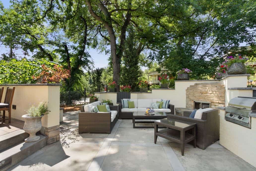
We renewed the teak dining room set with teak oil, and it transformed the set! The natural wood color looks really beautiful in front of the BM Hepplewhite Ivory wall.
What are the Best Trim and Ceiling Colors For Hepplewhite Ivory?
For exterior applications, like the historic house project featured in this post, we love using Simply White trim paint with Hepplewhite Ivory. Simply White has an LRV of 91.7, which makes it a bright white. This off-white paint also has lots of yellow in it, which helps it pair well with Hepplewhite Ivory and keeps the overall look bright and sunny.
The Best Hepplewhite Ivory Alternatives
Not sure if Hepplewhite Ivory is the correct shade for your home? Check out how it compares to similar paint colors. Color comparisons are the best way to define a color and its undertones and other properties.
Hepplewhite Ivory vs Windham Cream
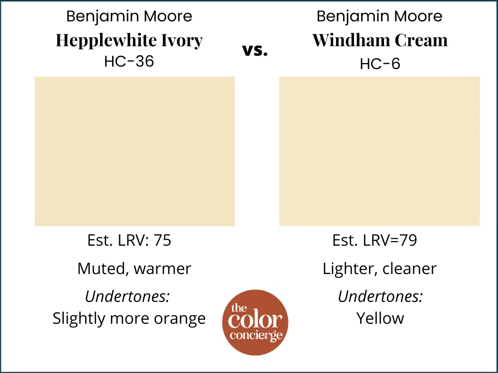
Windham Cream (Sample) is another paint in Benjamin Moore’s historical collection. This color is an off-white, cream color with strong yellow undertones. This is a very close match to Hepplewhite Ivory but with an LRV of 79, Windham Cream is slightly lighter and cleaner.
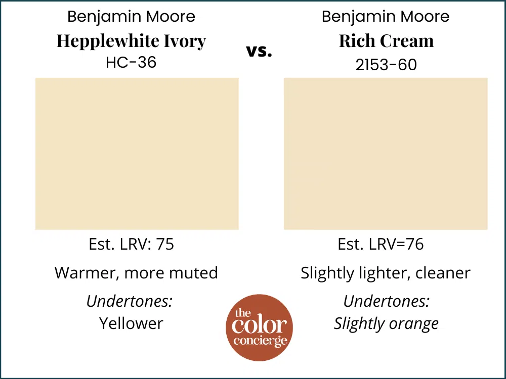
Hepplewhite Ivory vs Rich Cream
Benjamin Moore Rich Cream (Sample) is another beige paint with slightly orange undertones. This color is not recommended for exterior paint. With an LRV of 76, it is just barely lighter and a bit cleaner than Hepplewhite Ivory.
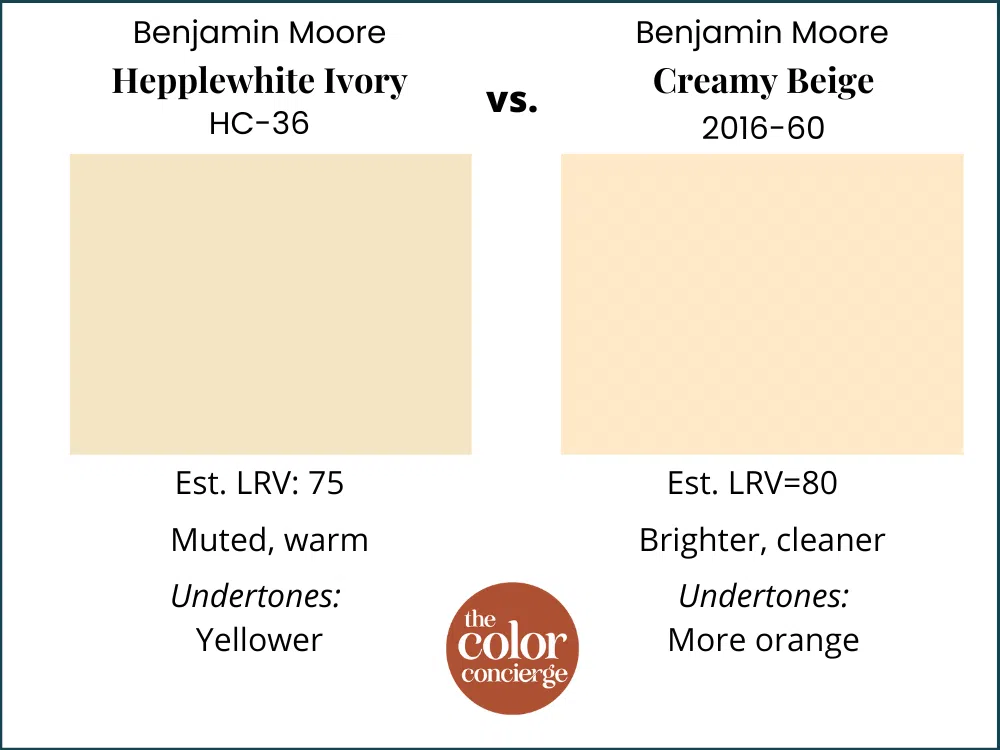
Hepplewhite Ivory vs Creamy Beige
Creamy Beige (Sample) by Benjamin Moore is a beige paint color with undertones that lean more toward orange than Hepplewhite Ivory. It looks brighter and cleaner than Hepplewhite Ivory and is lighter with an LRV of 80. Creamy Beige is not recommended as exterior paint.
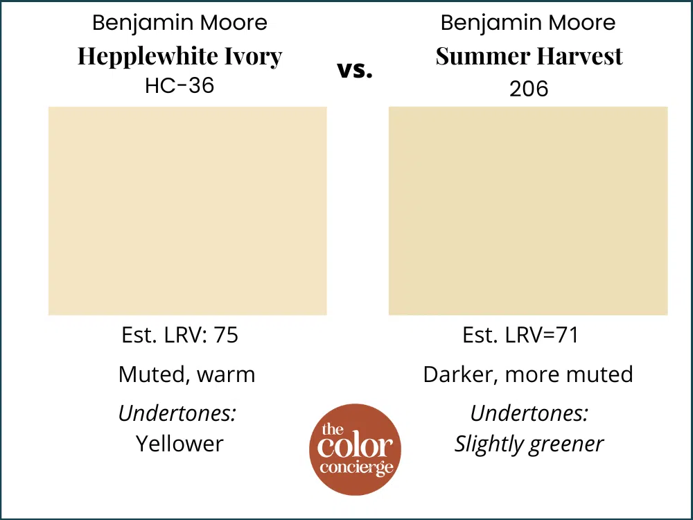
Hepplewhite Ivory vs Summer Harvest
Benjamin Moore Summer Harvest (Sample) is slightly more muted color than Hepplewhite Ivory, Summer Harvest looks yellow with very subtle green undertones. This color is very similar to Hepplewhite Ivory but is not recommended for exterior applications. With an LRV of 71 it is slightly darker than Hepplewhite Ivory.
What is the best way to test Hepplewhite Ivory?
As always, don’t forget to test your paint colors! The easiest way to sample any paint color is via SAMPLIZE. Their peel-and-stick paint samples are easy to use and true to color. With Samplize you can easily see how different shades look on your unique wall.
If you’d like to test the colors that we mentioned in this post, link below for the Samplize samples:
Hepplewhite Ivory (Sample)
Windham Cream (Sample)
Rich Cream (Sample)
Creamy Beige (Sample)
Summer Harvest (Sample)
Key Learning Points
Hepplewhite Ivory is a soft, pretty beige that looks yellow thanks to its strong undertones. It’s a beautiful option for yellow exterior color palettes because it looks soft in direct sunlight while still being very clearly yellow.
- Hepplewhite Ivory is a great option for historic homes, with muted clean yellow undertones that highlight the architectural features of a home
- It pairs well with white and black for a simple exterior color palette
- Hepplewhite Ivory is a light creamy yellow paint color that works well with crisp white trim paint, such as Benjamin Moore Simply White, Oxford White, or Chantilly Lace.
Remember – no matter how you plan to use Hepplewhite Ivory paint, don’t forget to test your paint colors. Check out the SAMPLIZE website HERE. And NEVER, EVER use paint matches from a different brand than the one specified. The results are poor. Even though your painter may truly believe it can be done, don’t do it. See results from paint matching Here.
Credits: Fordham and MacLean Painting, Five Empires Staging
Online Color Consulting
If you still need help with paint colors, check out our Online Color Consulting packages. We even offer special historic house exterior packages.

Related Posts
- Victorian House Exterior Color Palettes
- A Painted Lady Historic House Color Palette
- A Painted Gentleman Historic House Color Palette
- Historic Sears House Exterior Palette
About the Author

Hi, I’m Michelle Marceny, founder, owner, and Principal Color Designer at The Color Concierge. I believe a fresh coat of paint can completely transform a space. The Color Concierge was born out of my drive to help clients fall back in love with their homes. My clients trust me to help them find the perfect paint color for their home – whether it’s a whole-house paint color scheme or ideas for a single room.
Since The Color Concierge was founded in 2017, we have completed over 3000 color consultations, both online and in-person. I am a Certified Color Expert with 7 years of experience creating interior and exterior color palettes throughout North America.
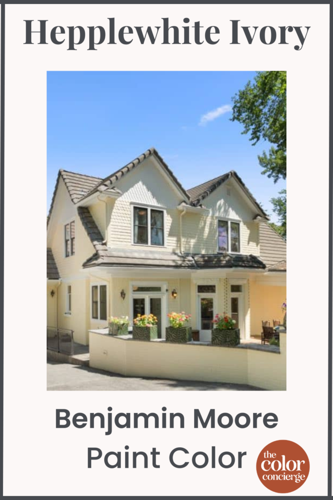
If you liked this post, don’t forget to pin!
We love your comments! Please note that the blog is meant as general advice, and it is not possible to give specific answers to your paint questions. If you want more specific advice, our Online Color Consultations will help you pick your paint colors. Thank you for your understanding.

3 Responses
Thank you! But I can’t see where the ‘carbon copy’ color was used on the window frames. Was that an error
My Living Room and Dining Room are painted Hepplewhite Ivory. While I thought it would be a more neutral color it is as you said more yellow. What color curtains would look the best?
Hi Ellen,
Its hard for me to give a definitive answer without seeing your decor, but my first idea would be to pick white curtains, the same color as your trim. If you have blue in the room, blue curtains might also be nice. Not black, though because the room might give a bumblebee vibe.
Michelle