We are so excited for what’s to come in the world of color and design – especially the upcoming paint color trends for 2026. Keep reading for a full breakdown.
As professional paint color consultants, tracking emerging paint color trends is part of our everyday work. While many trends are influenced by design influencers, fashion brands, and paint companies themselves, one of the most reliable indicators of what’s actually coming next is much closer to home: the colors our clients consistently ask for during real-world paint color consultations.
As we look ahead to 2026, we could not be more excited about the kinds of hues our clients keep coming back for. Overall, the new direction could be described as “Warm Minimalism,” which is a term we’ve seen used on a variety of platforms to describe emerging design trends.
After years of all-white interiors dominating the conversation, many homeowners still want spaces that feel light and airy, but not cold, stark, or sterile. Instead, 2026 paint color trends are moving toward warmer neutrals like cream, beige, and greige, paired with richer, bolder warm hues that add depth and personality without overwhelming a space.
As paint color consultants, this isn’t just a passing phase driven by social media. We’re seeing homeowners consistently request these warmer colors for their own homes. That kind of demand signals a meaningful evolution in how people want their homes to feel.
In the sections below, we’ll break down the specific paint colors and trends we’re expecting for 2026, and share real-life examples of the colors in our actual clients’ homes.
*This post contains affiliate links for products I use and love. If you click on some links and make a purchase, I will get a small commission at no cost to you. This helps pay for the costs of the blog, so I can continue to offer great content to our readers.
About The Color Concierge
Our Colorado-based paint color consultants make finding the right paint colors for your home easy. Whether you’re painting the exterior or interior of your home, our simple yet effective process lets us get your paint color right the first time. We’ve helped thousands of homeowners transform their homes into a space they love. Learn more about ONLINE COLOR CONSULTATIONS today.
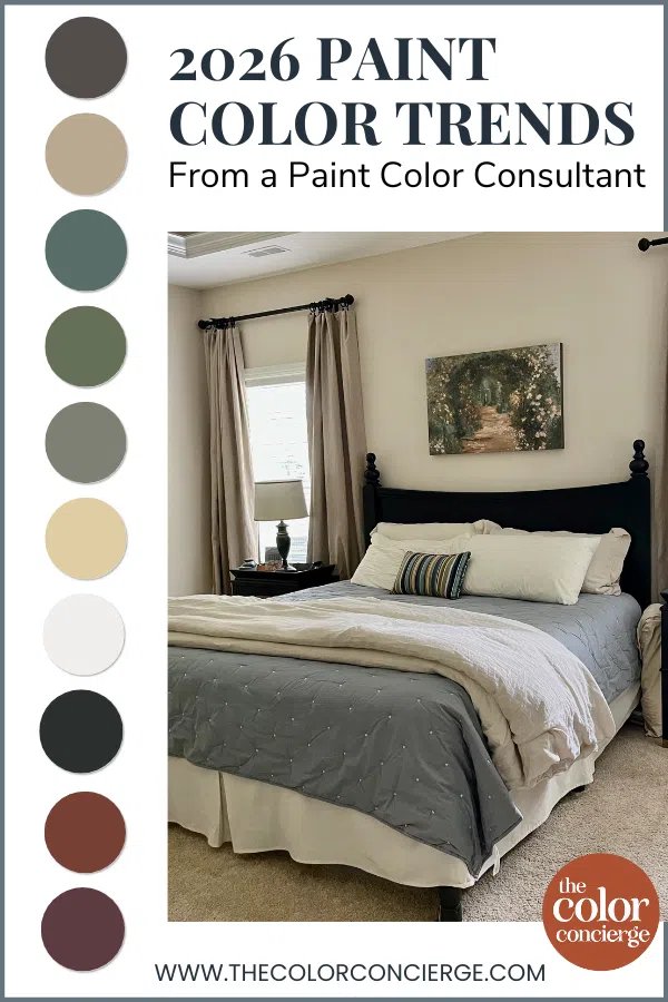
Sample Trending Paint Colors
We always recommend that you test paint colors (article) in your home because lighting can completely change a color, both on interiors and exteriors.
In the old days, this meant we painted a large poster board with sample pots and a huge mess.
Now we have a better way to test paint, with Samplize Peel-and-Stick samples!
- Samples pre-painted with 2 coats of real paint from the manufacturer.
- Large 9” x 14” samples to see the color better in the lighting.
- Delivered overnight
- Colors are accurate
- Less expensive than painting a large poster board with sample pots
- No mess, and no toxic paint to dispose of
I use these in my color consulting practice for exact results. Discover Samplize peel-and-stick paint samples and sample your favorite color trends via the link below.
Top 2026 Paint Color Trends
We worked with so many gorgeous paint colors in 2025 and are excited to share the hues we think have lasting power heading into 2026.
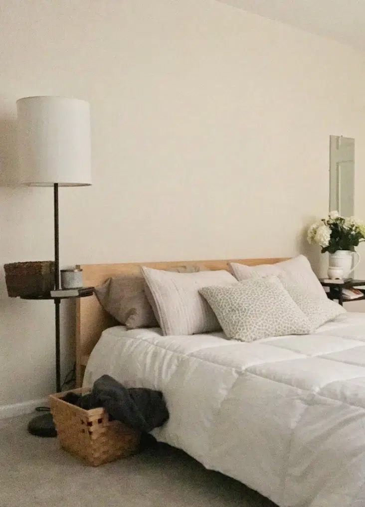
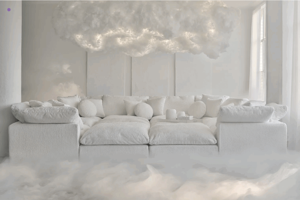
Warm Whites & Creams
One way to think of the “Warm Minimalism” trend is as a resurgence of the Tuscan Era, but without very heavy warm colors as whole-house foundational hues. Instead, common areas like open layout kitchens and living rooms, dining rooms, hallways and even entire homes are being painted with light but warm colors like Benjamin Moore Ballet White, Sherwin-Williams Pearly White (Article) and Sherwin-Williams White Duck (Article).
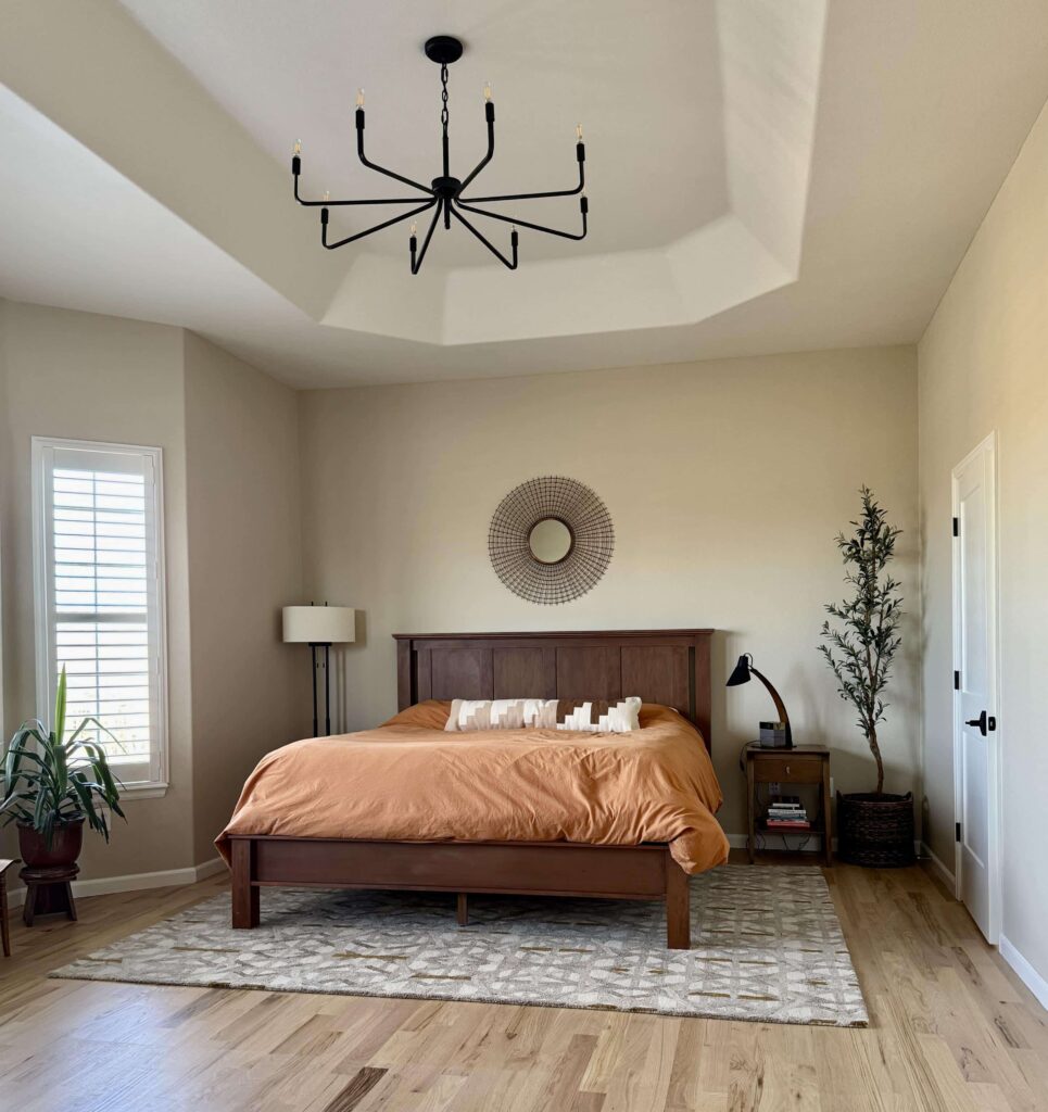
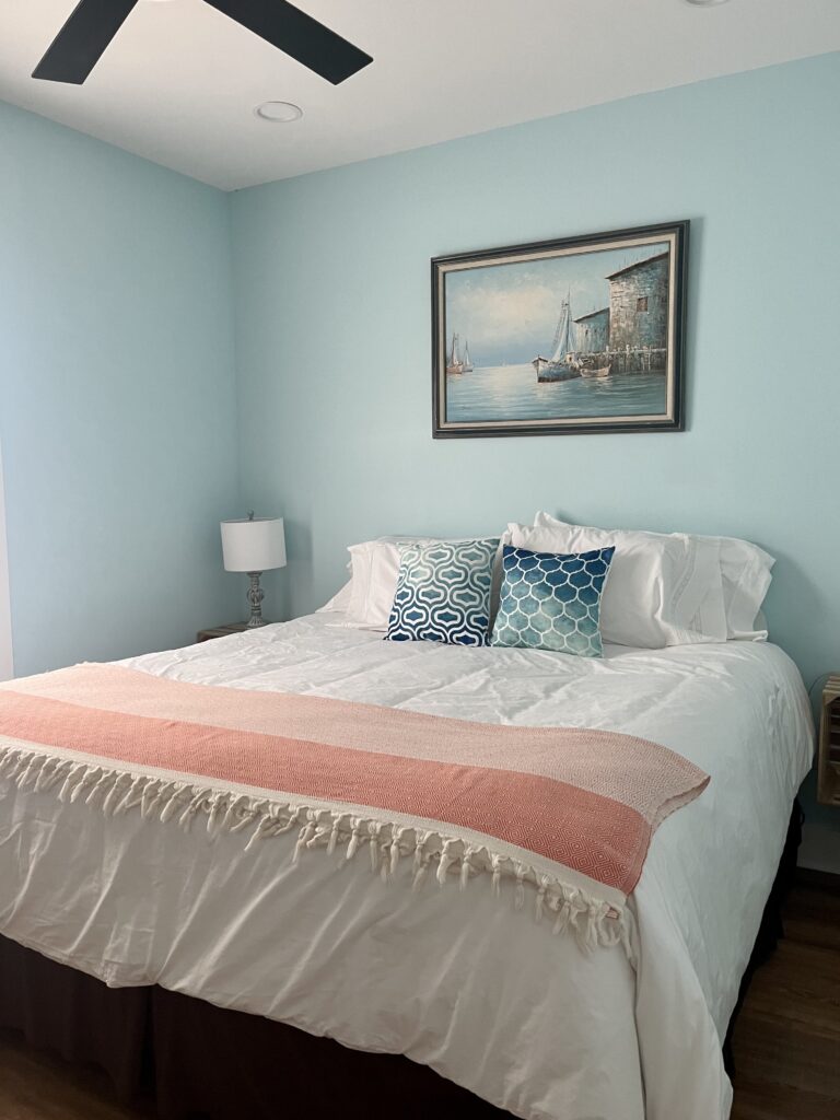
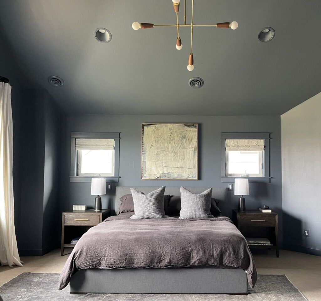
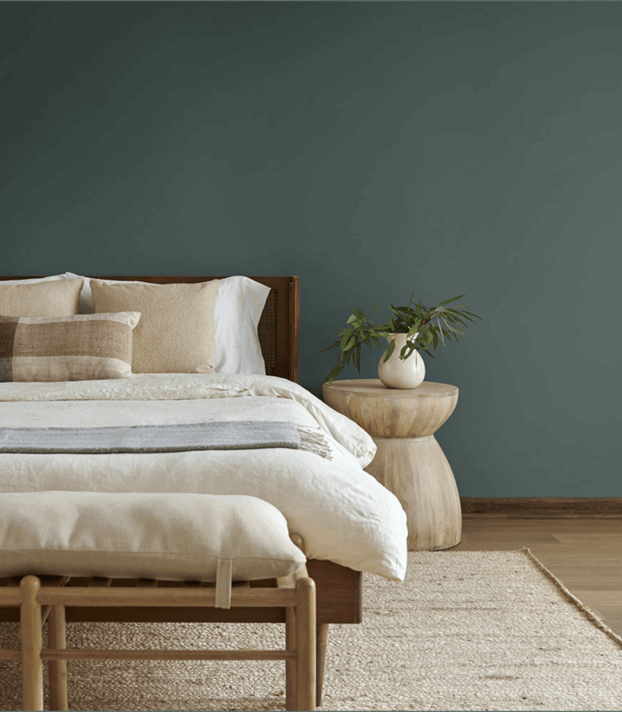
The bedroom (Article) below, for example, is painted with BM Ballet White. While the room is very minimal and almost monochromatic, it still feels cozy and inviting thanks to the warm off-white paint color.
Earthy Neutrals
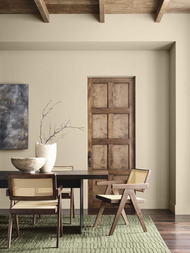
In addition to creamy whites, homeowners in 2026 are adding lots of warm, earthy neutrals to their spaces. Sherwin-Williams’ 2026 Color of the Year, Universal Khaki (Article), is a perfect example of this trend.
Other popular hues in this category include Benjamin Moore Natural Linen (Article) and Sherwin-Williams Natural Linen (Article). After an influencer shared information about SW Natural Linen in 2025, for example, we saw a huge surge of homeowners asking for this warm beige with peachy undertones.
It’s a really gorgeous color, but very peachy and doesn’t work for all spaces. Once we helped them actually test the color in their homes, however, most people went in a different direction. BM Natural Linen is typically a more popular choice because it’s just as warm but less peachy and more neutral in place.

Deep Browns
The warm, earthy hues continue with this next trend! We saw so many homeowners asking for deep, warm browns and taupes in their homes this year – especially in bedrooms and cozy living spaces. It was also interesting to see how the Fall/Winter clothing trends in 2025 also mirrored these gorgeous colors.
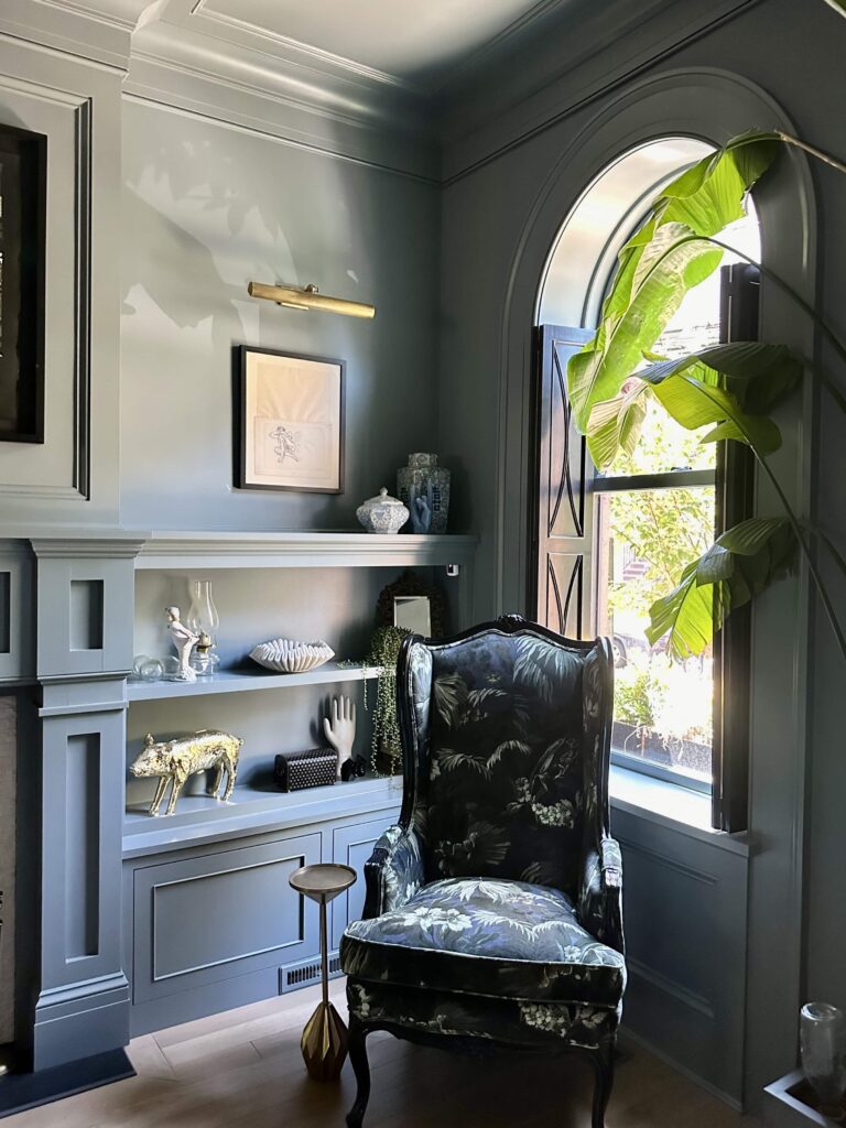
One of my favorite examples of this trend was the Benjamin Moore 2026 Color of the Year, Silhouette. A deep, moody espresso brown with hints of charcoal, this hue is seriously gorgeous. It works great for color-drenching, accent walls and even interior doors.
We had many clients reach out to use this color in their bedrooms. Ultimately, it felt too dark for most people, but in the right space and lighting, it’s beautiful.
Bright Colors
While earth tones are making their comeback, we also see a lot of color in the future. We’ve seen our clients wanting to make their home feel more and more like “them” rather than like a trend. And what better way to do this than with color that feels unique and personal?
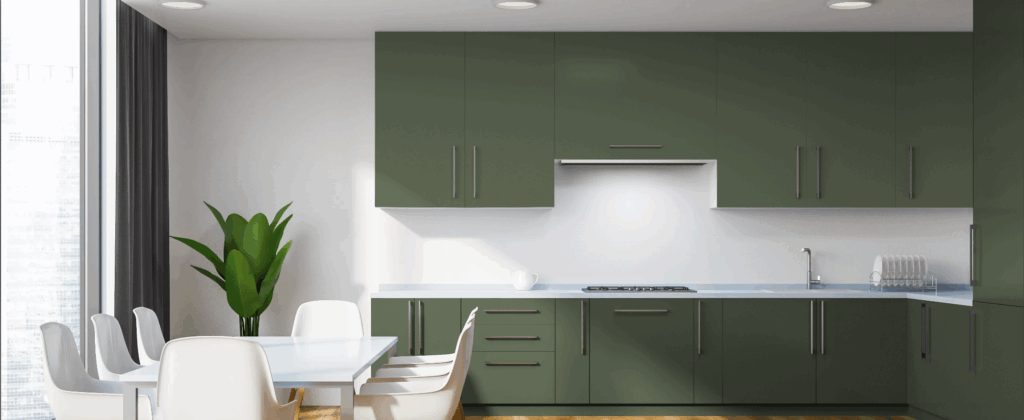
Clients are more frequently telling us their favorite colors, wanting color in common areas like the living room and kitchen, and more open to having colorful accent walls (Article) or entire rooms in shades like yellow, blue, teal, and even pink!
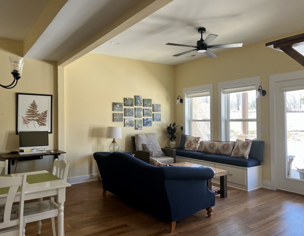
One of our favorite bold colors we’ve used for clients this year is Benjamin Moore Cornsilk (Article), a gorgeous warm yellow that is bright but still classic. It’s a great color if you want something other than a neutral for an open-concept kitchen and living area, such as my client’s space below. I’ve probably mentioned this before, but I have a soft spot for yellow paint on an interior. My grandmother always said that yellow was good luck!
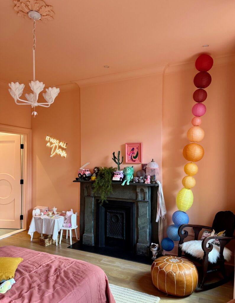
Another client used a bright coral pink with peachy undertones – Pop by Clare Paint – for a color-drenching (Article) project in her daughter’s bedroom. This is such a gorgeous space!
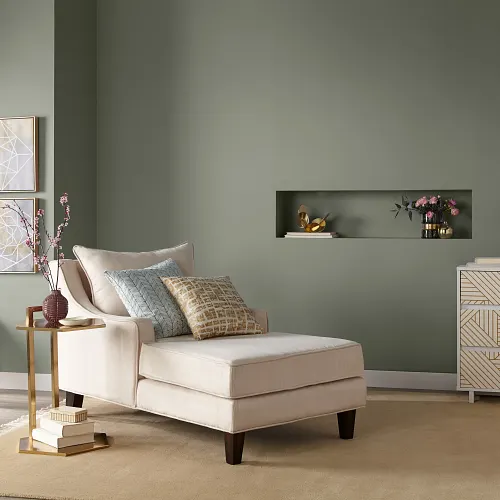
BM Crystal Springs (Article) is another favorite color we’ve had clients use this year. It’s a light, warm hue with green undertones. We especially love this kind of bright hue in a bedroom, such as our client’s room below.
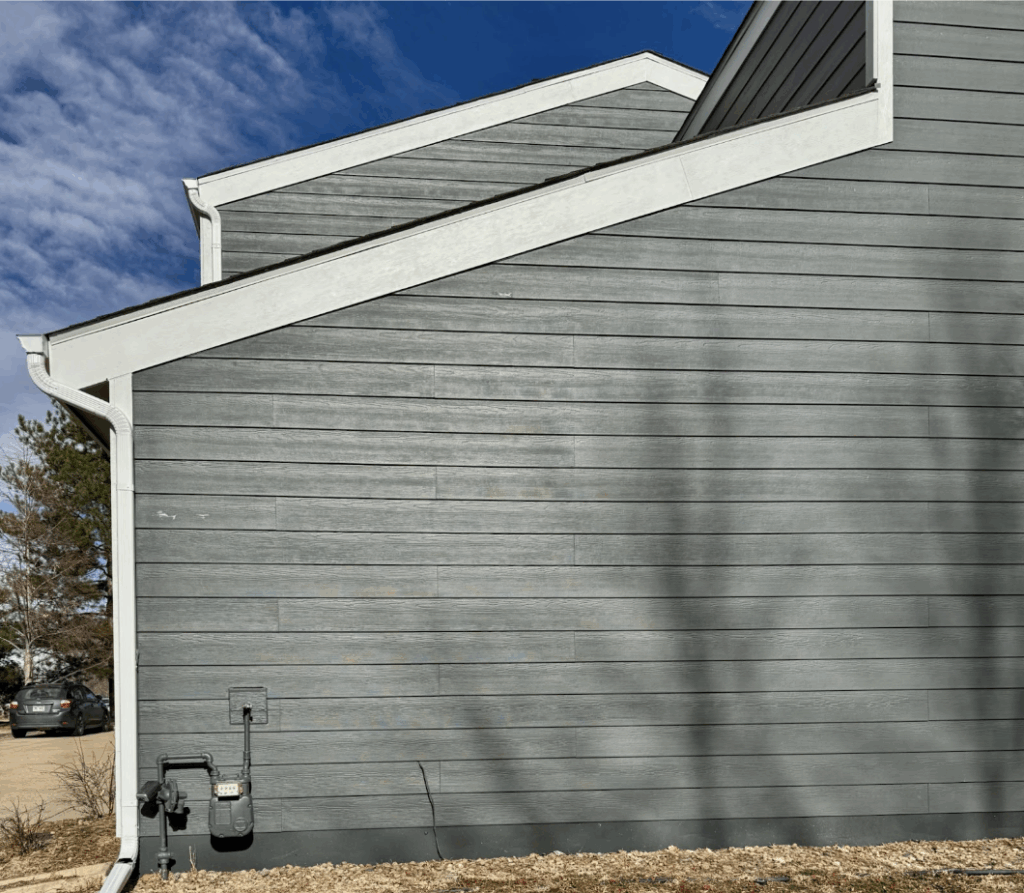
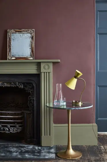
Dark Greens and Blues
We also saw darker blues and greens like Benjamin Moore Hale Navy, Sherwin-Williams Sea Serpent, Sherwin-Williams Needlepoint Navy, Sherwin-Williams Rosemary, and Sherwin-Williams Pewter Green requested more frequently than whites this year. I expect we’ll see this trend continue into 2026 and beyond.
Deep greens and blues are wonderful options for people who want to add more color to their home but want something that will still stand the test of time.
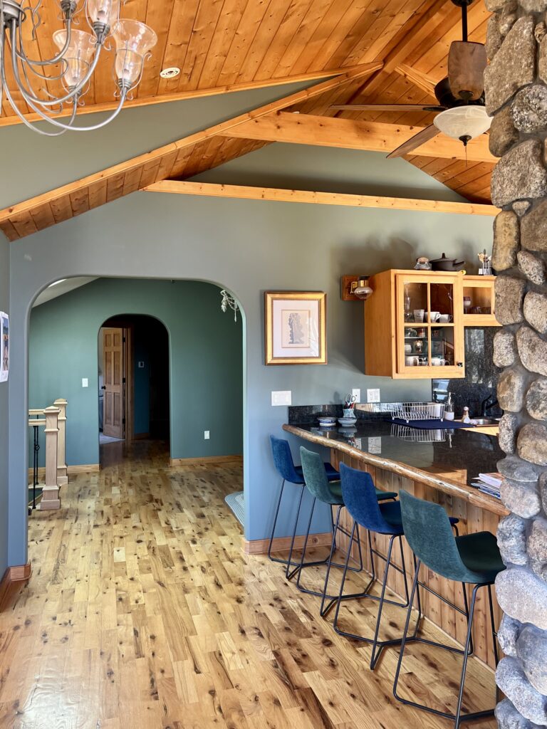
Our color consultant Maddie’s home, for example, is painted with Benjamin Moore Cambridge Green (Article) in almost every room and space. It’s a beautiful, warm hue that is deep and moody in low-light spaces and more colorful in brightly-lit rooms.
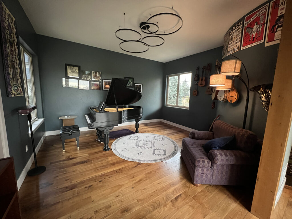
Maddie’s sister worked with us to choose a gorgeous dark blue-green hue called Benjamin Moore Blue Spruce (Article) for a music room in her home. This is another great example of the kind of dark paint colors we expect homeowners will reach for over and over again in 2026.
Neutral Trim & Doors
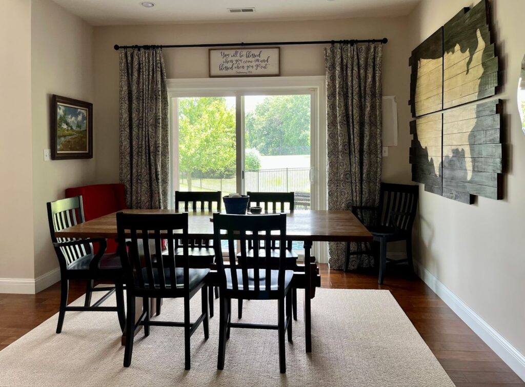
While the majority of homes in the United States have white trim and interior doors, we’ve been seeing more and more homeowners requesting to paint their trim and doors a light neutral or even a darker paint color.
This is something we love to do, with the warning for clients that it’s not necessarily timeless. It’s expensive to paint trim (it can cost as much as the walls), and when you paint your trim a color other than white, it can restrict the type of decor you can use. If you decide to change it back in the future, it can cost a fortune.
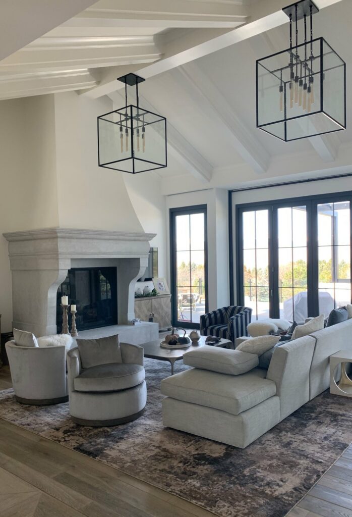
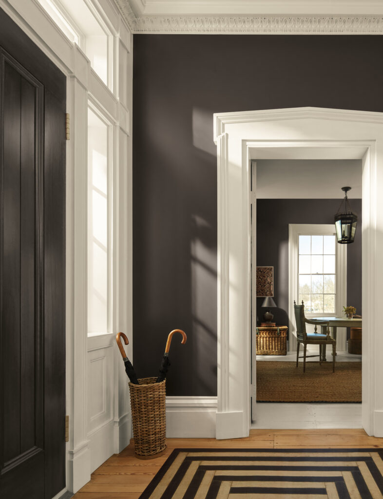
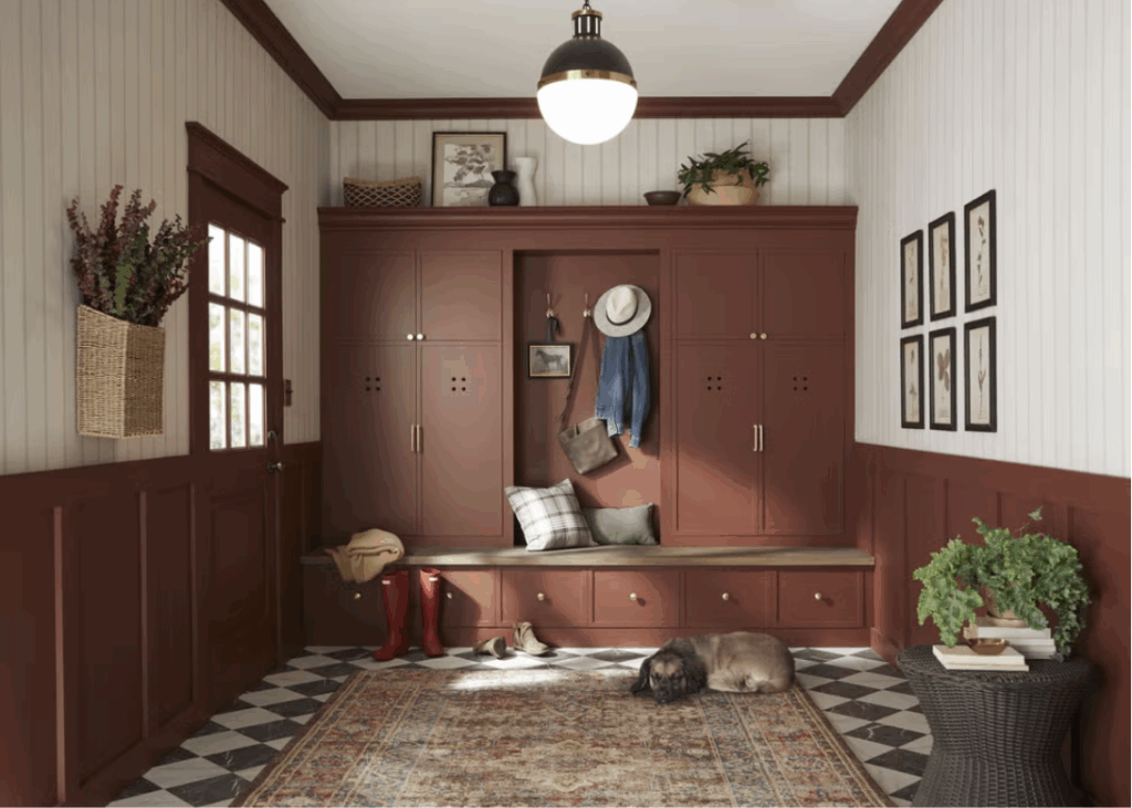
If you are looking for a more neutral color drench, then we recommend using a white or off-white color. The client’s home below, for example, Benjamin Moore Cloud White (Article) walls are paired with Benjamin Moore Wrought Iron (Article) door and window trim in this large living area. The ceilings are a flat sheen, beams and trim are satin sheen, and the walls are eggshell. Although we used the same Cloud White color throughout, we varied the sheen on the surfaces.
Color Drenching
Color drenching was a popular trend in 2025 and it’s not going anywhere in 2026! We usually advise our clients to stick to one room, as a gorgeous accent within their whole-house color palette.
There are so many color-drenching (Article) options you can choose from, but some of our favorites are darker hues perfect for creating cozy, comfortable spaces. The room below, for example, is painted with Farrow & Ball De Nimes, a gorgeous green-gray hue that is perfect for drenching a space.
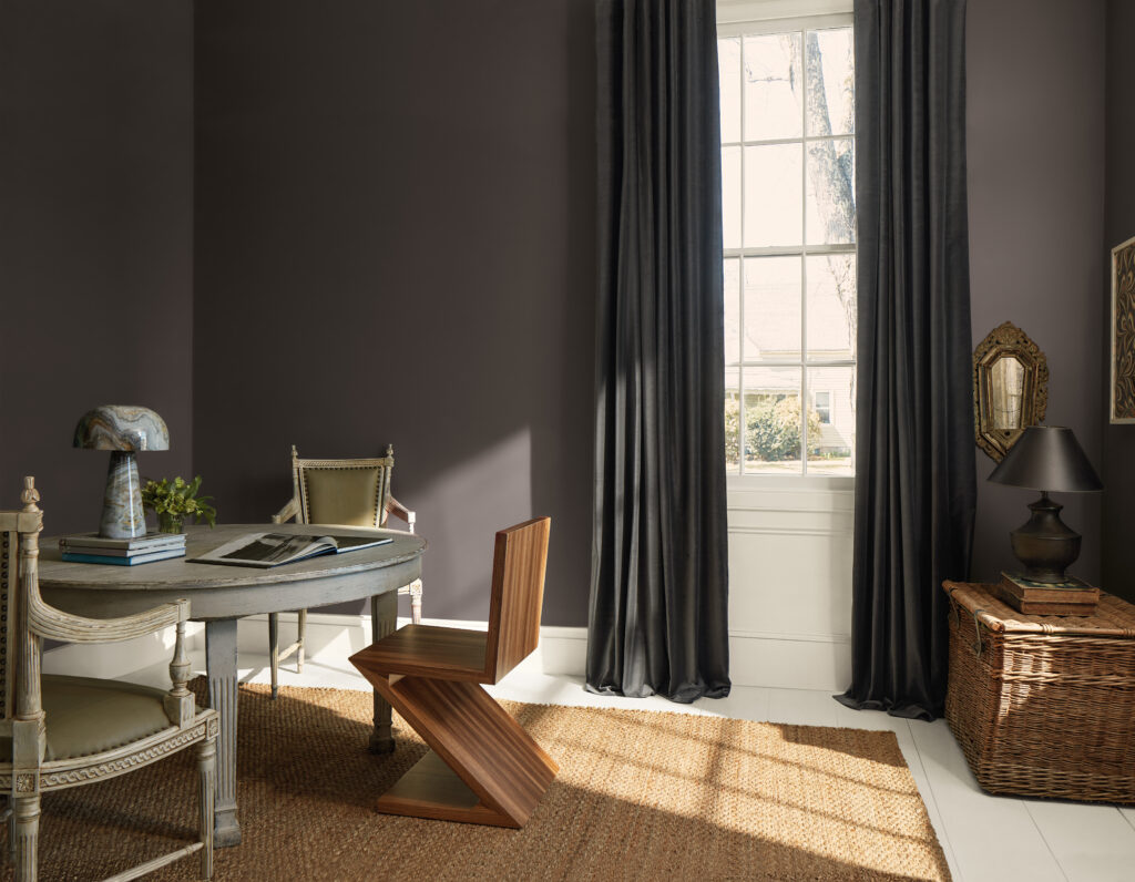
Another client color-drenched their bedroom with Sherwin-Williams Granite Peak (Article), and it’s a great example of the kind of project we’re expecting to see more of in 2026.
Granite Peak is a dark and silky sophisticated blue paint color with very soft green undertones. In the photo below, all walls, ceilings, and trim are painted with Granite Peak, but the color changes naturally as the light hits it in different ways.
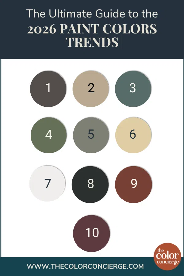
2026 Colors of the Year: Spotting The Trends
One of the best ways to further understand 2026 paint color trends is to review the total palette of all the various paint companies’ “Color of the Year” announcements. As we move through them, you’ll see how well they fit into the trends we’ve identified above.
Benjamin Moore Silhouette
BM Silhouette (Article) is a deep, moody and muted espresso brown. This color really paralleled the fashion trends in late 2025 and early 2026. This exact cool dark chocolate was everywhere. Below, Benjamin Moore paired it with Swiss Coffee, which is a darker, creamy off-white, without much yellow.
Sherwin-Williams Universal Khaki
The Sherwin-Williams Color of the Year, Universal Khaki (Article), is a warm, versatile tan that ties in perfectly with the earthy 2026 paint color trends. It’s more of an accent or complementary color than the star of the show, but really beautiful.
Behr Hidden Gem
Hidden Gem (Article) is a muted, warm green-blue paint color that can act almost as a neutral because it goes well with so many other hues. This would be beautiful as an exterior front door color or a great candidate for color drenching.
Dunn-Edwards Midnight Garden
The Color of the Year from Dunn-Edwards is another deep, muted green paint color that has the same depth, with warmer undertones than Behr Hidden Gem. This one is a bit more colorful and warm, but still a lovely, calming earth tone. It’s perfect for the warm, organic trends we’re seeing in 2026.
Valspar Warm Eucalyptus
Valspar Warm Eucalyptus is another organic green that supports the fact that we’re entering a warm, earthy era of paint colors. This is a lighter and more muted version of the other green colors of the year and gives a space a lovely, spa-like feel.
C2 Paint Epernay
This hue is a warm, sophisticated beige with yellow undertones. It’s lighter and warmer than SW Universal Khaki, but definitely following the same earthy paint color trend.
Pantone Cloud Dancer
Pantone Cloud Dancer is a light, warm neutral from Pantone’s broader color trend forecast. Pantone may have captured the Warm Minimalism trend better than anyone else in 2026. Light and airy and warm is where we see everything going and this hue is perfect for that look.
James Hardie Iron Gray
I had the pleasure of seeing this color in person a couple of weeks ago, and the photos don’t do it justice. Iron Gray is a very dark, bluish green and it’s gorgeous. The photo below is not one of our projects, but a photo that I took of an exterior. Iron Gray is the color on the right.
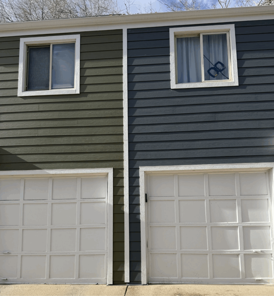
Here is what Iron Gray looks like in the Colorado Sunshine. For sure, it is another deep organic green.
Glidden Warm Mahogany
Warm Mahogany was one of my favorite Colors of the Year for 2026. This was another rusty, brown color we saw in popular fashion trends this fall and winter. This would be gorgeous on cabinets and a great primary bedroom color, but not a whole-house hue.
Little Greene “Adventurer”
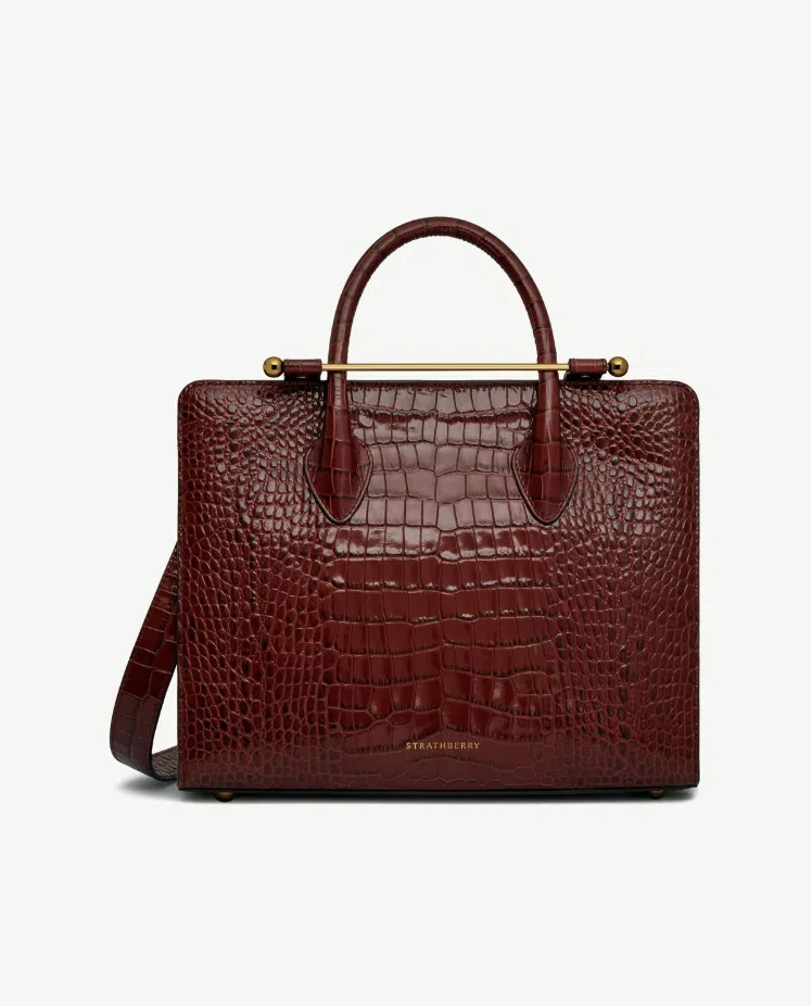
Adventurer from Little Greene is the burgundy paint color that I’ve been wanting to paint my lower cabinets.
It’s a gorgeous hue that is the same color as my favorite “oxblood” purse from Strathberry. Once again, this fits the warm, earthy paint color trends we’re seeing for 2026.
Sample all the 2026 Colors of the Year
- Benjamin Moore Silhouette
- Sherwin-Williams Universal Khaki
- Behr Hidden Gem
- Dunn-Edwards Midnight Garden
- Valspar Warm Eucalyptus
- C2 Paint Epernay
- Pantone Cloud Dancer
- James Hardie Iron Gray
- Glidden Warm Mahogany
- Little Greene Adventurer
Key Learning Points
Looking to update paint colors in your home in 2026? Exploring the latest paint color trends can help you find the hues that are right for your project.
- Warm Minimalism is a good way to describe the overarching color trends we’re seeing as paint color consultants: light, earthy and airy.
- Color drenching remains a popular trend and can be a beautiful way to add an accent room to your home.
- Warm, earthy greens and dark warm blues are continuing to grow in popularity in 2026, both for accent walls, whole rooms and even whole-house color schemes.
No matter what, don’t forget to test your paint colors. Check out the SAMPLIZE website.
NEVER, EVER use paint matches from a different brand than the one specified. Results are poor, and there are no standards for the sheens. Even though your painter may truly believe it can be done, don’t do it. See results from paint matching (Article).
Online Color Consulting
Still looking for the best white paint color? Discover our Online Color Consulting Package.

Related Posts:
- Best Warm Beige Paint Colors
- Benjamin Moore 2026 Color of the Year
- Sherwin-Williams 2026 Color of the Year
- Behr 2026 Color of the Year
About the Author

Hi, I’m Michelle Marceny, founder, owner, and Principal Color Designer at The Color Concierge. I believe a fresh coat of paint can completely transform a space. The Color Concierge was born out of my drive to help clients fall back in love with their homes. My clients trust me to help them find the perfect paint color for their home – whether it’s a whole-house paint color scheme or ideas for a single room.
Since The Color Concierge was founded in 2017, we have completed over 3000 color consultations, both online and in-person. I am a Certified Color Expert with 7 years of experience creating interior and exterior color palettes throughout North America.
We love your comments! Please note that the blog is meant as general advice, and it is not possible to give specific answers to your paint questions. If you want more specific advice, please consider purchasing a color consultation. Thank you for your understanding.

2 Responses
Great article. I color drenched my entire home SW Natural Choice. It’s a fabulous color, similar to SW Natural Linen but without the peachy undertone. I see SW Natural Choice as a canvas or foundational color in my semi open floor plan. I have identified paint colors from my whole house color palette to paint the primary bedroom and dining room. I wonder why more people don’t use SW Natural Choice especially with the fact trends are warming up. It’s a great off white color without a bossy undertone.
We just painted some of our open floor plan White Duck, and it works great with our existing darker, unknown warm trim!