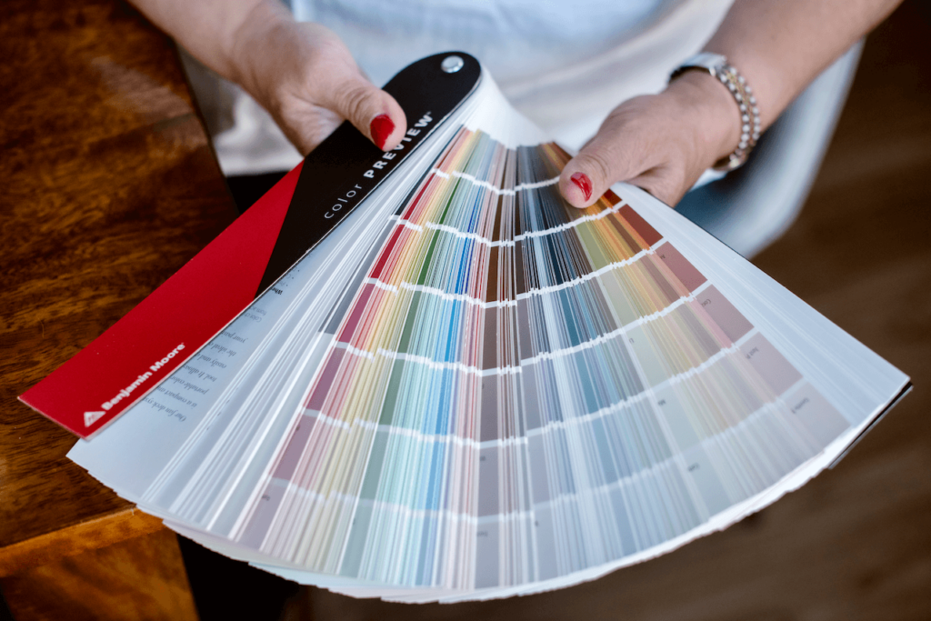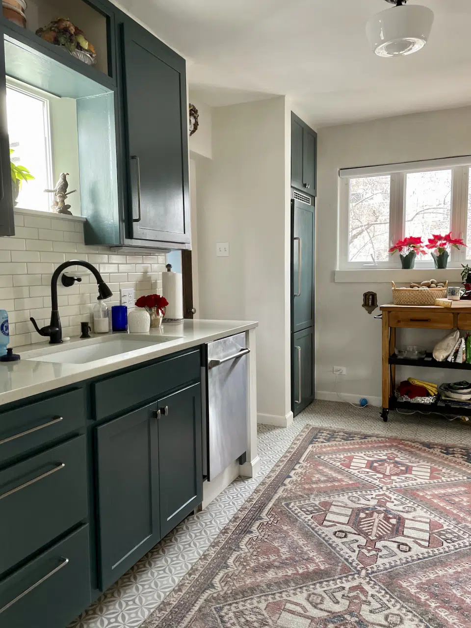
Sherwin-Williams Pearly White Color Review
Sherwin-Williams Pearly White is a light complex cream that looks great in darker rooms with contrasting white trim.

Sherwin-Williams Pearly White is a light complex cream that looks great in darker rooms with contrasting white trim.
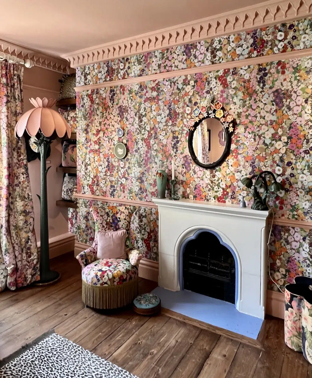
Feeling inspired by House of Hackney wallpaper? Explore our favorite picks for wallpaper and paint pairings.
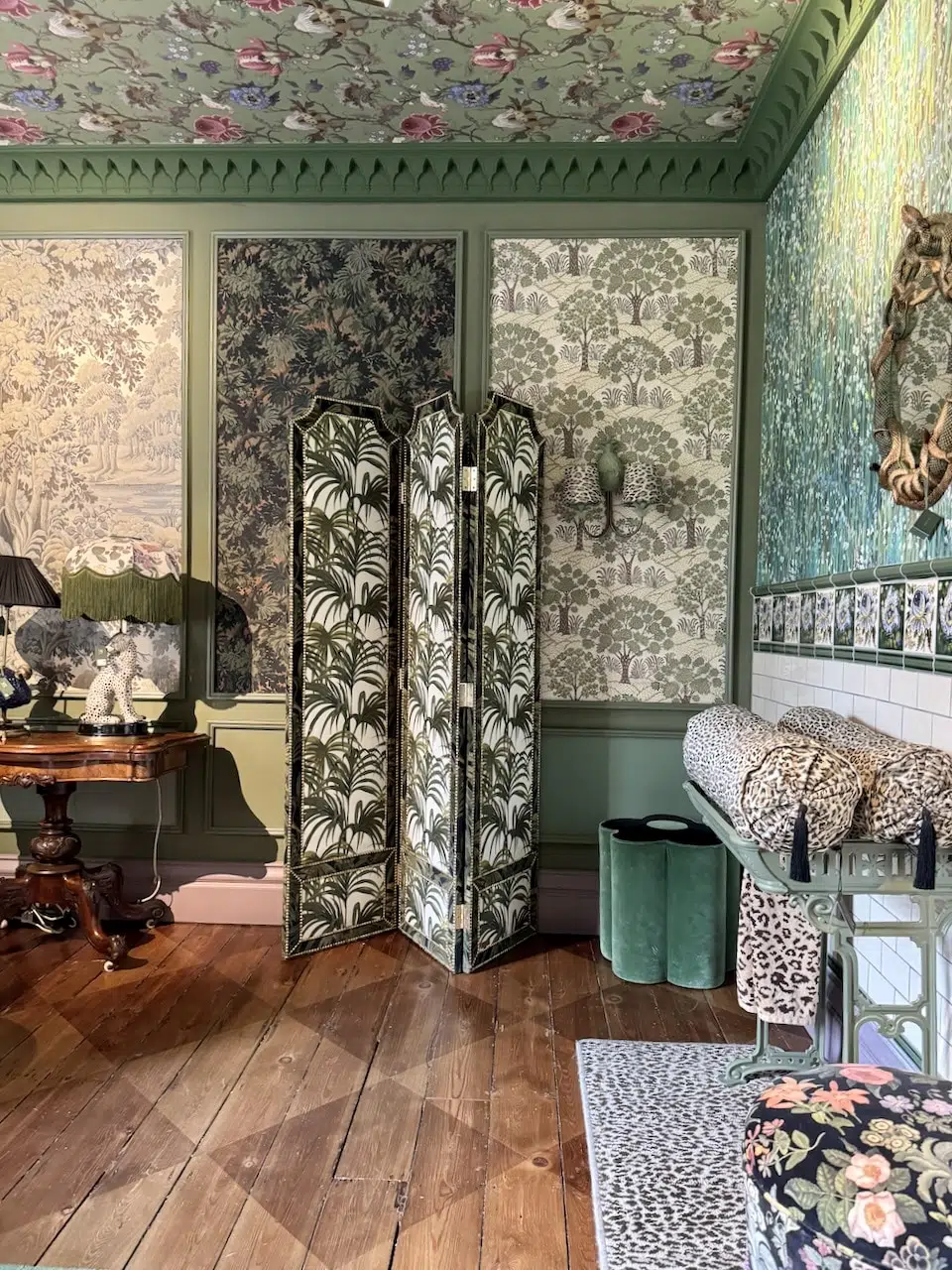
The Color Concierge recently explored the House of Hackney London flagship store. Read more about our visit & explore their gorgeous designs.

Looking for the perfect dark blue exterior color scheme? Explore this Benjamin Moore Westcott Navy exterior color palette.