Learn all about Sherwin-Williams Iron Ore exterior paint in this project spotlight from The Color Concierge, and see this gorgeous color in action in a real client’s Iron Ore exterior color palette.
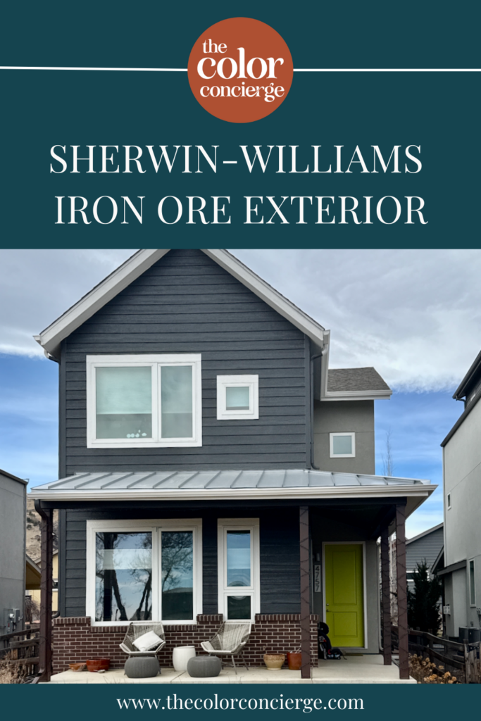
Sherwin-Williams Iron Ore (Article) is a muted black paint color that I absolutely love to use for exterior projects. And the home we’re featuring in today’s post is a true showstopper!
This Colorado home is the perfect example of how a few simple tweaks can make all the difference when it comes to creating the perfect exterior color palette.
Keep reading to learn more about using Iron Ore exterior paint and see the exact color palette we used to bring our client’s home to life.
*This post contains affiliate links for products I use and love. If you click on some links and make a purchase, I will get a small commission at no cost to you. This helps pay for the costs of the blog, so I can continue to offer great content to our readers.
About The Color Concierge
Our Colorado-based paint color consultants make finding the right paint colors for your home easy. Whether you’re painting the exterior or interior of your home, our simple yet effective process lets us get your paint color right the first time. We’ve helped thousands of homeowners transform their homes into a space they love. Learn more about ONLINE COLOR CONSULTATIONS today.
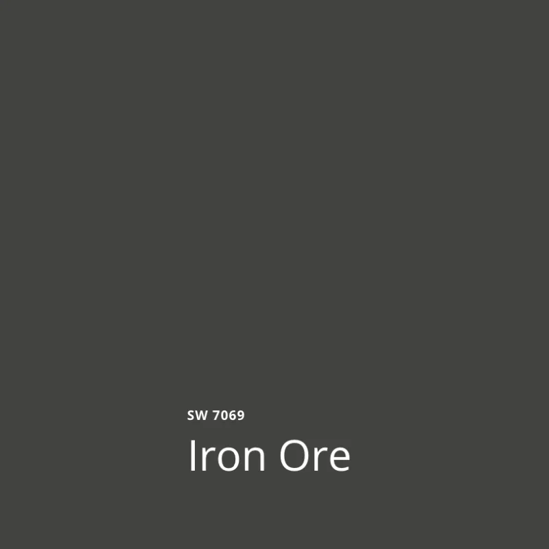
What Color is Sherwin-Williams Iron Ore?
Sherwin-Williams Iron Ore (Sample) is a soft black paint color. It’s dark, but muted, so it doesn’t look too harsh or overwhelming. It’s a wonderful complement to red brick and warm or cool stone.
What is the SW Iron Ore LRV?
The LRV of Iron Ore is 6, which makes it a soft black or a very dark charcoal. Outdoors, it looks more like a charcoal because of the bright sunlight.
LRV (Light Reflectance Value) is a measurement used to identify how light or dark a color is. The scale goes from 1 (pure black) to 100 (pure white) and indicates how dark or light a color is.
What are SW Iron Ore undertones?
SW Iron Ore has subtle green undertones. Indoors, the undertones are practically invisible. But outdoors – especially in very bright, high-altitude locations like the home we’re featuring today – the undertones can be much more obvious.
Is Iron Ore paint warm or cool?
Iron Ore is a warm black paint color thanks to its green undertones. This keeps the color looking cozy and inviting, even though it is very dark.
Is Iron Ore a good exterior paint color?
Yes, it is, but it’s not for everyone. Iron Ore will still look very dark, even in the sun. If that’s not the look you’re going for, or all of the surrounding homes in your neighborhood are very light, then it may feel too harsh. If you’re specifically looking for a dark exterior paint color (Article), however, it’s a gorgeous option.
Sample Sherwin-Williams Iron Ore Paint
We always recommend that you test paint colors (Article) in your home because lighting can completely change a color, both on interiors and exteriors.
In the old days, this meant we painted a large poster board with sample pots and a huge mess.
Now we have a better way to test paint, with Samplize Peel-and-Stick samples!
- Samples pre-painted with 2 coats of real paint from the manufacturer.
- Large 9” x 14” samples to see the color better in the lighting.
- Delivered overnight
- Colors are accurate
- Less expensive than painting a large poster board with sample pots
- No mess, and no toxic paint to dispose of
I use these in my color consulting practice for exact results. Discover Samplize peel-and-stick paint samples and Sherwin-Williams Iron Ore via the link below.
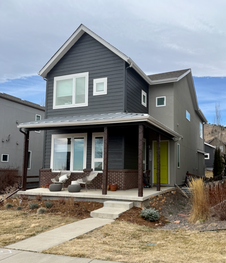
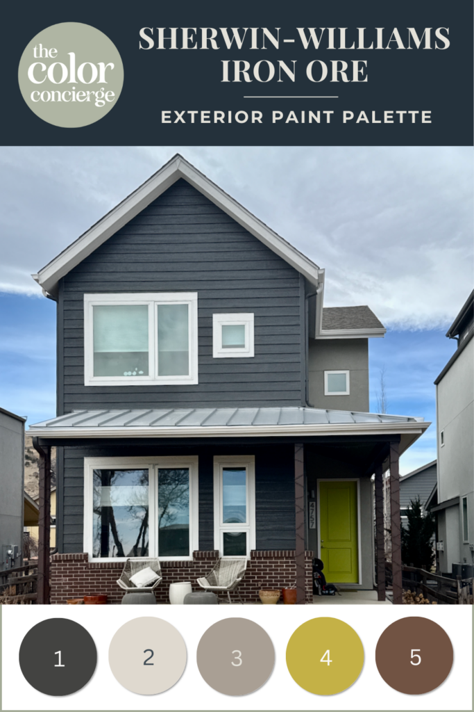
Project Spotlight: Sherwin-Williams Iron Ore Exterior Color Palette
The client’s home we’re featuring today is a gorgeous Colorado new build in a suburban neighborhood that borders a gorgeous mountain range. The dark color palette we chose for this home perfectly sets it apart from the beautiful scenery without taking away from the view.
What made this project unique is that this home already featured a dark color palette (Article). We’re often hired when a homeowner wants to completely transform their home, but this project was the perfect example of how a few simple tweaks can actually do just that.
Here is what the home looked like before:
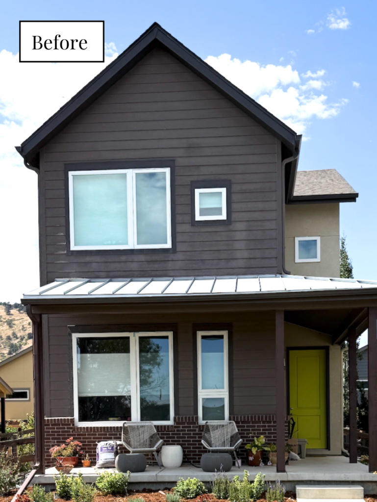
You can see the foundation of the palette is essentially the same: dark siding, mid-tone stucco and green front door. But the original looked very dark and gloomy and did nothing to show off the various architectural features of this house.
The builder painted the roofline and window trim with a dark trim color. Combined with the deep brown siding, the whole home felt very heavy and thick.
The gorgeous red brick accent along the bottom of the house is almost not even noticeable because there’s not enough contrast with the siding. The homeowner actually thought she wanted to paint the brick when we first started this project, but we were able to show how providing the right contrast made the brick beautiful.
The home’s white vinyl windows also stood out too much compared to the dark window trim of the original palette, which made them look out of place. And the columns along the front porch just blended into the siding and did nothing to provide contrast at the front of the house.
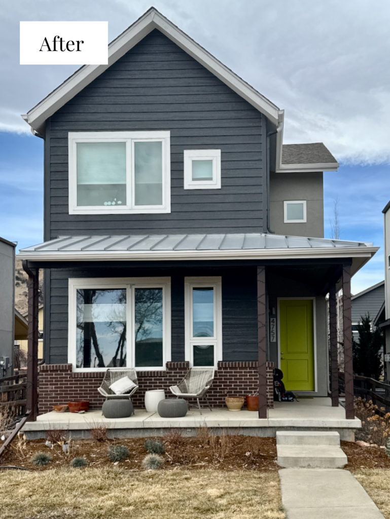
You can see in the image below that the updated palette we created kept the overall look of the home the same, but provided a much more balanced look and truly brought this home to life.

Here’s a glimpse at the before-and-after palettes side by side:
Let’s dig into the small changes that made this updated palette so much more balanced:
Sherwin-Williams Iron Ore Siding
SW Iron Ore was truly the perfect color for this home. Its warm green undertones provided more contrast with the home’s red brick and really helped this element stand out within the palette.
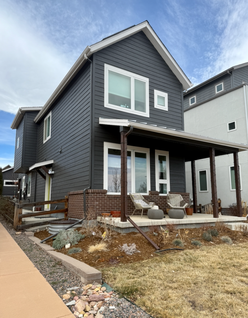
Iron Ore also offers a really good mix of being deep and dark but still muted and soft, so it didn’t look too harsh with the home’s white windows. We considered other black paint colors, such as SW Tricorn Black, SW Black Magic and SW Black Fox, but none of them provided the same contrast with the brick and other elements. Iron Ore was the perfect hue for this home!
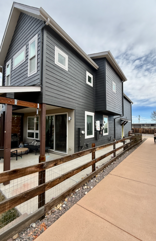
We also used Iron Ore on most of the home’s gutters and downspouts. The photo below is a good example of one of our favorite tricks to hide these elements, which most homeowners don’t want to highlight.
The downspouts were painted with SW Iron Ore where they ran along the siding and painted with the palette’s white exterior trim in the places where they ran along the fascia. This makes them recede into the palette.
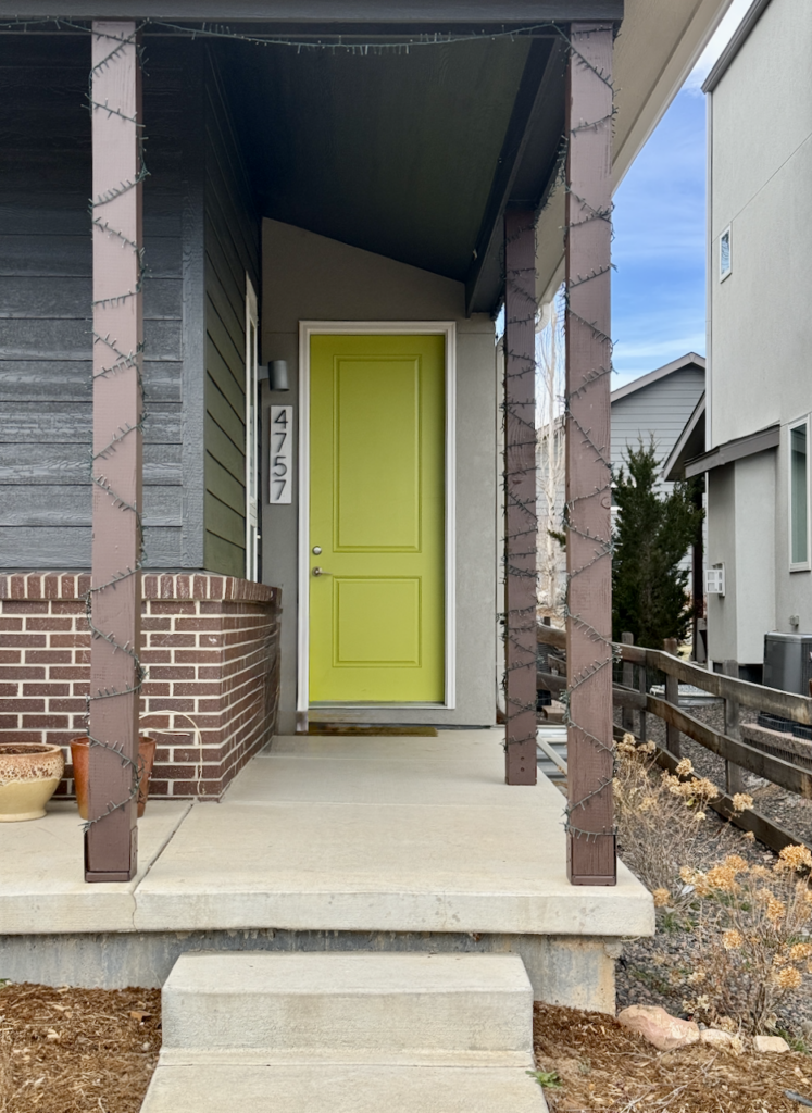
Sherwin-Williams Egret White Exterior Trim
One of the biggest changes we made to this home’s palette was adding more exterior white trim (Article) to balance out the windows. Sherwin-Williams Egret White (Article) is a warm, creamy off-white paint color that looks white outdoors but isn’t too stark next to the dark siding.
We used Egret White along the roofline, on the fascia and soffits, which helped the top of the house feel less heavy.
We also used Egret White (Sample) trim around the windows. In the original palette, dark window trim made the white vinyl windows look too stark. By adding Egret White trim instead, it created a transition from the very bright white windows to a darker, warm white and then the dark siding. It ends up making the white vinyl windows look more intentional and less builder-grade.
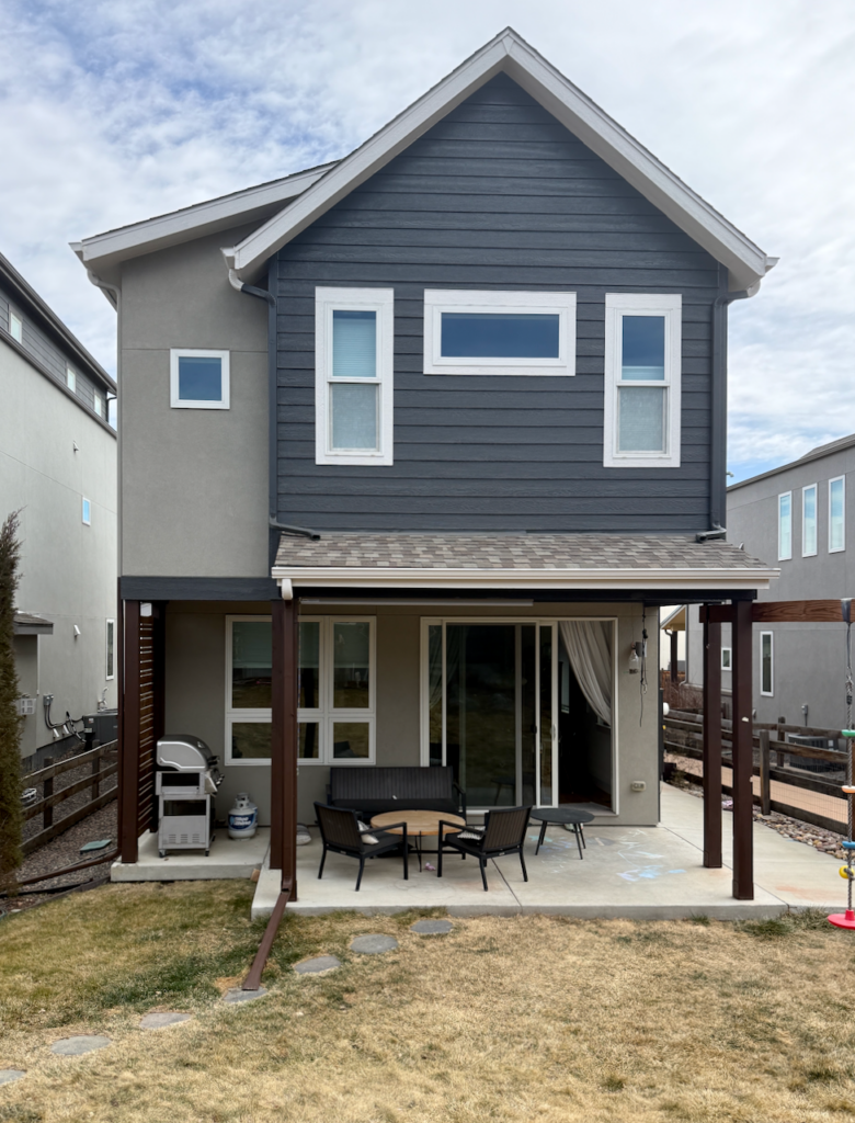
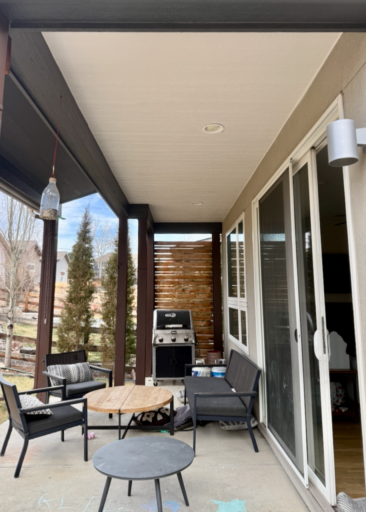
We also used Sherwin-Williams Egret White for the front porch ceiling (Article) and back porch ceiling. I really like to paint a front porch ceiling with the lightest color in the palette because it makes everything brighter and more cheerful.
The colors of the porch reflect back into the house. By painting the porch ceiling white, we ensure the interior stays as bright as possible with natural light.
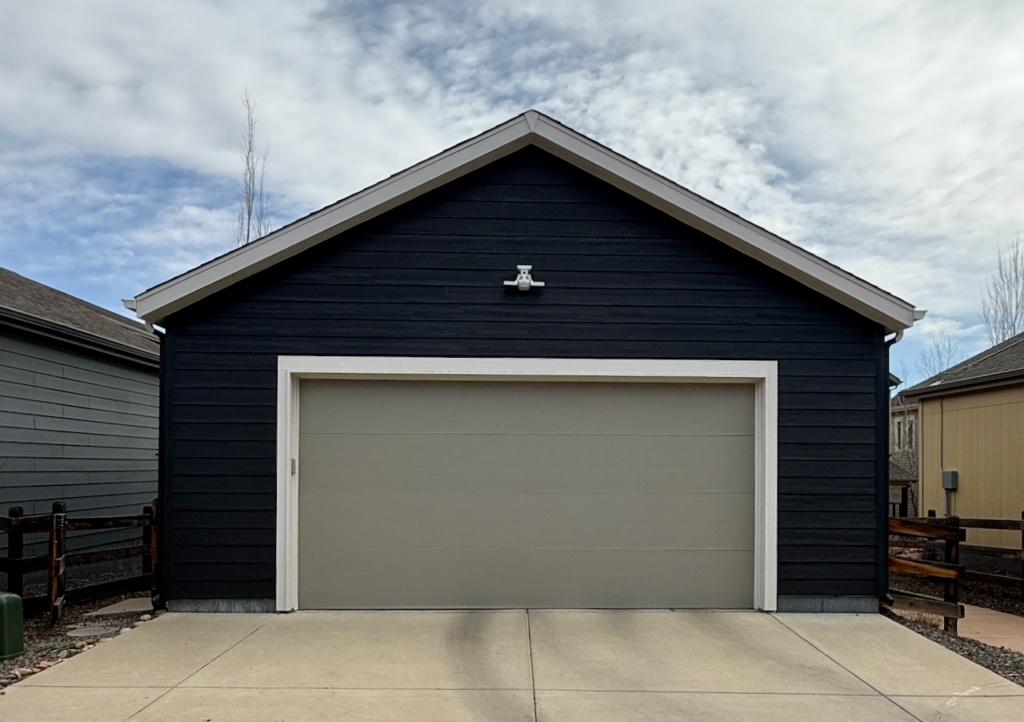
Sherwin-Williams Intellectual Gray Stucco
We kept the home’s stucco a mid-tone gray, but opted for Sherwin-Williams Intellectual Gray (Article) because its green undertones tied together perfectly with the Iron Ore siding and red brick.
Intellectual Gray (Sample) is just beautiful. We’ve used this color on many exterior color palettes before. In this palette, we also used this color for the garage door. The garage door opens into the alley behind the home and the Intellectual Gray door paired with Iron Ore siding provided a really lovely depth to this space.
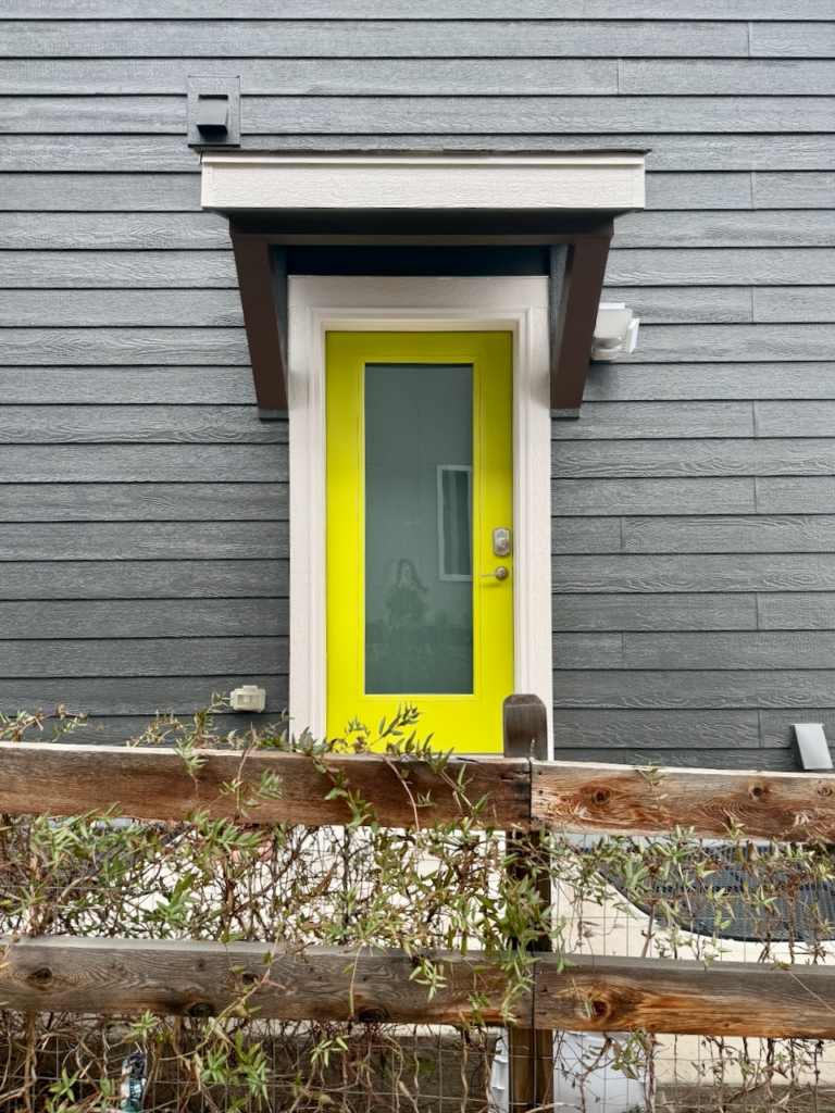
Sherwin-Williams Hep Green Exterior Doors
For the home’s front door paint color (Article), we wanted to stick to something very close to the original palette. The bright green door was one of the homeowner’s favorite parts of the home, so we chose Sherwin-Williams Hep Green (Sample).
This vibrant pop of color brought the otherwise neutral palette to life! We also used Hep Green on the side exterior door, which really brought out the green undertones in the Iron Ore siding.
Sherwin-Williams Brevity Brown Columns
The last change we made to this exterior palette was the home’s front columns. In the original palette, they completely blended into the house (and not in a good way). We painted them with a solid stain in Sherwin-Williams Brevity Brown (Sample), and it made such a difference.
This change created way more contrast and dimension with the Iron Ore exterior and made the whole front of the home feel warmer and more inviting.

Sample This Color Palette
- Sherwin-Williams Iron Ore: Siding
- Sherwin-Williams Egret White: Roofline (fascia, gutters, soffits), window trim, door trim, garage door trim, front porch ceiling, front porch soffits
- Sherwin-Williams Intellectual Gray: Stucco, garage door
- Sherwin-Williams Hep Green: Front door, exterior side door
- Sherwin-Williams Brevity Brown: Solid Stain: Posts, porch beam, side corbels, fence
Key Learning Points
Sherwin-Williams Iron Ore is a moody, muted black paint color perfect for exterior color palettes. Outside, it looks more like a deep charcoal gray with strong green undertones.
- Iron Ore looks gorgeous paired with contrasting colors, such as the warm red brick accent on this home.
- Pair Iron Ore’s warm green undertones with other warm paint colors, such as SW Egret White, SW Intellectual Gray and warm wood accents.
- Sherwin-Williams Iron Ore can look very different in sunny outdoor applications than for interiors or on the swatch, so be sure to test carefully and review how the color looks in all lighting on your property.
Remember: NEVER, EVER use paint matches from a different brand than the one specified. Results are poor and there are no standards for the sheens. Even though your painter may truly believe it can be done, don’t do it. See results from paint matching here.
No matter what, always test your paint colors. It’s a standard best practice. Whenever I test my paint colors, they are perfect, and when I don’t test they turn out wrong. Learn how to test your paint colors here.
Online Color Consulting
Still need help picking the best paint colors? Discover our Online Color Consulting Package.

Related Posts:
- Sherwin-Williams Iron Ore Color Review
- Best Sherwin-Williams Exterior Color Palettes
- Sherwin-Williams Peppercorn Exterior Spotlight
- Best Dark Exterior Paint Colors
About the Author

Hi, I’m Michelle Marceny, founder, owner, and Principal Color Designer at The Color Concierge. I believe a fresh coat of paint can completely transform a space. The Color Concierge was born out of my drive to help clients fall back in love with their homes. My clients trust me to help them find the perfect paint color for their home – whether it’s a whole-house paint color scheme or ideas for a single room.
Since The Color Concierge was founded in 2017, we have completed over 3000 color consultations, both online and in-person. I am a Certified Color Expert with 7 years of experience creating interior and exterior color palettes throughout North America.
We love your comments! Please note that the blog is meant as general advice, and it is not possible to give out specific answers to your paint questions. If you want more specific advice, please consider purchasing a color consultation. Thank you for your understanding.
