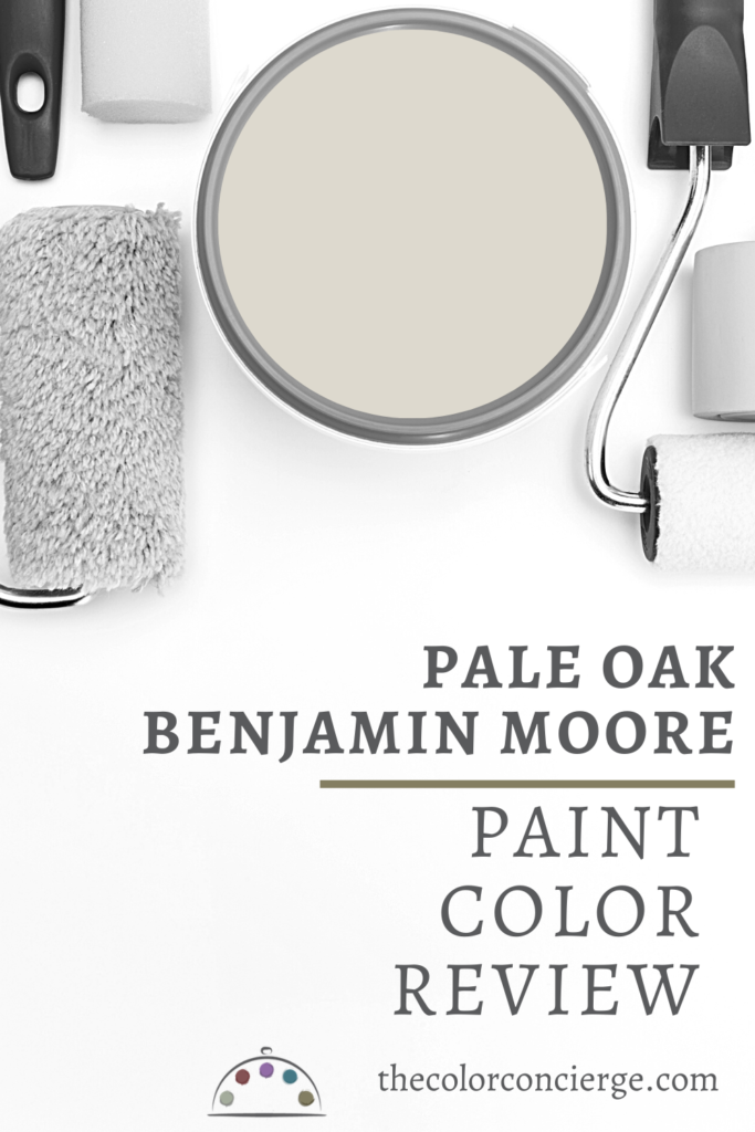
Learn all about Benjamin Moore Pale Oak in this color review (Sample Here). This light greige color is soft and lovely. It is a versatile neutral that looks great in a bright or dark room. Soft taupe undertones let it pair well with just about any type of light.
Why Is Pale Oak So Popular?
I love Pale Oak paint and I’m definitely not alone! It is truly one of the best neutral paint colors for interiors.
Pale Oak is really nice with warm wood furniture and floors, and a great way to brighten a home that was previously painted with dark Tuscan colors. So much of the tile installed during that era has taupe undertones, and Pale Oak can pair perfectly with those colors. I also like Pale Oak for rooms that have lots of foliage outside – the warm taupe tones neutralize the green colors that can reflect through the windows.
Because of its high LRV, some consider this color a darker white, but I see it as a very light greige. This greige paint color definitely leans toward the warm. It looks great in challenging North-facing light conditions. Pale Oak is warm and friendly. Although I don’t have it in my home, I really like it and I recommend Pale Oak frequently to friends and family!
All the photos in this post are Color Concierge projects. None of the photos are color edited.

What Color Is Pale Oak?
Pale Oak is a warm and friendly neutral that can be somewhat hard to classify. It is warm, but muted. To really understand Pale Oak, we need to explore its LRV and undertones.
Is Benjamin Moore Pale Oak a greige?
Because of its high LRV, some consider this color a darker white, but I see it as a very light greige that can read like a cream without yellow undertones. This greige paint color definitely leans toward the warm. It looks great in challenging North-facing light conditions.
What is the LRV of Pale Oak?
The LRV of Pale Oak is 69. LRV (or Light Reflectance Value) is a measure of how light or dark a paint color is compared to pure black (LRV-0) and pure white (LRV-100).
Darker versions of the same color would be BM Elmira White (LRV-64) or BM Cedar Key (LRV-61).
What are the Pale Oak undertones?
While Pale Oak is a greige paint color, it has taupe undertones. It’s these undertones that keep the color warm and leaning more toward a beige than a gray.
What is the easiest way to sample Pale Oak?
We always recommend that you test paint colors on your home because lighting can change a color completely, both with interiors as well as exteriors.
In the old days, this meant we painted a large poster board with sample pots and a huge mess.
Now we have a better way to test paint, with Samplize Peel-and-Stick samples!
- Samples pre-painted with 2 coats of real paint from the manufacturer.
- Large 9” x 14” samples to see the color better in the lighting.
- Delivered overnight
- Colors are accurate
- Less expensive than painting a large poster board with sample pots
- No mess, and no toxic paint to dispose of
I use these in my color consulting practice for exact results. Discover Samplize peel-and-stick paint samples and click the button below to sample Pale Oak (Sample).
Using Benjamin Moore Pale Oak Paint
I love to use Pale Oak in homes with north-facing light, warm wood finishes, or crisp whites and matching stone or quartz countertops.
It also can look fabulous in houses with very earthy Tuscan tile and granite countertops with taupe undertones. It also looks fabulous with bright South-facing light.
Can I use Pale Oak as an Interior “White” Trim Color?
Pale Oak is usually too dark to use as a “white” trim color, although there are exceptions. It could work as a trim color for a very dark wall color, or if you want to try darker trim with white walls.
Is Pale Oak a good whole-house paint color?
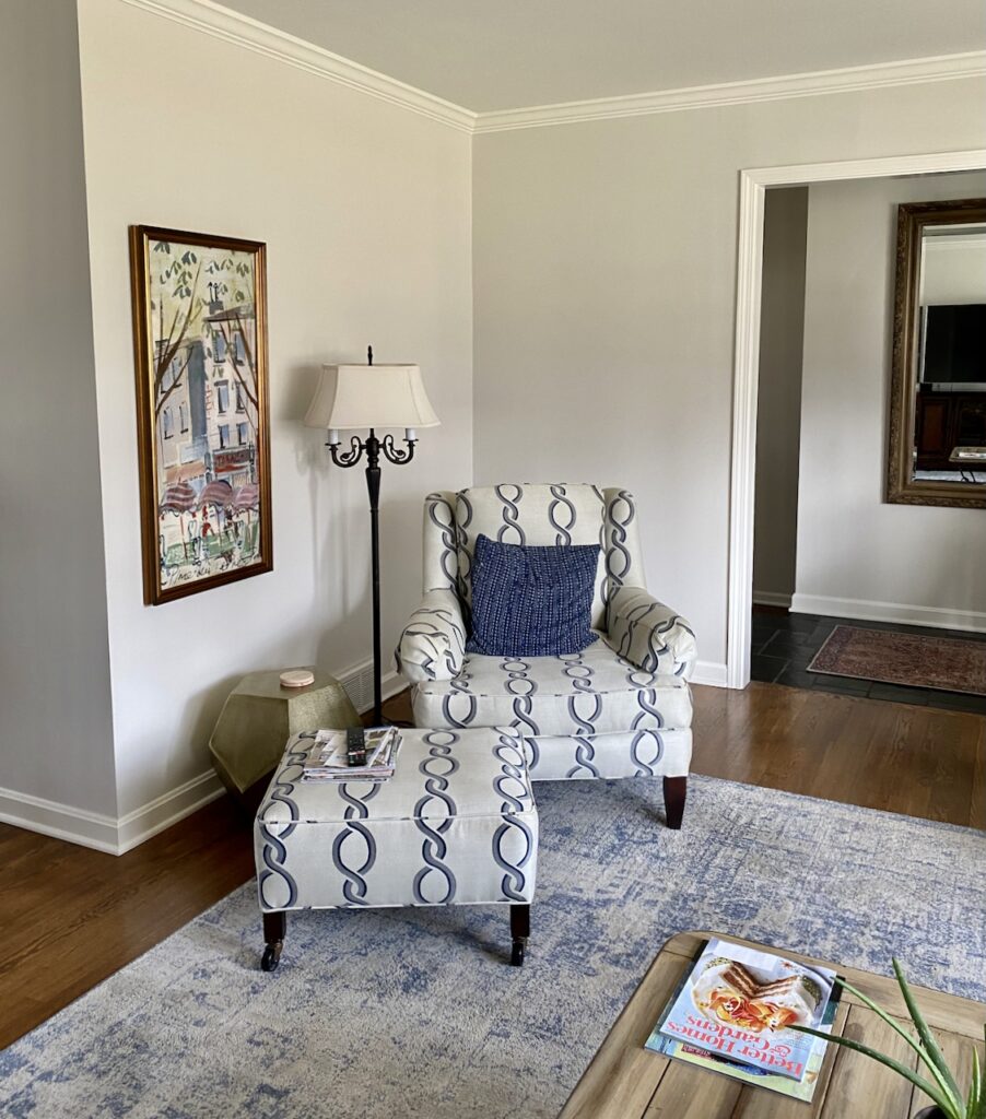
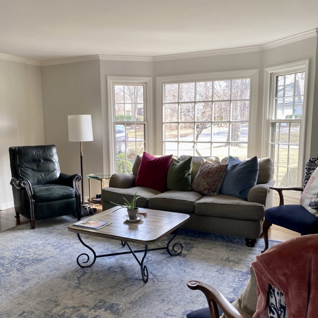
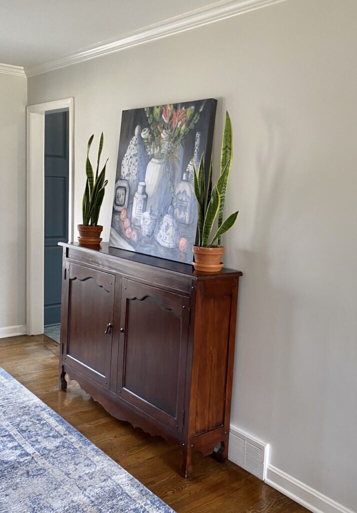
Yes, it’s a wonderful neutral to use throughout a variety of spaces in a home. The house featured throughout today’s post was one of our online consults, and it turned out beautifully! We paired BM Pale Oak interior paint with BM White Dove trim and ceilings because she had really earthy tile on her kitchen floor.
Is a Pale Oak bedroom a good idea?
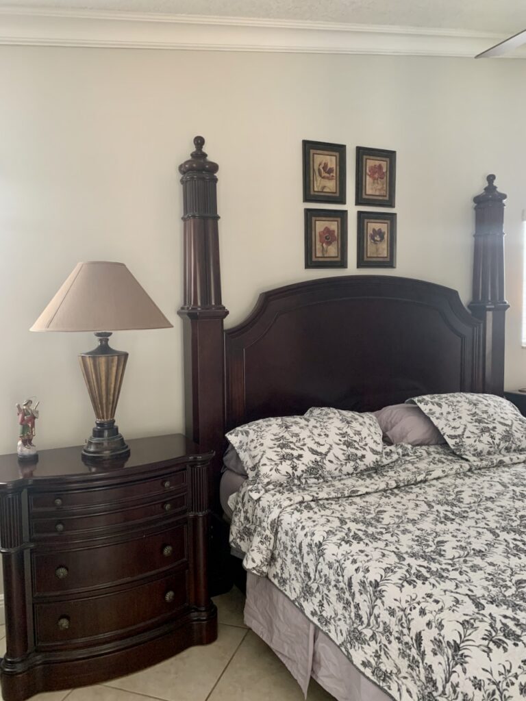
Yes, Pale Oak is a perfect calming bedroom paint color. It’s a great option if you want a neutral hue that will pair with colorful decor. The bedroom below had RED Tuscan walls before we painted it. Pale Oak is soft, harmonious, and lovely here!

Can I try Pale Oak cabinets?
Yes! You can use Pale Oak for cabinets, especially if your countertops or backsplash have matching taupe undertones. This neutral can look great with earthy granite countertops, where it looks like a soft white without the harshness of a brighter white cabinet paint color.
Can I use Pale Oak Exterior Paint?
Pale Oak is a great neutral color for exterior white trim, especially with darker colors. It will look like a soft white without harshness. It also makes a great whole-house white paint color, especially in a heavily wooded lot, where the warm Taupe undertones will neutralize the green tones from foliage.
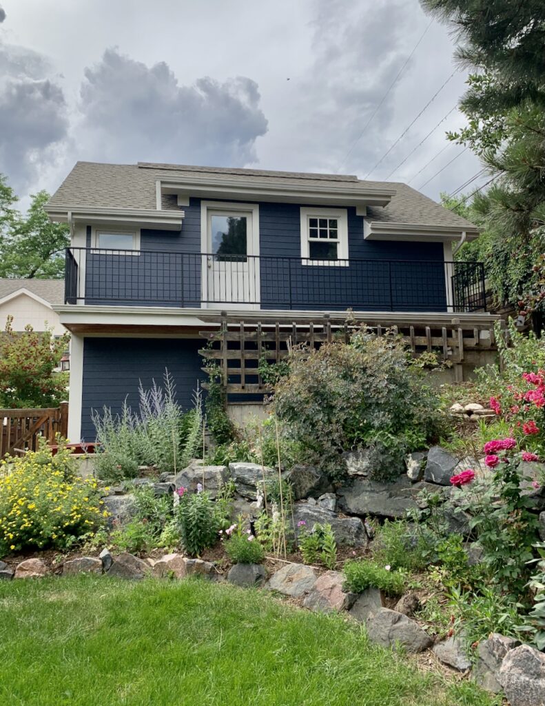
The client home below features dark siding painted with Benjamin Moore Hale Navy, a warm exterior blue paint color, and trim painted with BM Pale Oak exterior paint.
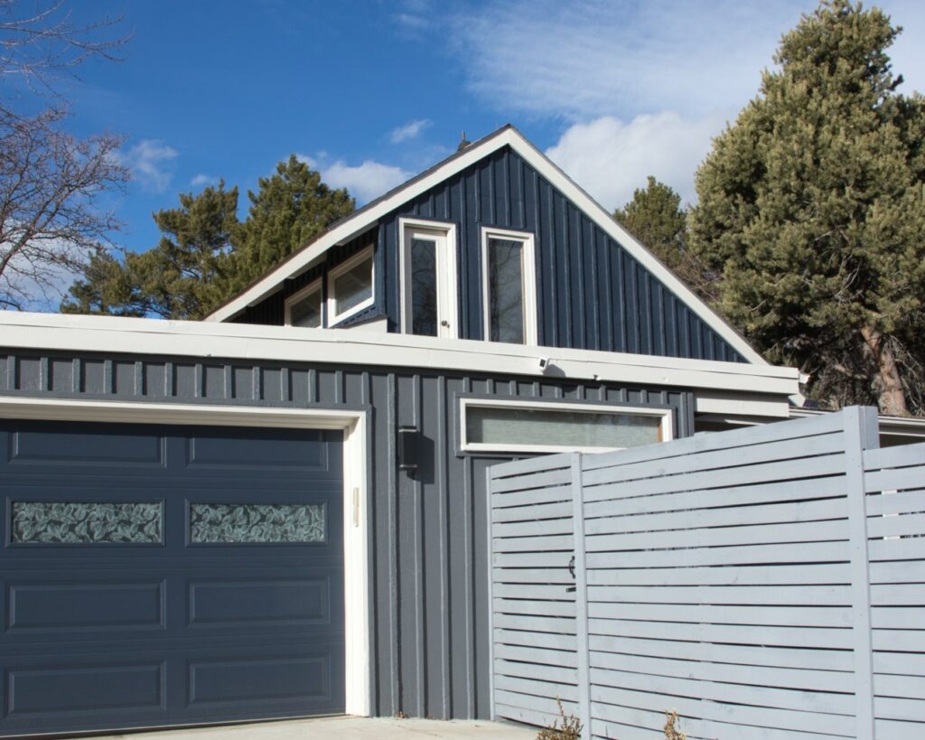
We used a similar color palette for this mid-century modern home, one of the first projects we ever did! This view of the home’s garage really shows how the full exterior palette comes together, with BM Hale Navy siding and garage door, a BM Stormy Sky garage and BM Pale Oak trim.
What are the Best Trim and Ceiling Colors For Pale Oak?
I prefer to use this paint color with clean or bright off-whites such as Benjamin Moore Chantilly Lace, BM Oxford White, or SW Pure White. I also like BM White Dove with Pale Oak, especially if the tile and other hard finishes are very earthy.
Blue-whites such as SW Extra White or BM Decorator’s White are ok but not my first choice because they can look harsh, but they can work.
Warmer off-whites and creams such as BM Swiss Coffee won’t have enough contrast to bring this color to light. Whites with strong yellow undertones such as BM Simply White or BM Snowfall White are not my favorites with this color because the yellow can look funky with this undertone.
When should I avoid Pale Oak?
Don’t pair Pale Oak with green-gray paint colors such as BM Revere Pewter, BM Edgecomb Gray or SW Agreeable Gray. The taupe undertones can look pink when contrasted with a neutral color that has green undertones. It can also look discordant with yellow or yellow-beige paint colors. Although we like Pale Oak with earthy Tuscan finishes, it can look pink if the tile has a green undertone.
What Pairs Well with Benjamin Moore Pale Oak?
Does Pale Oak go with blue?
Taupes look fabulous with blues of any shade. Pair Pale Oak with saturated blues, blue-grays and saturated greens.
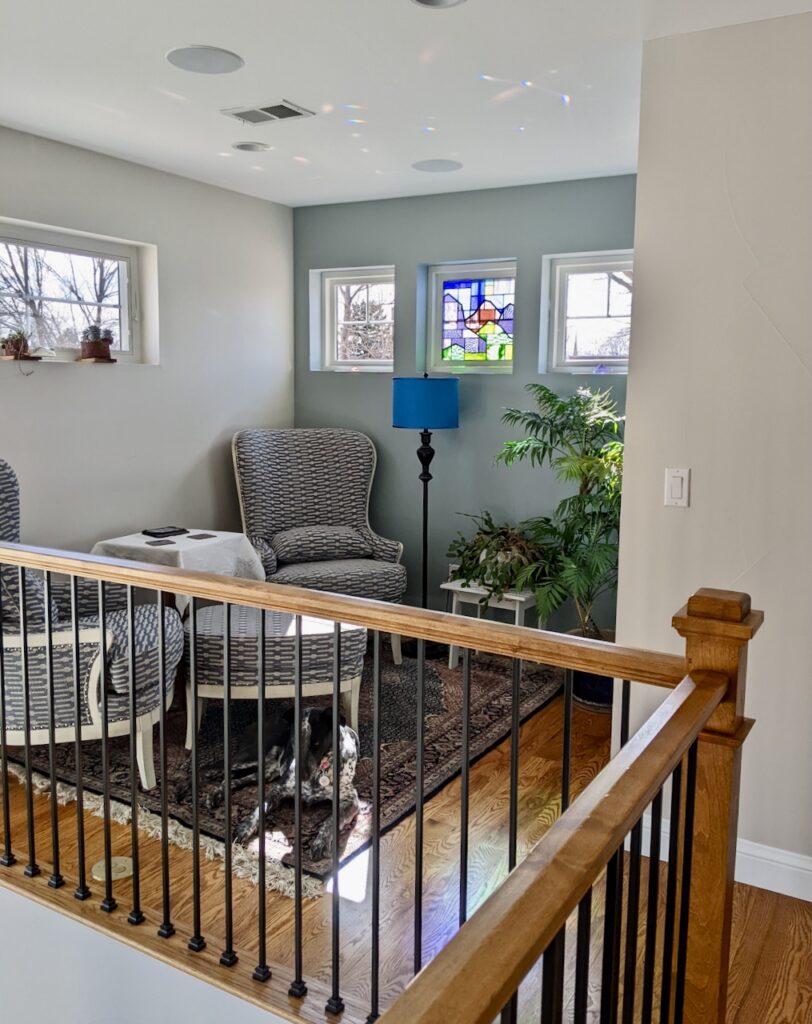
Below is Pale Oak on the walls with BM Mount Saint Anne as an accent wall. It looks so good! And that stained glass window is so pretty. This is the home of a very close friend of mine! We used BM Oxford White for the trim and ceiling color.
Can I use Pale Oak with gray?
While Pale Oak is a greige paint color, its warm taupe undertones can make it tricky to pair with gray paint colors, though not impossible. If you’re going to use it with gray paint, I recommend choosing a gray hue with cool, blue undertones or warmer, violet undertones (avoiding green-grays). It can also help to choose a gray hue that is significantly darker or lighter than Pale Oak.
Does Pale Oak go with warm paint colors?
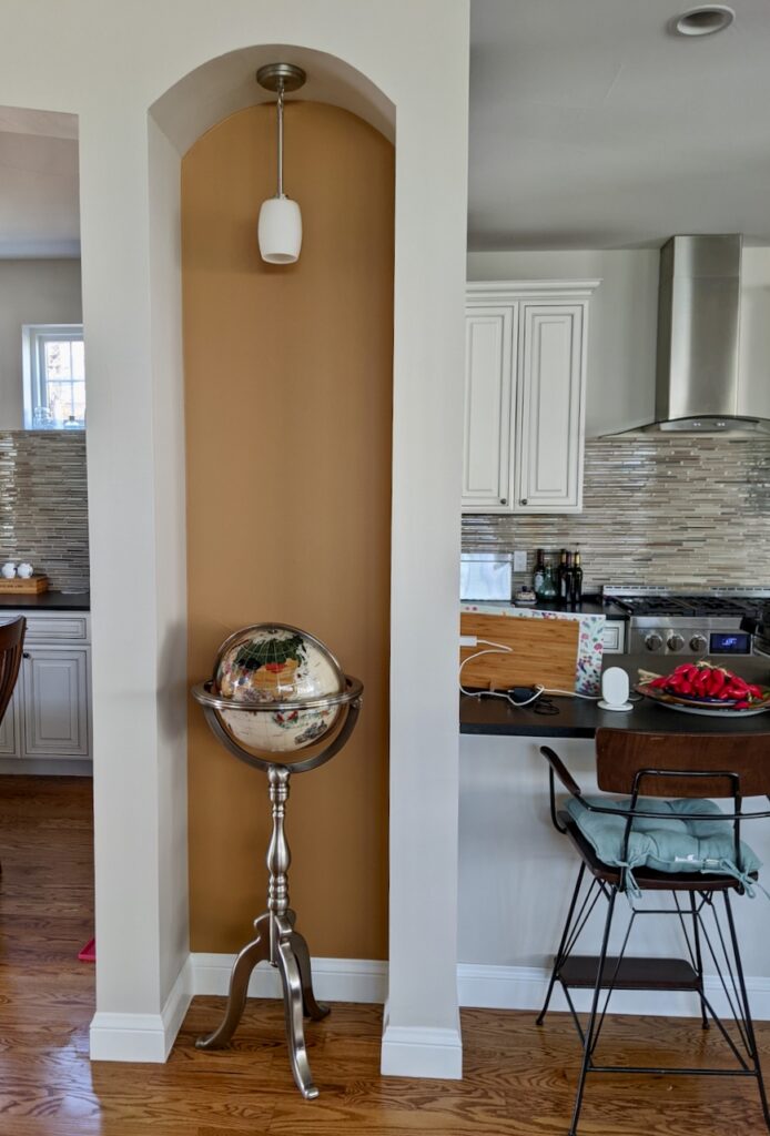
I love the way Pale Oak looks with warm paint colors, especially ones with reddish-orange undertones. Pale Oak looks so lovely with this rust accent color that we used to pick up one of the colors in the beautiful globe.
Comparisons With Other Greige Colors
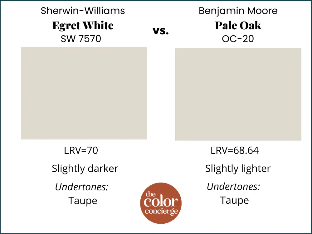
Sherwin-Williams Egret White vs Benjamin Moore Pale Oak
Sherwin-Williams Egret White is one of the closest alternatives to Pale Oak. Egret White also has taupe undertones but they flash a bit more pink, especially when paired with neutrals that have yellow undertones. In a perfect world, I prefer Pale Oak for interiors because it’s a bit more stable than Egret White and doesn’t flash as much pink.
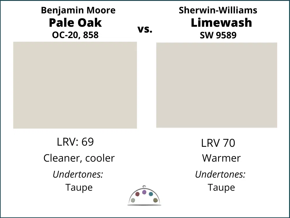
Sherwin-Williams Limewash vs. Benjamin Moore Pale Oak
Limewash is slightly lighter, but Pale Oak is cleaner and cooler. Limewash can look fleshier in low light, and is part of the Sherwin-Williams Emerald Designer Edition Collection. Both of these paint colors have Taupe undertones. Limewash is THE closest Sherwin paint color to Pale Oak, except ever-slightly warmer.
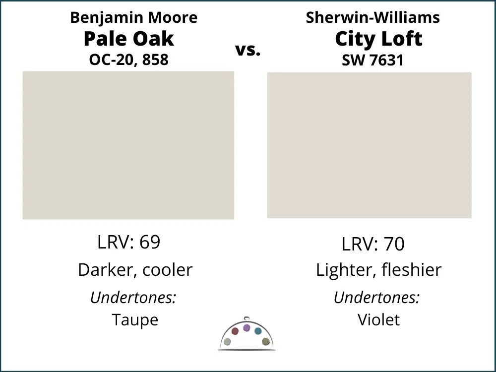
Sherwin-Williams City Loft vs. Benjamin Moore Pale Oak
SW City Loft is a violet gray with warmer and pinker undertones than Pale Oak. I would frequently use them in similar settings but Pale Oak is cleaner and cooler.
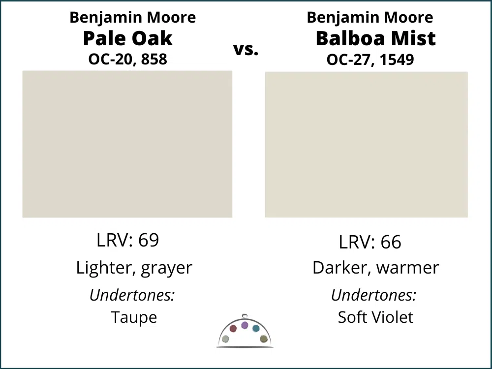
Benjamin Moore Balboa Mist vs. Benjamin Moore Pale Oak
Pale Oak and Balboa Mist are similar colors, but they will look pretty different in a room. Balboa is warmer with violet undertones, and Pale Oak will look more muted and gray. They are both beautiful!
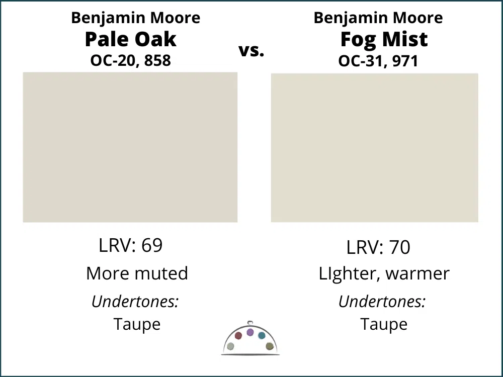
Benjamin Moore Fog Mist vs. Benjamin Moore Pale Oak
These two colors have the same taupe undertones and are almost identical! If you want a color with more warmth pick Fog Mist.
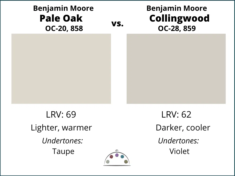
Benjamin Moore Collingwood vs. Benjamin Moore Pale Oak
Once you see them together, these colors are very different. Collingwood is a violet gray and Pale Oak is a lighter taupe greige. They are both beautiful! Pick the color that looks the best with your decor. Usually if Pale Oak looks great then Collingwood will fall flat.
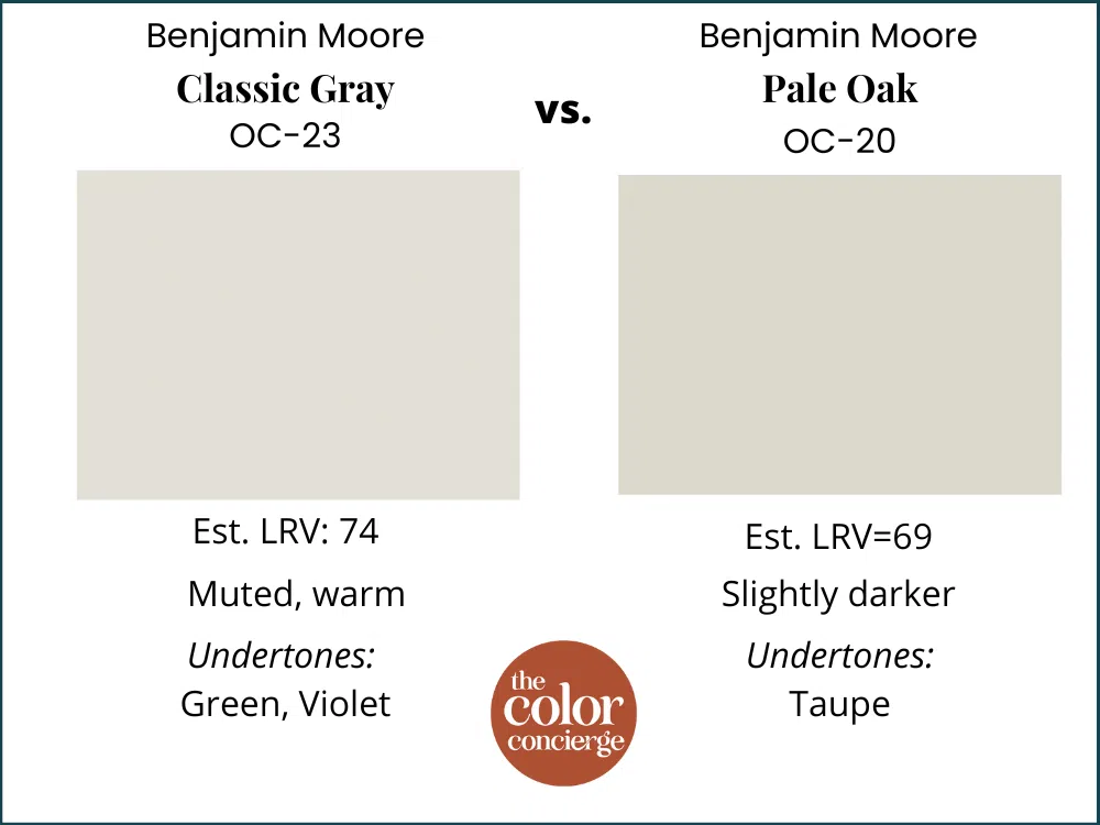
Benjamin Moore Classic Gray vs. Pale Oak
Classic Gray is another very close Pale Oak alternative. While they are both warm colors, Pale Oak has taupe undertones and so appears much more like a greige than Classic Gray, which has green and violet undertones.
What is the Sherwin Williams equivalent to BM Pale Oak?
As mentioned above, the very closest is Sherwin-Williams Limewash from the Emerald Designer Edition Collection. Limewash will give you the same look and feel as Pale Oak, even though they are not identical.
Learn more about matching paint colors here.
Benjamin Moore Pale Oak Pros and Cons
Pros:
- Looks beautiful with warm wood furniture and floors, as well as Tuscan-style finishes
- Works really well in challenging, North-facing light conditions
- Great color option if you want a creamy hue without yellow undertones
Cons:
- Usually too dark to use as a white trim color
- Does not work well with warm colors that have green undertones, which can make Pale Oak look pink
- Can look discordant with yellow or yellow-beige paint colors
Key Learning Points
Benjamin Moore Pale Oak is a gorgeous light greige with soft taupe undertones. It is most commonly used as a wall color and can look like a cream color without looking yellow. It is a warm and friendly neutral wall color.
- Pale Oak is a very light greige, but leans more toward beige thanks to its warm, taupe undertones.
- BM Pale Oak pairs well with Tuscan-era hard finishes, such as earthy granite and tile.
- Pale Oak is a wonderful neutral paint color to use throughout an entire home. It can also work as an exterior white paint color.
- Sherwin-Williams Egret White is a pretty close alternative to Pale Oak. If you want the look of Pale Oak with Sherwin paints, Egret White is your best bet.
No matter what, don’t forget to test your paint colors. Check out the SAMPLIZE website HERE.
NEVER, EVER use paint matches from a different brand than the one specified. Results are poor and there are no standards for the sheens. Even though your painter may truly believe it can be done, don’t do it. See results from paint matching Here.
Online Color Consulting
Still looking for the best white paint color? Discover our Online Color Consulting Package. Or, explore 8 easy ways to pick paint colors.

Related Posts
About the Author

Hi, I’m Michelle Marceny, founder, owner, and Principal Color Designer at The Color Concierge. I believe a fresh coat of paint can completely transform a space. The Color Concierge was born out of my drive to help clients fall back in love with their homes. My clients trust me to help them find the perfect paint color for their home – whether it’s a whole-house paint color scheme or ideas for a single room.
Since The Color Concierge was founded in 2017, we have completed over 3000 color consultations, both online and in-person. I am a Certified Color Expert with 7 years of experience creating interior and exterior color palettes throughout North America.
We love your comments! Please note that the blog is meant as general advice, and it is not possible to give out specific answers to your paint questions. If you want more specific advice, please consider purchasing a color consultation. Thank you for your understanding.

6 Responses
I have BM pale oak kitchen walls and am so frustrated trying to pick a light to medium gray for cabinets. Floor is light wood, light comes from west window, quartz countertops with grey. About to give up and keep oak cabinets!
Hi Marcia,
In addition to the wall color, the backsplash and countertop colors are also important as you make your decision. It can also be tricky to combine a taupe such as Pale Oak with gray paint colors, though not impossible. For more detailed advice, please consider a cabinet color consultation.
Michelle
Marcia,
A cool gray will be more difficult with Pale Oak, since it is a warmer taupe. Why not choose a taupe with more pigment? A gray with some warmth. Briarwood by BM? Not yellow warmth as that will make your walls look pink. What about a white? Like White Dove by BM. Kitchens are getting warmer that cool gray these days. If you appliances (Stainless?) tie in with the gray in your quartz tops, that should be fine. Or pick the cabinet color of your dreams and repaint your walls. So you can update those oak cabinets.
Hi! I have bright white subway tile and white countertops with cognac / cherry hardwood floors. Right now my cabinets are also a cognac / cherry color. Would Pale Oak work as color to paint my cherry cabinets to match the white backsplash and counters?
Paint color for natural maple flooring. East facing bedroom with one window. Furniture is Willowton from Lower Valley furniture. Behr Collingwood a bit too dark