
Mid-century modern exteriors work best with a muted body color, a mid-toned color-blocked accent, a creamy white trim, and a bright front door. In the Boulder, Colorado home featured in today’s post, we specified Benjamin Moore Hale Navy (HC-154) siding, Stormy Sky (1616) garage color blocking, Pale Oak (OC-20) trim, and a Redstone (2009-10) front door.
This project started when a local Boulder realtor reached out to The Color Concierge to pick the perfect exterior paint colors to update her Mid-Century Modern home. As a real estate agent, Juli Kovats, a local realtor in Boulder, Colorado, understands how a beautiful paint job can increase a home’s value. Juli wanted a beautiful house, and the increased property value was an added plus.
Juli had two requirements: She wanted to keep the roof and the blue-gray fence as-is. To be honest, she hated the roof, but changing it was expensive and impractical. Once we finished the project, all the elements worked harmoniously together.
We share the full transformation of Juli’s home later on in this post, but first, let’s explore the elements of a great mid-century modern exterior paint color.

About The Color Concierge
Our Colorado-based paint color consultants make finding the right paint colors for your home easy. Whether you’re painting a mid-century modern exterior or choosing an interior color palette, our simple yet effective process helps us get your paint color right the first time.
We’ve helped thousands of homeowners transform their homes into a space they love. Learn more about our business and what we do at The Color Concierge.
*This post contains affiliate links for products I use and love. If you click on some links and make a purchase, I will get a small commission at no cost to you. This helps cover the costs of the blog, so I can keep offering great content to our readers.
What Paint Colors Work on a Mid-Century Modern Exterior?
Every home is different, but when choosing mid-century modern exterior paint colors, we typically specify a few key elements: a muted body color, a mid-toned color-blocked accent, a creamy white trim, and a bold front door.
1. Start With a Muted Body Color
Mid-mod architecture is already doing a lot: long horizontal lines, big windows, flat or low-slope rooflines. The body color should support that, not compete with it. We reach for muted, grayed-out colors rather than clean, saturated ones.
Remember that exterior paint colors always look two to four times lighter and more colorful once they are up on the house. A more muted color helps ensure the home doesn’t look too bright.
2. Add a Mid-Toned Color Block
Color blocking is what makes a mid-mod palette read as mid-mod rather than just dark. Pick one mid-toned color, typically a few shades lighter than the body color, and use it on distinct architectural elements of the home, like a garage, chimney, or other portion of the home.
3. Pick a Bold Color for the Front Door
A mid-century modern exterior is the perfect place for a bright front door. Red-orange, mustard, turquoise, and chartreuse are all period-correct and look great alongside more muted body colors.
4. Tie It Together With a Creamy White for Trim
The trim, fascia, soffits, and porch ceilings for this type of palette should all be the same creamy white. A stark, clean white against a dark, muted body creates too much contrast outside and can look cold in direct sun.
You can, of course, pick a dark roofline, but if you do, make sure it contrasts properly with the siding. For this palette, since Hale Navy is so dark, a darker roofline would have looked too heavy.
Project Spotlight: Boulder Mid-Century Modern Exterior Paint Color Palette
The new paint palette we chose for our Boulder client transformed this amazing mid-century modern house. When we discussed options, Juli loved the idea of a color-blocked exterior.
Originally, she didn’t like the way her roof or her blue-gray fence looked with the rest of the home and property. After the transformation, the roof color ties in beautifully, and the homeowner did not plan to change the roof to update the color, a significant savings.
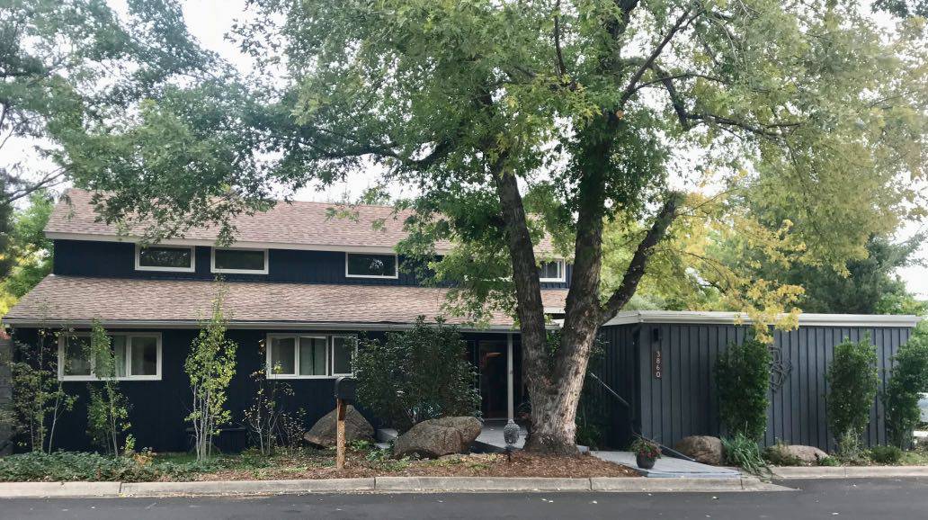
This street view is a work of art! The blue-gray fence, once an eyesore, became part of this beautiful blue-and-gray exterior palette.
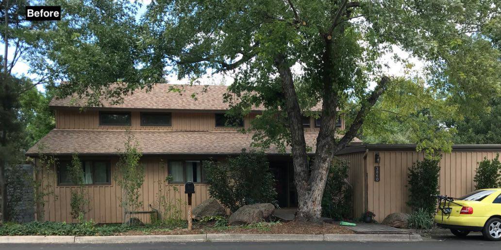
The photos below show our client’s house before we painted and highlight just how much the new mid-century modern exterior paint colors changed the look of this home.
The body of the house was painted a yellow-beige color that clashed with the pink-beige of her roof. The depth of the paint colors was similar to the roof, so there was no contrast, and the monochromatic tones hid the lovely xeriscaped front yard.
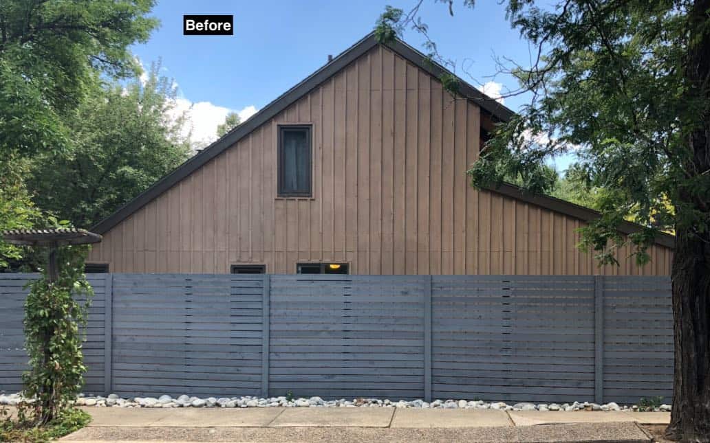
The blue-gray fence, which fits the new palette so perfectly, clashed with the body paint and looked really out of place before.
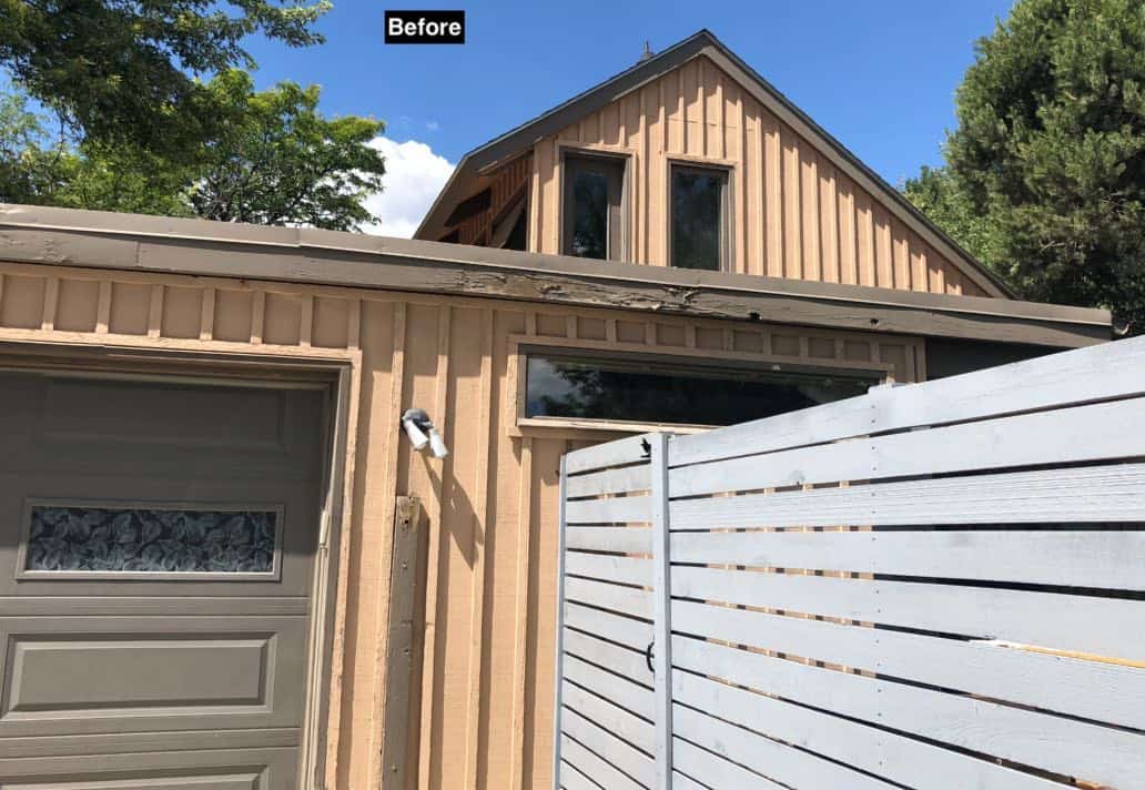
The house had not been painted in over a decade, and the siding was dried out from the low-humidity Colorado climate. It all looked a little tired.
The brick chimney was the only brick element and also looked out of place. You can see how its reddish tones clashed with the yellow beige siding and the rusty roof.
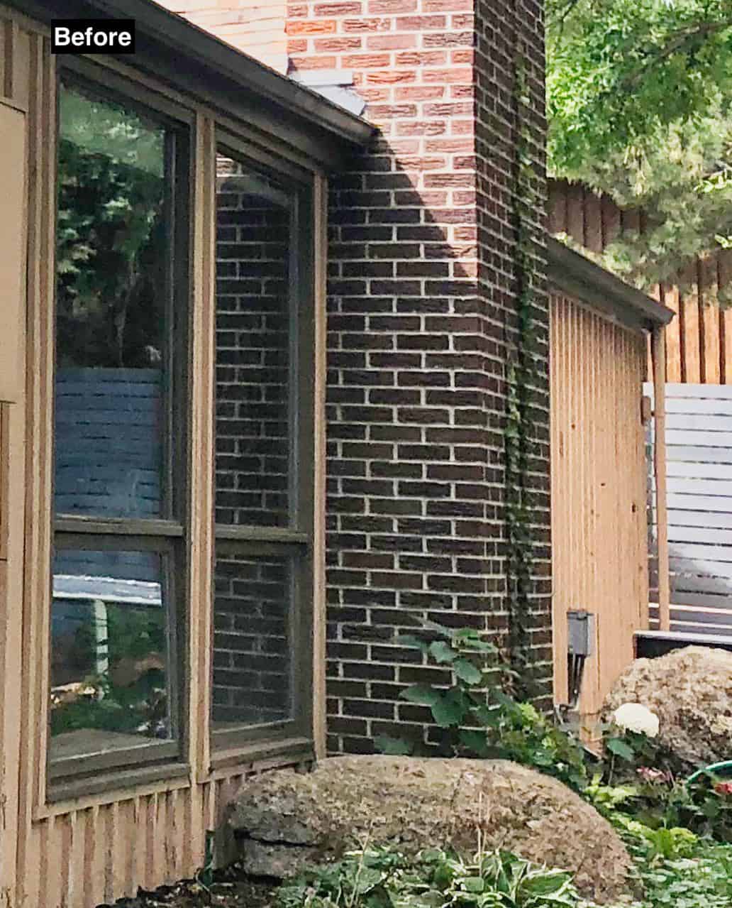
Our goal for this project was to choose paint colors that worked better with the home’s existing hard finishesof the home —including the xeriscaped yard, the pink-beige roof, and the blue-gray fence. The new palette, explored in depth below, manages to bring all of these elements together and better highlights the mid-century modern architecture.
| Color number | Light Reflectance Value (LRV), 0 to 100 | Undertones | Where we used it | |
|---|---|---|---|---|
| Benjamin Moore Hale Navy | HC-154 | 8.36 | Subtle green | Siding and body |
| Benjamin Moore Stormy Sky | 1616 | 13.75 | Blue | Garage and brick chimney color blocking |
| Benjamin Moore Pale Oak | OC-20 | 68.64 | Taupe | Trim, fascia, soffits and porch ceilings |
| Benjamin Moore Redstone | 2009-10 | 16.37 | Orange | Front and back doors |
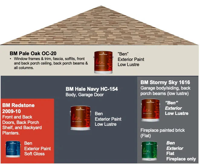
Muted Body Color: Benjamin Moore Hale Navy (HC-154)
BM Hale Navy is a gorgeous, deep blue exterior paint color with lots of gray tones and an LRV of 8.36. It has subtle green undertones, which give the paint its warmth. The undertones aren’t as apparent on a swatch or in darker interior spaces, but they stand out with plenty of natural light. Learn more about this color in our BM Hale Navy paint color review.
Hale Navy is dark and muted enough to act almost as a neutral, but has enough color to provide some interest. Frankly, Hale Navy is one of Benjamin Moore’s iconic paint colors, and you can see why!
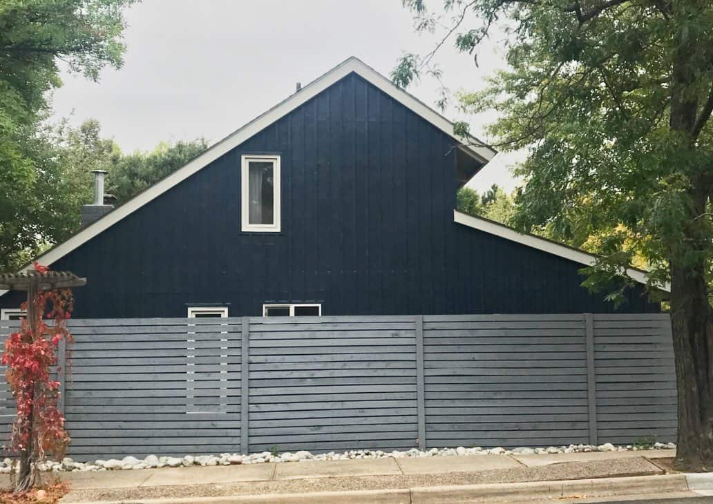
Mid-Toned Color Blocking: Benjamin Moore Stormy Sky (1616)
BM Stormy Sky is muted enough to stay subtle and sophisticated, but lighter and softer than Hale Navy, with an LRV of 13.75. It provides enough contrast to use for color blocking next to the Hale Navy siding without looking too stark in the bright sun.
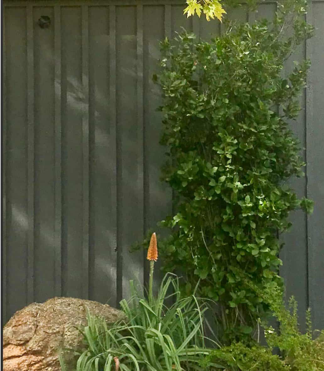
We used Stormy Sky on this home’s garage, and it completely transformed the look of the exterior. Now, the blue-gray fence that looked so cheap and discordant is beautiful and interesting. I love it! We also replaced the exterior light fixtures with rectangular black lights.
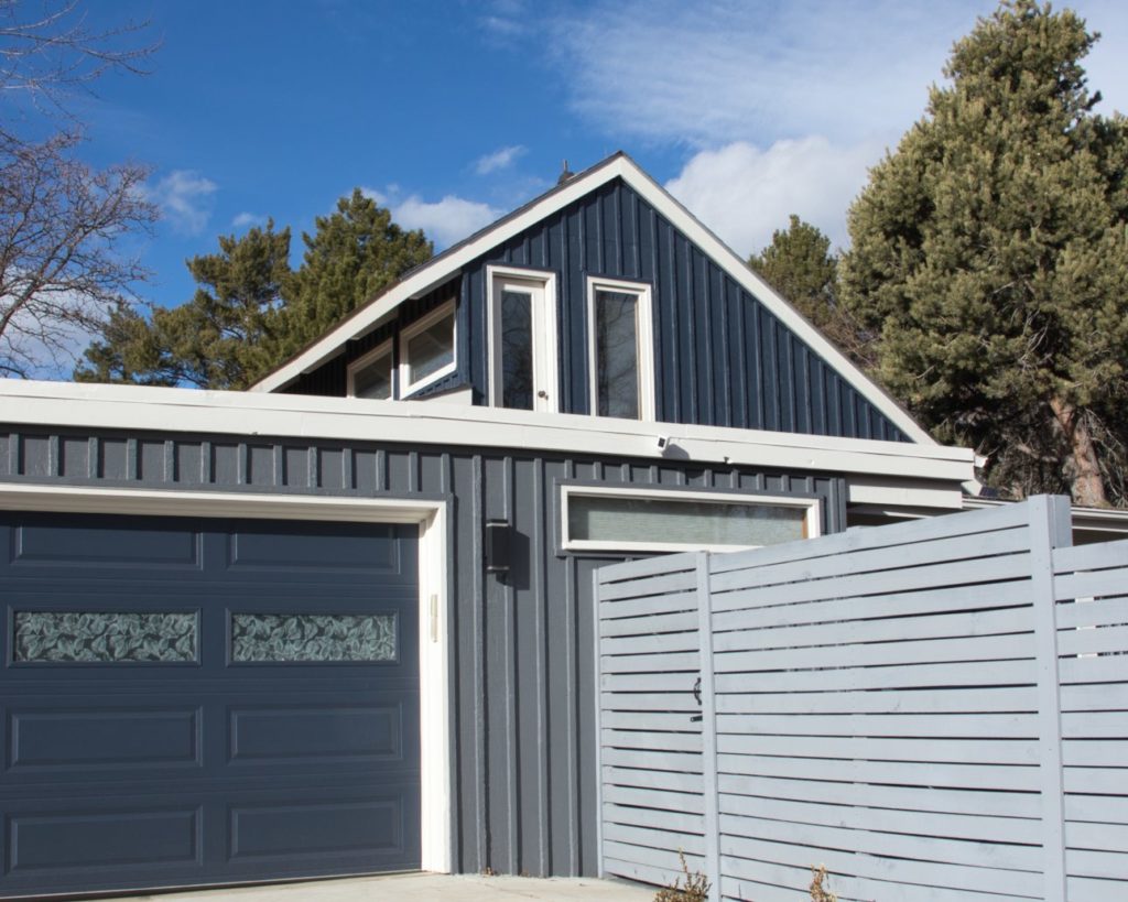
The Stormy Sky garage color below also acts as a beautiful contrast for perennials that we didn’t know were there because of the original tan color. It looks greener than expected because all the rich folliage is reflecting onto the siding at this time of day. But the color truly is the Stormy Sky. It just shows how much of an influence lighting can add to the home at different times of day.
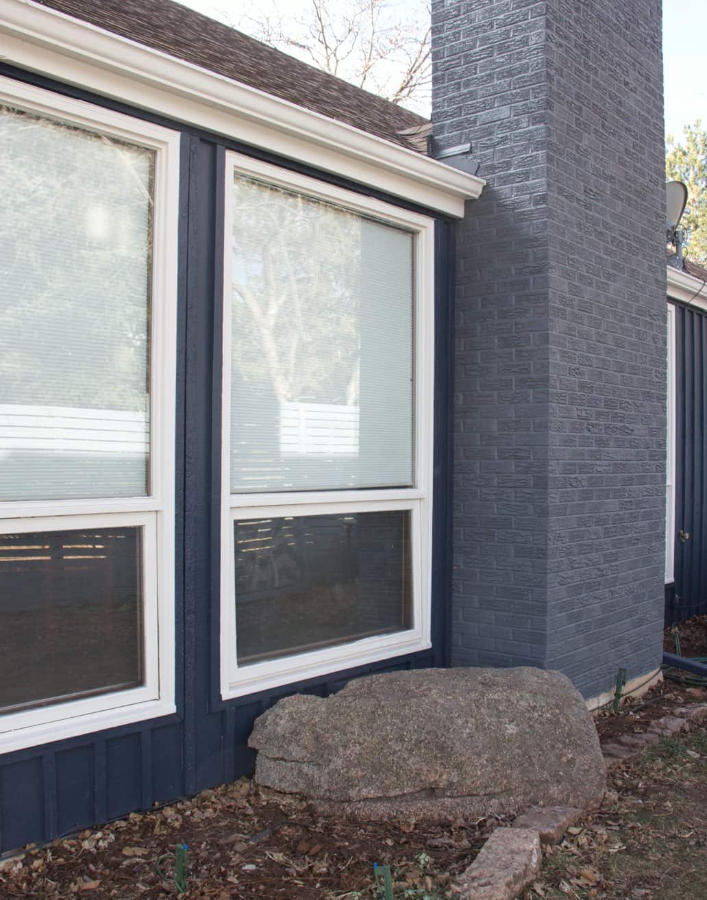
We continued BM Stormy Sky at the back of the house, painting the brick chimney. While the original red brick would have looked lovely alongside the Hale Navy siding, the painted chimney helps tie the color-blocking look together. I was also concerned that the red brick looked discordant with the roof. Since there was so little red brick, we decided to paint it.
Warm White Trim: Benjamin Moore Pale Oak (OC-20)
Benjamin Moore Pale Oak is a warm, friendly neutral with taupe undertones. It is warm, but muted, with an LRV of 68.64. Because of its LRV, some consider this color a darker white, but I see it as a very light greige that can read like a cream without yellow undertones, especially outside. When painted inside, it definitely looks like a light greige color.
We used Pale Oak for all the trim, soffits, and fascia on this mid-century modern house. For this type of home and color scheme, a light-colored fascia creates a classic roofline. A darker roofline paired with Hale Navy would have looked too heavy and like a big blob of darkness because of the low contrast. Painting the soffits white can also help reflect more light into the windows.
We also painted the front and back porch ceilings Pale Oak to brighten the exterior space, and keep the interior light and bright. I also like keeping front porch ceilings light to keep the entry easy to see as a security feature at night.
Bold Front Door: Benjamin Moore Redstone (2009-10)
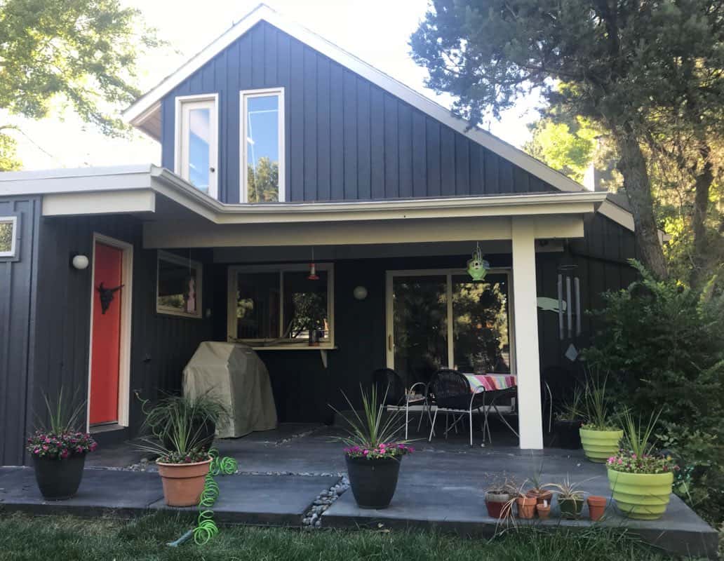
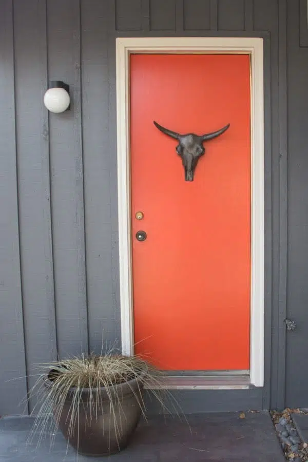
Benjamin Moore Redstone is a very bright, warm red paint color with orange undertones. It has an LRV of 16.37, so it has a lot of pigment and provides a bold pop of color against the deep, muted siding.
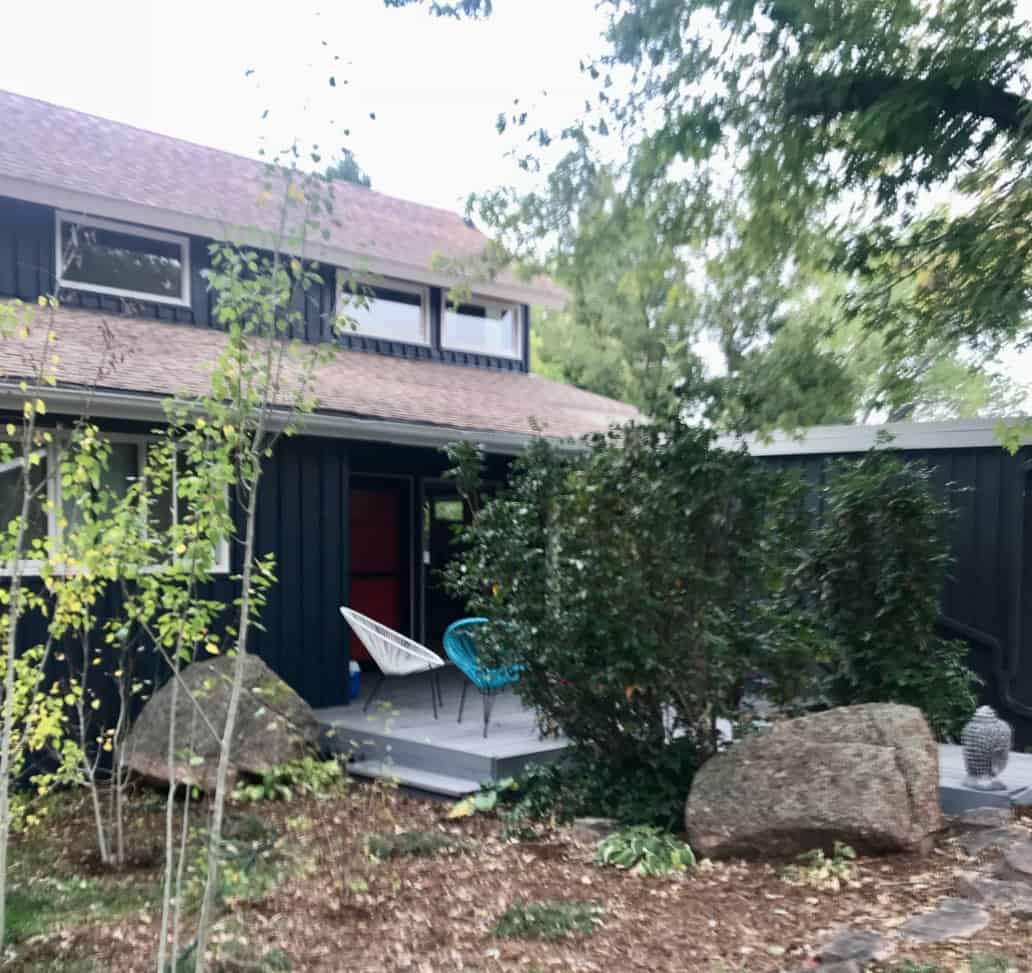
We stained the front deck the same color as the fence, and it looks amazing with the red-orange front door. The white and aqua plastic patio chairs add another Mid-Mod colorful design twist.
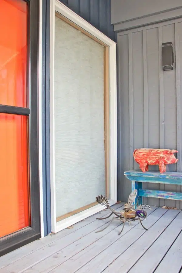
The back door was also painted with BM Redstone. I love the skull Juli hung on the back door for a funky Western Colorado accent. We replaced the old light fixture with this round Mid-Mod sconce to complete the look.

Sherwin-Williams Alternatives for Mid-Century Modern Exterior Paint Colors
Love this mid-century modern exterior but want to use Sherwin-Williams paint? Whatever you do, don’t try to color match! Instead, we recommend these alternatives:
| Benjamin Moore color | Sherwin-Williams alternative | Light Reflectance Value (LRV), 0 to 100 | Where we used it |
|---|---|---|---|
| Benjamin Moore Hale Navy (HC-154) | Sherwin-Williams Sea Serpent (SW 7615) | 7 | Siding and body |
| Benjamin Moore Stormy Sky (1616) | Sherwin-Williams Web Gray (SW 7075) | 13 | Color blocking |
| Benjamin Moore Pale Oak (OC-20) | Sherwin-Williams Egret White (SW 7570) | 70 | Trim, fascia and soffits |
| Benjamin Moore Redstone (2009-10) | Sherwin-Williams Fireworks (SW 6867) | 17 | Exterior doors |
Mid-Century Modern Exterior Paint Questions We Get Asked
Do mid-century modern exteriors have to be dark?
No. Dark bodies suit the architecture and photograph beautifully, but the formula matters more than the value. What makes a palette read mid-century modern is a muted body color, a color-blocked section in a mid-tone, a creamy white for the trim, and a bright front door. A lighter muted body follows the same rules.
My roof color clashes with my house. Do I have to replace it?
Often not. The homeowner on our Boulder mid-mod disliked her pink-beige roof and planned to replace it, even though the roof was in good shape. Once we painted the body Benjamin Moore Hale Navy (HC-154), the roof tied in with the xeriscaped front yard and overall palette, and she canceled the replacement entirely.
Can I paint the brick chimney on a mid-century modern house?
Yes, especially if it clashes with the other finishes. The brick chimney on this Boulder house looked dated, and its reddish tones fought the yellow-beige siding. It was such a small element that it made sense to change it instead of replacing the roof. We painted it Benjamin Moore Stormy Sky, the same mid-toned blue-gray as the garage, which folded the chimney into the color blocking instead of leaving it as a clashing element.
How do I test paint colors on a mid-century modern exterior?
Test large samples on the house itself, never on a chip or indoors. Exterior colors read two to four times lighter and more colorful outside than they do on a fan deck. Check each sample on more than one elevation, and look again in late afternoon light before you commit.
Sample Every Paint Color in This Mid-Century Modern Exterior Palette
| Paint color | Peel-and-stick sample |
|---|---|
| Benjamin Moore Hale Navy (HC-154) | Sample Hale Navy |
| Benjamin Moore Stormy Sky (1616) | Sample Stormy Sky |
| Benjamin Moore Pale Oak (OC-20) | Sample Pale Oak |
| Benjamin Moore Redstone (2009-10) | Sample Redstone |
Exterior colors are the ones people get wrong most often, because a dark muted body color like Hale Navy will read two to four times lighter and more colorful once it is up on the house than it does on a chip indoors.
When I started this business almost ten years ago, the first thing that my paint rep told me was that the most common mistake that homeowners make is picking exterior colors that are too light.
On a mid-mod, where the whole palette depends on the body, the color block, and the trim staying in the right relationship to each other, test all four together on the actual elevations rather than one at a time.
New to peel-and-stick samples? Samplize sends real manufacturer paint, two coats, in a 9” x 14” sheet, delivered overnight. I use them on every consultation. More on our method here: how to test paint colors.
Key Learning Points
We transformed a homely house into a Mid-Century Modern Treasure with typical paint colors with a modern twist. Our homeowner is thrilled, and she loves driving up to her house every day. Her house looks brand new, and we definitely increased the value of her home.
Don’t forget to test your paint colors! Check out “Learn to Test Paint Colors Like a Pro”.
Online Color Consulting
If you still need help with paint colors, check out our Online Color Consulting packages or an In-Person Color Consultation in the Denver Metro area.
If you liked this post, PIN IT!

Related Posts
- Benjamin Moore Hale Navy (HC-154) Color Review
- Benjamin Moore Pale Oak Color Review
- Coastal Cottage Exterior Makeover
- The Best Exterior Colors for Brick Houses (and what not to do)
About the Author

Hi, I’m Michelle Marceny, founder, owner, and Principal Color Designer at The Color Concierge. I believe a fresh coat of paint can completely transform a space. The Color Concierge was born out of my drive to help clients fall back in love with their homes. My clients trust me to help them find the perfect paint color — whether that’s a whole-house color scheme or ideas for a single room.
Since founding The Color Concierge in 2017, my team and I have completed 1,000s of color consultations, online and in person. I’m a Certified Color Expert with nine years of experience creating interior and exterior color palettes throughout North America.
Every color review on this site comes from colors we’ve specified in real homes and photographed on location during our own consultations — not from a fan deck or a manufacturer’s website.
We love your comments! Please note that the blog is meant as general advice, and it is not possible to give out specific answers to your paint questions. If you want more specific advice, our Online Color Consultations will help you pick your paint colors. Thank you for your understanding.

6 Responses
Love this! What is the color of the fence/stained deck?
Its so funny! The fence/stained deck was the ugliest part of the original house, and we left it the same. It was a lighter blue-gray but I don’t have the name.
Thanks!
Thanks! I am surrounded by navy/dark grey houses and feel the need to do something different. Thinking about a light-medium grey-blue, painting the brick, and a brightly colored mcm door. Something a bit more cheerful 🙂
I love the Pale Oak for the trim! I’m going a dark blue for my exterior but haven’t like the glaring whites I’m seeing. I used Pale Oak porch paint for old vinyl tile in my bathroom for the short term and have loved it’s neutral warmth. Thanks, Color Concierge!
We love Pale Oak for exterior trim too!
I do love the excitement for the “orange wood cow!” When it is in fact a wood pig.. lol