Sherwin-Williams Grays Harbor exterior paint is a gorgeous, deep slate blue with subtle warm green undertones. Its warmth makes it perfect for pairing with red brick and warm stone, so it’s a fantastic option for an exterior paint color.
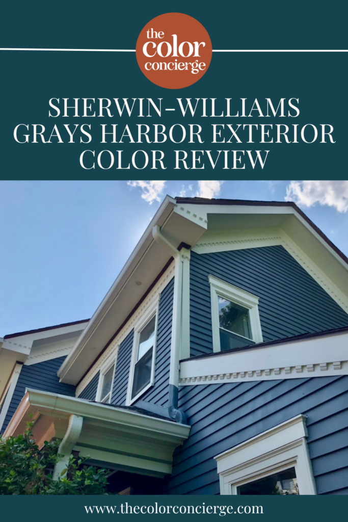
We’ve used SW Grays Harbor on a few of our clients’ homes, and it’s quickly become one of our favorite blue exterior colors to use. Which you can read more about in the linked article. Today, we’re diving deep into all the details about this beautiful hue so you can decide if it’s the right paint for your next exterior project.
*This post contains affiliate links for products I use and love. If you click on some links and make a purchase, I will get a small commission at no cost to you. This helps pay for the costs of the blog, so I can continue to offer great content to our readers.
About The Color Concierge
Our Colorado-based paint color consultants make finding the right paint colors for your home easy. Whether you’re painting the exterior or interior of your home, our simple yet effective process lets us get your paint color right the first time. We’ve helped thousands of homeowners transform their homes into a space they love. Learn more about ONLINE COLOR CONSULTATIONS today.
What Color is Grays Harbor?
Sherwin-Williams Grays Harbor is a deep blue paint color that really shines in the sunlight, which is part of what makes this such a good exterior paint color.
It’s also muted enough to be considered a blue-gray paint color. I also sometimes refer to this as a “bluetral” because it’s neutral enough to pair with many other hues.
What is the SW Grays Harbor LRV?
Grays Harbor has an LRV of 12, which makes it a dark paint color but not so dark that it risks looking black – especially not outdoors.
What are the Grays Harbor undertones?
Grays Harbor is a blue with green undertones, which actively warm up the color. It has enough black in it to keep it nicely muted and gray. It won’t go electric when the sun shines on it. These undertones keep this color looking warm and inviting and help it pair with red brick and warm stone accents.
Don’t forget – color is all about comparison. If you place Grays Harbor next to a green, it will look more blue. Blues can have green or purple undertones. The green comes from extra yellow in the color, and the purple comes from more red in the blue. I affectionately call blues with purple undertones blurples!

Sample Sherwin-Williams Grays Harbor Exterior Paint
We always recommend that you test paint colors in your home because lighting can completely change a color, both on interiors and exteriors.
I use these in my color consulting practice for exact results. Discover Samplize peel-and-stick paint samples and sample all your favorite exterior house colors via the link below.
Using Gray’s Harbor Exterior Paint
One of the best ways to understand a paint color is to see it on an actual house. Photos of a swatch will only take you so far, especially with a muted blue like this one that shifts so much between sun and shade.
We’ve used Grays Harbor on a number of clients’ homes during exterior paint color consultations, including two very different projects we feature below: a Colorado home with warm stone and a bright, open lot, and a historic 1910 home in New England with muted red brick sitting in full sun. Which you can read more about in the linked article.
In both cases, Grays Harbor brought these homes to life, offering enough color to stand out while still complementing the hard finishes beautifully. Here’s a closer look at each palette and how the rest of the colors came together around it.
Project Spotlight: Grays Harbor Exterior with Warm Stone
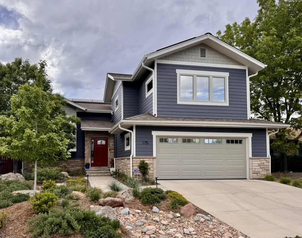
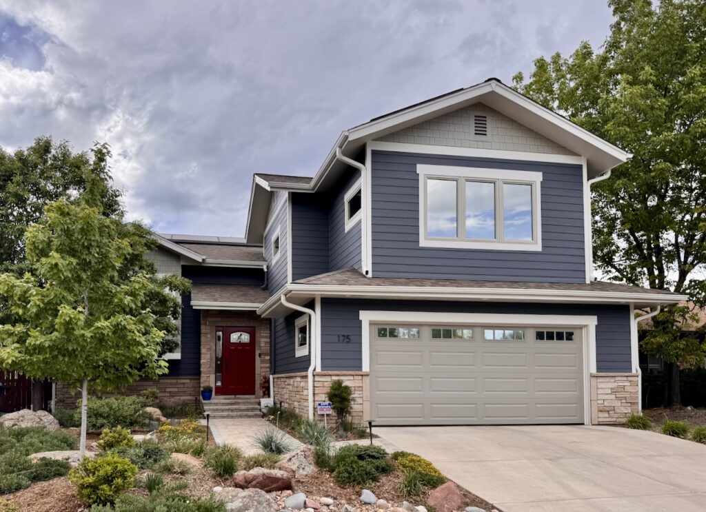
This Colorado home is a fairly new home, but its original color palette made it look heavy and drab. With a Grays Harbor exterior color scheme, this home feels welcoming and lighter – even though the siding is technically darker than the original.
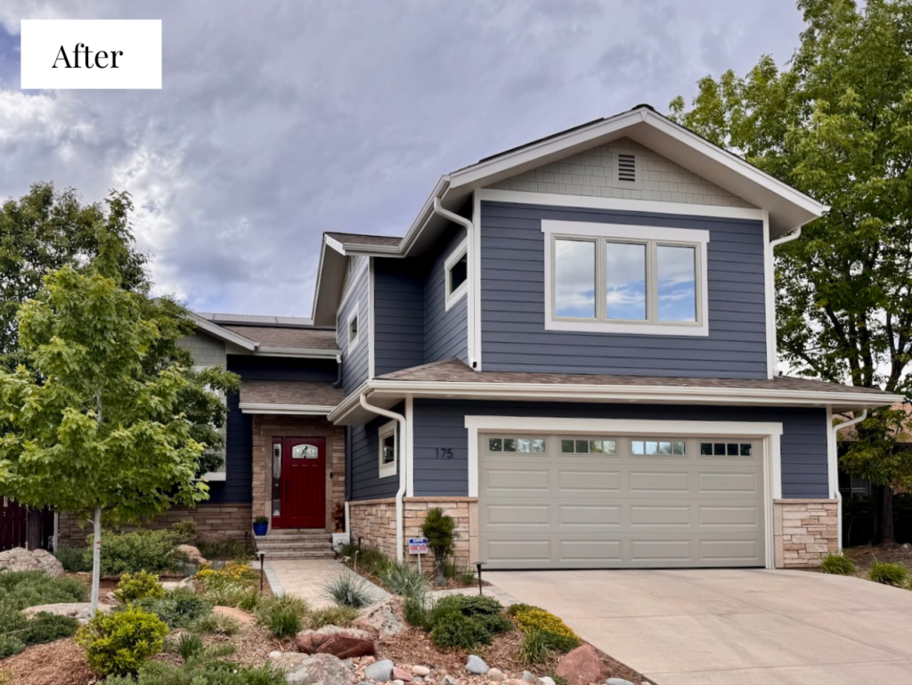
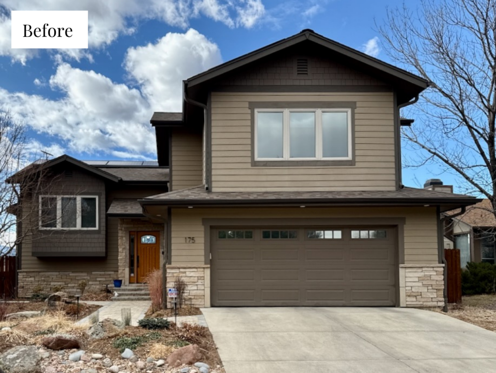
You can see in the before photo below, the siding and accent colors were too similar to the warm stone. Instead of complementing the hard finishes, they made the house look heavy and dark, and didn’t provide enough distinction between the different parts of the home.
Look at the before photo and you’ll see the problem right away. The white vinyl trim was fighting with the dark trim around it, and the whole thing read as garish rather than crisp. So we flipped the palette around: instead of dark trim against bright white, we gave the house a deep, muted body color and let a softer white carry the roofline.
Grays Harbor Siding
The more muted a blue is, the better it plays with warm landscaping, warm stone, and just about any roof color. This home has beautiful warm stone and a warm landscape, and Grays Harbor settles right in with both. With an LRV of 12, it’s a relatively dark color on paper, but outdoors it doesn’t read as a deep, inky navy. It lands closer to a mid-to-dark blue. Against the muted blue siding, the roof and stone stand out, letting each part of the home shine.
SW Fawn Brindle Accents
We pulled the accent colors for this home out of the warm stone, and SW Fawn Brindle – a gray paint color with warm green undertones – was a perfect match to the grout color in the stone and the color of the original windows. Which you can read more about in the linked article. This color made the windows suddenly look intentional instead of accidental and makes the palette feel personalized to the home.
For this home, we used SW Fawn Brindle on the garage doors and the architectural shingles on the side of the house. Which you can read more about in the linked article.
SW Egret White Trim
We tested a lot of white exterior trim colors for this home, and Egret White was far and away the best one. It’s a relatively dark white — more of a warm greige with taupe undertones than a crisp white — which keeps it from looking harsh in the bright Colorado sun. We could see a little bit of Egret White in the stone, too, which helped tie the roofline back to the hard finishes.
SW Sun Dried Tomato Front Door
As a final pop of color for this home, the front door was painted SW Sun Dried Tomato, a warm red hue that looks gorgeous against the blue siding.
Sample the Full Color Palette
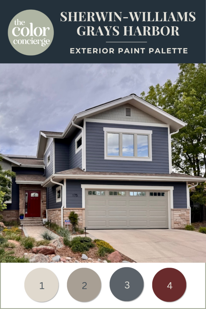
- Sherwin-Williams Egret White (SW 7570): Trim
- Sherwin-Williams Fawn Brindle (SW 7640): Garage door and gable shingles
- Sherwin-Williams Grays Harbor (SW 6236): Siding/body
- Sherwin-Williams Sun Dried Tomato (SW 7587): Front door
Can you use Grays Harbor as an Interior Paint Color?
You can, but with caveats. You can use Grays Harbor as an interior color, but the room needs a TON of natural or artificial light. I have seen it beautifully placed as a cabinet color. I think it’s because the shinier cabinet sheen gives it a bit more life.
Note how colorful Grays Harbor looks in the sunshine in both of these projects. It looks almost black on the swatch, but the sunshine really gives it life. This is one of the reasons that I prefer Grays Harbor as an exterior color.
Project Spotlight: Gray’s Harbor Historic Home Exterior
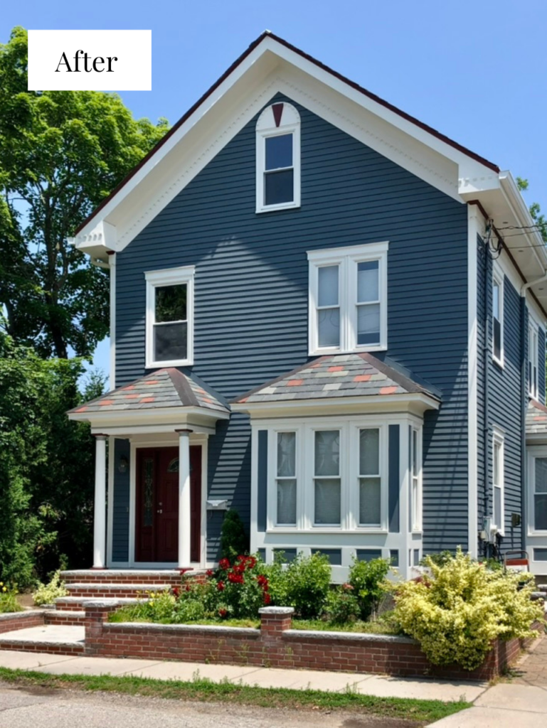
The second home we feature today is a historic home in Massachusetts that needed a fresh start. Built in 1910, the homeowner had started planning to sell the home and wanted something fresh but still classic. Grays Harbor siding gave us exactly that.
In the before photo below, you can see the house had a coral body color with an orange accent, which the homeowner thought would help tie in some of the colors from the red brick at the front of the house. Which you can read more about in the linked article.
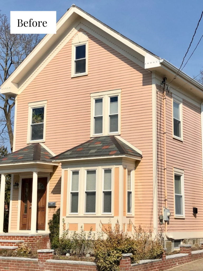
In the end, it was really hard to make that work, so we gave him some other options to consider and Grays Harbor was the winner.
Grays Harbor Siding
The updated Grays Harbor exterior palette fits this home so well and perfectly complements the muted brick. There’s also blue in the smaller sub-roof above the front door and window, which the body color now echoes so well.
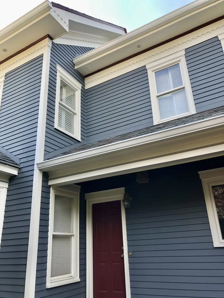
Light was a big factor here, too. This house sits in full sun with very few trees around it — even when the trees leaf out, they don’t shade the house at all. A brighter blue would have been overwhelming in that much light. Grays Harbor is muted enough to hold up in the sun but still looks beautiful in the more shaded parts of the home, where it reads much more gray.
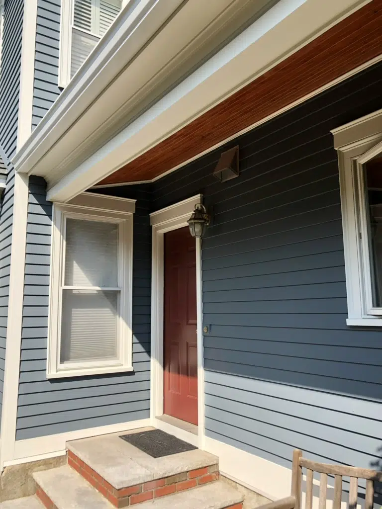
SW Nuance Exterior Trim
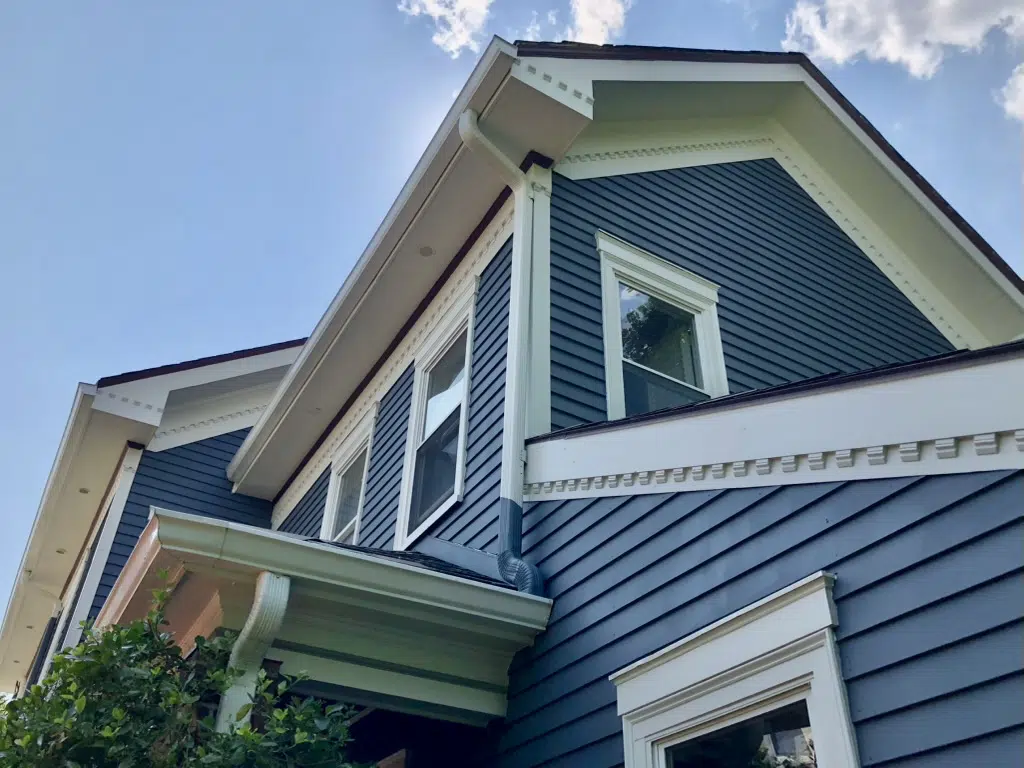
This house has lovely dentil molding under the eaves, and we played a lot with painting those details in a contrasting color. In the end, we decided to keep everything a clean white. You can see the accents along the roofline and soffits in SW Sommelier. We love a subtle burgundy accent on a historic house, especially with blue.
Sherwin-Williams Nuance brings some lightness to what is otherwise a dark palette, and it lets the architecture read clearly without getting fussy. We used it on the trim and columns, with Sherwin-Williams Stamped Concrete on the column collars.
SW Sommelier Front Door and Accents
The front door of this home was originally wood, which would have looked beautiful with this palette. Unfortunately, the wood wasn’t in good enough condition to restore, so we painted the whole thing SW Sommelier. It’s a near-match to the brick, and it pulls out the burgundy tones in the lower roofs.
You can see more of the color highlighting a few accents on the top of the posts and more crown moulding.
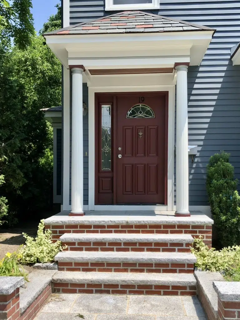
We carried that same burgundy red into the accents — a small stripe on the body and some detailing along the roofline — and it turned out really, really pretty.
Sample the Full Color Palette
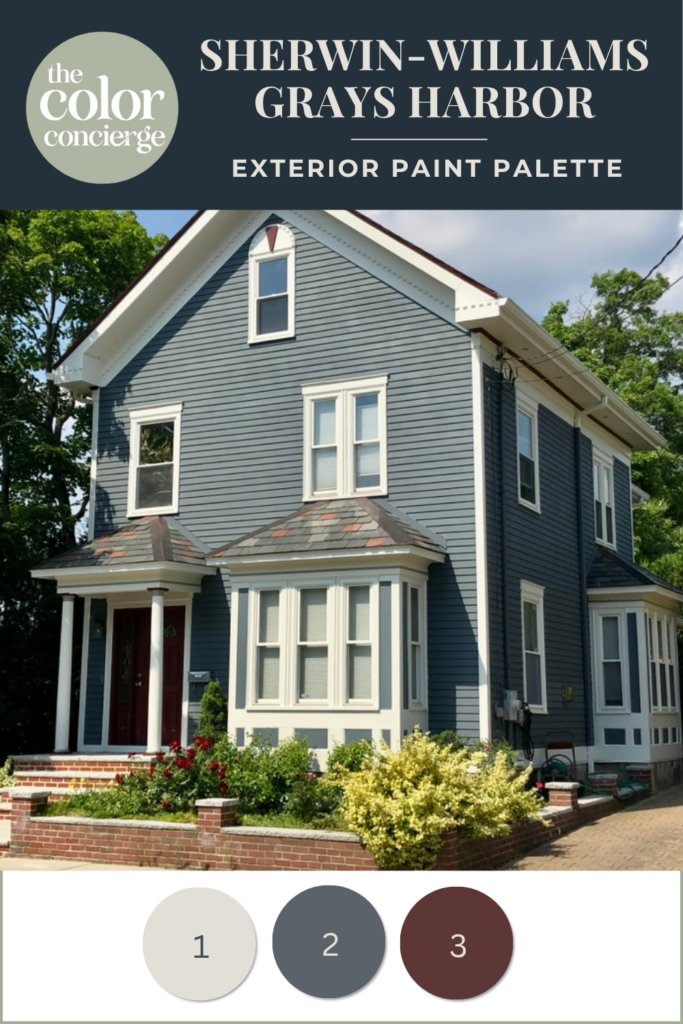
- Sherwin-Williams Nuance (SW 7049): Trim and columns
- Sherwin-Williams Grays Harbor (SW 6236): Siding/body
- Sherwin-Williams Sommelier (SW 7595): Front door and accents
Grays Harbor Color Comparisons
Not sure if Grays Harbor is right for your project? Compare these similar paint colors. We always say that color is all about comparison. It always helps me to compare a color with other options to make sure it’s what I’m looking for.
Grays Harbor vs Cyberspace
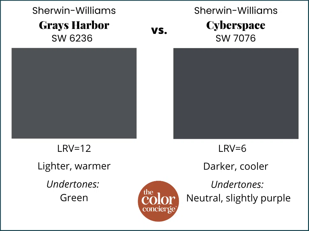
Grays Harbor is lighter than SW Cyberspace, which is nearly black with an LRV of 6. It’s also warmer than Cyberspace, with strong green undertones. Which you can read more about in the linked article.
Grays Harbor vs Sea Serpent
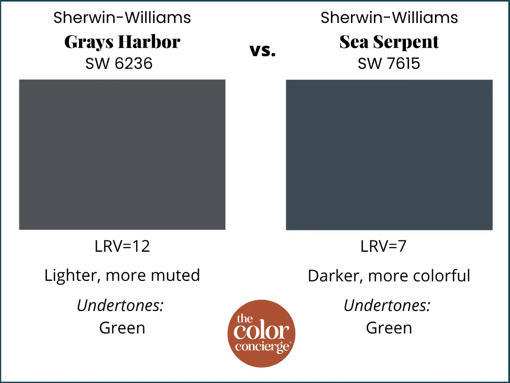
SW Grays Harbor is lighter and more muted than SW Sea Serpent, which has an LRV of 7 and strong green undertones. Sea Serpent appears more colorful than Grays Harbor, especially in bright sunlight. Which you can read more about in the linked article.
Grays Harbor vs Hale Navy
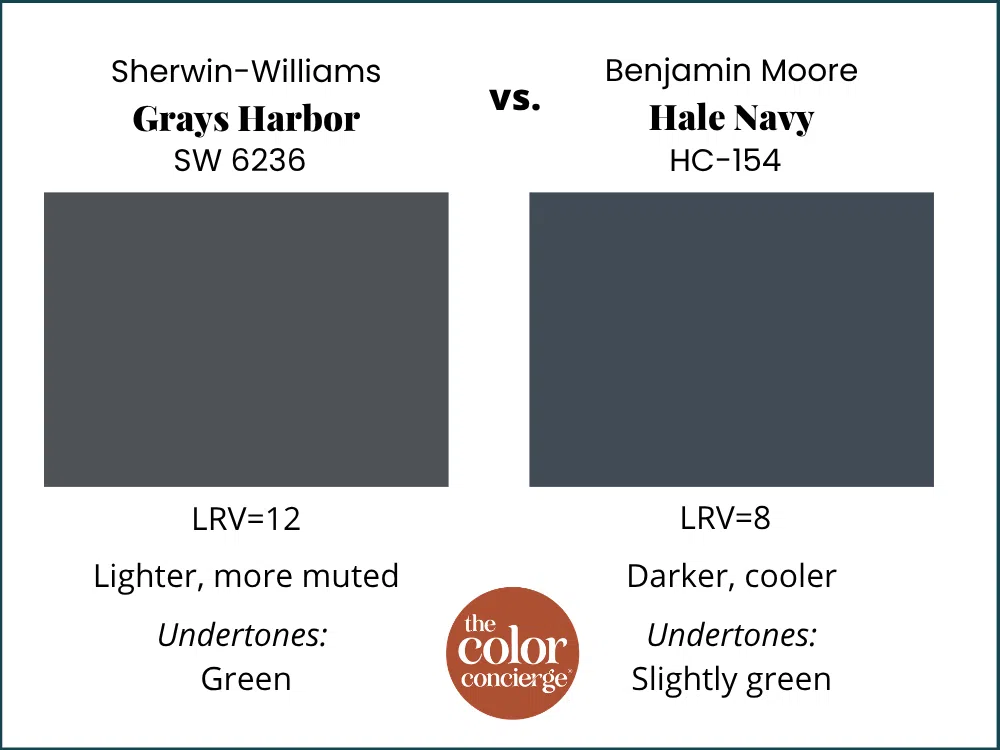
Grays Harbor is less colorful and lighter than BM Hale Navy. Hale Navy is not as muted as Grays Harbor, and both have warm, green undertones. Hale Navy is darker, with an LRV of 8.36. Which you can read more about in the linked article.
Grays Harbor vs Newburyport Blue
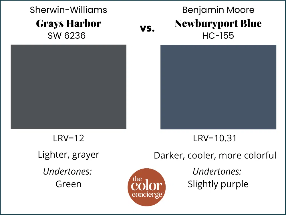
SW Grays Harbor and BM Newburyport Blue are both very muted paint colors, but Newburyport Blue is darker with an LRV of 10.31. Newburyport Blue also has slight purple undertones, rather than green, so it looks cooler.
Grays Harbor vs Indigo Batik
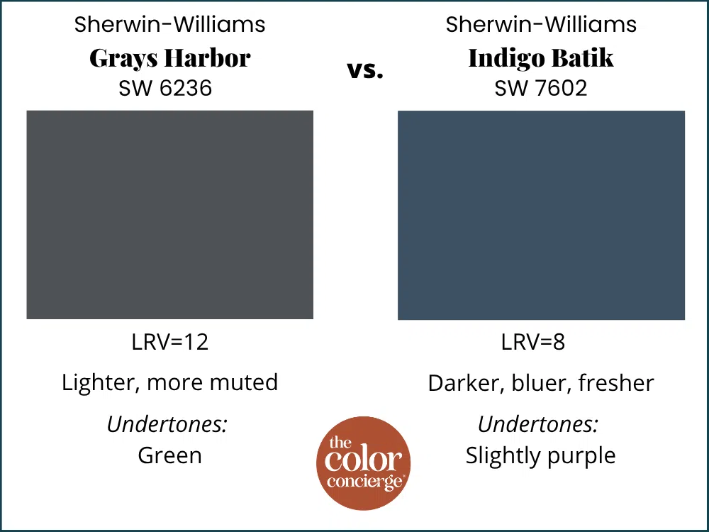
Indigo Batik is darker than Grays Harbor, with an LRV of 8. It also has slightly violet undertones, which make it look cooler (and bluer) than Grays Harbor.
Grays Harbor vs Wall Street
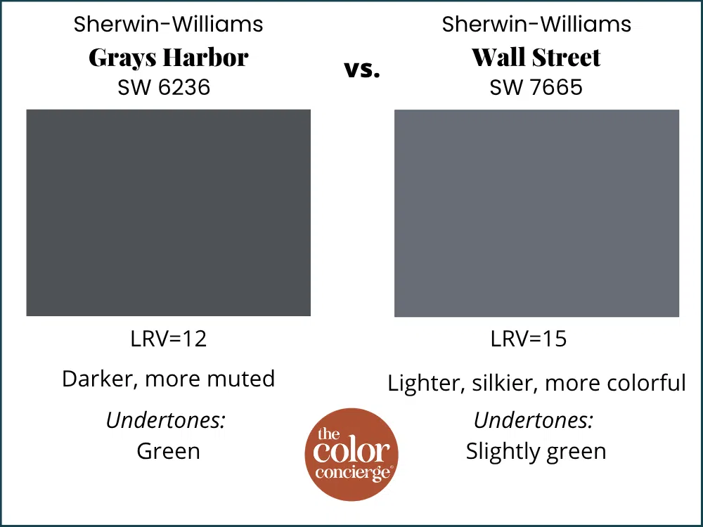
SW Wall Street has an LRV of 15, which makes it lighter than Grays Harbor. It’s also more muted with slightly green undertones. Wall Street looks silkier and visibly lighter than Grays Harbor.
Key Learning Points
Sherwin-Williams Grays Harbor is a deep, muted slate blue that reads far more blue outdoors than its blue-gray formulation suggests. It’s one of our most flexible exterior blues, and a great example of why testing in place matters so much.
- Grays Harbor is muted enough to behave like a neutral. Its subtle warm green undertones let it pair beautifully with red brick, redstone, and warm stone, and it works with just about any roof color.
- It shifts dramatically between sun and shade. In full sun, it reads distinctly blue; deeper into the shade, it reads much more gray. Blues transform more than almost any other color family, so always test your samples in the actual light conditions on your house.
- Pull your accent and trim colors from your hard finishes. Your body color doesn’t have to come out of your stone or brick — but grout colors, window frames, and roof tones are all fair game for accents, and using them is what makes a palette feel like it belongs to the house.
- Grays Harbor is a better exterior color than interior because it is so dark and muted. It could look black or murky inside unless you have a lot of artificial or natural light. Not recommended for color drenching.
Remember: NEVER, EVER use paint matches from a different brand than the one specified. Results are poor and there are no standards for the sheens. Even though your painter may truly believe it can be done, don’t do it. See results in our paint matching guide.
No matter what, always test your paint colors. It’s a standard best practice. Whenever I test my paint colors, they are perfect, and when I don’t test they turn out wrong. Learn how to test your paint colors like a pro.
Online Color Consulting
Still need help picking the best paint colors? Discover our Online Color Consulting Packages.

Related Posts:
- BM Hale Navy Color Review
- SW Sea Serpent Color Review
- SW Cyberspace Color Review
- Best Exterior Blue Paint Colors
About the Author

Hi, I’m Michelle Marceny, founder, owner, and Principal Color Designer at The Color Concierge. I believe a fresh coat of paint can completely transform a space. The Color Concierge was born out of my drive to help clients fall back in love with their homes. My clients trust me to help them find the perfect paint color — whether that’s a whole-house color scheme or ideas for a single room.
Since founding The Color Concierge in 2017, my team and I have completed 1,000s of color consultations, online and in person. I’m a Certified Color Expert with nine years of experience creating interior and exterior color palettes throughout North America.
Every color review on this site comes from colors we’ve specified in real homes and photographed on location during our own consultations — not from a fan deck or a manufacturer’s website.
We love your comments! Please note that the blog is meant as general advice, and it is not possible to give out specific answers to your paint questions. If you want more specific advice, please consider purchasing a color consultation. Thank you for your understanding.