This is one of our favorite projects for a Victorian exterior paint color scheme. It’s warm and comfortable and masculine. The homeowners call it “The Painted Gentleman“.
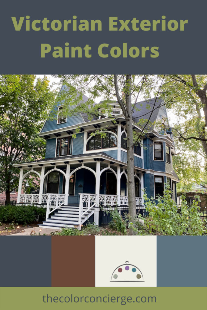
This beautiful house is a historic home built in 1897 and within a historic district. It’s a Queen Anne Victorian with unique architectural features, which make it stand out.
The new owners were looking for a more elegant and sophisticated design that felt more contemporary but also blended in with their historic neighborhood. They asked for bright bold colors that would also pair well with the red brick houses on the left and right.
Their goal – which we completely agreed with – was to simplify the color palette with fewer colors. This was a completely collaborative process that took lots of paint color tests, and we were with them every step of the way!
*This post contains affiliate links for products I use and love. If you click on some links and make a purchase, I will get a small commission at no cost to you. This helps pay for the costs of the blog, so I can continue to offer great content to our readers. I don’t get compensation from any of the paint companies for my color reviews.
About The Color Concierge
Our Colorado-based paint color consultants make finding the right paint colors for your home easy. Whether you’re painting the exterior or interior of your home, our simple yet effective process lets us get your paint color right the first time. We’ve helped thousands of homeowners transform their homes into a space they love. Learn more about ONLINE COLOR CONSULTATIONS today.
A Smaller Color Palette
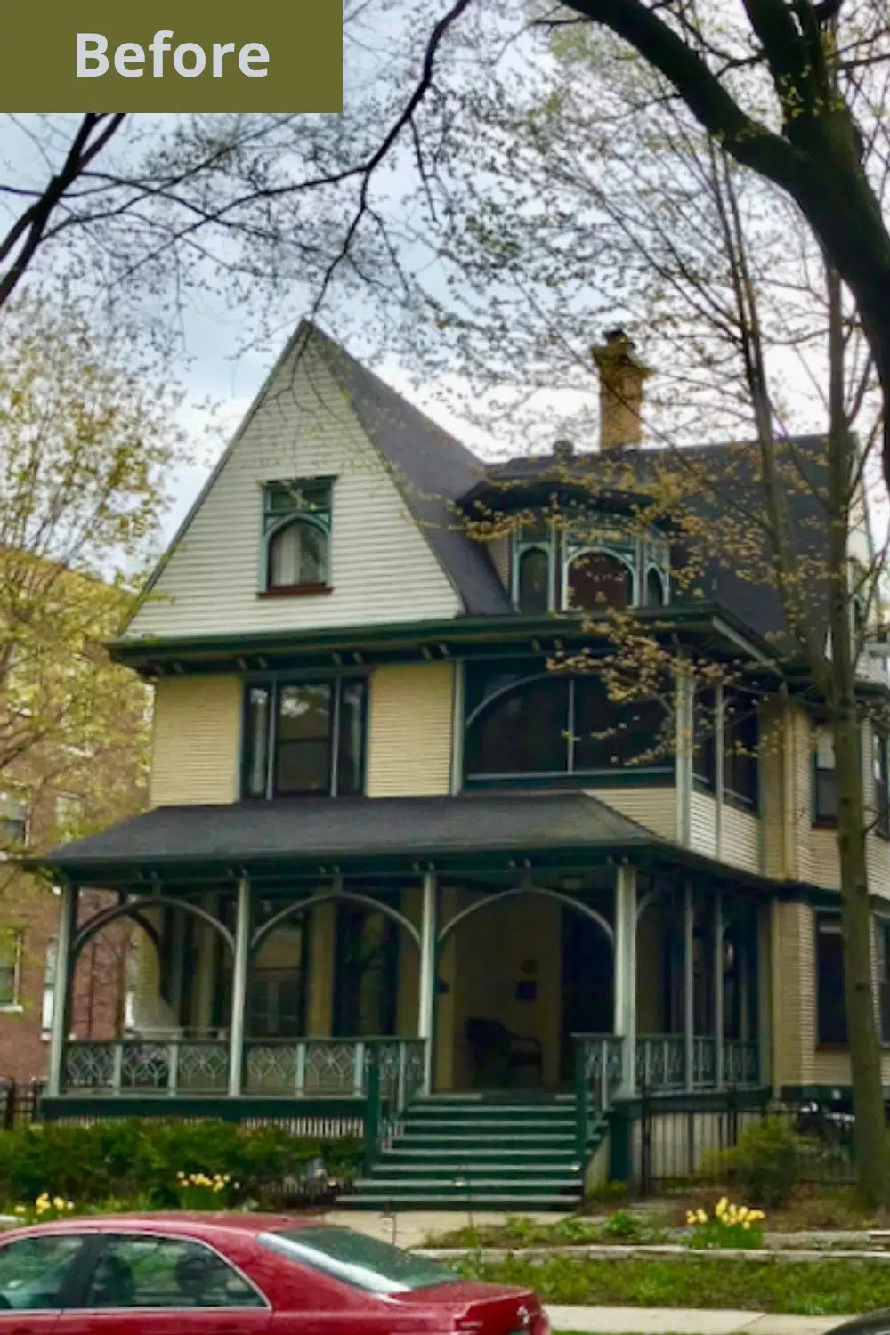
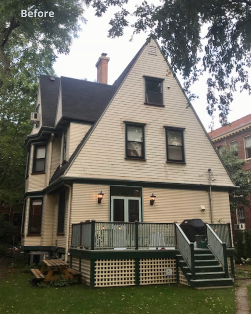
We have found that with historic homes, usually less is more. We often reduce the number of colors in the paint palette for our clients for a more harmonious look. Another benefit to using fewer colors is that the paint project is much less expensive.
In this case, we reduced the number of paint colors from six (white, yellow, mint green, dark green, burgundy and gold) to four. What a difference!
The Paint Color Scheme
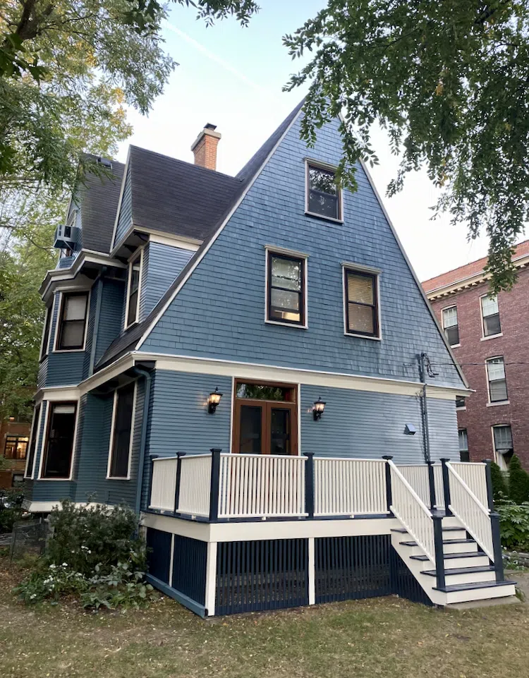
This beautiful exterior paint color palette is so modern with mid-toned BM Thousand Oceans for the siding. It pairs perfectly with the Forest Brown and Hale Navy accents and the White Dove trim.
Thousand Oceans and Hale Navy are both muted enough to be able to pair with the two red brick neighbors.
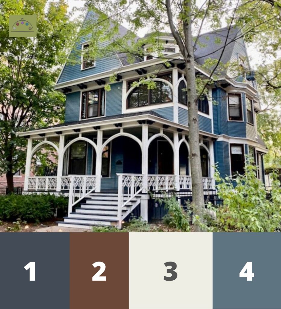
- BM Hale Navy (Sample) – Accent Color: Beams, porch floor, stair treads, window mullion/frames, front railing accent, back deck railing posts, lattice under deck
- BM Forest Brown (Sample) – Accent Color: Front railing detail, inner window trim, doors
- BM White Dove (Sample) – Fascia, soffits, columns, railings, stair risers, window trim, door trim, front porch ceiling
- BM Thousand Oceans (Sample) – Siding

The White Trim Color
We picked BM White Dove because it looked crisp and bright. Although White Dove looks like a creamy white inside, it was crisp and white outside.
Whites become substantially brighter when you take them outside, so we usually don’t specify White Dove for exteriors, but it was PERFECT here.
White Dove looked softer than expected because the house is generally in the shade, and the sunshine isn’t as strong up North as it is in Texas or Florida. High altitude projects such as Denver, Vail or Aspen also require much warmer whites and more muted tones because the strong UV rays wash out colors and make whites so much brighter.
Sample Colors
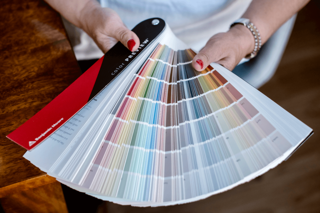
We always recommend that you test paint colors (article) in your home because lighting can completely change a color, both on interiors and exteriors.
In the old days, this meant we painted a large poster board with sample pots and a huge mess.
Now we have a better way to test paint, with Samplize Peel-and-Stick samples!
- Samples pre-painted with 2 coats of real paint from the manufacturer.
- Large 9” x 14” samples to see the color better in the lighting.
- Delivered overnight
- Colors are accurate
- Less expensive than painting a large poster board with sample pots
- No mess, and no toxic paint to dispose of
I use these in my color consulting practice for exact results. Discover Samplize peel-and-stick paint samples via the link below.
Front Porch Details
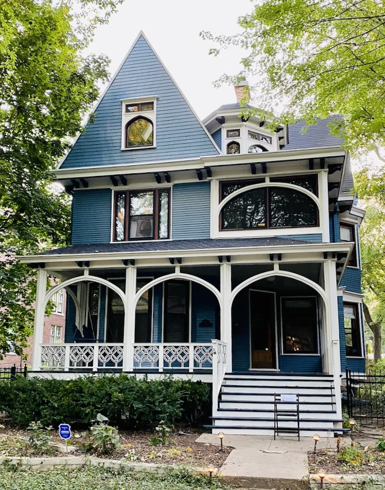
We painted the ceiling white for a brighter entry, and a blue deck was unexpected and simply gorgeous.
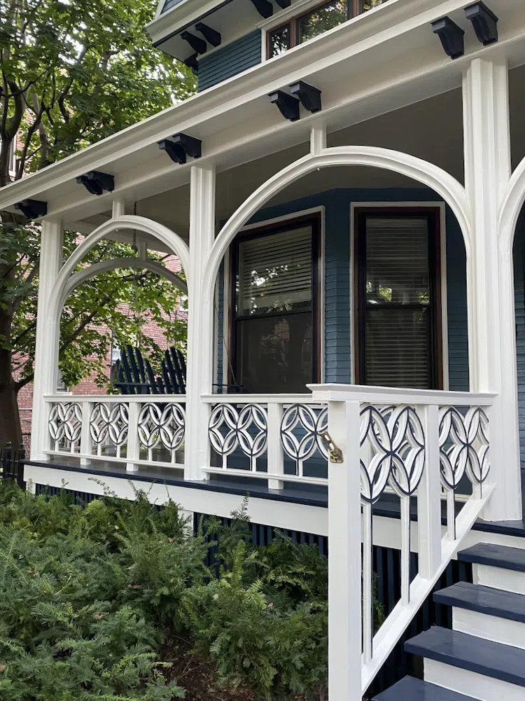
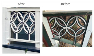
The front railing was one of the most unique features of the house. We reduced the number of paint colors to emphasize the detail. It might seem counterintuitive, but when you use white paint, you see more details than with many colors.
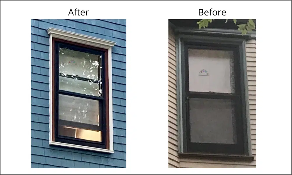
Window Paint Scheme
We painted the window mullions/frames BM Hale Navy, and the exterior trim was White Dove. BM Forest Brown was a nice middle accent of Forest Brown for bright transition.
Side of the Victorian Home
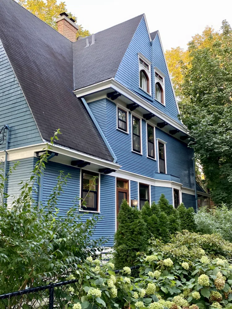
This house looks fresh and modern and honors this historic district with a modern paint color scheme. Simplification of a color palette can help emphasize architectural detail.
Key Learning Points
This house looks fresh and modern, honoring this historic district with a modern paint color scheme. A simplified color palette can help emphasize architectural detail.
No matter what, don’t forget to test your paint colors. It’s a standard best practice. Whenever I test my paint colors, they are perfect, and when I don’t test they turn out wrong. Learn how to test your paint colors here.
NEVER, EVER use paint matches from a different brand than the one you will use. Results are poor and there are no standards for the sheens. Even though your painter may truly believe it can be done, don’t do it. See results from paint matching here.
What is the easiest way to Sample Paint Colors?
We always recommend that you test paint colors in your house because lighting can change a color completely.
In the old days, this meant we painted a large poster board with sample pots and a huge mess.
Now we have SAMPLIZE, 9X14″ Pre-Painted peel-and-stick paint samples. Check out the SAMPLIZE website HERE
Online Color Consulting
Are you still looking for the perfect paint color?
Discover our ONLINE COLOR CONSULTATIONS! We offer Victorian House exterior paint consulting packages.

About the Author

Hi, I’m Michelle Marceny, founder, owner, and Principal Color Designer at The Color Concierge. I believe a fresh coat of paint can completely transform a space. The Color Concierge was born out of my drive to help clients fall back in love with their homes. My clients trust me to help them find the perfect paint color for their home – whether it’s a whole-house paint color scheme or ideas for a single room.
Since The Color Concierge was founded in 2017, we have completed over 3000 color consultations, both online and in-person. I am a Certified Color Expert with 7 years of experience creating interior and exterior color palettes throughout North America.
Related Posts
Historic Exterior Paint Color Update
6 Exterior Paint Color Combos (and how to pick them)
Best Exterior Blue Paint Colors and Palettes
We love your comments! Please note that the blog is meant as general advice, and it is not possible to give out specific answers to your paint questions. If you want more specific advice, our Online Color Consultations will help you pick your paint colors. Thank you for your understanding.


8 Responses
I just love your newsletter
Thanks, Ellice! I’m glad you enjoyed.
Love the color choices made on this victorian house. Thank you for sharing! 🙂
I’ so glad you enjoyed it!
Beautiful. Can you tell me which sheens you selected? Thank you.
We used mid-level sheens for everything. For Benjamin Moore Exterior paints its Low Lustre. We want a paint sheen that is flat enough so it won’t show imperfections but shiny enough to wash well.
Is the siding on the back of the house a different color than the front of the house or is that the lighting? I know Queen Anne style houses frequently have two main color tones. It’s beautiful. Thank you!
The siding is all Thousand oceans! When we change colors, we usually stick to one color per type of surface.
Michelle