Looking for the perfect dark teal exterior paint? Learn all about this paint color and get real-world inspiration with this Sherwin-Williams Seaworthy exterior color palette.
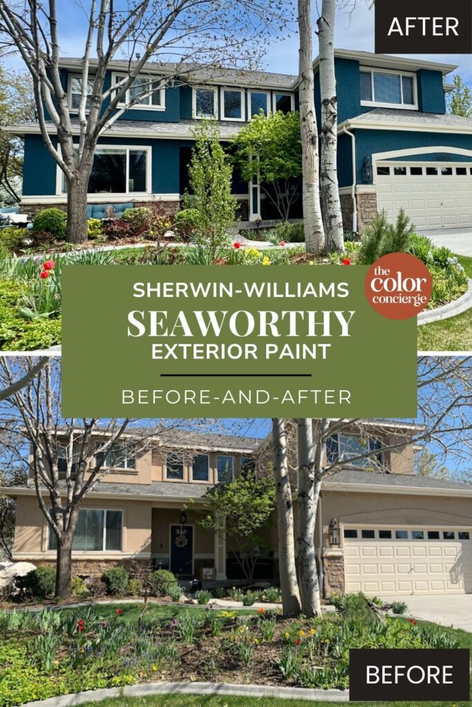
I love teal paint colors for exteriors. They are more flexible than you would think. We often recommend these paint colors for homes with warm stone or red brick. They also add warmth to cooler gray stones. It may feel risky to pick this paint color, but our clients took the leap and updated this home with rich colorful paint colors.
Although white and gray exterior paint colors are really popular right now, if chosen properly, a color will always be timeless.
We’ve noticed a lot of homeowners interested in green exteriors (Article) and blue exteriors (Article) lately, and the home we’re featuring today is a perfect example. As a teal paint color, its a cross between green and blue.
I actually selected this color palette in 2021 during a collaborative in-person color consultation in the Denver area. When I returned in 2024 to consult with the client about a kitchen color palette I rediscovered the project. It looks just as relevant today as it did in 2021.
This homeowner wanted to update their dated paint color, and a Seaworthy exterior palette was the perfect fit! Keep reading to learn more about Seaworthy paint and the full exterior color palette we designed for these clients.
*This post contains affiliate links for products I use and love. If you click on some links and make a purchase, I will get a small commission at no cost to you. This helps pay for the costs of the blog, so I can continue to offer great content to our readers.
What Color is SW Seaworthy?
Sherwin-Williams Seaworthy (sample) is a warm dark teal. By definition, teal is a combination of blue and green. For example, an aqua color is a very light version of teal. You could even say that in this case the color is blue with green undertones, but its just another language to describe the same color.
This dark teal is colorful in the sunshine as shown above, so I wouldn’t use it if you want a dark and moody exterior, unless your home is always in the shadows. It’s a really flexible color and looks great with red brick, warm stone, or cool stone.

What is the LRV of SW Seaworthy?
Seaworthy has an LRV of 7, which makes it a very dark teal. It still looks pretty dark in the shade, but comes to life in the sunshine. Colors look 4-5 times lighter and more colorful outdoors than they do indoors, especially in bright sunlight.
While some dark teal colors can appear too bright and colorful when used outdoors, the muted tones of Seaworthy keep it looking dark, yet colorful and rich even outdoors.
What are the SW Seaworthy undertones?
Seaworthy is a cool teal with blue as the dominant color that leans into the green undertones.
This is a perfect exterior paint color, but has more limited uses inside because of its darkness. You can use it inside as an accent wall or cabinet color if your room has lots of light. When you test the paint color in the room, make sure it doesn’t look black in the paint tests. You should still be able to see the color to make it look good.
Sample SW Seaworthy
We always recommend that you test paint colors (article) in your home because lighting can completely change a color, both on interiors and exteriors.
In the old days, this meant we painted a large poster board with sample pots and a huge mess.
Now we have a better way to test paint, with Samplize Peel-and-Stick samples!
- Samples pre-painted with 2 coats of real paint from the manufacturer.
- Large 9” x 14” samples to see the color better in the lighting.
- Delivered overnight
- Colors are accurate
- Less expensive than painting a large poster board with sample pots
- No mess, and no toxic paint to dispose of
I use these in my color consulting practice for exact results. Discover Samplize peel-and-stick paint samples and sample Sherwin-Williams Seaworthy (Sample) via the link below.

Sherwin-Williams Seaworthy Exterior Paint vs Other Exterior Teal Paint Colors
Sherwin-Williams Seaworthy is one of my favorite dark teal exterior paint colors. If you’re looking for other options, here’s how it stacks up to similar hues.
SW Seaworthy vs. SW Still Water
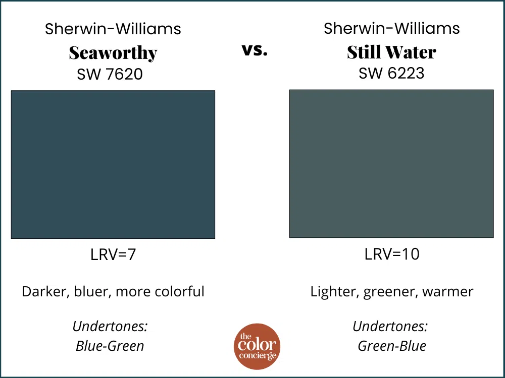
Seaworthy and SW Still Water (sample) are both beautiful dark teal paint colors from Sherwin-Williams. Still Water is a bit lighter, with an LRV of 10, and land is more muted, lighter and warmer than Seaworthy. Seaworthy is also more green than Seaworthy, so its warmer.
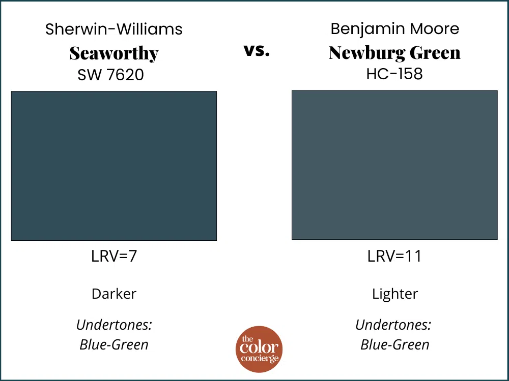
SW Seaworthy vs. BM Newburg Green
Benjamin Moore Newburg Green (sample) is the closest Benjamin Moore color to Seaworthy, although its much lighter. It does the same job, and is just as beautiful. They both behave the same in shadow and sunshine, which we will show later in the post. Learn more in the Newburg Green (Paint Color Review).
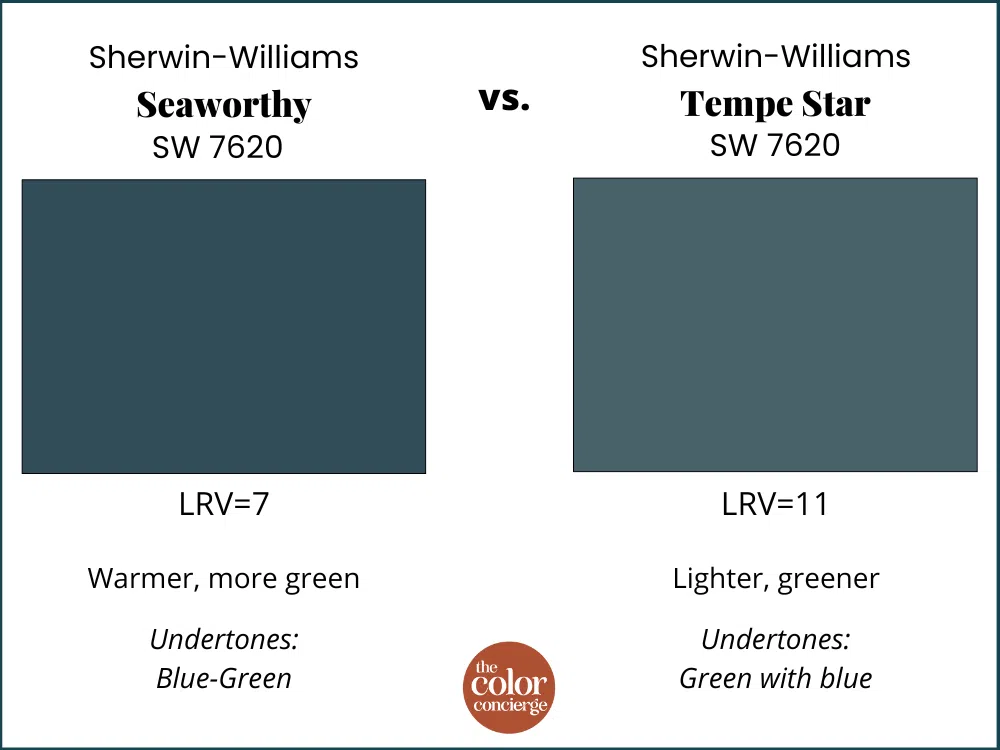
SW Seaworthy vs. SW Tempe Star
Sherwin-Williams Tempe Star (sample) is lighter than Seaworthy, but otherwise very similar. Tempe Star is perfect if you think that Seaworthy might be too dark. Seaworthy has an LRV of 7, and Tempe Star LRV is 11.
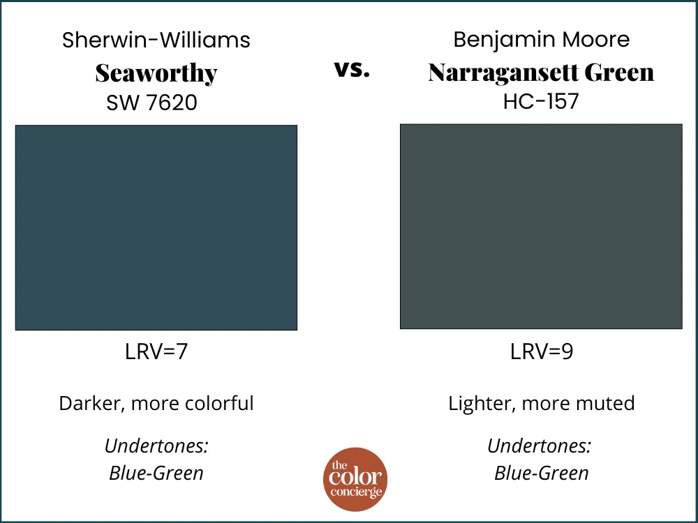
SW Seaworthy vs. BM Narragansett Green
Narragansett Green (sample) is much more muted, and darker than Seaworthy. It won’t look as colorful in the sunshine as Seaworthy, but is perfect if you want a dark and moody exterior.
Project Spotlight: Sherwin-Williams Seaworthy Exterior Color Palette
A Sherwin-Williams Seaworthy exterior color scheme turned out to be the perfect palette for this beautiful refresh! This home had stucco in the front and siding in the back of the home. Keep in mind that anytime you paint stucco, the color will be slightly darker because of the microshadows in the texture. This doesn’t make as much of a difference with dark paint color.
One more thing… we always recommend that you use a flat sheen to paint stucco, as well as a good masonry primer or paint formulated for stucco.
This beautiful home had dated pink beige paint, but its original beige body (stucco and siding paint wasn’t doing anything to highlight its complex architectural details or the beautiful stone accents.
The Seaworthy color palette we designed has truly brought this home to life!
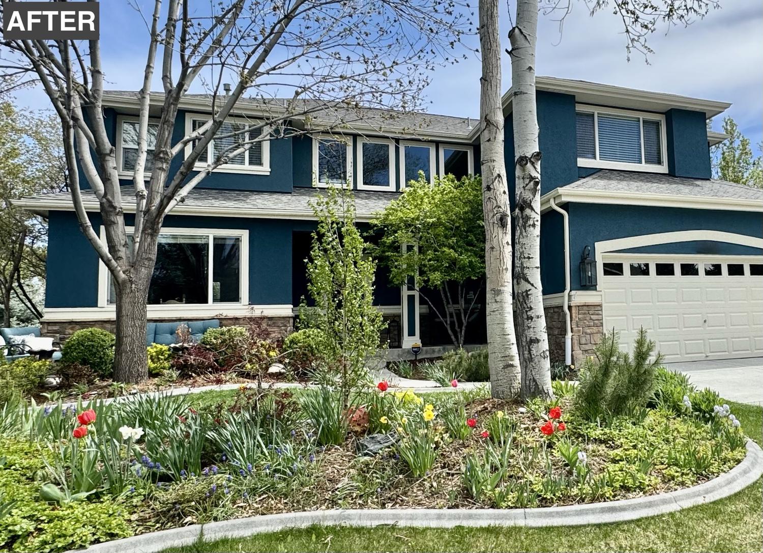
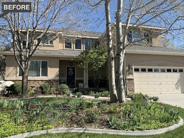
Our clients were looking for a stunning transformation that would be unique, but still flow nicely with the rest of the neighborhood.
Ultimately, we picked Seaworthy as the siding color and paired it with a soft white trim, and a timeless dark black front door. The palette is simple, but gorgeous.
The Sherwin-Williams Seaworthy Exterior Color Palette
- Seaworthy (sample)
- Grecian Ivory (sample)
- Tricorn Black (sample)
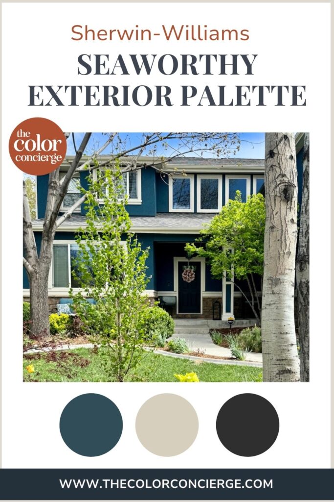
Sherwin-Williams Seaworthy Exterior Siding & Stucco

I love the way this home looks with Sherwin-Williams Seaworthy exterior paint! It pairs beautifully with the stone accents and other surfaces throughout the home. It looks dark in the shade, and rich and colorful in the sunshine.
Sherwin-Williams Grecian Ivory Exterior Trim
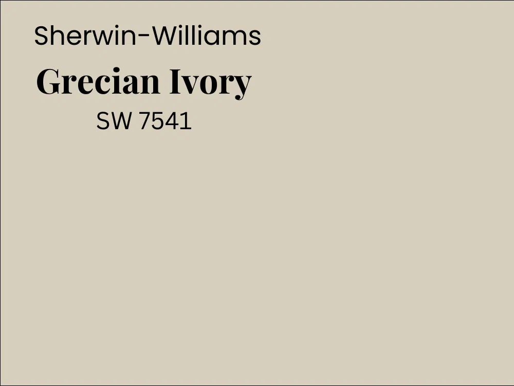
Sherwin-Williams Grecian Ivory (Sample) is the perfect “white” exterior trim color for this palette. We picked this color for several reasons. It provides a softer contrast with the dark teal Seaworthy paint color. Learn more in this Color Concierge post about picking Exterior White Trim Paint Colors (article).
We like to pick warmer and darker colors to pair with warm stone or red brick. At higher altitude in the Denver area, we use darker colors to keep the brighter sunshine from washing out the white colors, which we did her.
We also used Grecian Ivory for the garage door, believe it or not. I took this photo, so I know the effect is real. Grecian Ivory looks like a soft, warm creamy white color in the sunshine.
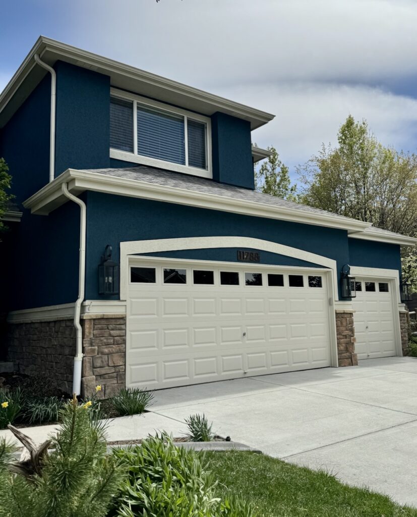
It works really well as a white trim color outdoors (Article), especially when paired with a dark body color like Seaworthy. It adds plenty of contrast without looking too stark in the sunshine.
Sherwin-Williams Tricorn Black Front and Back Doors

There is nothing more timeless and classic than a black front door. The owner opted for Tricorn Black (sample), which is the darkest of pure clean black colors offered by Sherwin-Williams. Read more about front door colors and how to pick them in our 14 Front Door Colors (article).
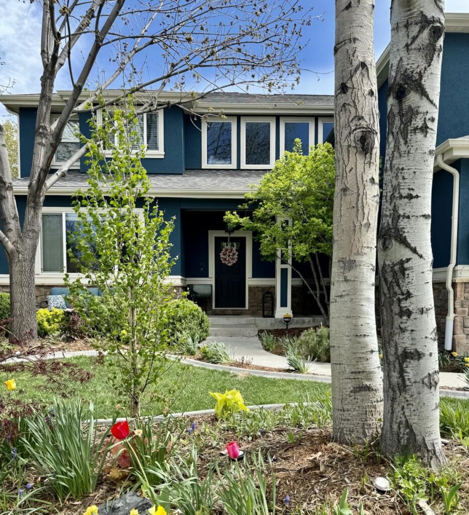
We often specify a back door that is the white color of the trim, which is a cultural convention. In this case we added another layer of dimension with a black back door.
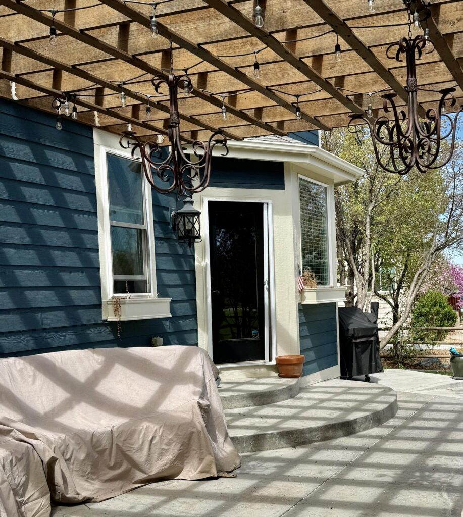
Is Dark Teal a Good Exterior House Color?
We love dark teal paint colors – they are beautiful and flexible! This is a great option if you want a blue paint color, but might feel that they are overdone in your neighborhood. Teals, like blues look great in wooded lots and with warm stone or red brick.
Dark teal paint colors also look fantastic if you are a gardener as a backdrop for color. You can see the gorgeous spring flowers throughout the photos in this post. Check out this photo of a cherry tree with the Sherwin-Williams Seaworthy exterior as a backdrop.
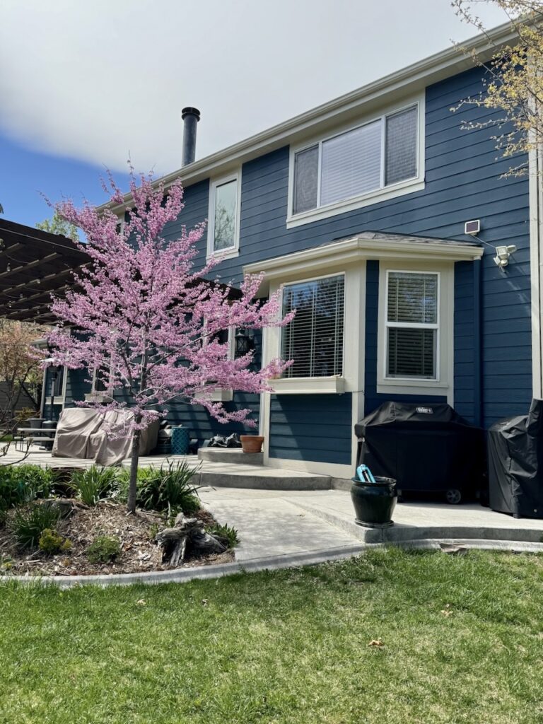
If you want an exterior color palette that stands out but also stands the test of time, then a dark teal paint like Seaworthy is a perfect option.
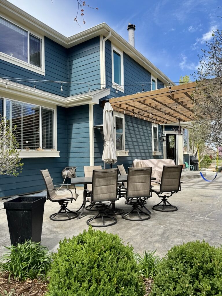
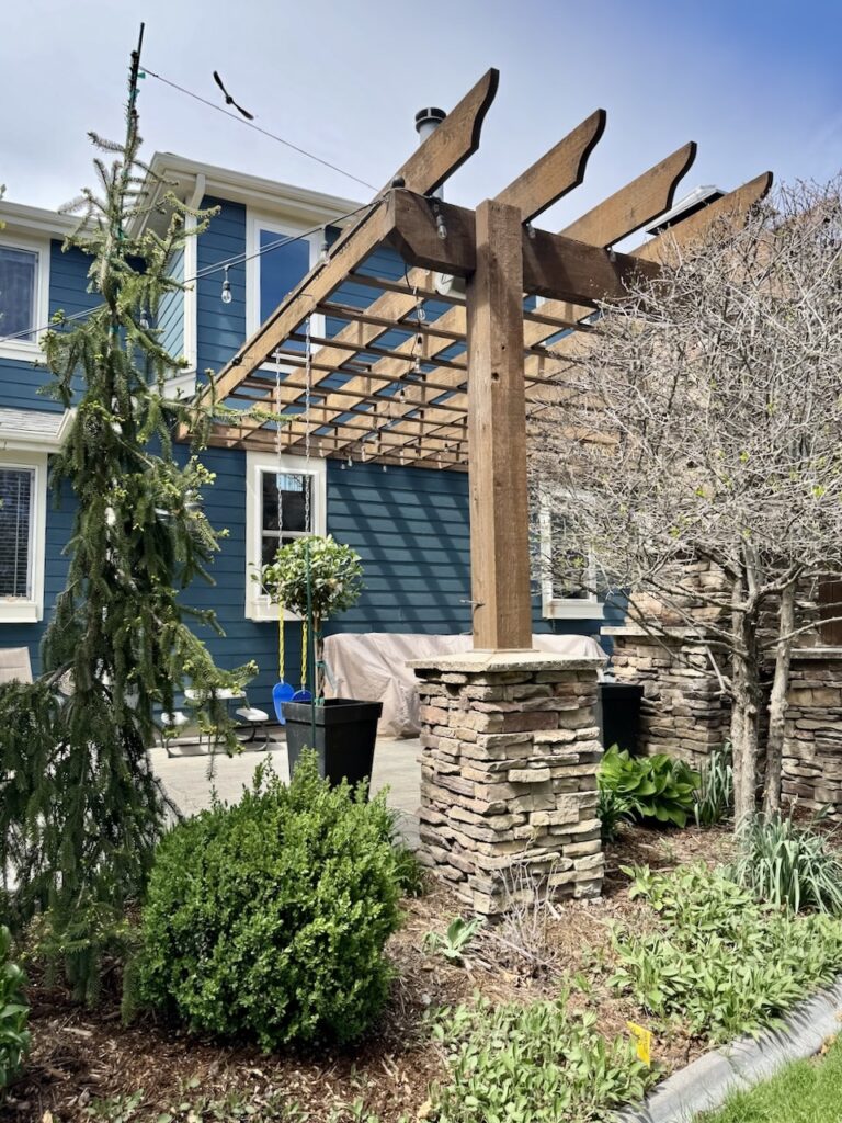
Don’t forget to consider your home’s location, landscaping, neighbors and hard finishes like stone or brick before choosing an exterior paint color. It’s also important to test your paint colors in the shade as well as in the shadows. This photo shows Seaworthy in both conditions on the hot tub side of the home.
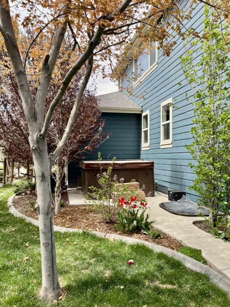
Be sure to test your paint colors, too, before taking the plunge.
Need help designing your perfect exterior palette? Hire our color consultants (Article) to do the hard part for you!
Key Learning Points
- Sherwin-Williams Seaworthy is a dark teal paint color that works beautifully as exterior paint.
- Seaworthy is a great paint color if you are looking for a substitute for blue.
- This color looks completetly different in the sun and the shade. Make sure you test the color both in the sunshine and shade before you paint.
- When you want a white paint color to pair with a dark body color, select much darker white (or warm greige) than you would expect. Otherwise the white will look too stark. A warm greige will look more harmonious than a darker cream color, which could shift to yellow.
- If you want a darker version of this color, consider BM Narragansett Green. For a lighter version, select SW Tempe Star.
- When choosing exterior paint colors, remember that paint looks 4-5 times lighter and more colorful outdoors than it does inside.
Remember: NEVER, EVER use paint matches from a different brand than the one specified. Results are poor and there are no standards for the sheens. Even though your painter may truly believe it can be done, don’t do it. See results from paint matching here.
Get an Expert-Made Exterior Paint Color Scheme
Don’t want to create a color palette by yourself? Discover our Online Color Consulting Packages.
Our All-In Exterior consults include three tailor-made color palettes, support during the testing process, one round of design edits, and detailed color placement instructions you can hand off to your painter.

Related Posts
- Best Blue Exterior Color Schemes
- BM Newburg Green Teal with Red Brick
- Best White Exterior Trim Paint
- Best Sherwin-Williams Exterior Color Palettes
- Best Front Door Paint Colors
About the Author

Hi, I’m Michelle Marceny, founder, owner, and Principal Color Designer at The Color Concierge. I believe a fresh coat of paint can completely transform a space. The Color Concierge was born out of my drive to help clients fall back in love with their homes. My clients trust me to help them find the perfect paint color for their home – whether it’s a whole-house paint color scheme or ideas for a single room.
Since The Color Concierge was founded in 2017, we have completed over 3000 color consultations, both online and in-person. I am a Certified Color Expert with 7 years of experience creating interior and exterior color palettes throughout North America.
We love your comments! Please note that the blog is meant as general advice, and it is not possible to give specific answers to your paint questions. If you want more specific advice, our Online Color Consultations will help you pick your paint colours. Thank you for your understanding.

