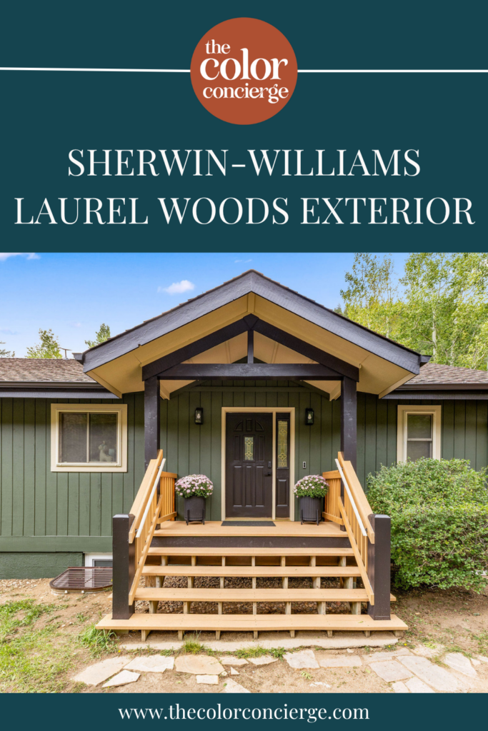
Sherwin-Williams Laurel Woods (SW 7749) is a deep green paint color with a near-neutral undertone
that leans slightly warm, and an LRV of 6 — dark enough to read almost black when used for interiors.
We used it on two Colorado exteriors, where it appears brighter and looks cohesive with surrounding trees and greenery.
Laurel Woods is a beautiful paint color that feels like it was made for Colorado home exteriors. The deep green hue looks just as beautiful nestled among evergreens as it does in a suburban neighborhood with mountains in the background.
We recently used Sherwin-Williams Laurel Woods for two Colorado exteriors, and the houses could not be more different: a mountain Airbnb at 8,000 feet and a suburban home in the Denver foothills at 5,300 ft of elevation. Same color, two genuinely different results.
Keep reading to discover what we learned while working on both homes, and to get the full palette we used on each.
*This post contains affiliate links for products I use and love. If you click on some links and make a purchase, I will get a small commission at no cost to you. This helps pay for the costs of the blog, so I can continue to offer great content to our readers.
About The Color Concierge
Our Colorado-based paint color consultants make finding the right paint colors for your home easy. Whether you’re painting the exterior or interior of your home, our simple yet effective process lets us get your paint color right the first time. We’ve helped thousands of homeowners transform their homes into a space they love. Learn more about ONLINE COLOR CONSULTATIONS today.
What Color Is Sherwin-Williams Laurel Woods?
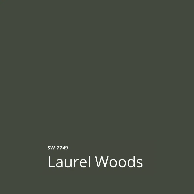
Sherwin-Williams Laurel Woods (SW 7749) is a very dark green that reads as a green-black indoors. Sherwin-Williams files it under neutrals rather than greens, and on a small chip, that classification makes a certain amount of sense — there is not much obvious color in it. Put it on a full exterior, however, and the bright sunlight really helps the green tones shine.
What Is the Sherwin-Williams Laurel Woods Undertone?
The undertone of this color is almost neutral and leans just slightly warm. Greens generally have either yellow (warm) or blue (cool) undertones. While Laurel Woods can look cool – especially when compared to very clear yellow-green hues, it does have a subtle yellow undertone.
That small amount of warmth matters more than it sounds like it should. It is the reason Laurel Woods looks so good next to warm brick and other warm paint colors, as you’ll see in our project spotlights below.
| Color | Sherwin-Williams Laurel Woods |
|---|---|
| Color number | SW 7749 |
| LRV | 6 (Light Reflectance Value, on a scale of 0 to 100) |
| Undertones | Close to neutral, leaning slightly warm with a trace of yellow. Cooler than a green like Sherwin-Williams Shade-Grown. |
| Color family | Green, dark enough to read as a green-black indoors. Sherwin-Williams files it under neutrals. |
| Best for | Exterior siding and stucco on wooded or mountain lots, and dark, moody exteriors that still need to contrast with brick or stone |
| Best exterior trim colors | Sherwin-Williams Universal Khaki (SW 6150), LRV 40, or Sherwin-Williams Egret White (SW 7570), LRV 70 |
| Avoid pairing with | whites that look stark outdoors, such as Benjamin Moore Chantilly Lace (OC-65), LRV 90, or Benjamin Moore White Dove (OC-17), LRV 83 |
| Closest Benjamin Moore match | Benjamin Moore Topsoil (CC-692), LRV 8 |
Sherwin-Williams Laurel Woods Tips and Tricks
- Use with: natural wood and composite timber, warm brick or stone, black metal, and warm whites. It is at its best on a wooded or mountain lot, where the house has a green backdrop to settle into.
- Don’t use with: whites that look stark outdoors. These will look especially bright against a dark body color.
- For exteriors: with an LRV of 6, Laurel Woods reads as a green-black up close and as a soft dark green from the street. It lightens noticeably as elevation rises. Against warm brick, it is one of the few near-black greens with enough color in it to hold contrast.
- Watch the windows: if the house has white vinyl window frames, keep the trim a warm white or greige rather than black. Black trim next to bright vinyl draws attention straight to the windows.
- Best exterior trim colors: Sherwin-Williams Universal Khaki (SW 7541), LRV 40, or Sherwin-Williams Egret White (SW 7570), LRV 70. For black trim, use the darkest blacks such as Black Magic (SW 6991), LRV 3 to get noticeable contrast with the green.
- Best paint matches: Benjamin Moore Topsoil (CC-692), LRV 8 — two points lighter, so sample both rather than swapping one for the other
Project Spotlight: A Mountain Airbnb at 8,000 Feet
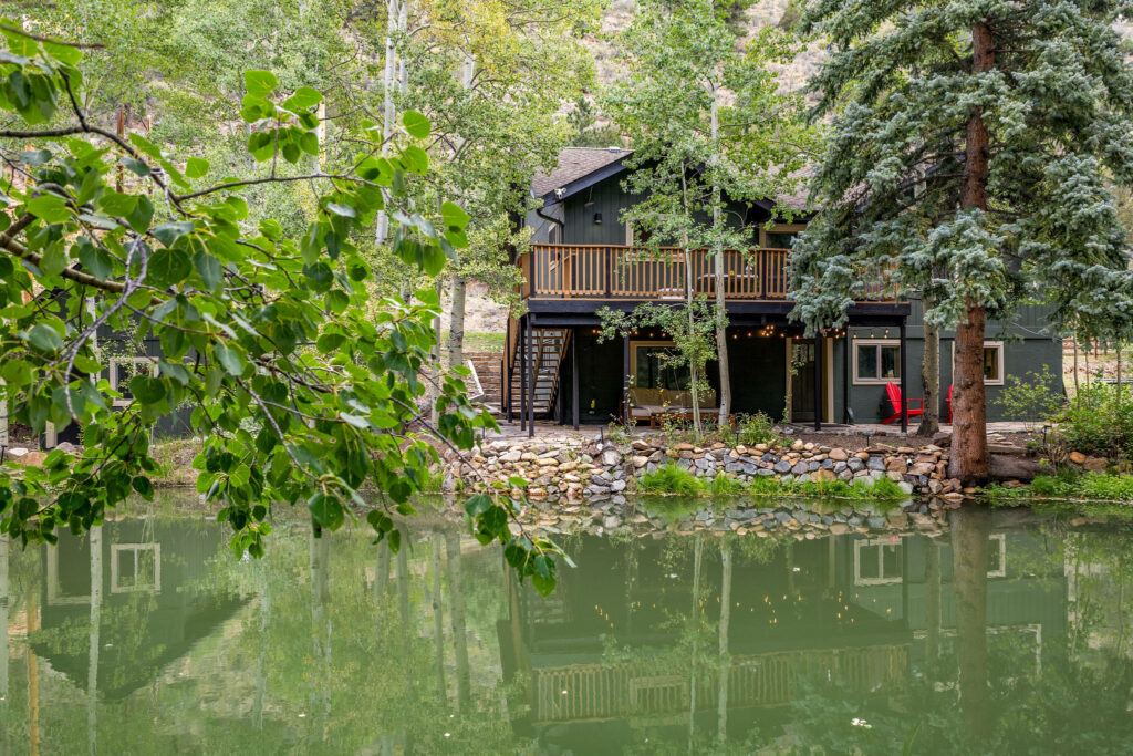
The first client’s home we’re featuring today is a gorgeous AirBNB near Idaho Springs, CO, in the mountains west of Denver, at 8,000 feet of elevation. It is an Airbnb called Haddad Hollow. The owner, Jonalle Haddad, is a close friend of our family and an extraordinary chef. You cannot lose staying here.
The inside of this house was already beautiful. The outside was not keeping up. Painting it Sherwin-Williams Laurel Woods completely transformed the property.
For this project, I was inspired by designer Emily Henderson, who used Laurel Woods with black accents on her own house in the woods.
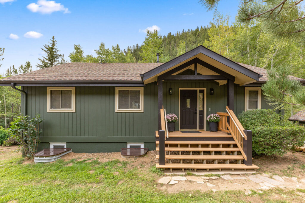
Before this makeover, the home was a sage green with stark white trim. In certain light, the green went murky and minty. The white was too bright for the setting, and the overall palette read coastal rather than mountain. It simply did not look as elevated as the interior it was wrapped around.
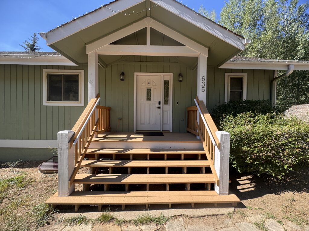
The final palette was a beautiful, cohesive home that fit perfectly into its mountainside surroundings.
Sherwin-Williams Laurel Woods Siding and Stucco
We used Laurel Woods on the home’s stucco and siding. The house really began blending into the woods around it. While we sometimes prefer a home to stand out, blending in with surrounding nature really helps this mountain escape feel even more peaceful.
Some of the wood on this house was composite and couldn’t be painted, so we left it as-is. That turned out to be a gift. The warm natural timber against a dark green body is exactly the contrast this house needed.
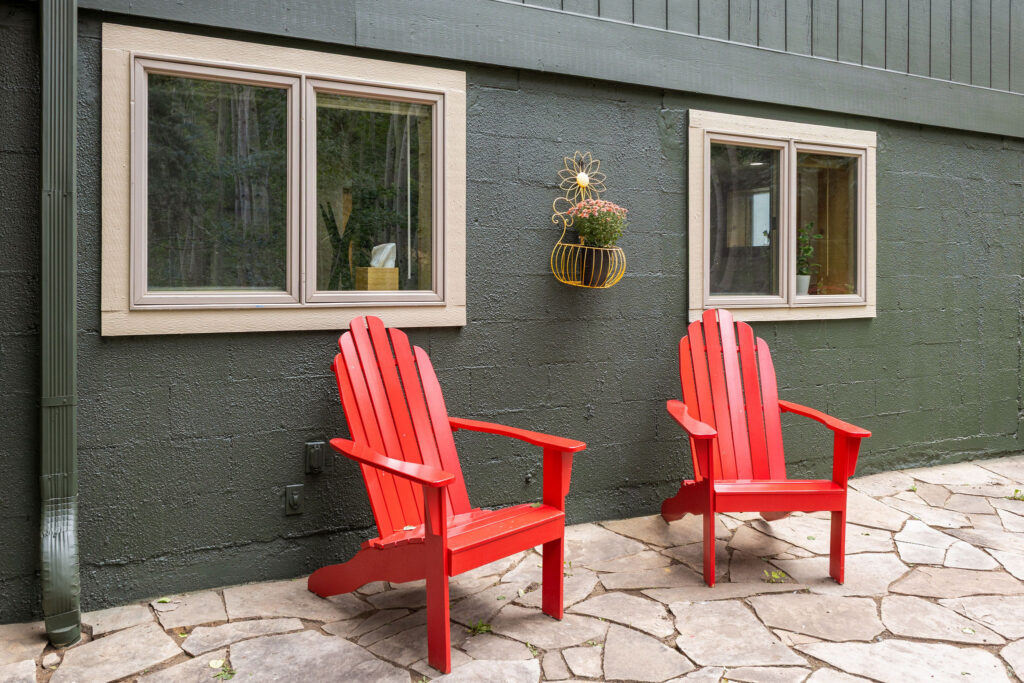
Sherwin-Williams Black Magic Soffits, Fascia, and Doors
The roofline (including soffits, fascia, and gutters), front columns, porch beams, and every exterior door were painted Sherwin-Williams Black Magic (SW 6991). With an LRV of 3, Black Magic is only slightly darker than the siding. While it didn’t provide contrast like trim often does, it acted almost like a shadow along the edges of the home, deepening the roofline and making the doors recede rather than pop.
If the window frames had been black, we could have used Black Magic for the window trim.
The roof on this house is a warm color that never worked with the original sage. Against Laurel Woods and Black Magic, however, it suddenly belongs.
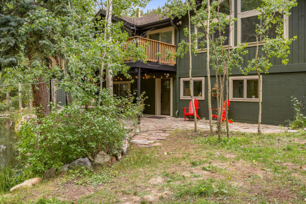
Sherwin-Williams Universal Khaki Window Trim and Porch Ceiling
While we used Black Magic accents on much of the home, we still needed a “white” exterior trim for the windows, which were white vinyl and would have looked too bright against black trim. For that, we used Sherwin-Williams Universal Khaki (SW 6150).
Universal Khaki has an LRV of 40. Outside at this high elevation of 8000 ft, the sun is brighter, so it reads as a creamy white and stays warm without being yellow. We use it constantly on high-elevation homes for this reason: it gives you a creamy color that isn’t stark.
Another great reason to use this darker trim color was that it didn’t look stark with the dark green Laurel Woods color. At a lower altitude, we would have used a lighter color such as Sherwin-Williams Grecian Ivory (SW 7541), with an LRV of 63.
We also painted the front porch ceiling Universal Khaki, to keep the entry light and airy under all that dark body color.
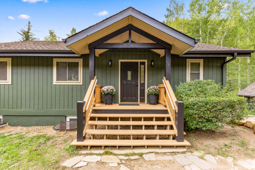
| Paint color | Where we used it |
|---|---|
| Sherwin-Williams Laurel Woods (SW 7749) LRV 6 |
Siding and stucco |
| Sherwin-Williams Black Magic (SW 6991) LRV 3 |
Soffits, fascia, gutters, front porch columns and beams, and all exterior doors |
| Sherwin-Williams Universal Khaki (SW 6150) LRV 63 |
Window trim and front porch ceiling |
What I love most about the finished house is something we didn’t specify at all: the pop of red in the outdoor chairs, alongside the paddle boards and the picnic table. It lifts the entire palette. And here is the coincidence — the second house in this post has a pop of red too.
Project Spotlight: A Denver Foothills Home at 5,300 Feet of Elevation
The second house we’re featuring is a suburban home in the Denver foothills. While it’s very different from the AirBNB, it turned out just as beautifully with Sherwin-Williams Laurel Woods exterior paint. You’ll notice that with a lower elevation, the Laurel Woods paint looks a bit darker compared to the mountain home.
It sits in the same neighborhood as the Sherwin-Williams Iron Ore house we completed recently, and has the same maroon brick. These homeowners wanted something different from their neighbors and were really, really set on a dark green. In the end, it turned out to be the perfect choice.
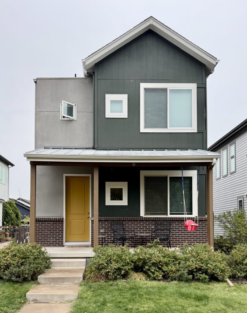
Before this transformation, the siding was a medium blue with beige, and honestly it just looked dirty. It was old and faded, the roofline was a dark brown, the posts were the same beige as the stucco, and the front door was brown — nothing was doing any work.
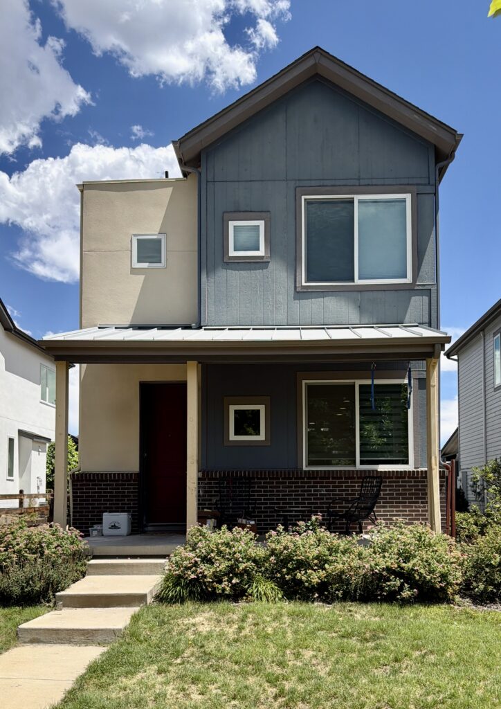
The new palette, explored in depth below, really brought this property to life.
Sherwin-Williams Laurel Woods Siding With Acier Stucco
The home’s siding was painted with SW Laurel Woods, and the stucco was painted with Sherwin-Williams Acier (SW 7017), with an LRV of 32.
The LRV difference between the siding and the stucco is what keeps this house from reading as one dark mass. Acier is a true mid-tone — dark enough to feel substantial against the green, but light enough to provide contrast.
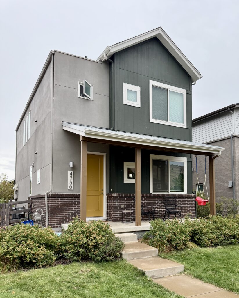
We also love taking a neutral from within the palette and using it on the garage door. That’s exactly what we did here — painting the garage the same color as the stucco to tie the whole property together.
Sherwin-Williams Egret White Trim and a White Porch Ceiling
The trim on this home is Sherwin-Williams Egret White (SW 7570), with an LRV of 70. It’s a warm, creamy beige paint color that reads white outdoors, and it goes beautifully with the brick.
For some reason, it always tests well in this neighborhood’s lighting as a “white” trim color. I think that it’s because Egret White has taupe undertones, and the red in the taupe color neutralizes all the greens in the foliage.
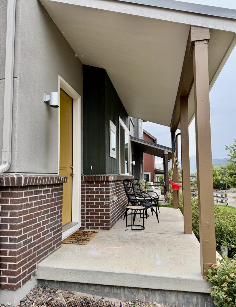
We painted the front porch ceiling Egret White as well, which lightened that whole area. You can see the difference between this home and the one next to it, which has a dark porch ceiling. The entry of our client’s home is noticeably brighter.
Sherwin-Williams High Tea Porch Posts and Beams
For a bit of color that wouldn’t take away from the siding or the stucco, we painted the home’s front porch posts, seen above, with Sherwin-Williams High Tea (SW 6159) — a golden brown that leans almost yellow.
High Tea provides a nice transition between the dark green siding and the lighter greige siding and also helps tie together the whole front of the house.
Sherwin-Williams Bosc Pear Exterior Doors
The front door is Sherwin-Williams Bosc Pear (SW 6390). We carried it through to the back door, the entry door, and the garage door, which offered some color within an otherwise dark and moody palette. This helped the palette come to life!
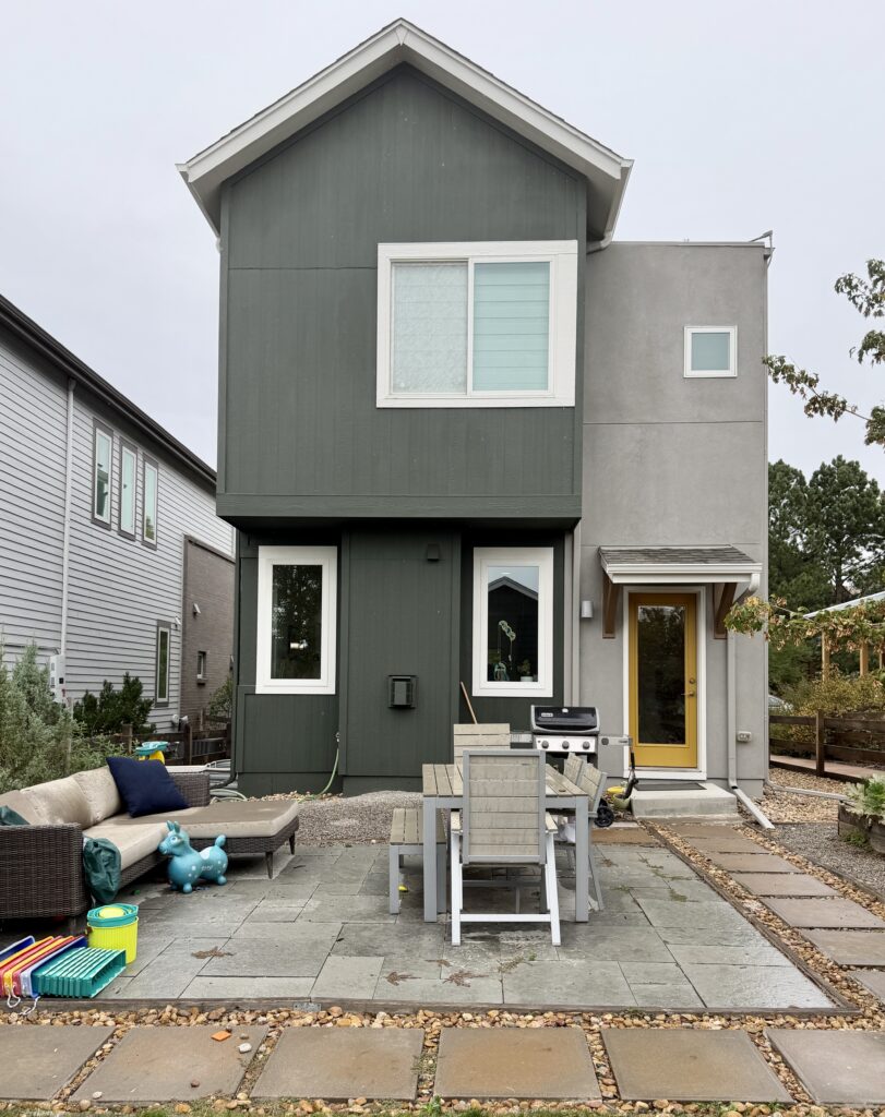
| Paint color | Where we used it |
|---|---|
| Sherwin-Williams Laurel Woods (SW 7749) LRV 6 |
Siding |
| Sherwin-Williams Acier (SW 9170) LRV 39 |
Stucco and garage door |
| Sherwin-Williams Egret White (SW 7570) LRV 70 |
Roofline (fascia, soffits, and gutters), trim, and front porch ceiling |
| Sherwin-Williams High Tea (SW 6159) LRV 17 |
Front porch posts and beams |
| Sherwin-Williams Bosc Pear (SW 6390) LRV 32 |
Front door, back door, garage entry door |
And yes: these homeowners have a red child’s chair on the porch. Two houses, two pops of red, entirely by accident.
Sherwin-Williams Laurel Woods FAQ
Is Sherwin-Williams Laurel Woods a good exterior paint color?
Sherwin-Williams Laurel Woods (SW 7749) is an excellent exterior color on lots with trees, stone, or brick, where its LRV of 6 lets the house settle into the landscape instead of competing with it. It looks more green than many other near-black colors, which is what lets it contrast with warm brick and natural wood so well.
Can you use Sherwin-Williams Laurel Woods inside the house?
Yes, but with an LRV of 6, it absorbs nearly all the light reaching it. Indoors it works best on cabinetry, built-ins, or a small room you want to feel enveloping, in a space that already gets good natural light. On large walls in a dim room it turns heavy.
What is the Benjamin Moore equivalent of Sherwin-Williams Laurel Woods?
The closest Benjamin Moore match to Sherwin-Williams Laurel Woods (SW 7749) is Benjamin Moore Topsoil (CC-692), at an LRV of 8 compared to Laurel Woods’ 6. Topsoil is slightly lighter, so on a full exterior the two are not interchangeable. Sample both on the house before choosing between them.
| Paint color | Peel-and-stick sample |
|---|---|
| Sherwin-Williams Laurel Woods (SW 7749) | Sample Laurel Woods |
| Sherwin-Williams Black Magic (SW 6991) | Sample Black Magic |
| Sherwin-Williams Universal Khaki (SW 6150) | Sample Universal Khaki |
| Sherwin-Williams Acier (SW 9170) | Sample Acier |
| Sherwin-Williams Egret White (SW 7570) | Sample Egret White |
| Sherwin-Williams High Tea (SW 6159) | Sample High Tea |
| Sherwin-Williams Bosc Pear (SW 6390) | Sample Bosc Pear |
At an LRV of 6, Sherwin-Williams Laurel Woods gives you very little to judge on a screen — it reads as nearly black on a computer monitor or paint swatch and as a deep green on a wall. It also lifts as elevation rises, which is why it looked like two different colors on our two Colorado houses. Tape a sample to the actual siding, in the actual light, before you commit. New to peel-and-stick samples? Samplize sends real manufacturer paint, two coats, in a 9” x 14” sheet, delivered overnight. I use them on every consultation. More on our method here: how to test paint colors.
Key Learning Points
Sherwin-Williams Laurel Woods (SW 7749) does its best work where there is something natural for it to sit against — trees, stone, or warm brick — and it behaves differently depending on where that house sits.
- Elevation changes how a dark color reads. The same Laurel Woods looked softer and greener on our house at 8,000 feet than on our house at 5,300 feet, where it held much closer to black. Thin air and stronger light lift a dark color. Test on the house, not on a screen.
- Against brick, chroma matters more than LRV. Several greens we tested at a similarly low LRV disappeared against this home’s burgundy brick. Laurel Woods worked because it carries enough actual color to register as a contrast rather than as another dark mass.
- White vinyl windows decide your trim color. On both houses the windows were partly white vinyl and could not be painted, so black trim was out — it would have framed the windows and drawn every eye to them. A warm white at LRV 63 to 70 bridges the gap instead. With black window frames, we could have painted the window trims Black Magic, or even the body color.
Remember: NEVER, EVER use paint matches from a different brand than the one specified. Results are poor and there are no standards for the sheens. Even though your painter may truly believe it can be done, don’t do it. See results in our paint matching guide.
No matter what, always test your paint colors. It’s a standard best practice. Whenever I test my paint colors, they are perfect, and when I don’t test they turn out wrong. Learn how to test your paint colors like a pro.
Online Color Consulting
Still need help picking the best paint colors? Discover our Online Color Consulting Packages.

Related Posts:
- Dark green house exterior with stone: a Sherwin-Williams Rosemary project
- Our full Sherwin-Williams Grecian Ivory review
- Our full Sherwin-Williams Egret White review
- Universal Khaki Paint Color Review
- Iron Ore Project Spotlight
- Sherwin-Williams Dorian Gray exterior color palette
- Best green exterior paint colors
About the Author

Hi, I’m Michelle Marceny, founder, owner, and Principal Color Designer at The Color Concierge. I believe a fresh coat of paint can completely transform a space. The Color Concierge was born out of my drive to help clients fall back in love with their homes. My clients trust me to help them find the perfect paint color — whether that’s a whole-house color scheme or ideas for a single room.
Since founding The Color Concierge in 2017, my team and I have completed 1,000s of color consultations, online and in person. I’m a Certified Color Expert with nine years of experience creating interior and exterior color palettes throughout North America.
Every color review on this site comes from colors we’ve specified in real homes and photographed on location during our own consultations — not from a fan deck or a manufacturer’s website.
We love your comments! Please note that the blog is meant as general advice, and it is not possible to give out specific answers to your paint questions. If you want more specific advice, our Online Color Consultations will help you pick your paint colors. Thank you for your understanding.