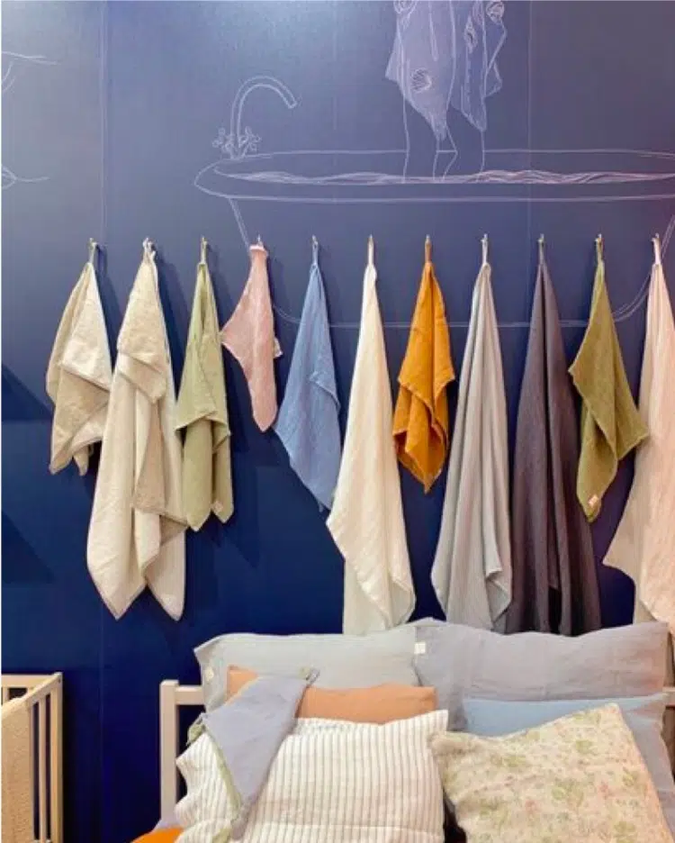
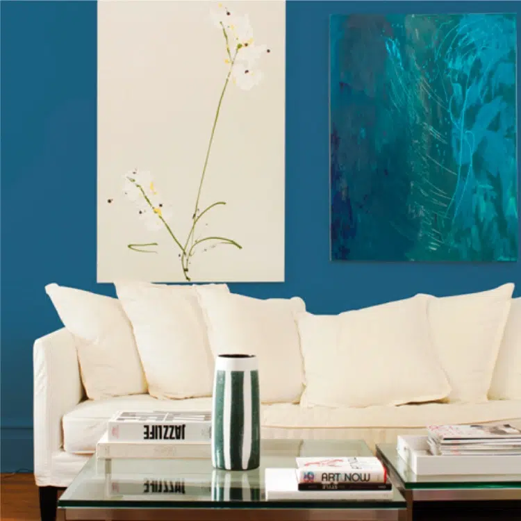
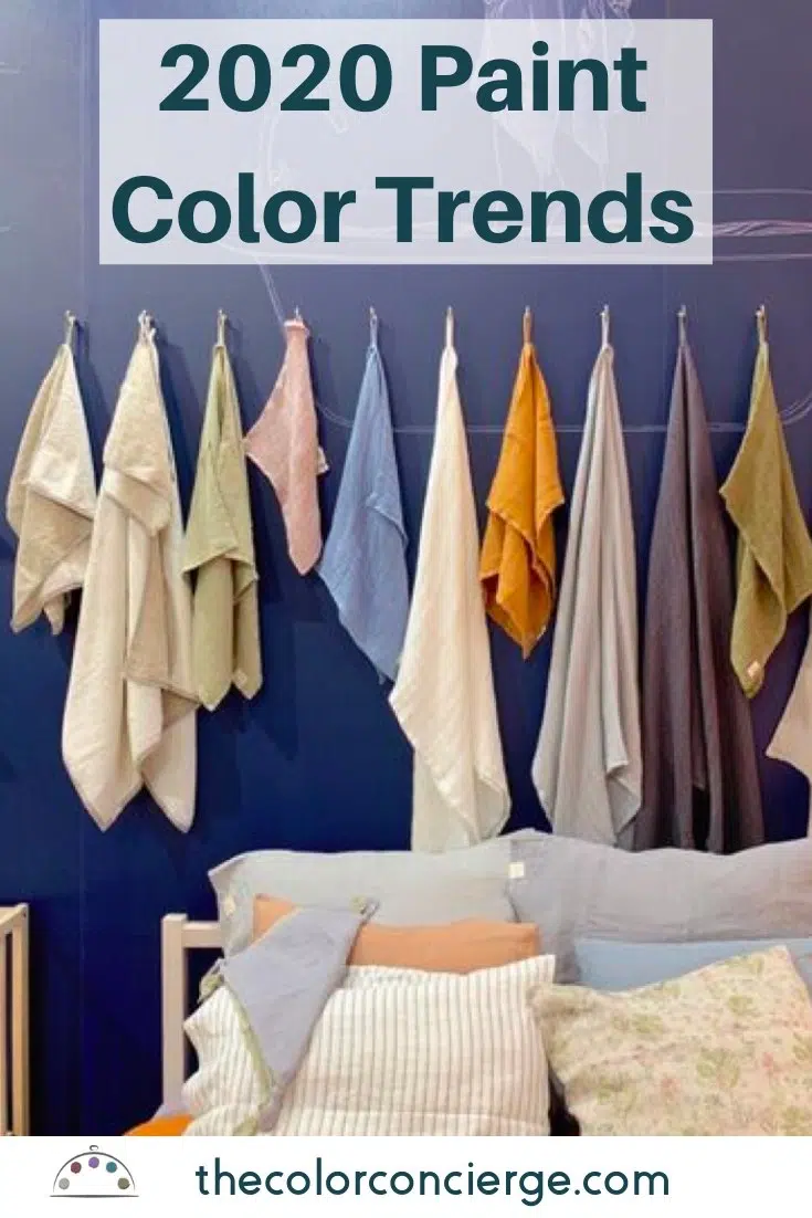
Organic colors from nature are the paint color trend for 2020 with whites and dark blues as background. The colors tie in with neutrals already in place.
Maison d’Objet Colors Predict Paint Color Trends
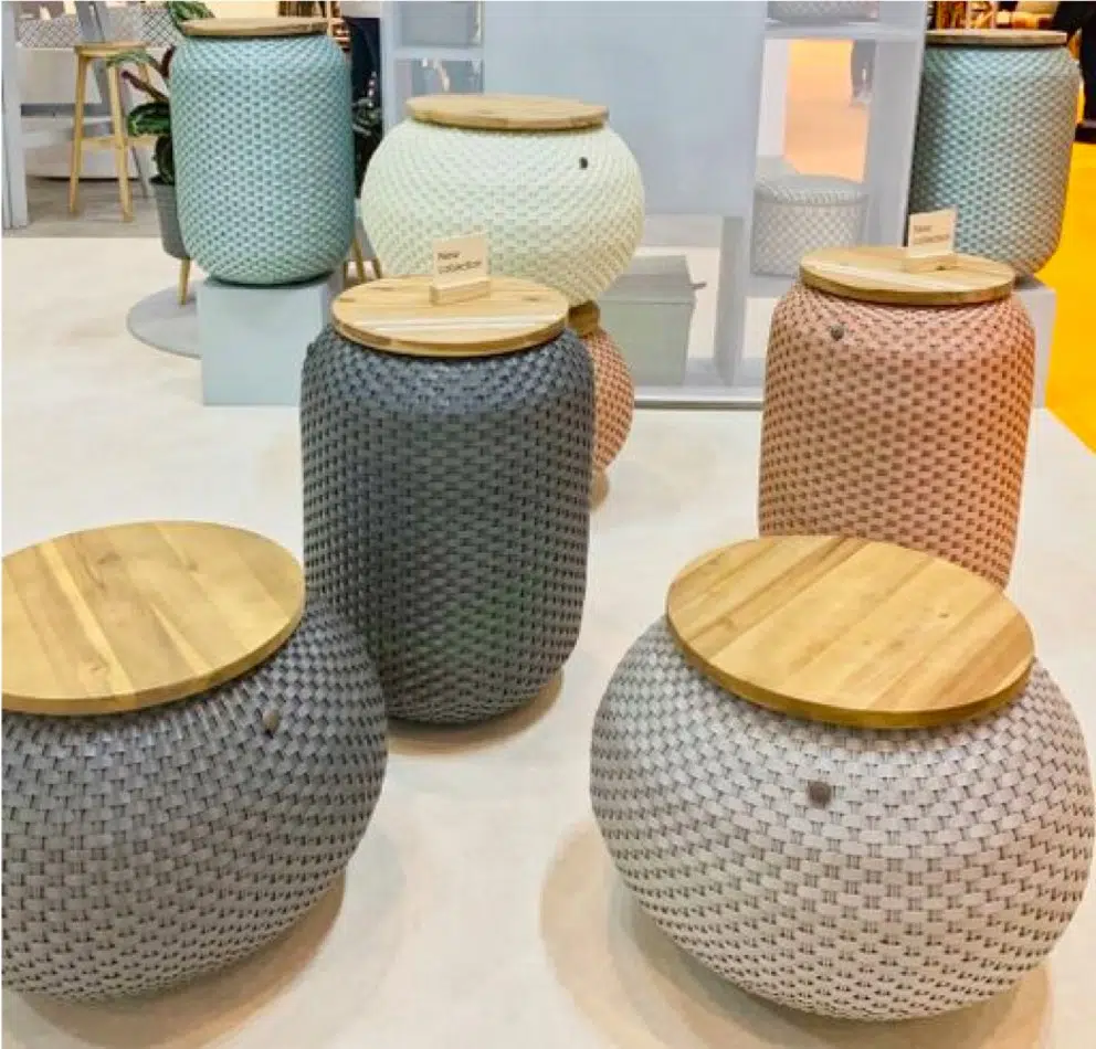
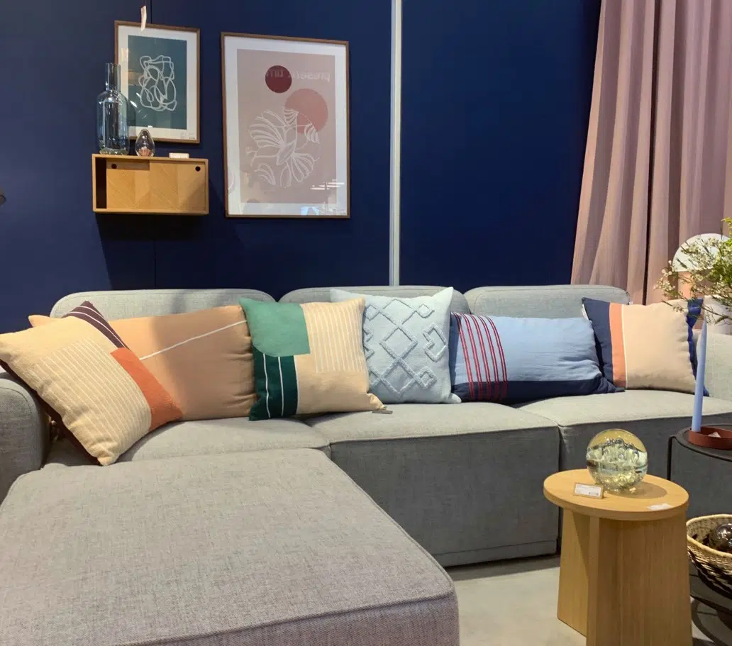
The colors we saw repeatedly at Maison d’ Object (Paris, September 2019) were a colorful organic palette from nature, and we love it! Think about orange sunsets, blue water, green plants, purple flowers.
Everyone is painting their home interiors and exteriors white after a decade of grays. When Maddie and I went to Maison d’Objet in Paris this fall, we didn’t see very much white. Instead, we saw these beautiful soft colors over and over again.
*This post contains affiliate links for products I use and love. If you click on some links and make a purchase, I will get a small commission at no cost to you. This helps pay for the costs of the blog, so I can continue to offer great content to our readers.
About The Color Concierge
Our Colorado-based paint color consultants make finding the right paint colors for your home easy. Whether you’re painting the exterior or interior of your home, our simple yet effective process lets us get your paint color right the first time. We’ve helped thousands of homeowners transform their homes into a space they love. Learn more about ONLINE COLOR CONSULTATIONS today.
2020 Paint Company Colors of The Year
The paint company colors fall into the trend we saw with fresh, hopeful organic colors.
Usually paint company colors of the year seem random, just an excuse to sell paint colors. This year, the paint companies nailed it. This new color palette is full of beautiful organic colors found in nature, just as we saw at Maison d’Objet. The recurring themes are calm and tranquility with colorful natural elements as a retreat from technology.
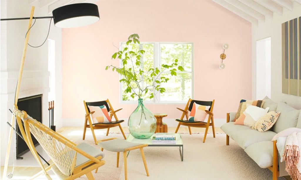
Color of the Year: Benjamin Moore First Light (2102-70)
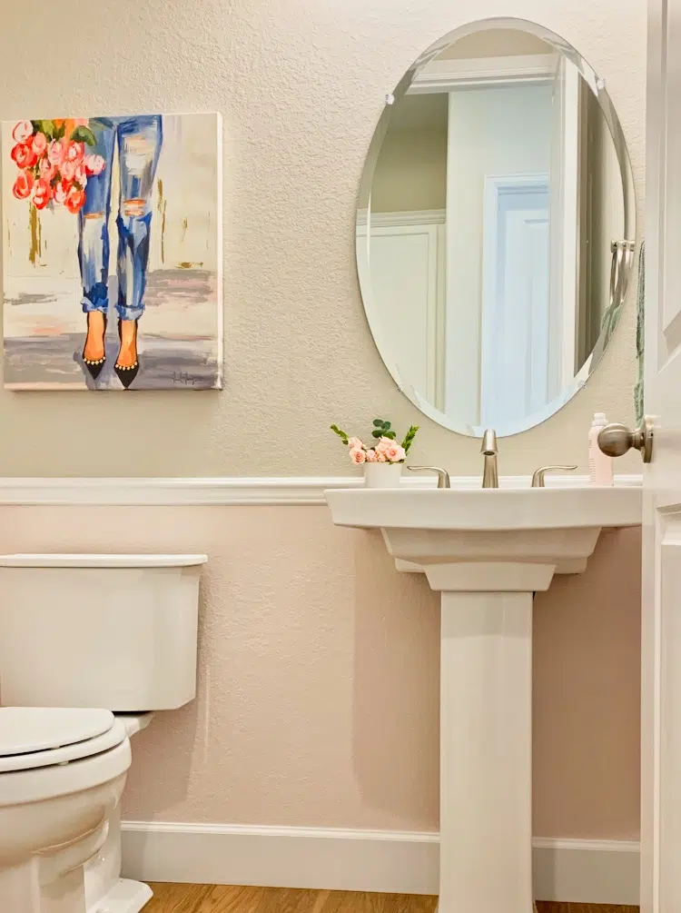
Call me a color geek, but when I saw the announcement for Benjamin Moore’s First Light (2102-70) (Sample), I was so excited that I couldn’t sleep. I stayed up all night thinking about where I could paint it, and I decided on my powder room. See our paint color review for First Light (Article) here. That kind of excitement is the first sign of a true paint color trend. Then, I painted the lower panel under the wainscoting in my powder room. The top part is SW Agreeable Gray (Sample) SW 7029.
Sample Colors
We always recommend that you test paint colors (article) in your home because lighting can completely change a color, both on interiors and exteriors.
In the old days, this meant we painted a large poster board with sample pots and a huge mess.
Now we have a better way to test paint, with Samplize Peel-and-Stick samples!
- Samples pre-painted with 2 coats of real paint from the manufacturer.
- Large 9” x 14” samples to see the color better in the lighting.
- Delivered overnight
- Colors are accurate
- Less expensive than painting a large poster board with sample pots
- No mess, and no toxic paint to dispose of
I use these in my color consulting practice for exact results. Discover Samplize peel-and-stick paint samples via the link below.
Andrea Magno, Benjamin Moore’s Color & Design Expert said: “We’ve been in the neutral zone for a long time, and we love neutrals, but we feel people are ready to bring color into the home.”
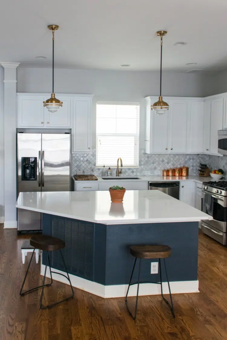
Color of the Year: Sherwin-Williams Naval (SW 6244)
Sherwin-Williams continued the Paint Color Trend with Naval (SW 6244) (Sample), the color of the night sky. We saw this often in Maison d’Objet as a backdrop to brighter colors. Maddie Camilli used this color on an island for a kitchen update this year, and it looked stunning! At the Colormix® Forecast presentation in Denver, Sue Waddell said Navy will be on cabinets, walls, hardware and furniture. It is beautifully paired with jewel tones and metals for an elegant and beautiful look. We were told at Colormix® that GE is about to launch a line of appliances in Navy!
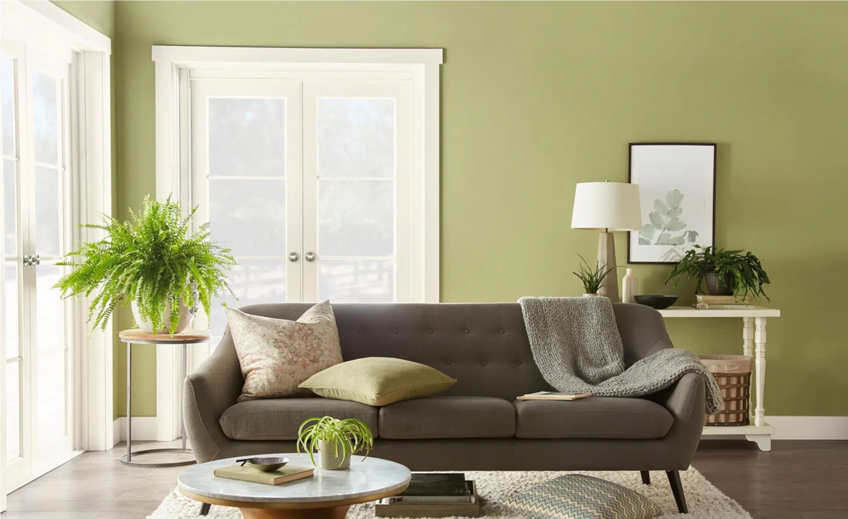
Color of the Year: Behr Back to Nature (S340-4)
Behr announced the color on August 15, 2019, right in line with the paint color trends: “Back To Nature is an organic shade of green meant to purify and promote balance at home.” The theme of peace and tranquility for 2020 continues with this color. Looks like sage green from the 1990s, but we love it.
Color of The Year: PPG Chinese Porcelain (PPG1160-6)
PPG also follows the paint color trend for calm and peace with Chinese Porcelain (Sample) for their Color of the Year. Dee Schlotter, senior color manager, PPG paint brand, said “The need for simplicity and escapism from technology is, in part, the reason that consumers are craving blues like Chinese Porcelain that bring us closer to natural elements such as the sea and sky – creating serenity in any space.”
Color Palette of the Year: Valspar Palette
Instead of one color, Valspar gave us 12 Colors of The Year, almost identical to the Maison d’Objet paint color trends. We picked two of our favorites from the palette to show you from their collection.
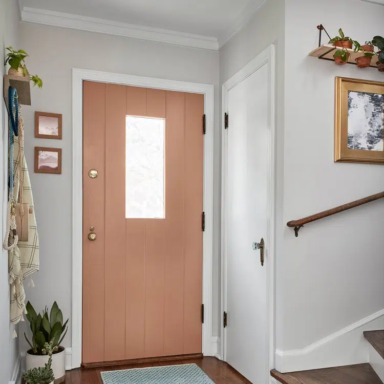
Valspar Canyon Earth (1007-9C) is a very soft livable Terra Cotta, the color of earth and clay. It’s great for doors and accents, and we saw it all over Maison d’Objet.
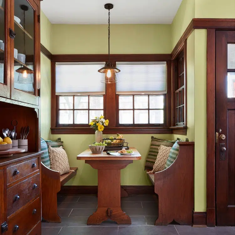
Valspar Tempered Sage (6006-5A) is more yellow than sage green, but it looks amazing with warm woods. Its a great color for a nook or powder room.
How do I use these colors in my house?
All these colors look gorgeous with whites and grays that you probably have in place. Start by adding these colors as accents, with throw pillows, art or rugs. If you feel bold and want to experiment, paint a secondary room such as a guest room, powder room, laundry room or den.
The Verdict
For paint color trends in 2020, expect to see beautiful vibrant colors from nature in 2020, mixed in with dominant whites and grays. It has been a long time since color was so prevalent in design palettes. Experiment with throw pillows and other accent pieces, accent walls and with secondary rooms such as powder rooms.
As always, don’t forget to test your paint colors. Check out our paint testing blog here.
Online Color Consulting
If you still need help with paint colors, check out our Online Color Consulting packages or an in the Denver Metro area.

If you liked this post, don’t forget to pin!
About the Author

Hi, I’m Michelle Marceny, founder, owner, and Principal Color Designer at The Color Concierge. I believe a fresh coat of paint can completely transform a space. The Color Concierge was born out of my drive to help clients fall back in love with their homes. My clients trust me to help them find the perfect paint color for their home – whether it’s a whole-house paint color scheme or ideas for a single room.
Since The Color Concierge was founded in 2017, we have completed over 3000 color consultations, both online and in-person. I am a Certified Color Expert with 7 years of experience creating interior and exterior color palettes throughout North America.
We love your comments! Please note that the blog is meant as general advice, and it is not possible to give out specific answers to your paint questions. If you want more specific advice, our Online Color Consultations will help you pick your paint colors. Thank you for your understanding.
